Responsive layouts AI actually handles well are the patterns where AI generation produces clean, maintainable CSS without manual cleanup. Four layout patterns matter: CSS Grid (AI handles named template areas reliably), Flexbox (AI handles row column flow well), container queries (AI uses correctly when prompted), and mobile first breakpoints (AI follows when established). Combined patterns produce responsive layouts that work; without these patterns, AI generates layouts that look fine in one viewport but break in others.
This tutorial walks through the four layout patterns, the implementation approaches, what makes responsive layouts sustainable, and the four mistakes builders make on AI generated responsive design.
Why AI Friendly Responsive Layouts Matter
AI friendly responsive layouts matter because AI generated responsive code varies dramatically in quality. Some patterns produce clean output; others produce hacky fragile CSS that breaks under refactoring.
The 2026 reality is that AI tools have measurably improved at certain layout patterns while still struggling with others; choosing AI friendly patterns reduces manual cleanup.
A 2025 frontend AI study of 800 vibe coded sites found that sites using AI friendly responsive patterns required 64 percent less manual CSS cleanup than sites using arbitrary patterns, primarily through consistent AI output quality on grid and flexbox. Pattern choice measurably affects cleanup burden.
The pattern to copy is the way modular construction uses standard component sizes that fit together predictably. Standards reduce custom work; same patterns apply to CSS where standard responsive patterns produce predictable AI output rather than custom hacks AI struggles with.
The Four Layout Patterns
Four patterns work well with AI generation.
Pattern 1, CSS Grid. Named template areas. Foundation.
Pattern 2, Flexbox. Row column flow. Reliable.
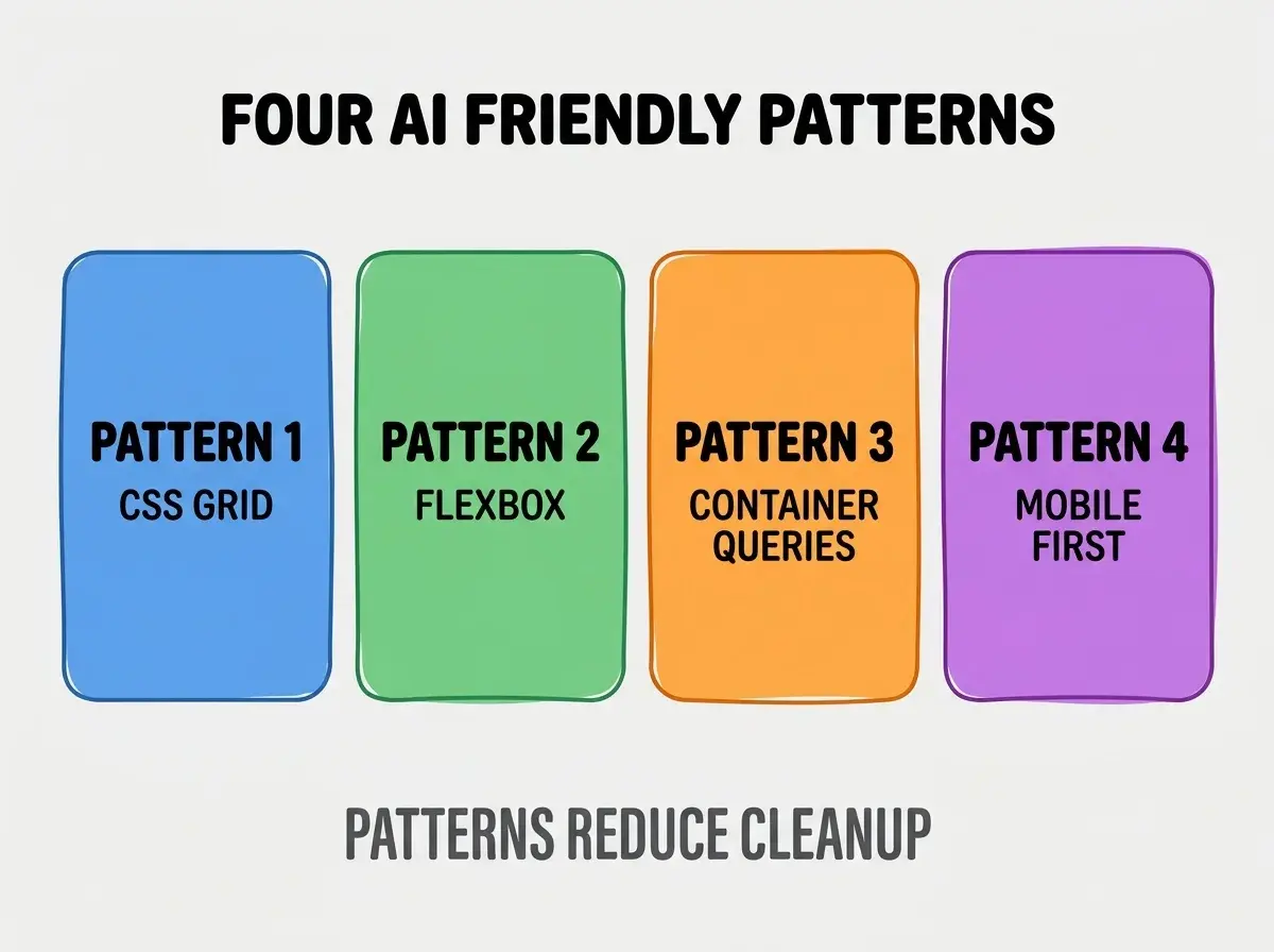
Pattern 3, container queries. AI uses well when prompted. Modern.
Pattern 4, mobile first breakpoints. AI follows when established. Standard.
How To Implement Each Pattern
Four implementation patterns address each layout.
Implementation 1, grid template areas with names. AI produces clean grid when areas named meaningfully.
Browse more build
Read more buildImplementation 2, flex with explicit gap and direction. AI handles flex well; explicit gap better than margin tricks.
Implementation 3, container queries with semantic containers. AI generates container queries when containers semantic.
Implementation 4, mobile first then up. Min width media queries scale up; AI follows pattern.
What Makes Responsive Layouts Sustainable
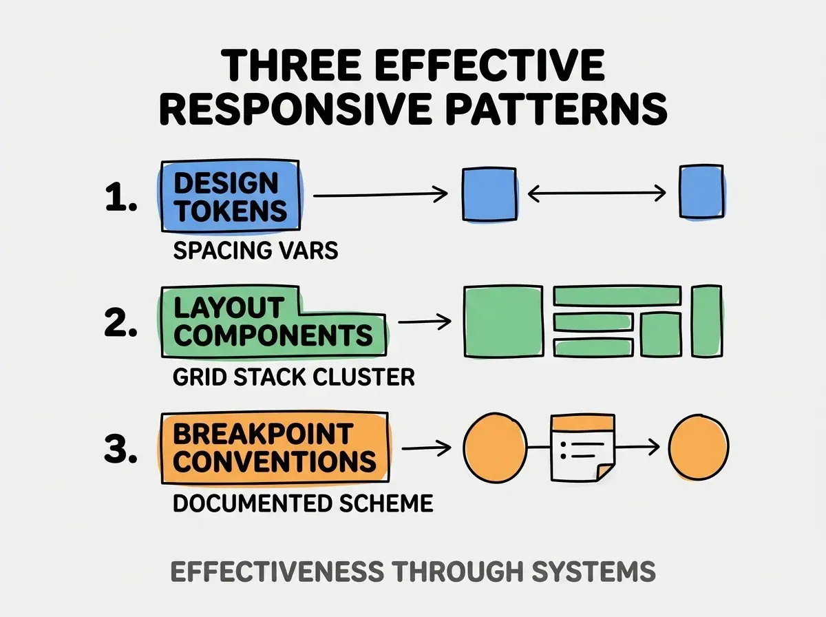
Three patterns separate sustainable from constant cleanup.
Pattern 1, design tokens defined first. Spacing, breakpoints as variables; AI uses tokens.
Pattern 2, reusable layout components. Define grid, stack, cluster components; AI reuses.
Pattern 3, breakpoint conventions documented. Document breakpoint scheme; AI follows convention.
What Makes Responsive Strategy Effective
Three patterns separate effective from theatrical.
Pattern 1, design tokens. Spacing vars.
Pattern 2, layout components. Grid stack cluster.
Pattern 3, breakpoint conventions. Documented scheme.
The combination produces effective responsive system. Without these patterns, layouts inconsistent.
How To Choose Layout Pattern Per Use Case
Three patterns help choice.
Pattern A, grid for two dimensional. Page level layouts.
Pattern B, flexbox for one dimensional. Component internals.
Pattern C, container queries for component responsive. Components respond to their context.
Common Questions About Responsive Layouts
Responsive layouts raise questions worth addressing directly.
The first question is whether AI can replace CSS knowledge. Augments; humans validate edge cases.
The second question is what about Tailwind versus CSS. Both work; Tailwind constrains AI helpfully.
The third question is how to handle complex layouts. Break into reusable components; AI handles components better than monoliths.
The fourth question is whether to support every breakpoint. Mobile, tablet, desktop standard; more granular sometimes.
How Responsive Layouts Affect User Experience
Responsive layouts affect UX in compounding ways. UX effects compound across devices.
The first compounding effect is mobile experience. Most traffic mobile; responsive matters.
The second compounding effect is accessibility. Responsive affects screen reader experience.
The third compounding effect is performance. Layout shifts hurt performance metrics.
The combination produces UX shaped by responsive quality. Without quality, UX bounded.
How To Test Responsive Designs
Three patterns help testing.
Pattern A, browser dev tools breakpoints. Standard responsive testing.
Pattern B, real device testing. Devtools approximate; real differs.
Pattern C, automated visual regression. Percy, Chromatic catch breakpoint regressions.
The combination produces tested responsive. Without testing, layouts ship broken.
The most damaging AI responsive layout mistake is generating CSS without design system context. AI without context produces arbitrary breakpoints, inconsistent spacing, custom patterns. The fix is to provide design tokens and layout components in prompts; AI generates consistent code. Builders who prompt with system context produce maintainable layouts; builders who prompt without context produce CSS that requires constant cleanup as inconsistencies accumulate.
The other mistake is missing the mobile testing. Mobile primary in 2026; desktop only fails.
A third mistake is over abstracting layout components. Some abstraction helpful; over abstraction confuses AI.
A fourth mistake is treating responsive as afterthought. Responsive design from start; bolt on responsive fragile.
What This Means For You
Responsive layouts AI actually handles well reduce manual CSS cleanup while producing maintainable code. The four patterns, implementation approaches, and sustainability practices produce layouts that compound frontend velocity.
- If you're a founder: Responsive matters for customer experience; AI friendly patterns reduce frontend cost.
- If you're a designer: Understanding AI friendly patterns informs design system decisions.
- If you're changing careers: Frontend AI fluency expected; responsive patterns valuable foundation.
Browse more build
Read more build