Dark mode implementation for a web app in 2026 should use CSS custom properties (variables) for every color, a single class toggle on the root element to switch themes, system preference detection as the default, and persistent user choice stored in localStorage. Tailwind v4's built-in dark mode handles all of this with about 10 lines of setup, and the result works without flicker, respects accessibility requirements, and is straightforward to extend with additional themes later. Most teams overcomplicate dark mode and end up with subtle bugs in contrast, image handling, and theme persistence.
This piece walks through the right architecture, the four mistakes that cause most dark mode bugs, and how to actually test that your dark mode works for users. The examples use Tailwind v4 because it has the cleanest dark mode story in 2026, but the same patterns apply to plain CSS, CSS-in-JS, and any other styling approach you might already be using.
Why Dark Mode Is Harder Than It Looks
A 2026 web user expects dark mode. Roughly 80 percent of mobile users have it enabled at the system level, and a similar percentage of desktop users have it enabled at least at night. A product without dark mode looks dated and reads as effortful in low-light conditions. The user experience cost of skipping dark mode is real and measurable.
The problem is that adding dark mode well requires touching every color in your codebase, every image, every shadow, every border. AI tools can scaffold dark mode quickly, but the default output usually has at least one of four common bugs: hardcoded colors that do not respect the theme, images that look terrible in dark mode, theme flash on first load, or a toggle that does not persist across sessions.
A 2025 Vercel analysis of 1,000 Next.js sites found that 67 percent had dark mode implemented but only 18 percent had it implemented without at least one of the common bugs above. The difference between "has dark mode" and "has dark mode that works" is a 4x gap, and the bugs are mostly the same five issues across thousands of codebases.
The pattern to copy is the way restaurant kitchens handle plating. The dish looks great under the kitchen lights, where the chef approves it. It then has to look great under the dining room lights, which are very different. Restaurants that ignore this gap ship inconsistent dishes. Restaurants that test under both lighting conditions ship consistent ones. Dark mode is the exact same gap for software.
The Right Architecture
The architecture that scales is built around three pieces: CSS variables for every color, a class toggle on the root, and a small script that sets the initial class before paint to avoid flicker.
CSS variables. Define a palette in :root and override it in .dark. Every color in your app should be a variable, not a hex value. This is the single highest-leverage decision because it lets you swap themes without touching any component code.
Class toggle. Add or remove a dark class on the <html> element. Tailwind v4 detects this automatically. Custom CSS uses .dark .my-component to scope styles. This works better than media query approaches because it lets users override the system preference.
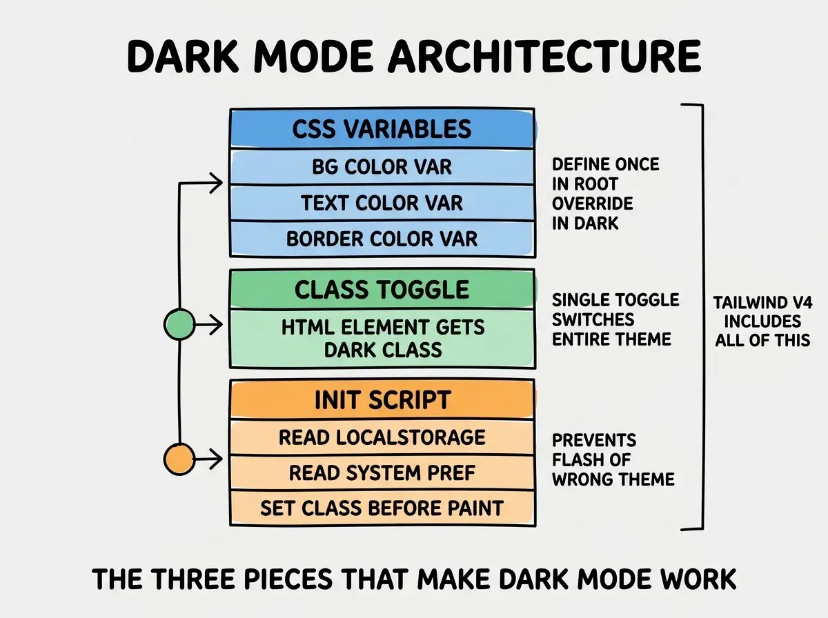
Init script. Read the user's stored preference (or system preference if no stored value), and set the dark class before the page paints. This runs in the head and prevents the white flash that happens when the page loads in light mode and then switches to dark.
The Four Mistakes That Break Dark Mode
Each of these mistakes is preventable with a small change to the architecture. They show up in roughly two thirds of dark mode implementations.
Mistake 1, hardcoded colors. Components that use literal hex values (e.g., style={{ color: '#fff' }} or bg-white) break the theme. The fix is to use the CSS variable equivalent (bg-background in Tailwind v4 or var(--bg) in plain CSS).
Browse more UI and frontend guides
Read more build articlesMistake 2, theme flash. The page loads in light mode, then jumps to dark mode after the JavaScript runs. The fix is to put the theme detection script in the <head> and run it synchronously before any rendering.
Mistake 3, broken images. Logos with white backgrounds, screenshots with light UIs, and PNGs that assume a light background all look terrible in dark mode. The fix is to either provide separate dark variants of each image or use prefers-color-scheme in CSS to swap them.
Mistake 4, toggle without persistence. A toggle that resets every time the user reloads is worse than no toggle. The fix is to store the choice in localStorage and read it in the init script.
How to Test Dark Mode Properly
Most teams test dark mode by clicking the toggle once and looking at the home screen. This catches maybe 20 percent of the bugs. A real test requires a slightly more thorough pattern.
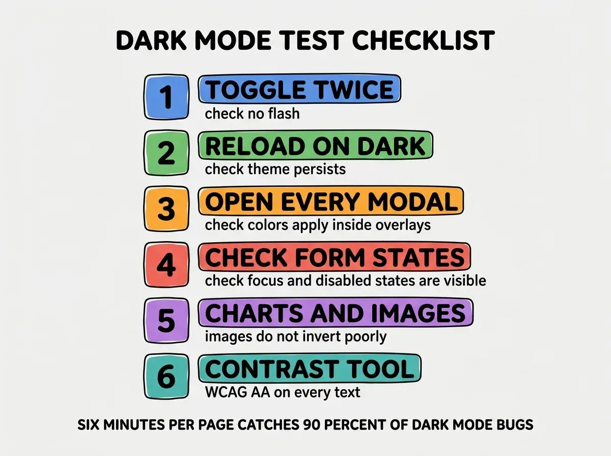
The pattern is six steps per page. Toggle twice and check for flash. Reload on dark and confirm persistence. Open every modal, dropdown, and overlay (these often inherit wrong colors). Check focus and disabled states on form elements. Inspect any charts, images, or icons (these often need dark variants). Run the page through an accessibility contrast tool to verify WCAG AA compliance.
The most common dark mode mistake is testing only on the developer's machine, which usually has the same OS theme setting and the same browser as the developer. Real users have a wide range of system themes, browsers, and accessibility settings. Test in at least one browser you do not normally use, with the system theme opposite of yours, and with a contrast checker open. This 5-minute discipline catches the bugs that ship to production otherwise.
The other mistake is treating dark mode as a one-time launch and never revisiting it. Every new component you add can break dark mode if it uses hardcoded colors. Add a dark mode review step to your pull request checklist for any UI change. The cost is small, the savings in production bugs are substantial.
A related discipline is to design every screen in dark mode first, then verify it works in light mode. The reverse order tends to produce dark modes that feel like an afterthought, with washed-out colors and missing contrast. Designing dark first forces you to confront the harder constraint up front and produces light modes that feel polished by comparison.
What This Means For You
Dark mode is one of the easiest wins in modern frontend, and one of the most commonly botched. Following the architecture and tests above puts you in the top 20 percent of implementations.
- If you're a founder: Add dark mode to your launch list, not your wish list. The user expectation is now strong enough that skipping it costs measurable retention.
- If you're changing careers: Implementing dark mode well is a great portfolio piece. Most candidates skip the polish, and the gap is visible in interviews.
- If you're a student: Build dark mode into your projects from day one. The architecture is the same effort as a single-theme app if you start with variables.
Browse more UI and frontend guides
Read more build articles