If you have been prompting AI tools to build apps, you have already seen Tailwind CSS. Those cryptic-looking strings like className="flex items-center gap-4 bg-blue-500 text-white p-4 rounded-lg" that show up in every piece of AI-generated code? That is Tailwind. And once you understand what those words actually mean, you unlock the ability to tweak, adjust, and control your app's design instead of blindly accepting whatever the AI gives you.
Think of Tailwind as a LEGO color palette. Traditional CSS is like mixing paint from scratch: you pick raw pigments, blend them in exact ratios, and hope you get the shade you want. Tailwind hands you a box of pre-made, perfectly shaped LEGO bricks. Each brick does one thing. bg-blue-500 is a blue brick. rounded-lg is a rounded-corner brick. p-4 is a spacing brick. You snap them together to build exactly what you need, and everything fits because the bricks were designed as a set.
What Tailwind CSS Actually Is
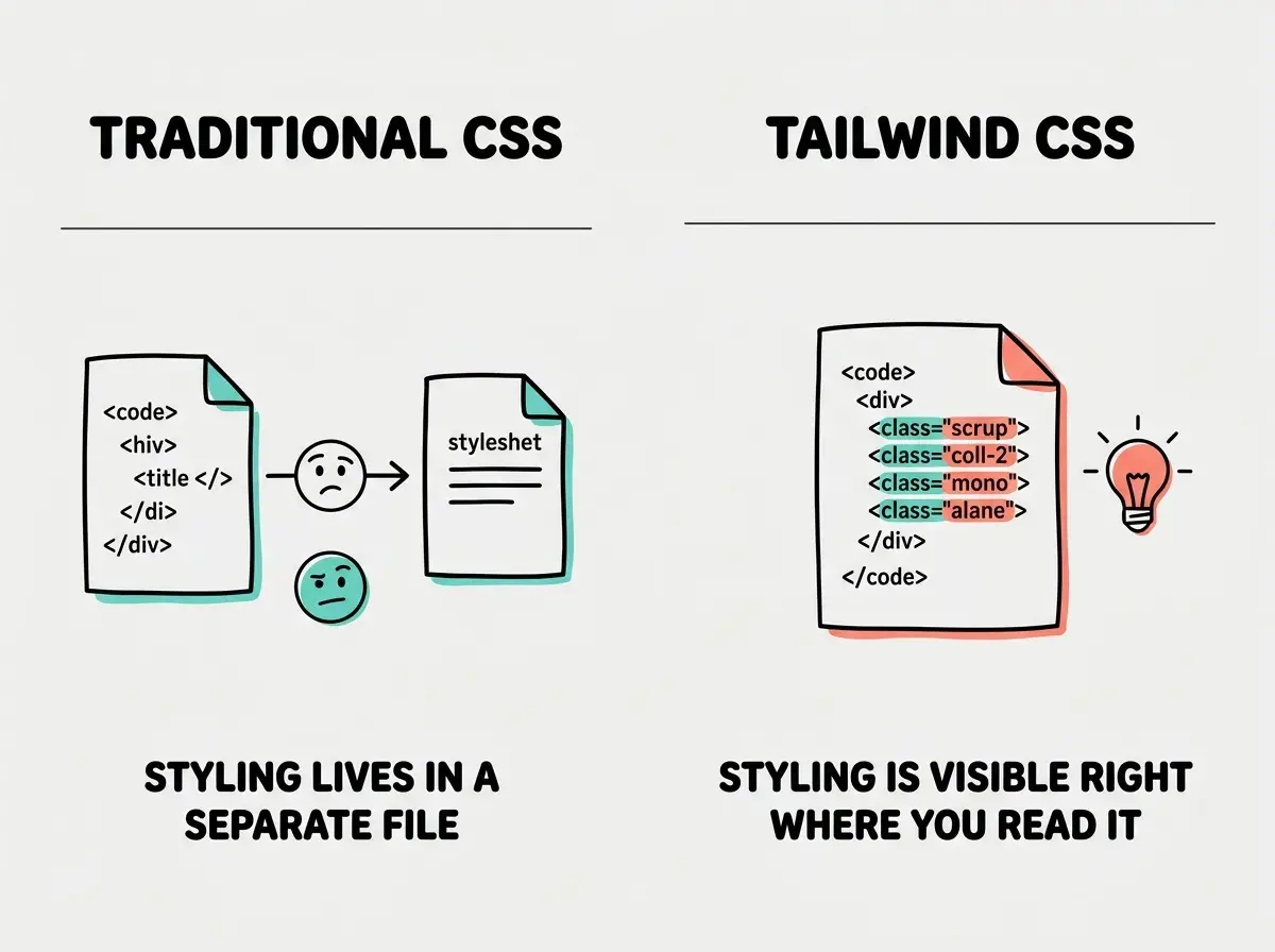
Tailwind is a utility-first CSS framework. In plain language, it is a collection of tiny, single-purpose styling classes that you apply directly to your HTML elements. Instead of writing CSS in a separate file and giving your elements class names like header-container or main-button, you describe the styling right where the element lives.
Here is the difference. In traditional CSS, you might write a separate file that says "elements with the class card should have a white background, rounded corners, and a shadow." In Tailwind, you write className="bg-white rounded-xl shadow-md" directly on the element. The styling and the structure live in the same place.
This matters for vibe coders because it means you can read the styling by looking at the code. You do not need to hunt through separate CSS files to figure out why something is blue or why a button has rounded corners. Everything is visible, right there in the component.
Tailwind is not a design tool or a component library. It is a vocabulary for describing visual styles. When you see text-xl font-bold text-gray-900 in your AI-generated code, you are reading a sentence that says "make this text extra-large, bold, and dark gray." Learning to read this vocabulary is the single most useful design skill a vibe coder can develop.
Why Every AI Coding Tool Defaults to Tailwind
There is a reason 92% of developers using AI daily encounter Tailwind in their generated output. AI models love Tailwind for the same reasons that make it readable for humans.
It is self-documenting. When an AI generates flex justify-between items-center, a human can read that and understand the layout intent. Traditional CSS class names like nav-wrapper tell you nothing about the actual styling.
It is composable. AI can combine Tailwind classes like LEGO bricks, snapping together exactly the combination of spacing, color, typography, and layout needed for each element. There is no risk of styles from one component accidentally affecting another.
It is predictable. Each Tailwind class does exactly one thing. mt-4 always adds margin to the top. text-red-500 is always the same shade of red. This predictability means fewer bugs and fewer surprises when the AI assembles a design.
It ships with sensible defaults. Tailwind's color palette, spacing scale, and typography sizes are all designed to work together harmoniously. The AI does not need to invent a design system from scratch. It just picks from the LEGO box, and the pieces look good together because the box was curated by professional designers.
The Tailwind Classes You Will See Most Often
You do not need to memorize hundreds of classes. Here are the patterns that cover roughly 80% of what AI tools generate.
Spacing (the invisible architecture). p-4 adds padding (space inside an element). m-4 adds margin (space outside an element). The number is a multiplier: p-1 is tiny, p-8 is generous, p-16 is huge. Add a direction with pt- (top), pb- (bottom), pl- (left), pr- (right), px- (left and right), or py- (top and bottom).
Colors (picking from the palette). Tailwind uses a naming pattern: {property}-{color}-{shade}. So bg-blue-500 is a medium blue background, text-blue-700 is darker blue text, and border-blue-300 is a lighter blue border. Shades range from 50 (almost white) to 950 (almost black). Think of it as reaching into your LEGO box and picking the exact shade of blue brick you want.
Layout (arranging the bricks). flex makes an element a flexbox container, which is the modern way to arrange elements in rows or columns. flex-col arranges children vertically. gap-4 adds space between children. justify-center centers items along the main axis. items-center centers items along the cross axis.
Typography (making text readable). text-sm, text-base, text-lg, text-xl, text-2xl control size. font-bold, font-semibold, font-normal control weight. leading-relaxed adds comfortable line spacing.
Responsiveness (one app, every screen). Prefix any class with sm:, md:, lg:, or xl: to apply it only at that screen size and above. So grid-cols-1 md:grid-cols-3 means one column on mobile, three columns on medium screens and larger. This is how Tailwind handles responsive design without media queries in separate files.
How to Read AI-Generated Tailwind Code
When your AI tool generates a component, here is how to decode the styling. Take this example:
className="flex flex-col gap-6 p-8 bg-white rounded-2xl shadow-lg max-w-md mx-auto"
Read it like a sentence: "This is a flex container, arranged as a column, with a gap of 6 between children, padding of 8 all around, white background, very rounded corners, a large shadow, a maximum width of medium, and centered horizontally." Each class is one LEGO brick snapped onto the element.
Once you can read these sentences, you can edit them. Want less padding? Change p-8 to p-4. Want a different background? Swap bg-white for bg-gray-50. Want sharper corners? Change rounded-2xl to rounded-lg. You do not need to understand the entire codebase. You just need to find the right brick and swap it.
Learn the fundamentals that make AI-generated code click.
Start with the basicsCustomizing Your Tailwind Design
The default LEGO box is great, but eventually you will want your own brand colors, custom fonts, or specific spacing values. Tailwind makes this straightforward through its configuration.
In most AI-generated projects, you will find a tailwind.config.js or tailwind.config.ts file in the root directory. This is where you extend the default palette. Want your brand's specific shade of purple? You add it to the config, and then you can use it everywhere as bg-brand or text-brand.
You can also tell the AI to do this for you. A prompt like "Add my brand color #7C3AED as a custom color called 'brand' in the Tailwind config, then use it for all primary buttons and headings" works perfectly. The AI will update the config and apply the new color throughout your components.
Dark mode is built in. Prefix classes with dark: to set dark mode styles. So bg-white dark:bg-gray-900 text-gray-900 dark:text-white creates an element that is white with dark text in light mode and dark with white text in dark mode.
Overriding Tailwind with custom CSS files. When something does not look right, vibe coders sometimes ask the AI to "add custom CSS" or "create a stylesheet" to fix it. This creates a parallel styling system that fights with Tailwind and makes future changes unpredictable. Instead, ask the AI to solve the problem using Tailwind classes. Say "use Tailwind utilities to make this section full-width with a gradient background" rather than "write custom CSS for the hero section." Staying within the LEGO system keeps everything consistent and maintainable.
Is Tailwind CSS Going Anywhere?
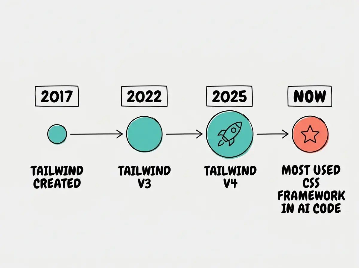
You might have seen search results asking "Is Tailwind CSS shutting down?" The short answer is no. Tailwind CSS v4 launched in early 2025 with major performance improvements and a simplified configuration system. The framework is actively maintained, widely adopted, and deeply integrated into the AI coding ecosystem. If anything, Tailwind's position has strengthened as AI tools have made it the de facto standard for generated code.
Building a Simple Card Component Step by Step
Let's put this knowledge to use. Here is how you would prompt an AI tool to build a pricing card, and how to understand every piece of the output.
Your prompt: "Build a pricing card component with a plan name, price, a list of four features with checkmark icons, and a signup button. Use a white background with a teal accent for the button."
The AI will generate something with classes like bg-white rounded-xl shadow-md p-6 on the card, text-4xl font-bold text-teal-600 on the price, and bg-teal-600 text-white rounded-lg px-6 py-3 hover:bg-teal-700 on the button.
Now here is where your Tailwind vocabulary pays off. Want the price bigger? Change text-4xl to text-5xl. Want a different button color? Swap every teal for indigo or violet. Want more spacing? Increase the gap or mt number. These small, targeted edits transform AI output from "looks okay" to "looks like mine."
You do not need to rewrite the component or understand React. You just need to find the LEGO brick that controls what you want to change and swap it.
Dig deeper
A few hand-picked sources if you want to go further.
What This Means For You
Understanding Tailwind is not about becoming a CSS expert. It is about gaining the vocabulary to communicate with your AI tools and to make precise adjustments to their output.
- If you are a founder building a product, Tailwind fluency means you can adjust your app's look and feel without filing tickets or waiting for a designer. When your AI builds a dashboard and the spacing feels off, you can fix it in seconds. When your brand colors need updating, you change one config file and the entire app updates. This is design autonomy, and it accelerates every iteration cycle.
- If you are a career changer learning to build, Tailwind is probably the highest-leverage CSS skill you can develop right now. Traditional CSS has a steep learning curve with cascading rules, specificity battles, and layout quirks that take months to master. Tailwind simplifies all of that into a readable, consistent system that you can start using productively in an afternoon. Every class you learn is immediately useful in every project.
The LEGO palette analogy is not just a teaching tool. It genuinely describes how professional teams use Tailwind in production. Designers create the palette (the configuration), and builders snap the bricks together (the utility classes). As a vibe coder, you are doing both, and the AI is handing you the bricks. Your job is knowing which ones to pick.
Put your new Tailwind knowledge to work on a real project.
Start your first project