You type "make it look nice" into your AI coding tool and hit enter. What comes back is technically a user interface. It has buttons, text, maybe a card or two. But it looks nothing like what you pictured. The colors are wrong, the spacing feels off, the layout is some generic template that could belong to any app on earth. You try again: "make it more modern." The AI changes the font and adds rounded corners. Still not right. Three prompts deep with nothing to show for it.
This is the most common frustration designers and founders hit when building with AI. The tool is perfectly capable of producing beautiful, functional UI. The problem is that "make it look nice" contains zero usable information, the visual equivalent of telling a contractor "build me a house" and expecting your dream home.
Describing UI well is a learnable skill, and once you pick it up, AI tools become shockingly good at producing interfaces that match your vision on the first try.
Why Vague Visual Prompts Always Fail
When you write "make it look nice," the AI has to make hundreds of micro-decisions on your behalf. What layout? How much padding? Which font sizes? What color palette? What happens on hover? What about mobile?
Every one of those decisions is a coin flip. The AI picks something reasonable, but reasonable is not the same as right. Stack two hundred reasonable-but-wrong micro-decisions together, and the result feels generically adequate instead of intentionally designed.
The fix is not writing longer prompts. It is writing more specific ones. You do not need to describe every pixel. Describe the decisions that matter most and let the AI fill in the rest from a much smaller set of possibilities.
Think of it like commissioning a portrait painter. Walk in and say "paint someone" and you get a competent painting of a person you do not recognize. Bring reference photos, describe the pose, specify the lighting, mention oil-on-canvas with warm tones, and the painter produces something that feels like yours. The more reference material you provide, the closer the result. AI coding tools work exactly the same way.
The Specificity Ladder for UI Prompts
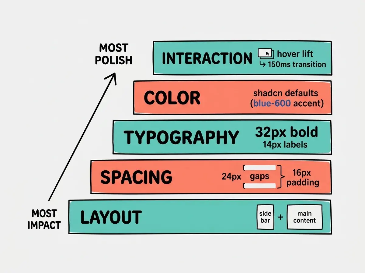
There are five layers of specificity that transform a vague UI prompt into one that produces what you envision. Each rung of this ladder gets you closer to a pixel-perfect result.
Layer 1: Layout structure. This is the skeleton. Describe the major regions and how they relate spatially. "A sidebar on the left at 280px width with a main content area filling the rest." "A sticky header, then a hero section, then a three-column grid of cards." "A split layout with a form on the left and a live preview on the right."
Layout is the most impactful layer. If you describe nothing else, describe this. A wrong layout means everything built on top of it is wrong too.
Layer 2: Spacing. This separates amateur UI from professional UI. "24px of padding inside each card." "16px gap between grid items." "48px of vertical space between sections." Focus on the spacing that defines rhythm: gaps between sections, padding inside containers, space between repeated elements.
Layer 3: Typography hierarchy. Describe the relative sizes and weights that establish visual importance. "Page title at 36px bold, section headings at 24px semibold, body text at 16px regular, captions at 14px in gray-500." Typography hierarchy tells the AI which content is most important. Without it, you end up with headings that are too big, too small, or too similar to body text to create visual structure.
Layer 4: Color. Be specific. "Primary buttons in #2563EB, secondary buttons with a border only and no fill." "Background is white, cards are gray-50, text is gray-900 for headings and gray-600 for secondary text." Or reference a framework: "Match the default shadcn/ui color palette" or "Use Tailwind's slate scale for grays and indigo-600 for accents."
You do not need to specify hex codes for every element. Name one or two accent colors and tell the AI which design system to follow for everything else. "Use shadcn defaults with emerald-600 as the primary accent" gives the AI a complete, consistent palette while keeping your prompt short. Framework-aware color instructions produce far more cohesive results than listing individual hex values.
Layer 5: Interaction. Describe what happens when users do things. "Buttons scale to 1.02 and darken slightly on hover." "Cards lift with a subtle shadow increase on hover." "The sidebar collapses to icons only on click, with a smooth 200ms transition." "Form fields show a blue border on focus and a red border with error text on invalid input."
This is the layer most people skip. They describe what the UI looks like at rest and forget that users hover, click, focus, and resize. Leave it unspecified and the AI either adds nothing (flat, lifeless UI) or makes its own choices (which rarely match yours).
Using Reference Screenshots
Sometimes words are not the most efficient way to describe a visual. Most modern AI coding tools accept image inputs. Paste a screenshot of an interface you admire and say: "Build something with this layout and spacing, but use my brand colors (indigo-600 primary, gray-50 background) and replace the chart with a data table."
The image handles what is hardest to put into words: spatial relationships, proportional sizing, and overall feel. Your text handles customization. Crop to the relevant section, call out what to keep and what to change.
Describing Responsive Behavior
You prompt the AI for a beautiful desktop layout. It delivers. Then you open it on your phone and everything is broken. Cards overflow, text is unreadable, the sidebar covers the main content.
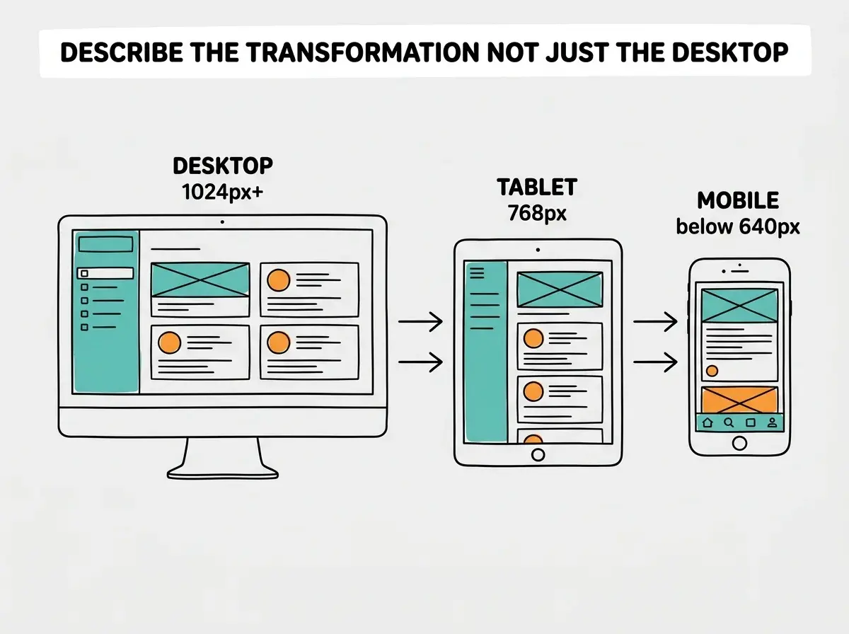
Responsive behavior does not happen automatically. You need to tell the AI what changes at smaller screens. The most effective format is describing the transformation: "On desktop, sidebar and content side by side. On tablet, collapse the sidebar into a hamburger menu. On mobile, stack everything vertically with a bottom tab bar." "The three-column card grid becomes two columns on tablet and one column on mobile."
Focus on two transitions: desktop to tablet (horizontal space shrinks) and tablet to mobile (stack vertically, simplify navigation).
Putting It All Together
Here is what a complete UI prompt looks like when you apply all five layers.
The vague version: "Build a dashboard for my analytics app."
The specific version: "Build a dashboard page for a web analytics product. Layout: sticky top nav with logo left and user avatar right. Below that, four stat cards in a row (Total Visitors, Page Views, Bounce Rate, Avg Session Duration). Below the stats, two-column layout: line chart at two-thirds width showing visitors over 30 days, vertical bar chart at one-third showing top 5 pages. Spacing: 24px gaps between sections, 16px padding inside cards. Typography: page title 24px semibold, stat numbers 32px bold, stat labels 14px regular gray-500. Colors: shadcn/ui defaults with blue-600 for chart lines and gray-200 for gridlines. Interactions: stat cards lift with shadow-md on hover, 150ms transition. Responsive: on mobile, stats become a 2x2 grid, charts stack vertically, nav becomes a bottom bar."
That takes two minutes to write. It produces a dashboard that looks intentionally designed instead of randomly generated.
UI prompting is one piece of the puzzle. Master the full prompt engineering system.
Explore the blogThe ladder becomes second nature fast. Start with layout, add spacing, then typography, color, and interactions. Each layer narrows the AI's interpretation until it matches yours.
Common Mistakes and How to Avoid Them
Describing aesthetics instead of structure. "Make it sleek and modern" tells the AI nothing actionable. Instead, describe the structural properties that create a modern feel: "generous whitespace, one accent color, rounded-lg corners, subtle shadow-sm for depth."
Forgetting about empty states. Your dashboard looks great with data. But what does the user see before they have any? Tell the AI: "If no data exists, show a centered message saying 'No visitors yet. Share your tracking link to get started.' with a copy-link button."
Specifying technology without specifying design. "Use React, Tailwind, and Recharts to build a dashboard" gives the AI technical constraints but zero visual direction. You get something that looks like the default Recharts demo. Always pair technical constraints with visual ones.
Ignoring dark mode. If your app needs dark mode, mention it upfront. "In dark mode, backgrounds become gray-900, cards become gray-800, text inverts to gray-100." Retrofitting dark mode later is painful. Building it in from the start is easy.
The single most expensive UI prompting mistake is describing what something looks like without describing what it does. A login form is not just two input fields and a button. It is a form that validates email format on blur, shows a red border and error message on invalid fields, disables the submit button while loading, and redirects to the dashboard on success. If you skip interaction behavior, you will spend more time fixing the experience than you spent describing the appearance.
Dig deeper
A few hand-picked sources if you want to go further.
What This Means For You
Prompting for UI is the skill that turns AI coding tools from "interesting demo" into "actual design partner." The specificity ladder gives you a repeatable framework that works across every tool and every project.
- If you are a designer moving into building: You already think in layouts, spacing, typography, and color. The only shift is translating your Figma thinking into words. Start by describing the layout layer for your next screen, add spacing and color, and watch the AI output jump from generic to intentional. Your design eye is a massive advantage because you know what "right" looks like and can describe it.
- If you are a founder building your product: Stop accepting the AI's default aesthetics. Two minutes of specificity saves two hours of "no, move that, change this, make it bigger" back-and-forth. Write one thorough UI prompt using the five layers and you will ship an interface that looks like you hired a designer.
Master the techniques that turn AI tools from guessing machines into reliable building partners.
Explore the Prompt Playbook