User experience, or UX, is the overall feeling someone has while using your app. It goes far beyond what the app looks like. UX includes how easy it is to accomplish a task, how quickly the app responds, whether the next step feels obvious, and whether the whole experience leaves someone feeling satisfied or frustrated. When you vibe code with AI, the app will almost certainly "work," but making it feel good to use requires deliberate attention that AI does not provide by default.
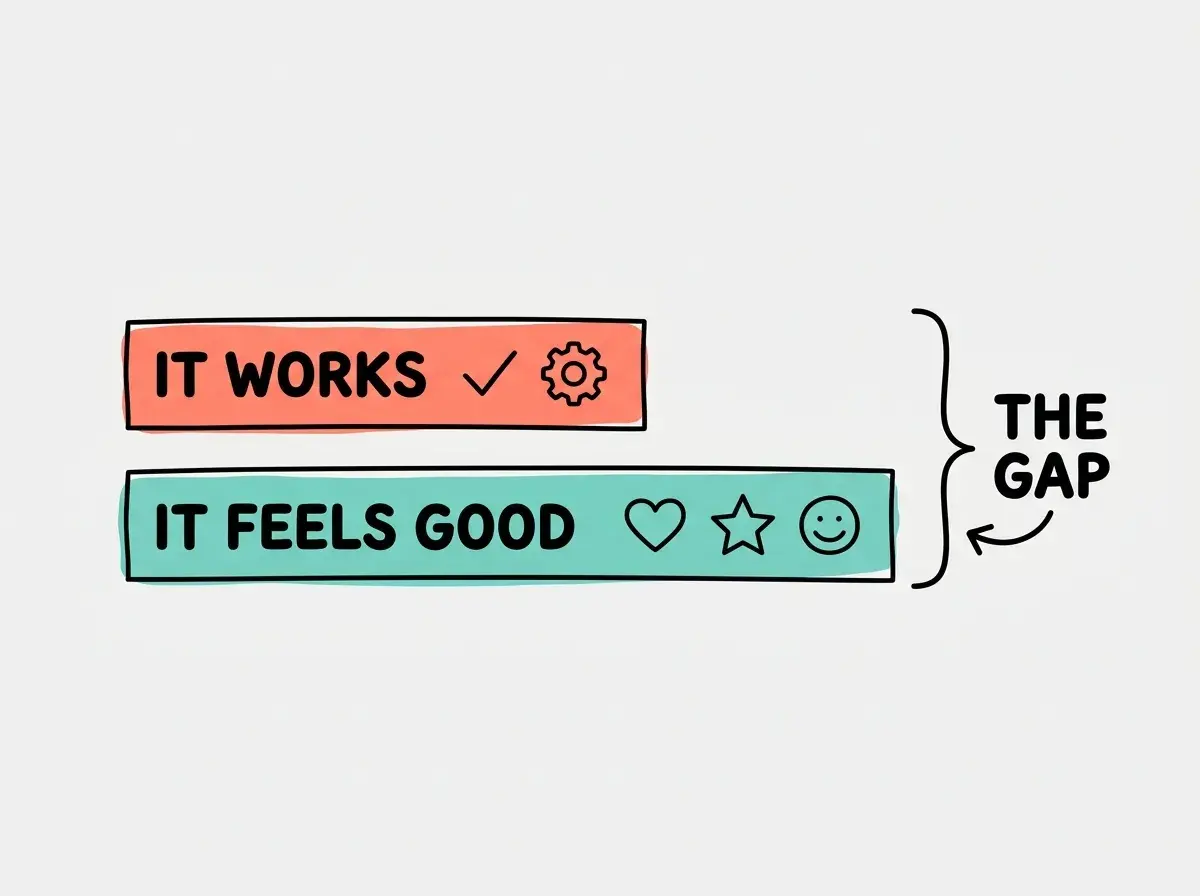
Here is the uncomfortable truth about AI-generated apps: they tend to function correctly while feeling mediocre to use. The buttons work. The pages load. The data saves. But the experience feels generic, the flow feels clunky, and users struggle to explain why they don't love it. That gap between "it works" and "it's good" is the UX gap, and closing it is one of the highest-value skills a vibe coder can develop.
Why UX Is the Hidden Quality Layer
You have probably used two apps that do the same thing but felt completely different. Two note-taking apps. Two weather apps. Two to-do lists. The features were similar, but one felt delightful and the other felt like homework. That difference is UX.
UX is invisible when it is done well. You don't think "wow, this navigation is really well-designed." You just find what you need. You don't notice "the loading experience is thoughtful." You just feel like the app is fast. Good UX disappears into the experience. Bad UX announces itself through every confused click, every unexpected dead end, every moment where you think "wait, what am I supposed to do now?"
For vibe coders, UX matters for a practical reason: it is the most common reason apps fail after launch. Not because of bugs. Not because of missing features. Because the experience does not meet user expectations, and people quietly stop using it.
UX vs UI, What Is the Difference
People often confuse UX and UI, or use them interchangeably. They are related but different.
UI (User Interface) is what users see: the visual layer of buttons, colors, fonts, and layouts. It is the surface.
UX (User Experience) is what users feel: the entire journey from opening the app to accomplishing their goal. It includes the UI, but also the flow between screens, the speed of interactions, the clarity of information, the helpfulness of error messages, and dozens of other factors.
A good analogy: UI is the interior design of a hotel room (the furniture, the colors, the lighting). UX is the entire hotel stay (was check-in smooth? was the room easy to find? was the Wi-Fi fast? was checkout painless?). You can have a beautiful room in a terrible hotel, and you can have a plain room in a wonderful hotel.
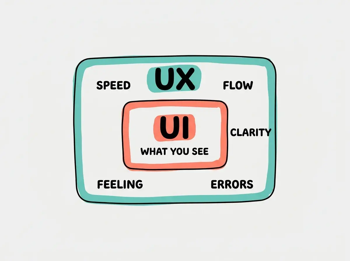
In vibe coding, AI is excellent at generating good UI. It produces clean layouts, readable typography, and attractive color schemes. Where it consistently falls short is UX: the flow between screens, the handling of edge cases, the microinteractions that make an app feel polished, and the overall journey from start to finish.
The Five Pillars of Good UX
You don't need to become a UX designer. But knowing these five pillars will make your AI-generated apps dramatically better.
1. Clarity
Every screen should answer three questions instantly: Where am I? What can I do here? What should I do next? If a user has to think about any of these, the UX needs work.
AI often generates pages that answer the first two questions but fumble the third. There are buttons and options, but it is not clear which one the user should click next. Adding a single prominent call-to-action and reducing visual clutter fixes this.
2. Speed
Users perceive anything under 100 milliseconds as instant, anything under 1 second as fast, and anything over 3 seconds as slow. After 10 seconds, most users leave.
Speed is not just about server response times. It is about perceived speed. A loading skeleton (gray shapes that show the layout before content loads) makes a page feel faster than a blank screen with a spinner, even if both take the same time. Ask AI to add loading skeletons and optimistic updates (showing the result before the server confirms it) to make your app feel snappier.
3. Forgiveness
Users make mistakes. Good UX makes mistakes easy to recover from. Undo buttons, confirmation dialogs for destructive actions, autosaved drafts, and clear "go back" paths all contribute to a forgiving experience.
AI-generated apps almost never include undo functionality or autosave unless you specifically request them. These features are invisible when they work, but their absence is painfully obvious when a user accidentally deletes something irreplaceable.
After AI generates your app, test the "unhappy paths." What happens when you submit an empty form? What happens when you click the back button in the middle of a process? What happens when you lose internet connection? These tests reveal the UX gaps AI leaves behind.
4. Consistency
Every part of your app should feel like it belongs to the same family. Same button styles everywhere. Same spacing patterns. Same way of handling errors. Same tone in messages. Inconsistency erodes trust because it makes the app feel unreliable.
AI is surprisingly inconsistent across multiple prompting sessions. If you build page one today and page two tomorrow, they might have subtly different styles, spacing, or interaction patterns. Building from a shared component library (or asking AI to reference existing pages when generating new ones) solves this.
5. Feedback
Every action should have a visible response. Clicked a button? Show that it was pressed. Submitted a form? Show a success message. Encountered an error? Explain what went wrong and what to do about it. Processing something slow? Show progress.
Silence is the worst UX. When users do something and nothing visibly happens, they don't know if it worked, if it is loading, or if it broke. They click again. And again. And now they've submitted the form three times.
Learn how to make your vibe-coded apps feel effortless.
Read the UX guideThe UX Gap in AI-Generated Apps
There is a consistent pattern in AI-built software: it works but it doesn't flow. Here are the most common UX gaps:
No empty states. When your app has no data yet (a new user with no posts, an empty inbox, a fresh dashboard), AI usually shows a blank page. Good UX shows a helpful message: "No projects yet. Create your first one." with a clear button. Empty states are the first thing new users see, and they set the tone.
Poor error messages. AI defaults to technical error messages like "Error 500" or "Request failed." Users need human messages: "Something went wrong. We couldn't save your changes. Try again, or contact support if it keeps happening."
No onboarding flow. When someone uses your app for the first time, they need guidance. A quick tooltip tour, a welcome message, or even a checklist of "get started" tasks. AI never adds these unless asked.
Missing loading indicators. When something takes time, users need to know the app is working. AI often fires off a request and leaves the UI frozen until the response comes back. A simple spinner or progress bar eliminates the uncertainty.
Dead ends. Pages where the user has no obvious next action. After completing a form, after reading a confirmation, after finishing a process. Good UX always suggests what to do next. AI-generated flows often just stop.
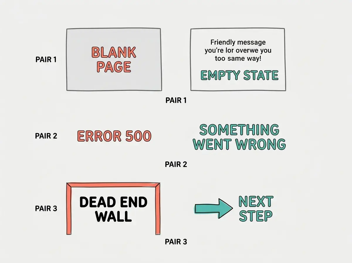
The good news is that fixing these gaps does not require a complete rebuild. Most of them can be addressed with a single follow-up prompt to AI, asking it to add empty states, improve error messages, or suggest next steps at the end of each flow.
The number one UX mistake vibe coders make is testing only the happy path. You test with perfect data, in perfect conditions, doing exactly what the app expects. Real users will find every edge case, every error state, and every confusing flow that you missed.
How to Improve UX in Your Vibe-Coded Apps
You don't need to redesign everything. These three habits will improve UX in any project:
Test with real people. Show your app to someone who has never seen it before. Watch them use it without helping. Note every moment of confusion, every wrong click, every hesitation. Those moments are your UX roadmap.
Walk the full journey. Open your app as if you have never used it. Sign up. Complete the main task. Make a mistake. Try to undo it. Log out. Log back in. This end-to-end walkthrough reveals gaps that looking at individual screens never will.
Ask AI to critique itself. After generating your app, paste the code back to AI and ask: "What are the UX problems in this interface? What states am I missing? Where would a user get confused?" AI is surprisingly good at finding UX issues it did not prevent in the first place.
What This Means For You
User experience is the difference between software that functions and software that people love. AI builds the first kind by default. Building the second kind requires you to think about clarity, speed, forgiveness, consistency, and feedback, and to specifically ask AI to address each one.
- If you're a founder: UX is your competitive advantage when features are similar. Two apps that do the same thing will compete on experience, not functionality. Invest time in user testing before launch. It costs nothing and reveals everything. Learn about the UI layer as the visual foundation of UX.
- If you're a designer: Your UX instincts are the most valuable thing you bring to vibe coding. AI generates the code; you ensure the experience is worth using. Your critical eye for flow, friction, and delight is exactly what AI-built software needs most.
- If you're a product manager: UX is where product thinking meets code. The questions you already ask ("What is the user trying to accomplish? What gets in their way?") are the exact questions that improve AI-generated software. See how frontend and backend work together to understand the technical foundation.
The best vibe-coded apps will not be the ones with the most features. They will be the ones where every interaction feels intentional, every error is handled gracefully, and every user finds what they need without thinking about it.
Explore the fundamentals that separate good apps from great ones.
Browse foundations