Pull up any website on your phone, then open the same site on your laptop. The content is identical, but the layout is completely different. On your phone, the navigation is tucked behind a hamburger menu, images stack vertically, and text fills the full width of the screen. On your laptop, the navigation stretches across the top, images sit side by side, and text flows in comfortable columns.
Nobody built two separate websites. One set of code adapts itself to whatever screen it lands on. That adaptation is responsive design, and understanding it will change how you think about building anything for the web.
Water Taking the Shape of Its Container
Pour water into a tall glass and it becomes a tall, narrow column. Pour the same water into a wide bowl and it spreads flat. The water does not change. The container does, and the water adapts.
Responsive design treats your content like water. The text, images, buttons, and layouts you build are the water. The screen they appear on is the container. A phone is a tall, narrow glass. A tablet is a medium bowl. A desktop monitor is a wide serving platter. Your content flows and rearranges itself to fill whatever container it lands in, without anyone having to manually rebuild it for each size.
This is not magic. It is a set of rules baked into your app's styling that say things like "when the container is narrow, stack these items vertically" and "when the container is wide, place these items side by side." The content stays the same; the arrangement shifts.
Before responsive design existed, companies built separate websites for mobile and desktop. Two codebases, two sets of updates, two chances for things to get out of sync. Responsive design eliminated that entire problem.
How the Rules Work
This confuses everyone at first because it feels like the app must somehow "know" what device you are using. It does not. It only knows one thing: how wide the screen is, measured in pixels.
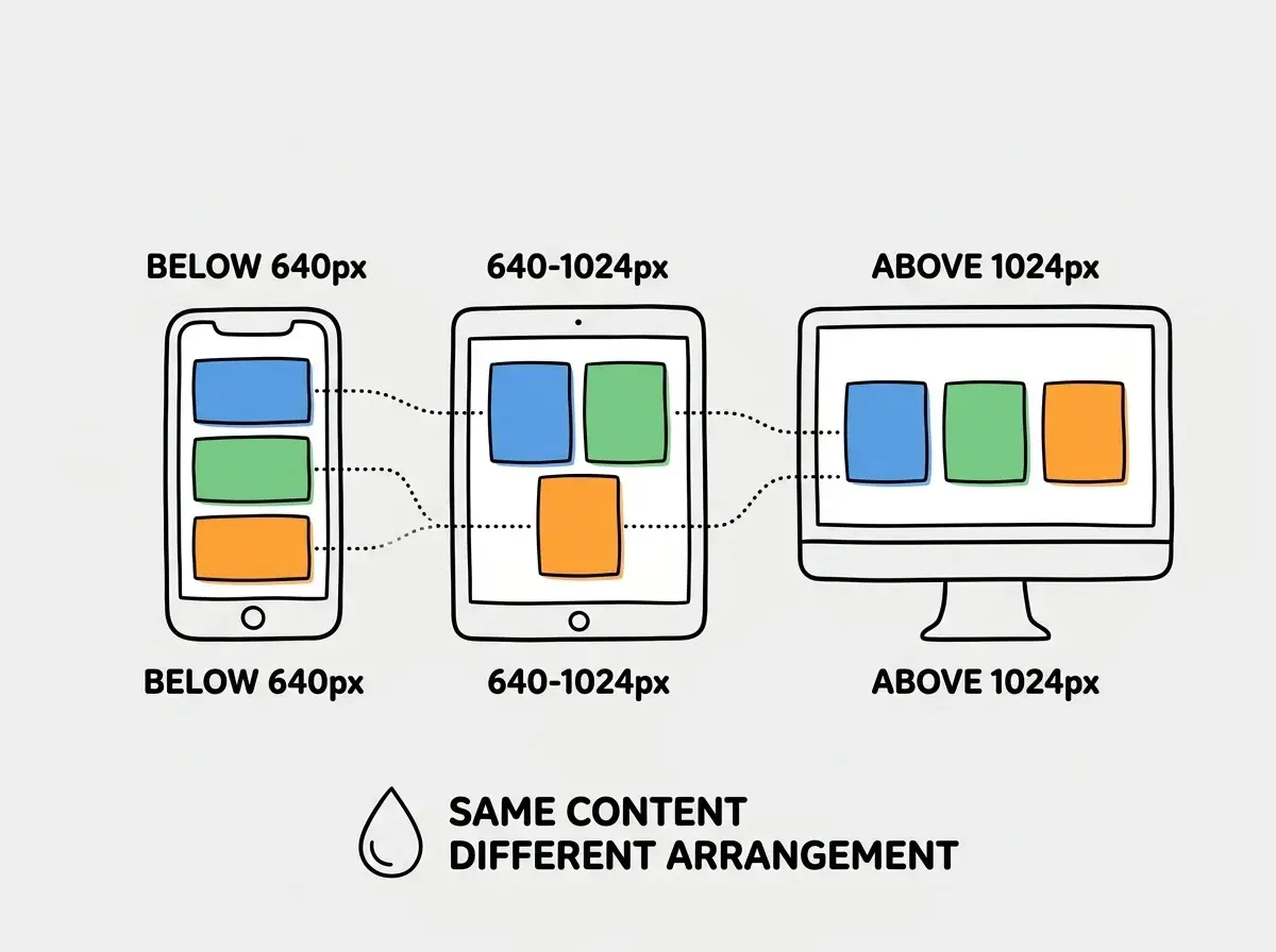
The rules that control responsive behavior are called breakpoints. A breakpoint is a specific screen width where the layout changes. Think of them as markers on a measuring cup. Below 640 pixels wide, the layout is "phone-sized." Between 640 and 1024 pixels, it is "tablet-sized." Above 1024 pixels, it is "desktop-sized."
When the screen is narrower than a breakpoint, one set of styling rules applies. When the screen is wider, a different set kicks in. The app does not care whether you are using an iPhone, a Samsung tablet, or a desktop monitor. It only cares about the width.
Here is a concrete example. Imagine a page showing three product cards. On a desktop (wide container), they sit side by side in a row. On a tablet (medium container), two sit side by side with the third wrapping to a second row. On a phone (narrow container), all three stack vertically, one on top of the other. Same three cards, same content, three different arrangements based purely on available width.
Mobile First Means Starting Small
You might think you should design for the big desktop screen first and then shrink things down for mobile. But actually, the best approach is the opposite. It is called mobile-first design, and it is the standard practice for good reason.
Think about packing a suitcase. If you start by laying everything out on a king-size bed, you will spread out and grab things you do not need. But if you start by packing for a carry-on, you are forced to prioritize. What is essential? What can be left behind? Once you have packed the carry-on perfectly, expanding to a larger suitcase is easy. You already know what matters.
Mobile-first design works the same way. You start with the smallest screen, where space is most constrained, and make sure the core experience works perfectly. Then you add enhancements for larger screens. More columns, bigger images, side-by-side layouts, wider margins. You are expanding from a solid foundation rather than cramming a sprawling design into a tiny box.
This approach also reflects how people actually use the web today. More than half of all web traffic comes from mobile devices. If your app looks broken on a phone, you have lost the majority of your potential audience before they even see your desktop layout.
Responsive design is not about making things smaller for phones. It is about starting with a layout that works on the smallest screen and then enhancing it for larger ones. The content is the water; the screen is the container. You design the water first, then let it flow into whatever container it meets.
What This Looks Like in Code (Without Getting Technical)
If you are using Tailwind CSS (which most AI-generated projects use), responsive design is built into the class names. You do not need to write complex code. You add prefixes that correspond to breakpoints.
The concept works like this. You might tell an element: "By default, take up the full width. But on medium screens and larger, take up half the width. And on large screens, take up a third." Tailwind lets you express this in a single line using prefixes like md: and lg:.
The beauty of this system is that AI tools handle it extremely well. When you tell an AI "make this a three-column layout on desktop but single column on mobile," it knows exactly what Tailwind classes to use. Responsive design is one area where AI tools are genuinely reliable because the patterns are consistent and well-documented.
This does not mean you can completely ignore responsive behavior. You should always check your AI-generated layouts on different screen sizes (your browser's developer tools let you simulate any device). But the baseline that AI produces is usually solid, and the adjustments are typically minor.
Responsive design is one of many concepts that help you evaluate what AI tools generate.
Build your foundationThe Things That Break
While AI handles basic responsive layouts well, certain patterns trip up both beginners and AI tools. Knowing these patterns helps you spot problems before your users do.
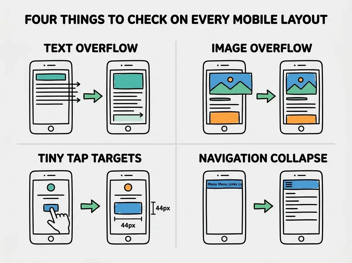
Text that overflows. On a narrow screen, a long heading or an unbroken URL can extend beyond the edge of the screen, causing horizontal scrolling. This looks broken and feels frustrating on mobile. The fix is usually a CSS property that forces long text to wrap or break.
Images that do not scale. A 1200-pixel-wide image on a 375-pixel-wide phone will either overflow (causing horizontal scroll) or get cut off. Responsive images need to be set to a maximum width of 100% so they shrink to fit their container. Most frameworks handle this by default, but it is worth checking.
Touch targets that are too small. Buttons and links that work fine with a mouse cursor can be impossible to tap accurately on a phone. Apple recommends touch targets of at least 44 by 44 pixels. When you review an AI-generated mobile layout, check that buttons and links are large enough to tap comfortably.
Navigation that does not adapt. A desktop navigation bar with seven links does not fit on a phone screen. Responsive navigation typically collapses into a hamburger menu (those three horizontal lines) on smaller screens. If your AI tool generates a navigation bar, check that it includes a mobile version.
The Viewport Meta Tag (One Line That Matters)
Every responsive web page needs a single line in its HTML that tells the browser "render this page at the actual device width, not at a zoomed-out desktop width." Without it, mobile browsers display the desktop version shrunk down to fit, making everything tiny and unreadable. Every modern framework includes this line automatically, so you will almost never need to add it yourself. But if you ever see a shrunken desktop site on a phone, the missing viewport meta tag is probably the cause.
Testing only on your own device. Your phone is one screen size. Your laptop is one screen size. But your users have hundreds of different devices with different screen widths. Always use your browser's responsive design mode (usually found in the developer tools) to test at multiple widths. Pay special attention to widths right around the breakpoints (639px, 641px, 1023px, 1025px) where layout shifts happen. Problems love to hide at the edges.
Why AI Handles Responsive Design Well
Responsive design follows clear, repeatable patterns, which is exactly what AI tools excel at. The rules are logical and unambiguous. Tailwind's responsive system makes it even easier because the pattern is encoded in the class names themselves. This consistency is why responsive layouts are one of the most reliable things you can ask an AI tool to generate.
Where AI occasionally falls short is in design judgment: deciding which content to prioritize on mobile, or when a layout needs a fundamentally different structure rather than just reflowing the same elements. These are aesthetic decisions that benefit from a human eye. Check the mobile layout yourself, decide if the priorities feel right, and adjust accordingly.
What This Means For You
Responsive design is the practice of building one app that adapts to any screen size. Your content is the water; the screen is the container. Breakpoints define when the layout rearranges, and mobile-first design ensures you start with the most constrained, most common screen size.
- If you are a founder building a product: Over half your users will visit on mobile devices. If you are reviewing a prototype or MVP, always check the mobile experience first. A product that looks polished on desktop but broken on mobile will lose users immediately. The good news is that modern tools and AI handle the basics well; you just need to verify the result.
- If you are a career changer learning to build: Get familiar with Tailwind's responsive prefixes (
sm:,md:,lg:,xl:). They are intuitive once you see the pattern, and understanding them helps you tweak AI-generated layouts with confidence. Practice resizing your browser window while building and watch how your layouts respond. That visual feedback builds intuition faster than any tutorial. - If you are a student exploring design and development: Responsive design is a perfect example of constraint-driven creativity. Designing for a small screen forces you to clarify what matters most, which makes your large-screen designs better too. This skill is valuable in design, development, and product management roles alike.
Responsive design is one piece of the foundation. There is more to explore.
See all guides