A user interface, usually shortened to UI, is the layer of your application that people actually see and interact with. Every button, menu, form, image, and piece of text on screen is part of the UI. It is the bridge between your users and whatever your app does behind the scenes. When you vibe code with AI, the UI is often the first thing that gets generated, and it is the part that shapes first impressions, builds trust, and determines whether people stick around or leave.
AI tools are remarkably good at generating user interfaces. Describe what you want, and you get a working layout in seconds. But "working" and "good" are different things. The difference between an app that feels amateur and one that feels professional almost always comes down to UI decisions, and those decisions still need a human guiding them.
Why Good UI Matters More Than You Think
People form opinions about software in the first 50 milliseconds of seeing it. Before they read a single word or click a single button, their brain has already decided whether this app looks trustworthy, modern, and worth their time.
That is not vanity. That is survival. Your users have dozens of alternatives for almost anything you build. If your interface feels confusing or outdated, they will close the tab and try something else. The backend could be flawless, the features could be exactly what they need, and none of it matters if the UI pushes them away.
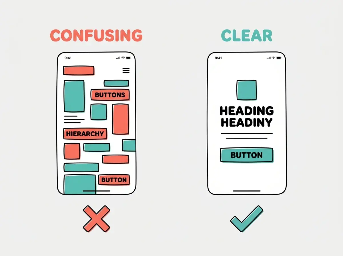
UI is not decoration. It is communication. Every element on screen tells users what they can do, where to focus, and what matters most. Good UI makes complex things feel simple. Bad UI makes simple things feel impossible.
Think of UI as the packaging of your product. You might have the best coffee in the world, but if you serve it in a dirty cup, people will not drink it. The cup is your UI. It does not change the coffee, but it changes whether anyone tries it.
What Makes Up a User Interface
A UI is built from a surprisingly small set of building blocks, combined in different ways:
Visual Elements
Typography is the text on screen: headings, body text, labels, and links. The font you choose, the size you set, and the spacing between lines all affect readability. AI tends to pick reasonable defaults here, but "reasonable" and "great" are different.
Color communicates meaning. Red for errors and warnings. Green for success. Blue for links and primary actions. Your color palette sets the entire mood of your app. When AI generates a UI, it often picks safe, generic colors. You can elevate any AI-generated interface by choosing a distinctive, intentional palette.
Icons and images provide visual shortcuts. A trash can icon means delete. A magnifying glass means search. These tiny elements reduce cognitive load because users recognize them instantly without reading labels.
Whitespace is the empty space between elements. It might seem like wasted space, but it is one of the most powerful UI tools. Generous whitespace makes interfaces feel calm, organized, and premium. Cramped interfaces feel overwhelming and cheap.
Interactive Elements
Buttons are the primary way users take action. "Sign up," "Submit," "Delete," "Next." The size, color, and placement of buttons tell users what is important.
Forms collect information. Name fields, email fields, dropdown menus, checkboxes. Forms are where most friction happens because you are asking users to do work.
Navigation helps users move between sections. Menus, tabs, sidebars, breadcrumbs. Good navigation makes an app feel small and manageable, even when it has dozens of pages.
Feedback tells users what happened after they did something. Loading spinners, success messages, error alerts, progress bars. Without feedback, users feel lost and uncertain.
Build your first interactive interface with AI.
Try the tutorialThe Types of User Interfaces
Not all UIs work the same way. The type you choose depends on what your app does and who uses it.
Graphical User Interface (GUI)
This is what most people mean when they say "UI." A visual interface with windows, icons, menus, and pointers. Every website, mobile app, and desktop application you use has a GUI. When you vibe code a web app, you are building a GUI.
Command-Line Interface (CLI)
A text-based interface where users type commands. Developers use CLIs constantly (that is what the terminal is), but most non-technical users never touch them. AI coding tools like Claude Code actually run in a CLI, which is why they feel different from visual tools like Lovable or Bolt.
Conversational Interface
Chat-based UIs where users interact through natural language. Chatbots, voice assistants, and AI tools with chat interfaces fall into this category. If you have used ChatGPT, Claude, or any AI assistant, you have used a conversational interface.
Voice Interface
UI driven entirely by speech. Siri, Alexa, and Google Assistant are voice interfaces. No visual elements needed, which makes them accessible but limited for complex tasks.
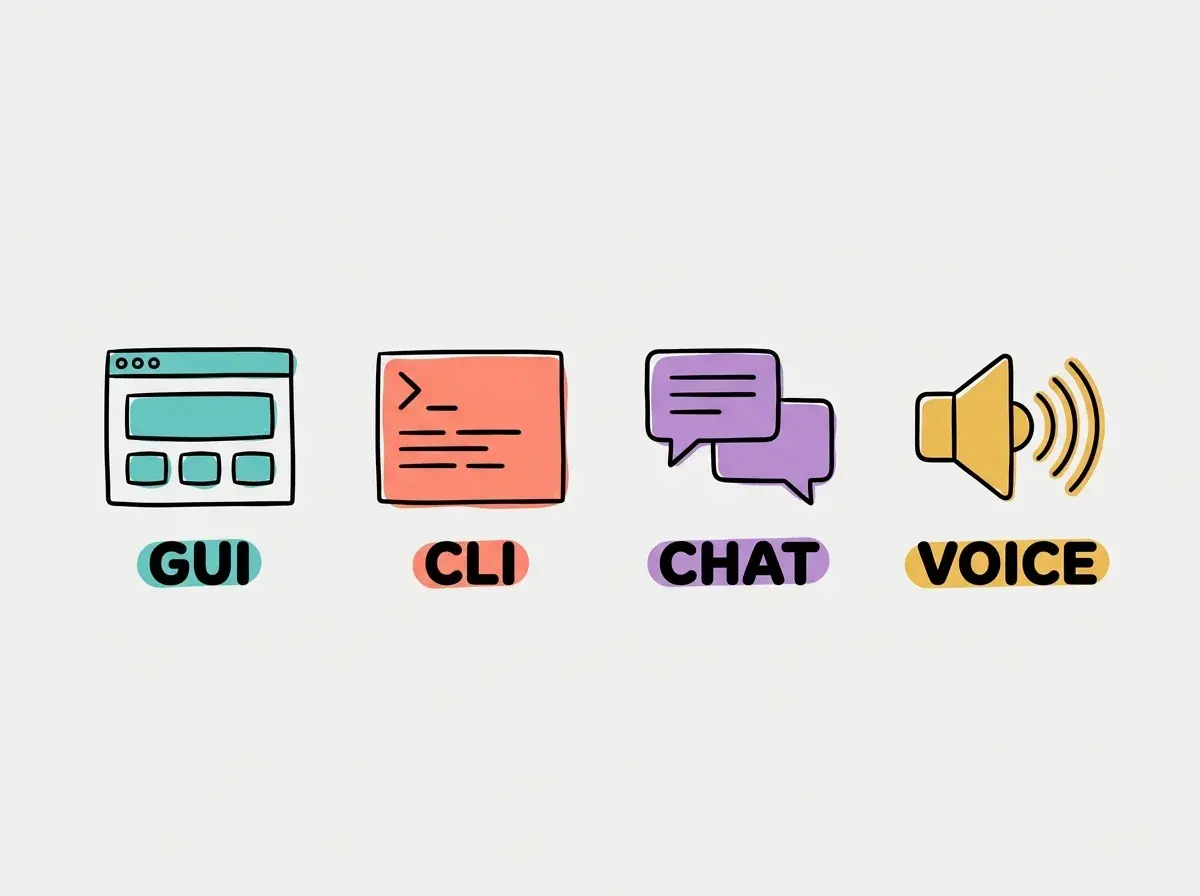
For vibe coders, GUIs and conversational interfaces are the most relevant. AI excels at generating both, but each requires different thinking about how users interact with your app.
How AI Generates User Interfaces
When you tell AI "build me a dashboard," here is what happens:
- AI picks a layout pattern (sidebar navigation, header with tabs, or cards in a grid)
- It generates the HTML structure for each element
- It applies CSS styling, usually with a framework like Tailwind
- It adds JavaScript for interactive behavior (dropdown menus, button clicks)
- It wraps everything in a component framework like React
The result often looks impressive on first glance. But there are patterns in AI-generated UIs that experienced designers spot immediately:
Generic layouts. AI tends to generate the same dashboard layout, the same card grid, the same hero section. Your app ends up looking like every other AI-generated app.
Inconsistent spacing. AI sometimes mixes different spacing values, creating a subtle feeling of disorder that users sense but cannot articulate.
Missing states. AI builds the happy path but often forgets empty states (what the page looks like with no data), loading states, and error states. These "boring" states are what users encounter most.
Accessibility gaps. AI frequently forgets alt text for images, keyboard navigation, proper heading hierarchy, and color contrast requirements. This excludes users with disabilities and hurts your search rankings.
After AI generates a UI, ask it specifically: "Add empty states for when there's no data. Add loading states for async operations. Add error states for when things fail. Check color contrast meets WCAG AA standards." These four requests dramatically improve quality.
UI Principles Every Vibe Coder Should Know
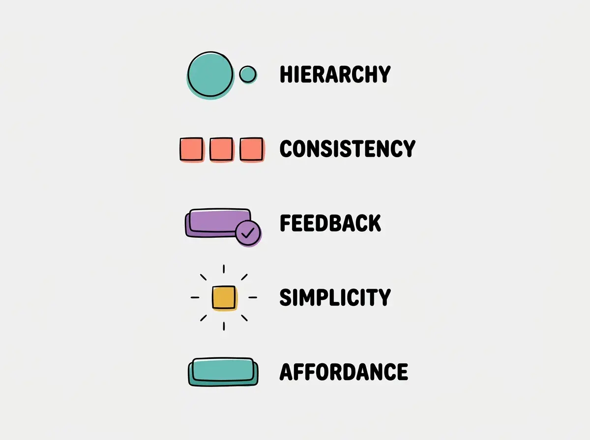
You don't need a design degree. These five principles cover 80% of what makes a UI good:
Hierarchy. The most important thing on the page should be the most visually prominent. Big heading, contrasting button, clear call to action. Everything else is secondary. If everything is equally prominent, nothing stands out and users don't know where to look.
Consistency. Buttons should look the same everywhere. Headings should use the same font and size at the same level. Spacing should follow a pattern. Consistency builds familiarity, and familiarity builds speed.
Feedback. Every action should have a visible result. Click a button, see a spinner. Submit a form, see a confirmation. Make an error, see a clear explanation of what went wrong. Silence is the enemy of good UI.
Simplicity. Every element on screen should earn its place. If removing something does not hurt the user's ability to complete their task, remove it. Fewer elements means less cognitive load, which means faster, happier users.
Affordance. Things that are clickable should look clickable. Buttons should look like buttons. Links should look like links. Inputs should look like places to type. When users have to guess what is interactive, your UI has failed.
Common Misconceptions About User Interfaces
You might think UI is just about making things pretty. But actually, the best UIs are invisible. Users don't notice them because everything works exactly as expected. Beauty is a bonus; clarity is the requirement.
You might think more features means better UI. But the opposite is usually true. Every feature you add increases complexity. The best apps do fewer things, better. When AI suggests adding a feature, ask yourself whether it helps users accomplish their primary task or distracts from it.
You might think AI handles UI quality automatically. AI generates functional interfaces, but it does not automatically generate good interfaces. It needs specific guidance about spacing, hierarchy, states, and accessibility. The quality of your UI is directly proportional to the specificity of your prompts.
What This Means For You
A user interface is the layer between your users and your app. It determines first impressions, builds trust, and shapes the entire experience. AI can generate functional UIs fast, but guiding AI toward good UIs requires understanding the basics of visual hierarchy, consistency, and user expectations.
- If you're a founder: Your UI is your product's first impression with investors, users, and potential partners. Spend the extra time refining it. Ask AI to generate three different layouts, pick the best one, then iterate. Read about frontend vs backend to understand how UI connects to the rest of your app.
- If you're a designer: You already have the eye for good UI. Vibe coding lets you turn that eye into working software. Your design instincts are exactly what AI needs to produce above-average results. See how frontend and backend connect for a practical walkthrough.
- If you're changing careers: Learning to evaluate UI quality is one of the fastest ways to become a better vibe coder. Start by noticing the apps you use daily: what works, what frustrates you, what you'd change. That critical eye is a skill AI cannot replace. Learn what user experience means to go deeper.
Understanding the interface is step one. Making it feel effortless is step two.
Learn about UX