A component is a self-contained, reusable building block that makes up part of your app's interface. Think of it like a single LEGO brick. On its own, a button or card component does one small thing. Snap enough of them together and you get a complete application. When you vibe code with AI, nearly everything it generates is a component.
If you have ever wondered why AI tools produce code in small, labeled chunks instead of one giant file, this is why. Components are the fundamental unit of modern app development. They are the reason AI can generate a signup form in seconds, the reason you can rearrange your app's layout without breaking everything, and the reason teams of developers (or a solo vibe coder with AI) can build complex software without losing their minds.
Why Components Changed How Apps Are Built
Before components, building an app was like painting a mural on a wall. Every piece was connected to every other piece. Want to change the navigation? You might accidentally break the footer. Want to reuse a button style from one page on another? Copy and paste the code, then pray nothing conflicts.
Components changed everything. Instead of painting a mural, you are building with LEGO bricks. Each brick is independent. You can pick up a navigation brick, move it, swap it, or replace it entirely without touching the rest of your creation. You can use the same button brick in fifty places, and updating it once updates it everywhere.
This is not just a nice metaphor. It is literally how React, the most popular framework for building web apps, works. React was created by Facebook in 2013 specifically to solve the problem of building complex interfaces from reusable pieces. Today, AI tools like Cursor and Claude generate React components by default when you ask them to build something. The component model is so dominant that it has become the universal language between humans and AI for describing interfaces.
A component is a reusable piece of your interface that manages its own appearance and behavior. Modern apps are not built as single monolithic pages. They are assembled from dozens or hundreds of small, focused components that snap together like LEGO bricks.
So what are the main components of a website? Most sites break down into four fundamental pieces: a header (navigation and branding at the top), a layout shell (the overall page structure), content sections (cards, lists, forms, and text blocks), and a footer (links and information at the bottom). Every other component you encounter, from dropdown menus to modal dialogs, is a variation or combination of these building blocks.
How Components Actually Work
Imagine you are building a house out of LEGO. You would not try to construct the entire house as a single inseparable block. Instead, you would build smaller sub-assemblies: a wall section, a window unit, a door frame, a roof panel. Each sub-assembly has a clear purpose, a defined size, and standard connection points where it snaps into other pieces.
Components work exactly the same way. A typical web app might have a Header component that contains a Logo component and a NavMenu component. The NavMenu contains several NavLink components. Each one is a separate, named piece with its own job.
Here is what a simple component looks like in practice. Say you want a button. Instead of writing button code from scratch every time you need one, you create a Button component. That component knows its own color, size, what text to show, and what to do when someone clicks it. Need a blue button on the homepage and a red button on the settings page? Same component, different settings.
Those settings are called "props," short for properties. Props are how you customize a component without changing the component itself. It is like having a LEGO brick that can change color based on where you place it, while keeping the same shape and connection points.
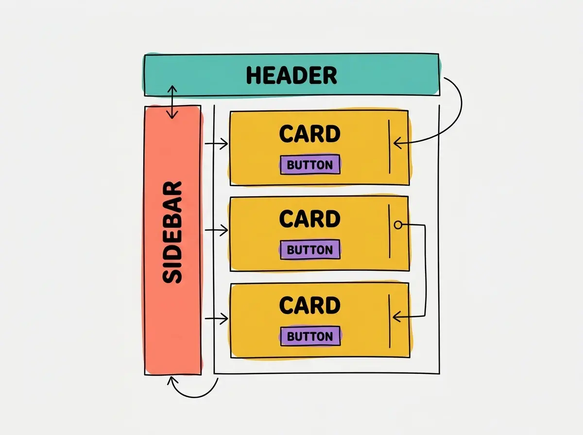
What makes this powerful is composability. Just like LEGO bricks snap together because they share a standard connection system, components compose together because they follow the same patterns. You can put a Button inside a Card, put Cards inside a Grid, and put the Grid inside a Page. Each level of nesting is clean and predictable.
An example of a component in everyday terms: think of a social media post. The post itself is a component. Inside it, there is a UserAvatar component (the profile picture), a PostContent component (the text), an ImageGallery component (the photos), and a ReactionBar component (the like and comment buttons). Each one can be developed, tested, and updated independently.
What Happens When AI Generates Components
Here is where components become especially relevant for vibe coders. When you ask an AI tool to "build me a dashboard with a sidebar, stats cards, and a table," the AI does not generate one massive file. It generates individual components: a Sidebar component, a StatsCard component, a DataTable component, and a DashboardLayout component that arranges them all.
63% of vibe coding users are non-developers. If you fall into that group, you might never look at the code the AI generates. But understanding that your app is made of components helps you communicate with AI far more effectively.
Instead of vague requests like "make the page look better," you can say "make the StatsCard component taller and add a trend arrow." Instead of "something is broken on the settings page," you can say "the ProfileForm component is not saving changes." This precision is like giving a builder the exact LEGO brick number instead of saying "that blue-ish piece, you know the one."
AI is remarkably good at generating individual components. It can produce a polished navigation bar, a responsive card layout, or an interactive form in seconds. Where AI sometimes struggles is in the composition, how components fit together, share data, and create a cohesive experience. That is where your guidance matters.
See how AI assembles components into working apps, even if you have never written code.
Explore the blogCommon Mistakes with AI-Generated Components
The most common mistake vibe coders make with components is letting AI generate components that are too large. When you ask AI to "build the entire settings page," it might produce a single SettingsPage component that handles navigation tabs, form inputs, password changes, notification preferences, and billing information all in one file. This is the equivalent of building your entire LEGO house as one solid block. It works, but the moment you want to change anything, you are stuck.
Letting AI generate mega-components that do everything at once. If a component has more than one clear responsibility (showing a form AND handling navigation AND managing user data), ask AI to break it into smaller pieces. "Split this into separate components for each section" is one of the most valuable prompts you can learn.
The second mistake is inconsistency. If you ask AI to build a card on Monday and a different card on Thursday, the AI might generate two completely different components with different styles, spacing, and behavior. In LEGO terms, this is like using two different building systems that do not snap together cleanly. The fix is to establish a component library early: ask AI to "create a reusable Card component" first, then reference it everywhere you need a card.
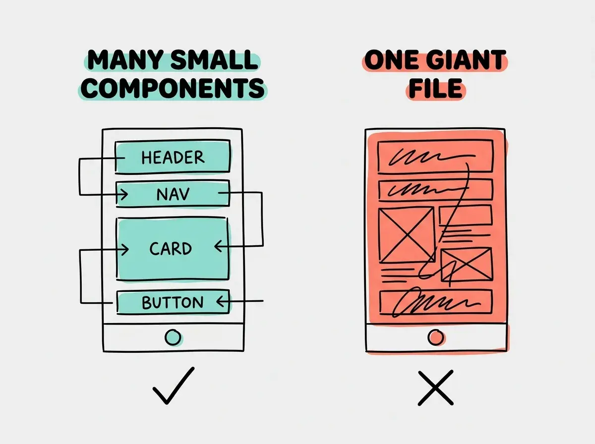
The third mistake is not reusing components. If your app has three different buttons that all look slightly different, you probably need one Button component with props for different styles, not three separate button implementations. Every duplicate component is a place where future changes can get out of sync.
These mistakes are not failures. They are a normal part of learning. If you have been vibe coding and your app feels messy or hard to change, there is a good chance the component structure needs attention. You do not need to know how to fix the code yourself. You just need to know how to ask AI to restructure it.
What This Means For You
Components are the LEGO bricks of modern software. They are small, reusable, and composable. Understanding this concept transforms how you work with AI, how you describe what you want, and how you think about the apps you build.
- If you are a founder: Components directly affect how fast your app can evolve. Apps built from clean, small components can add features quickly. Apps built from tangled mega-components slow down with every change. When reviewing what AI builds, ask whether each piece has a single clear job.
- If you are changing careers: Learning to think in components is one of the highest-leverage skills in modern development. It applies to React, Vue, Svelte, mobile apps, and any framework you encounter. Practice by looking at any app you use and mentally breaking the interface into its component pieces.
- If you are a student: Build a small project and intentionally ask AI to show you the component structure. Ask it to explain which component does what. Then try rearranging the components, swapping one out, or adding a new one. This hands-on experimentation builds intuition faster than any tutorial.
Components are one piece of the foundation. Explore what else powers modern apps.
Browse all articles