Responsive design prompting is the difference between an AI-built app that looks polished on your laptop and one that actually works when someone opens it on their phone. 92% of builders now use AI tools daily, but most never test what the AI generates on a smaller screen. This tutorial shows you how to write one prompt that produces layouts adapting to every device automatically.
Why AI Defaults to Desktop-Only Layouts
When you tell an AI "build me a landing page," it builds what it visualizes as the default viewport. That default is almost always a wide desktop screen. The AI produces a beautiful three-column grid, generous horizontal spacing, and large hero images that look perfect on your 15-inch laptop display.
Then someone opens it on their phone. The three columns try to squeeze onto a 375px screen. Text overflows. Buttons become impossible to tap. Images stretch beyond the viewport and create a horizontal scrollbar. The layout that looked professional on desktop looks broken on mobile.
This happens because the AI optimizes for the context you gave it. If your prompt says nothing about screen sizes, the AI picks the most common development context: a desktop browser. It is not being lazy. It is doing exactly what you asked, which is the problem.
The fix is not to add "make it responsive" at the end of your prompt. That is too vague. The AI might add a single media query that collapses everything into a messy stack, or it might add percentage widths that create awkward spacing at tablet sizes. You need to speak the language of responsive design in your prompts.
AI coding tools default to desktop layouts because your prompt describes what things look like, not how they adapt. The single most effective change you can make is adding "mobile-first" to your prompt and describing the layout at each breakpoint. This one habit eliminates 80% of responsive design bugs before they happen.
The Mobile-First Prompt Prefix
Mobile-first is not just a CSS philosophy. It is a prompting strategy. When you start your layout description with the smallest screen and build up, the AI generates code that stacks cleanly on phones and progressively enhances for larger screens.
Here is the prefix that changes everything: "Build this mobile-first using Tailwind CSS responsive breakpoints."
That single sentence tells the AI three critical things. First, the base styles should target phone screens. Second, use Tailwind's breakpoint system (not custom media queries). Third, larger screens get additions, not overrides.
Compare these two prompts:
Without mobile-first: "Create a pricing page with three plan cards side by side, each with a title, price, feature list, and CTA button."
With mobile-first: "Create a pricing page, mobile-first with Tailwind responsive breakpoints. On mobile, stack the three plan cards vertically with full width. On tablets (md breakpoint), show two cards per row. On desktop (lg breakpoint), show all three cards in a row with equal widths. Each card has a title, price, feature list, and CTA button."
The first prompt gives you a three-column layout that breaks on phones. The second gives you a layout that works everywhere because you described exactly what happens at each screen size.
Understanding the Tailwind Breakpoint System
To write responsive design prompts effectively, you need to know the breakpoint vocabulary the AI understands. Tailwind CSS uses five breakpoints, and referencing them by name in your prompts produces dramatically better results than saying "on small screens" or "on big screens."
Here is the system: sm kicks in at 640px (large phones in landscape), md at 768px (tablets), lg at 1024px (small laptops), xl at 1280px (desktops), and 2xl at 1536px (large monitors). The base styles with no prefix apply to everything below the first breakpoint, which means phones in portrait mode.
When you write "on mobile, stack vertically; at md, two columns; at lg, three columns," the AI translates this directly into Tailwind classes like flex flex-col md:grid md:grid-cols-2 lg:grid-cols-3. Clean, maintainable code that works exactly as you described.
You do not need to memorize pixel values. Just remember the names and their device equivalents: sm is large phones, md is tablets, lg is laptops, xl is desktops. Use these names in your prompts and the AI will apply them correctly.
Learn the fundamentals of prompting that apply to every layout and every tool.
Start with the basicsDescribing Layouts by Breakpoint
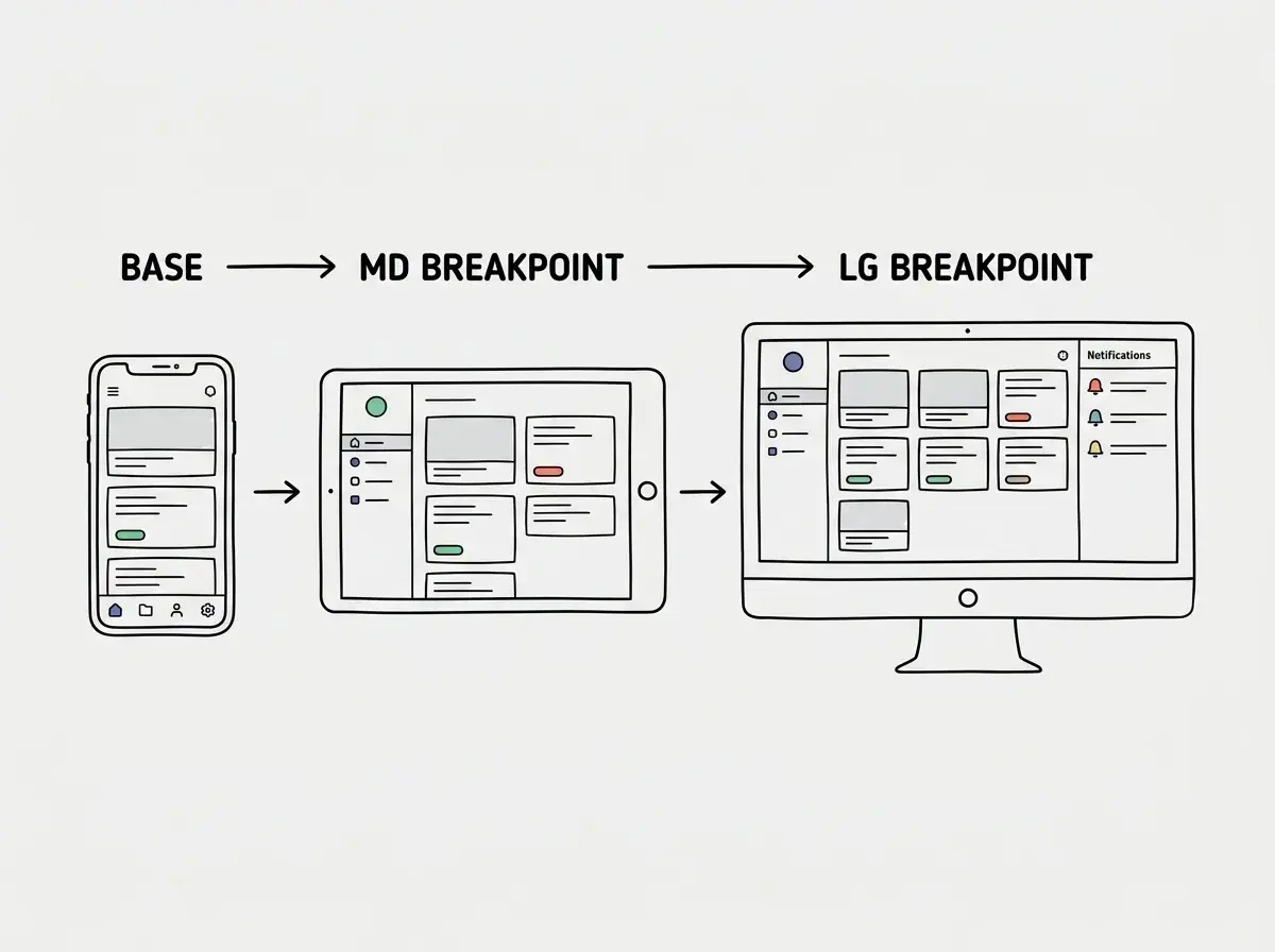
The most effective responsive design prompts describe each breakpoint as a separate visual state. Think of it as giving the AI a storyboard instead of a single screenshot.
Here is the pattern that works consistently:
"Build a dashboard layout, mobile-first with Tailwind breakpoints. Mobile (base): Single column. Navigation is a bottom tab bar with four icons. Content fills the full width with 16px horizontal padding. Cards stack vertically with 12px gaps. Tablet (md): Navigation moves to a collapsible sidebar on the left, 240px wide. Content area fills the remaining space. Cards display in a 2-column grid. Desktop (lg): Sidebar is always visible. Cards display in a 3-column grid. Add a right sidebar (280px) for notifications and quick actions."
This prompt produces a layout that genuinely adapts to three different screen experiences. You are not asking the AI to "make it responsive." You are designing three layouts and asking the AI to implement the transitions between them.
The key detail most people miss: describe navigation separately from content. Navigation changes most dramatically across screen sizes. A horizontal nav bar on desktop might become a hamburger menu on tablet and a bottom tab bar on mobile. If you do not specify this, the AI will just shrink the desktop nav until it overflows.
The Stack-on-Mobile, Grid-on-Desktop Pattern
This is the single most useful responsive pattern in web design, and it works for about 70% of all layout situations. The idea is simple: elements that sit side by side on desktop should stack vertically on mobile.
Here is how to prompt it: "Display the feature cards in a single column on mobile, a 2-column grid at md, and a 3-column grid at lg. Use gap-4 on mobile and gap-6 at lg."
That prompt generates something like grid grid-cols-1 gap-4 md:grid-cols-2 lg:grid-cols-3 lg:gap-6. Clean, predictable, and it works on every screen.
This pattern applies to pricing cards, team profiles, blog grids, feature lists, testimonial sections, and footer columns. Once you internalize this "stack, then grid" thinking, you can describe responsive layouts for almost any section in one sentence.
For content beside an image on desktop, use this variation: "On mobile, show the image full-width above the text. At lg, place image on the left (50% width) and text on the right side by side." This translates to flex-col on mobile becoming flex-row at lg.
Testing Responsiveness With Chrome DevTools
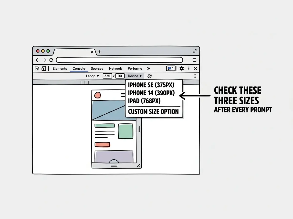
Writing great responsive prompts is half the battle. The other half is verifying the AI actually produced what you described. Chrome DevTools has a device mode that lets you test any screen size in seconds.
Open your app in Chrome, press Cmd+Shift+M on Mac or Ctrl+Shift+M on Windows to toggle device mode. You will see a toolbar at the top with device presets like iPhone SE, iPad, and various Android phones.
The workflow is simple: prompt the AI, see the result on desktop, immediately check it on iPhone SE (375px wide) and iPad (768px). If something breaks, describe the specific problem in your next prompt. "The nav links overflow on iPhone SE. Stack them vertically on mobile and show them horizontally at md." This targeted follow-up is far more effective than "fix the responsive issues."
Responsive design is just one piece of the puzzle. See the full workflow from prompt to production.
Explore the guidesCommon Responsive Bugs AI Creates
Even with great prompts, AI tools have recurring blind spots with responsive design. Knowing these lets you catch and fix them fast.
Fixed widths instead of flexible ones. The AI loves writing w-[600px] or width: 600px instead of percentage or fraction-based widths. Any element with a fixed pixel width wider than 375px will overflow on phones. Add "use relative widths, no fixed pixel widths wider than the mobile viewport" to your constraints.
Horizontal overflow from images. Images without max-w-full or w-full will extend beyond the screen on mobile, creating an invisible horizontal scroll. Always include "images should be full-width and responsive" in your prompt.
Text that does not scale. The AI sometimes uses large fixed font sizes like text-4xl on headings without reducing them on mobile. Add "use text-2xl on mobile, text-4xl at lg for headings" to prevent text from dominating small screens.
Padding that eats the viewport. Desktop-friendly padding like px-20 consumes most of a phone screen. Specify "px-4 on mobile, px-8 at md, px-20 at lg" to keep content breathing room proportional to the screen.
Touch targets too small. Buttons and links that work fine with a mouse cursor need to be at least 44px tall for comfortable tapping on mobile. Add "minimum 44px touch targets on mobile" to your interactive element prompts.
Adding "make it responsive" at the end of your prompt almost never works. The AI interprets this as "add some media queries to what I already built," which produces patches on top of a desktop-first layout. Instead, start with "mobile-first" and describe each breakpoint. Retrofitting responsiveness is always harder than building it in from the start.
Dig deeper
A few hand-picked sources if you want to go further.
What This Means For You
Every app you build with AI will be opened on a phone. That is not a prediction. It is the reality of how people use the internet today. The patterns in this tutorial work across every AI coding tool because they are not tool-specific tricks. They are a way of communicating layout intent clearly enough that any AI can translate them into working code.
Start with your next prompt. Add "mobile-first with Tailwind responsive breakpoints" and describe what happens at mobile, tablet, and desktop. Test on Chrome DevTools device mode. Fix what breaks with targeted follow-ups. Within a few iterations, responsive prompting becomes a habit, and your apps will work on every screen without a second thought.