About 92% of developers now use AI tools daily for writing code, and almost none of them include accessibility requirements in their prompts. The result is millions of new interfaces that look great but break completely for keyboard users, screen readers, and people with low vision. Learning the right AI accessibility prompts changes that outcome from the very first generation.
This is not about being a good person (though it is that too). Inaccessible interfaces lose users, trigger lawsuits, and create technical debt that compounds with every feature you ship. The earlier you build accessibility in, the cheaper it is. And the easiest time to build it in is when you are writing the prompt that generates the code in the first place.
Why AI Generates Inaccessible Code by Default
AI models learn from the internet, and the internet is overwhelmingly inaccessible. The WebAIM Million report consistently finds that over 96% of homepages have detectable WCAG failures. When you ask an AI to "build a navigation menu," it draws from millions of examples where the navigation is a pile of divs with click handlers, no keyboard support, and zero ARIA attributes.
The AI is not ignoring accessibility on purpose. It is reflecting the statistical reality of how most code is written. The most common patterns in its training data are the patterns it reproduces. And the most common patterns are inaccessible ones.
This means accessibility will not happen by accident. You have to ask for it explicitly. The good news is that once you know the right patterns to request, AI tools are remarkably good at implementing them. They know the ARIA spec. They know WCAG 2.1 AA guidelines. They just need you to tell them that those standards matter for this particular generation.
AI models default to the most statistically common code patterns, and 96% of the web has accessibility failures. Including accessibility requirements in your prompts is not optional polish. It is the only way to get accessible output. The AI knows how to build accessible interfaces. It just needs you to ask.
The Accessibility Prompt Suffix
The simplest change you can make is appending an accessibility suffix to every UI prompt. Think of it as a standard footer that you paste at the end of any prompt that generates interface code.
Here is a suffix that targets WCAG 2.1 AA compliance:
Accessibility requirements (WCAG 2.1 AA):
- Use semantic HTML elements (nav, main, section, article, button, etc.)
- Add ARIA labels to all interactive elements
- Ensure full keyboard navigation with visible focus indicators
- Maintain minimum 4.5:1 color contrast ratio for text
- Include descriptive alt text for all images
- Support screen reader announcements for dynamic content
You do not need to memorize this. Save it in a text snippet, a system prompt, or a .cursorrules file. The point is that it becomes part of every UI generation, not something you remember to add occasionally.
When you include this suffix, the AI shifts from "build something that looks like a nav" to "build a nav that meets specific accessibility standards." That shift in framing changes the output dramatically.
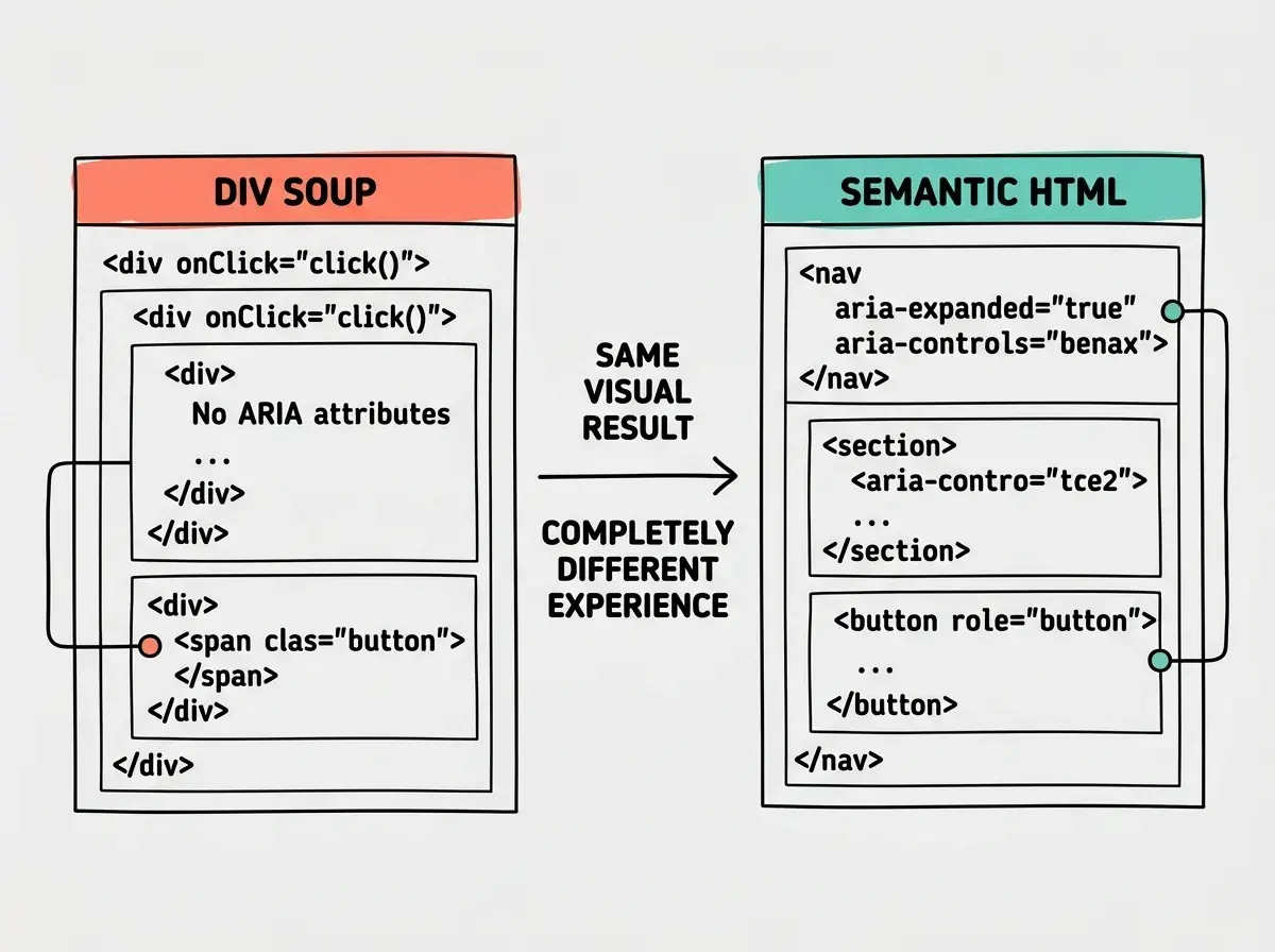
Semantic HTML Over Div Soup
The single highest-impact accessibility prompt pattern is asking for semantic HTML. Most AI-generated interfaces use div and span for everything because those are the most common elements in training data. A div with an onClick handler looks like a button on screen but is invisible to assistive technology.
Instead of prompting "create a card component with a clickable header," prompt "create a card component using an article element with a button element for the expandable header." The difference in output is enormous.
Here is a practical comparison. This prompt produces inaccessible output:
Build a FAQ section with expandable questions.
This prompt produces accessible output:
Build a FAQ section with expandable questions.
Use a <details> and <summary> element for each FAQ item.
If using custom components instead, ensure each question
is a <button> with aria-expanded, and the answer panel
has a unique id referenced by aria-controls on the button.
Use <section> as the wrapper with an aria-labelledby
pointing to the FAQ heading.
The second prompt is longer, but the code it generates works for everyone. Keyboard users can tab through questions and press Enter to expand them. Screen readers announce whether each item is expanded or collapsed.
ARIA Labels and Live Regions
ARIA (Accessible Rich Internet Applications) attributes fill the gaps where HTML semantics alone are not enough. The most important ones to request in your prompts are aria-label, aria-labelledby, aria-expanded, aria-controls, aria-live, and role.
When prompting for interactive components, be specific about ARIA requirements:
Build a notification dropdown.
Requirements:
- The bell icon button needs aria-label="Notifications"
  and aria-expanded to indicate open/closed state
- The dropdown panel needs role="menu"
  with aria-labelledby pointing to the trigger button
- When new notifications arrive, use aria-live="polite"
  to announce the count to screen readers
- Each notification item needs role="menuitem"
Without these instructions, the AI will build a dropdown that works with a mouse and breaks for everything else. With them, the AI generates proper markup that screen readers can parse and announce.
For dynamic content, aria-live regions are critical. Any time your UI updates without a page reload (toast messages, form validation, loading states), prompt the AI to include live region announcements. "When the form submits successfully, display a success message in a div with aria-live='polite' and role='status'."
Keyboard Navigation That Actually Works
Keyboard accessibility is the most commonly broken feature in AI-generated code. The AI will build beautiful dropdown menus and modal dialogs that are completely inaccessible to anyone not using a mouse.
Include these patterns in your prompts for interactive components:
Keyboard navigation requirements:
- All interactive elements must be reachable with Tab
- Dropdown menus: Arrow keys to navigate items,
  Enter to select, Escape to close
- Modal dialogs: Focus trap inside the modal,
  Escape to close, return focus to trigger on close
- Visible focus indicators on all focusable elements
  (minimum 2px outline, not just browser default)
Focus management is the detail most prompts miss. When a modal opens, focus should move to the first focusable element inside it. When it closes, focus should return to the element that triggered it. Without explicit prompting, the AI almost never implements this correctly.
A useful pattern is to prompt for focus management as a separate step after the initial component generation: "Review the modal component and add focus trap logic. When the modal opens, move focus to the close button. When it closes, return focus to the element that triggered the open. Ensure Tab cycles through focusable elements inside the modal without escaping to the page behind it."
Relying on tabindex to fix keyboard navigation is a trap that AI tools often fall into. Adding tabindex="0" to a div makes it focusable but does not give it button behavior. You still need onKeyDown handlers for Enter and Space. Always prompt for native button and a elements instead. Reserve tabindex for managing focus order in complex widgets, not for making divs behave like buttons.
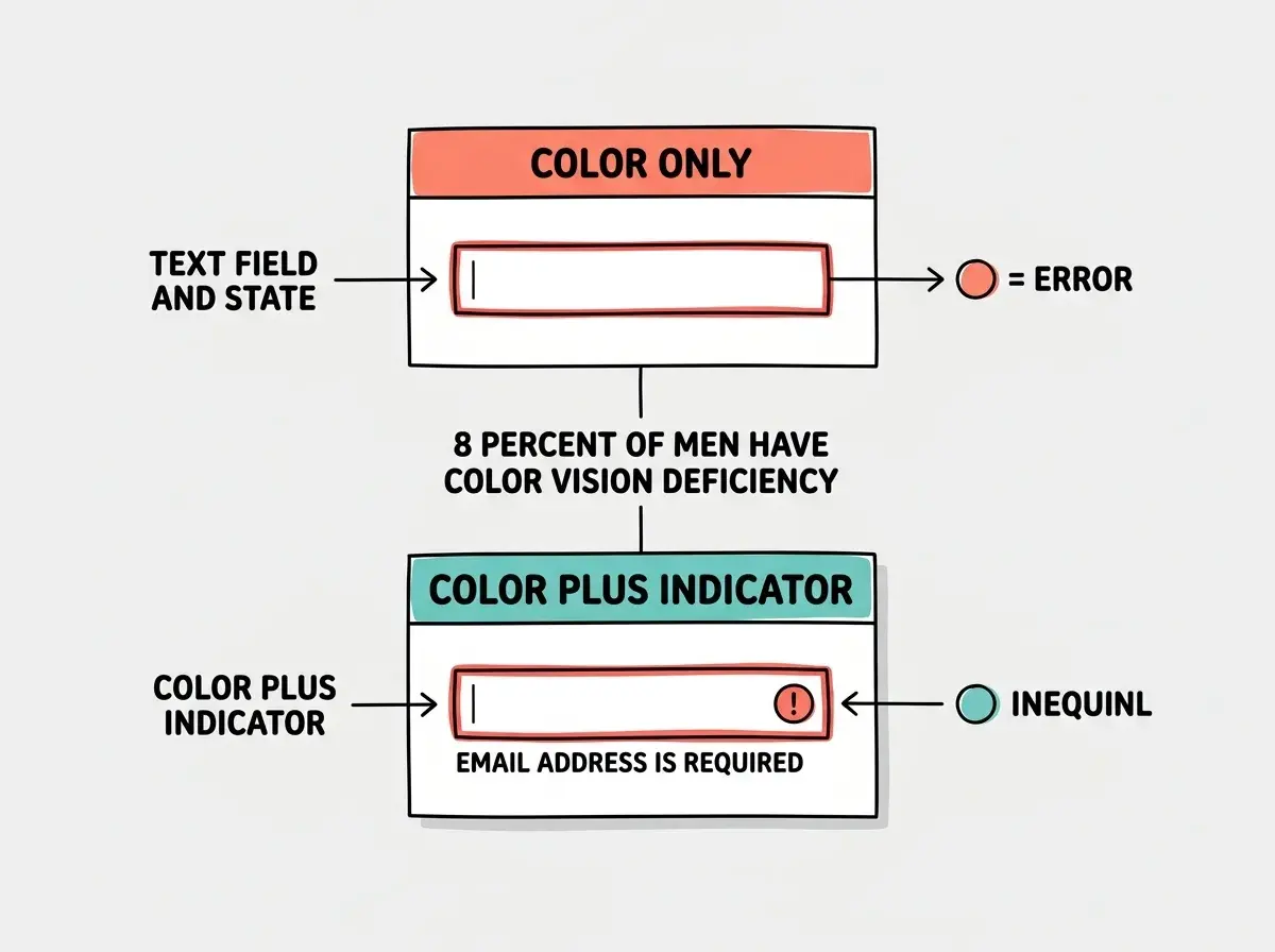
Color Contrast and Visual Accessibility
WCAG 2.1 AA requires a minimum 4.5:1 contrast ratio for normal text and 3:1 for large text (18px bold or 24px regular). Most AI-generated designs fail these thresholds because trendy color palettes often prioritize aesthetics over readability.
When prompting for color schemes, be explicit:
Use a color palette that meets WCAG 2.1 AA contrast
requirements. All body text must have minimum 4.5:1
contrast ratio against its background. Interactive
elements must have visible boundaries or underlines,
not just color changes. Error states must use both
color AND an icon or text label (never color alone).
That last point is critical. About 8% of men have some form of color vision deficiency. If your form validation only turns the border red, those users will never see the error. Always prompt the AI to use "color plus another indicator" for states like errors, warnings, and success messages.
Alt Text and Image Accessibility
AI tools generate placeholder alt text that is either empty or meaningless ("image," "photo," "screenshot"). Your prompts should specify what kind of alt text you expect.
For decorative images, prompt explicitly: "This is a decorative background image. Set alt='' and aria-hidden='true'." For informational images, describe what the alt text should convey: "Add alt text that describes the chart data, not the chart appearance. Example: 'Bar chart showing monthly revenue growing from 12K in January to 47K in June.'"
Screen Reader Testing in Your Prompt Workflow
The final step is prompting the AI to help you verify accessibility, not just build it. After generating a component, add a follow-up prompt:
Review this component for screen reader compatibility.
Walk me through what a VoiceOver or NVDA user would
hear when they navigate through this component using
only the keyboard. Identify any elements that would
be invisible, unlabeled, or confusing to a screen
reader user.
This prompt turns the AI into an accessibility auditor. It will catch missing labels, confusing reading order, and unlabeled interactive elements. It is not a replacement for real screen reader testing, but it catches the majority of issues before they reach production.
Start every UI prompt with accessibility requirements and ship interfaces that work for everyone.
Explore more tutorialsPutting It All Together
Combine the patterns from this guide into a single structured prompt. For any UI component, include five sections: semantic HTML elements, ARIA attributes for interactive widgets, keyboard navigation with focus management, color contrast requirements, and alt text rules. You do not need to write a novel. A bulleted list under each heading is enough. The AI fills in the implementation details when you give it the right constraints.
Every tutorial on Vibe Coder Blog is built to help you get more out of AI tools.
Browse all guidesWhat This Means For You
Accessibility is not a feature you bolt on at the end. It is a quality you build in from the beginning, and the beginning for vibe coders is the prompt. Every time you generate UI code, you have a choice: include accessibility requirements and get accessible output, or leave them out and accumulate technical debt that gets more expensive with every sprint.
The patterns in this guide work with every AI tool. Cursor, Lovable, Bolt, Claude, ChatGPT, Copilot. The models all know accessibility standards. They are just waiting for you to tell them those standards matter. Start with the accessibility suffix. Add it to your system prompt, your .cursorrules file, or your project instructions. Make it the default, and you will never have to retrofit accessibility again.