AI animation prompts are the difference between an app that feels like a prototype and one that feels like a finished product. With 92% of developers using AI tools daily, getting polished animations from those tools should be effortless. But most people prompt for animations and get janky, over-the-top results that make their UI feel worse, not better.
The problem is not that AI cannot generate good animations. It can. The problem is that most prompts are vague about the qualities that make an animation feel right. "Add some animations" produces chaos. Describing duration, easing, triggers, and restraint produces something that feels intentional and professional.
Why Animation Prompts Go Wrong
When you tell AI to "add animations to this page," it does what any eager junior designer would do. It animates everything. Cards fly in from the left. Buttons pulse on hover. Text fades up with a stagger delay. The page feels like a theme park ride instead of a product someone trusts with their data.
This happens because the AI lacks the one thing experienced designers have internalized over years of practice: restraint. Good animation is invisible. It guides attention, confirms actions, and smooths transitions. Bad animation demands attention and makes users wait. The AI does not know which category you want unless you tell it explicitly.
The fix is straightforward. Instead of asking for "animations," describe the specific behavior you want. Specify which elements move, how far they move, how long it takes, and what triggers the movement.
The Four Properties That Matter Most
Every animation prompt should address four properties, whether you are using Tailwind CSS classes or a dedicated animation library. These are the dimensions where vague prompts produce the worst results.
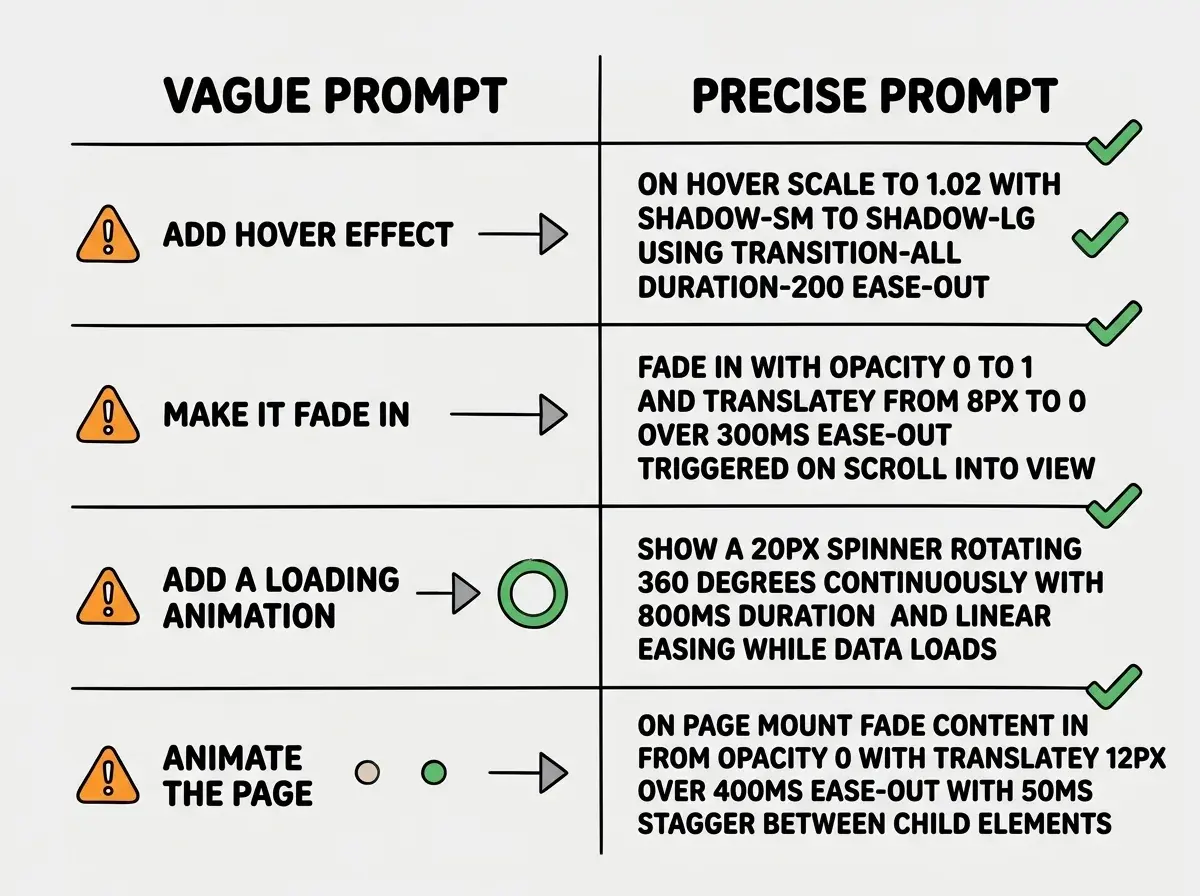
Duration controls how long the animation takes. Most UI animations should be between 150ms and 300ms. Anything under 100ms feels instant (which is sometimes correct, like toggling a checkbox). Anything over 500ms feels sluggish. When prompting, always specify: "Use a 200ms duration" rather than "make it smooth."
Easing determines the acceleration curve. Linear animations feel robotic. Ease-in starts slow and ends fast, which feels like something falling. Ease-out starts fast and ends slow, which feels natural for most UI transitions because the element decelerates into its final position. When in doubt, tell the AI "use ease-out" for elements appearing and "ease-in" for elements disappearing.
Trigger is what starts the animation. Hover, click, scroll into view, page load, or state change. Specifying the trigger prevents the AI from defaulting to "animate on mount," which is the most common unwanted behavior. If you want a card to animate when it scrolls into view, say that explicitly.
Distance is how far elements move. Subtle animations move elements 4px to 12px. Dramatic animations move elements 20px or more. For most UI work, tell the AI "translate 8px" or "scale from 0.95 to 1.0" to keep things restrained.
The "subtle is better" principle applies to nearly every animation in product design. If a user notices the animation itself rather than the content, the animation is too aggressive. Prompt for 150-300ms durations, ease-out curves, and small movements (under 12px) as your default.
Tailwind CSS Transitions in Prompts
Tailwind CSS has built-in transition utilities that handle the majority of hover states, focus states, and simple appearance changes. When you want the AI to use Tailwind for animations, be specific about the utility classes you expect.
Here is a prompt pattern that consistently produces good results:
"Add a hover effect to this card component. Use Tailwind transition utilities. The card should scale to 1.02 on hover with a subtle shadow increase. Use transition-all, duration-200, and ease-out. The shadow should go from shadow-sm to shadow-lg on hover. Do not add any transform on initial render."
That prompt works because it specifies the exact Tailwind classes (transition-all, duration-200), the exact transform value (scale 1.02), the exact shadow change (sm to lg), and explicitly prevents an unwanted behavior (no transform on initial render).
Compare that to "add a hover effect to this card." The AI might use JavaScript, add a color change instead of a shadow, or scale to 1.1, which looks cartoonish on a data card.
For button hover states, a reliable prompt pattern is: "Style this button with Tailwind transitions. On hover, darken the background by one shade, translateY by -1px, and add shadow-md. On active (click), translateY by 0px and remove the shadow. Use duration-150 and ease-out for all transitions."
That translateY trick creates a satisfying physical feel. The button lifts on hover and presses down on click. Three CSS properties, one interaction that feels considered.
Motion Library for Complex Animations
Tailwind handles simple transitions well, but for page transitions, scroll-triggered sequences, and orchestrated animations, you need a dedicated library. Motion (imported from "motion/react") is the standard for React projects, and AI tools generate excellent code with it when prompted correctly.
The key to prompting for Motion animations is describing the animation in terms of initial state, animate state, and transition config. This maps directly to how Motion's API works.
"Create a page transition using Motion. Import motion from 'motion/react'. Wrap the page content in a motion.div. Set initial opacity to 0 and y to 20. Animate to opacity 1 and y to 0. Use a transition with duration 0.4, ease 'easeOut'. Add an exit animation that reverses these values."
That prompt produces clean, idiomatic Motion code because it mirrors the library's actual API structure. The AI does not have to guess how to structure the animation.
For staggered list animations, use this pattern: "Animate a list of cards using Motion. Each card should be a motion.div with initial opacity 0 and y 12. Animate to opacity 1 and y 0. Add a transition delay of index times 0.05 seconds, with duration 0.3 and easeOut. The total stagger should not exceed 300ms regardless of list length."
That last constraint is critical. Without it, a list of 20 items takes a full second to finish staggering. Capping the total stagger time prevents long lists from creating awkward pauses.
AI tools love to add whileInView animations to every element on the page. This creates a "popcorn" effect where content pops in as you scroll, making the page feel broken rather than polished. Limit scroll-triggered animations to hero sections, key statistics, and feature showcases. Body text and standard UI elements should already be visible when the user reaches them.
Scroll-Triggered Animations Done Right
Scroll animations are where most AI-generated UIs go wrong. The AI adds whileInView to every component, and the page turns into a carnival. The fix is to be extremely specific about which elements animate on scroll and which do not.
A good prompt pattern: "Add a scroll-triggered animation to only the three feature cards in the features section. Use Motion's whileInView prop. Each card should fade in from opacity 0, translateY 16px to 0, with duration 0.4 and easeOut. Set the viewport threshold to 0.3 so the animation triggers when 30% of the card is visible. Set the viewport once property to true so it only animates once, not every time the user scrolls past."
The "once: true" property is something you should include in almost every scroll animation prompt. Without it, elements re-animate every time they enter the viewport, which feels glitchy during normal scrolling.
For parallax-style effects, keep the movement minimal: "Add a subtle parallax effect to the hero background image. As the user scrolls down, the image should translate up at 50% of the scroll speed. Use transform translateY, not margin or top positioning, for smooth 60fps performance."
Loading State Animations
Loading animations are one of the few places where continuous animation is appropriate. Spinners, skeleton screens, and progress indicators all loop indefinitely until content arrives.
"Create a loading skeleton for a blog post card. Show a pulsing animation on placeholder rectangles for the title (h-6 w-3/4), description (h-4 w-full, two lines), and image area (h-48 w-full). Use Tailwind's animate-pulse class. The skeleton should match the exact dimensions of the real card to prevent layout shift when content loads."
Specifying "match the exact dimensions" prevents the jarring page jump that happens when skeleton and real component have different sizes.
Learn the fundamentals of vibe coding, from prompts to deployment.
Start learningPutting It All Together
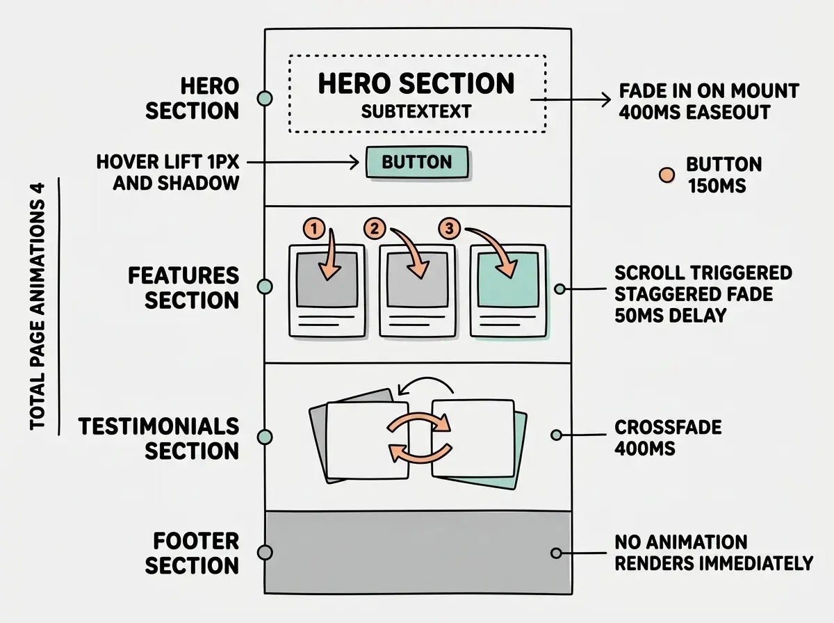
A well-animated page uses three to five animations total, not thirty. Here is how to prompt for a complete page with appropriate animation:
"Build a landing page with these specific animations and nothing else. First, the hero headline and subtext should fade in on page mount with opacity 0 to 1, translateY 12px to 0, duration 400ms, easeOut. Second, the CTA button should have a hover effect with translateY -1px, shadow increase, duration 150ms. Third, the three feature cards should animate on scroll into view with a staggered fade-in, 50ms delay between each, duration 300ms. Fourth, the testimonial carousel should crossfade between items with a 400ms transition. No other elements should animate. Body text, navigation, and footer should render immediately with no animation."
That prompt works because every animation serves a purpose and everything else stays out of the way.
See how other vibe coders are shipping polished products with AI tools.
Explore tutorialsDig deeper
A few hand-picked sources if you want to go further.
What This Means For You
Good AI animation prompts follow a simple principle: describe the physics, not the feeling. "Make it smooth" is a feeling. "200ms duration, ease-out, translateY 8px to 0" is physics. AI tools excel at precise specifications and struggle with subjective descriptions.
Start with your next project. Pick three elements that should animate and describe each one using duration, easing, trigger, and distance. Leave everything else static. Three well-described animations add more polish than thirty vague ones.
The builders who get the best results from AI are not the ones using the most animations. They are the ones who know exactly which animations matter and can describe them precisely enough that the AI gets it right on the first try.