Pricing page optimization is the design and copywriting work that turns "interested visitor" into "paying customer." For vibe coded SaaS products, the pricing page is often the single biggest revenue lever, because the difference between a 1% and a 4% conversion rate is the difference between a hobby and a business. Most AI-generated pricing pages reproduce the average pattern from the training data, which is fine for an average product but undersells anything actually useful.
This guide covers the four decisions that matter most, the layout patterns that consistently win, the copywriting tricks borrowed from behavioral economics, and the specific mistakes vibe coded apps tend to make.
Why Pricing Pages Are the Most Underleveraged Real Estate
The pricing page is the moment of truth for almost every SaaS visitor. They have read your homepage, looked at your features, and now they want to decide whether the product is worth their money and time. The conversion rate at this exact step is the most important number for your revenue, and the smallest improvements compound into meaningful business outcomes.
Most vibe coded apps treat the pricing page as a final feature to ship before launch, drop in three plans with feature checklists, and move on. The result is a pricing page that converts in line with the median, which is roughly 1% to 2% of visitors who reach it. Apps in the top quartile of pricing page conversion run at 5% to 8%, and the difference is almost entirely design and copywriting decisions, not the actual price.
A 2024 ProfitWell analysis of 4,000 SaaS pricing pages found that the median page converted 2.1% of visitors, and that pages in the top quartile converted 5.4%. The 2.5x difference was attributed primarily to four specific design decisions, none of which were the actual prices charged.
The pattern to copy is the menu in a well-run restaurant. The menu does not just list dishes, it guides you toward the ones the kitchen is best at, anchors prices through strategic ordering, and uses descriptive language that makes specific items more appealing. A good menu can change the average check size by 15% to 25% without changing the actual prices. Your pricing page can do the same.
The Four Decisions That Matter
Almost every meaningful pricing page improvement reduces to one of four decisions. Getting all four right puts you in the top conversion quartile.
Decision 1, the recommended plan. One plan should be visually highlighted as "most popular" or "recommended." Behavioral economics research shows that visitors make faster decisions and convert at higher rates when one option is clearly recommended, regardless of which option is highlighted. The pattern is to highlight the plan with the best margin or the most natural growth path, usually the middle plan.
Decision 2, the anchoring price. A higher-priced plan exists primarily to make the recommended plan look reasonable by comparison. The "Enterprise" tier on most SaaS pricing pages does this work, even if 90% of customers never choose it. Without an anchoring price, the recommended plan looks expensive on its own. With it, the same price feels like a deal.
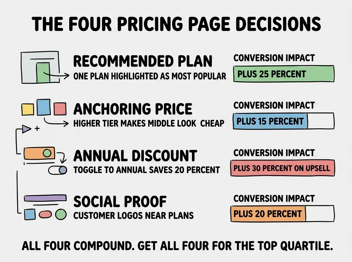
Decision 3, the annual discount. Offering a meaningful discount (typically 20%) for annual billing serves two purposes, it boosts cash flow and it locks in retention. The pricing page should default to monthly view but toggle clearly to annual, with the annual discount visible. The combined effect on revenue is usually 30% or more, even though only a fraction of customers choose annual.
Decision 4, social proof near the plans. Customer logos, testimonials, or usage statistics positioned near the pricing tables increase conversion because they reduce perceived risk. Visitors who see "trusted by 5,000 teams" are 20% to 30% more likely to convert than visitors who do not. Most vibe coded apps add social proof somewhere on the page, but not near the pricing decision.
The Layout Patterns That Win
Layout is the second tier of pricing page optimization. The patterns that consistently win are well-documented and largely uncontroversial.
The 3-column tier comparison is the standard for a reason. Three columns let visitors compare without overload, while four or more produce decision paralysis. Each column has the same number of rows, the recommended column has visual emphasis (border color, slight scale, "popular" badge), and the call-to-action button text varies subtly across columns.
Read more revenue and growth guides for vibe coded products
Browse the grow categoryThe order of features in the comparison matters. Lead with the features the visitor is most likely searching for, not with the features you are proudest of. The first three rows of the comparison get the most attention, so the most important differentiator should be there. Vibe coded pricing pages often lead with infrastructure features the user does not care about, because the AI does not know what is most important to the buyer.
The Copywriting That Converts
The text on a pricing page does meaningful work. Three patterns deserve special attention.
Plan names that signal stage. Names like "Starter," "Growth," "Scale" do better than names like "Bronze," "Silver," "Gold" because they signal which plan fits the customer's current stage. The visitor self-selects more accurately, which raises both conversion and retention.
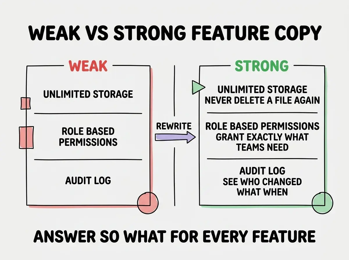
Feature descriptions that answer "so what." "Unlimited storage" is weaker than "Unlimited storage, never delete an old file again." The latter answers the implicit question every feature description faces. AI-generated pricing pages tend toward the former, listing features without translating to user value.
Trust signals near the call-to-action. Just below the buy button, a line that reduces perceived risk does meaningful work. "Cancel anytime," "30-day money-back guarantee," "No credit card required for trial" are common patterns. The line costs nothing to add and consistently raises conversion 5% to 15%.
The most expensive pricing page mistake is hiding the price. Every founder who has ever asked "should we put 'contact us' on the cheapest tier" has reduced conversion. Visitors who do not see a price assume the price is too high to discuss publicly, and most leave. Show the price unless your enterprise sales motion absolutely requires gating it.
The corollary is that even enterprise sales benefit from a published price. A "starting at" price, a price per seat, or a transparent calculator all outperform the gated "contact us" pattern in raw lead volume, which is the metric that matters at the start.
The other consideration is that pricing pages need quarterly review, not just initial design. Markets shift, customers learn what is normal in your category, and a page that converted at 5% in year one often degrades by year two if nothing changes. Schedule a review every quarter to look at conversion data and competitive pricing in your space.
What This Means For You
Pricing page optimization is one of those topics where the gap between average and excellent is small in calendar time and enormous in business outcomes. A focused week on the four decisions and the copywriting patterns above is high-leverage work for any SaaS.
- If you're a founder: Run an A/B test on your pricing page within the first month of having any meaningful traffic. The winner is rarely your initial guess, and the iteration loop pays back quickly.
- If you're changing careers: Pricing page design is one of the highest-leverage skills in modern product work. Every product role benefits from understanding the patterns that move conversion.
- If you're a student: Reverse-engineer the pricing pages of three SaaS companies you respect. Write down each of the four decisions and how they made it. The exercise teaches more than any course module on pricing.
Browse more revenue and conversion guides
Read more grow guides