Building a paywall for content and features in 2026 means choosing between four gating patterns: hard wall (no access without paying), metered wall (limited free access then pay), feature gate (free tier missing premium features), and freemium with upsell (full free tier plus premium upgrades). Each pattern has a clear right use case based on your product type, and choosing the wrong pattern can crush conversion or destroy organic discovery. The architectural implementation is small (maybe a day of work), but the strategic choice of which pattern to use is the single biggest paywall decision and worth getting right before any code is written.
This piece walks through each of the four patterns, when each one wins, the implementation architecture, and the four mistakes that make paywalls feel hostile rather than fair.
Why Paywalls Are So Easy to Get Wrong
A paywall sits at the most consequential moment in the user journey: the moment when an interested user has to decide whether to pay. Get it right and you convert a meaningful percentage of free users to paid. Get it wrong and you lose the user entirely, often with negative word of mouth that hurts future acquisition.
The most common mistake is treating the paywall as a binary toggle (paid or not) rather than as a designed experience. Hard walls work for some products and destroy others. Metered walls work for content but rarely for features. Picking the right pattern requires understanding your product type, your acquisition channel, and your typical user's purchase intent at first contact.
A 2025 ProfitWell analysis of 2,000 SaaS and content products found that paywall pattern alone accounted for a 4 to 8x difference in conversion rate, holding everything else constant. Products with the right pattern for their type converted 6 to 12 percent of active free users; products with the wrong pattern converted 0.5 to 2 percent. The architectural simplicity of switching patterns later does not compensate for the lost users in the meantime.
The pattern to copy is the way newspapers handle subscriptions. The Wall Street Journal uses a hard wall (paid only). The New York Times uses a metered wall (free articles per month). Both work for their specific audience and content mix, and switching either to the other pattern would significantly hurt their business. Paywall pattern is part of the product, not a setting on top of it.
The Four Gating Patterns
Each pattern below has a specific right use case. The goal is to match your product to the pattern, not to pick the pattern you find aesthetically appealing.
Hard wall. No access without paying. Best for products with a clear value proposition that does not need demonstration (enterprise SaaS where the buyer is informed, premium content where the brand is the proof, professional tools with strong word-of-mouth).
Metered wall. Free access up to a limit (e.g., 3 articles per month, 100 API calls per day, 5 projects total). Best for content products where samples are needed to demonstrate value, and for products where usage frequency drives upgrade urgency.
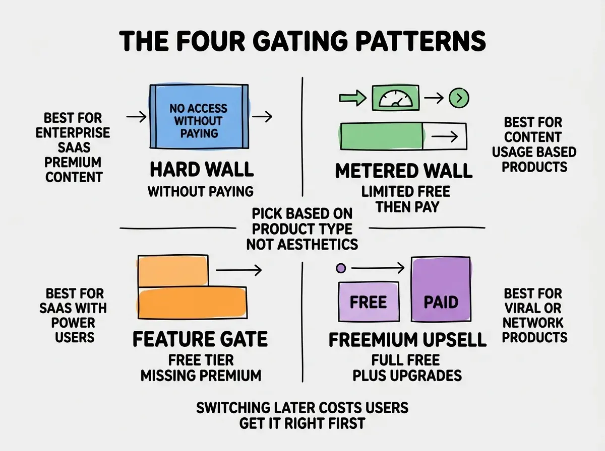
Feature gate. All users get a fully functional free tier; specific features are gated behind paid plans (e.g., GitHub free vs Pro for private repos, Notion free vs Plus for unlimited blocks). Best for products with clear power-user features that casual users do not need.
Freemium with upsell. Free tier is genuinely useful indefinitely; paid is for specific upgrades like more storage, faster processing, removed ads, or team collaboration. Best for products with viral or network effects (Slack, Dropbox, Spotify).
The Architecture of a Paywall
The technical implementation is small but has specific patterns that hold up. Three architectural pieces handle most paywall logic.
Subscription state. A clean subscription state model: free, trial, paid, past_due, canceled. Every other gating decision references this state. Store it in your users table or a separate subscriptions table linked to users.
Browse more monetization guides
Read more grow articlesFeature flags or entitlement service. A lookup function that takes a user and a feature name and returns whether they have access. Even simple paywalls benefit from a centralized entitlement check rather than scattered if-paid checks throughout the codebase.
Paywall UI components. A reusable component that renders the right paywall (hard wall message, metered limit message, feature unlock CTA, etc.) when a user hits a gated boundary. Centralizing this UI makes it easy to A/B test paywall messaging across the product.
How to Tune Conversion Without Hurting Trust
Once a paywall is shipped, the conversion rate becomes the metric to tune. Three patterns produce most of the conversion lift without making the paywall feel hostile.
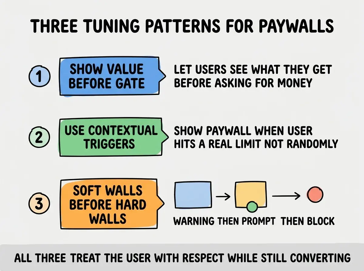
Show value before the gate. Let users experience the value before asking for money. For content, give them the first paragraph. For features, let them try a smaller version. The goal is to make the paid offering feel like an upgrade, not a barrier.
Use contextual triggers. Show the paywall when the user is actually trying to do something the paywall blocks, not at random points in the flow. A paywall that appears when the user clicks "Export" feels reasonable; a paywall that appears on page load feels hostile.
Soft walls before hard walls. Warn the user when they are approaching a limit (e.g., "You have 1 free article remaining this month") before blocking them entirely. This gives them agency and reduces the sense of surprise.
The most damaging paywall mistake is showing a hard wall to users who came from organic search or social referral. These users have no context, no prior experience with the product, and no reason to trust paying immediately. They bounce, never come back, and tell others to avoid the product. The fix is to give all first-time visitors at least one moment of unblocked value before any paywall, regardless of the gating pattern. This is sometimes called "first-click free" and can lift overall conversion by 30 to 50 percent.
The other mistake is changing paywall patterns frequently. Each change confuses returning users and trains the audience that the rules are unstable. Pick a pattern, commit to it for at least 6 months, and only change after you have clear data showing a different pattern would convert better with similar trust impact.
A useful diagnostic is to track three metrics per paywall: the percentage of users who hit the paywall (exposure rate), the percentage who convert when they hit it (conversion rate), and the percentage who never return after seeing it (churn rate). High exposure with low conversion and high churn means the paywall is poorly targeted. Low exposure with high conversion means the paywall is well-targeted but you might be leaving money on the table by not showing it to more users.
What This Means For You
A well-designed paywall is the single most important monetization decision for any SaaS or content product. The architecture is small; the strategic choice is everything.
- If you're a founder: Pick your paywall pattern before writing code. Match it to your product type and your typical user's first-visit context.
- If you're changing careers: Studying real paywalls across industries (newspapers, SaaS, mobile apps) is one of the fastest ways to develop product judgment.
- If you're a student: Build a paywall into your portfolio project even if you do not plan to monetize. The discipline of designing the paywall makes you think about value differently.
Browse more monetization and growth guides
Read more grow articles