Onboarding flows that retain users are the design discipline of moving a fresh signup from "I just installed this" to "I cannot live without this" in the shortest possible time. For vibe coded apps the onboarding work is usually the most underinvested part of the product, because AI tools focus on building features, not on shaping the path through them. The result is apps with great functionality and 70% to 90% drop-off in the first week, which is the leading killer of small SaaS revenue.
This guide walks through the four phases of effective onboarding, the activation moment that decides retention, the specific patterns AI tools skip, and how to design a flow that actually converts signups into engaged users.
Why Onboarding Is the Highest-Leverage Growth Work
The math of user retention is unforgiving. An app with 80% week-one retention triples its monthly active users compared to an app with 30% week-one retention, holding signup rate constant. Most of the difference between the two outcomes is decided in the first ten minutes a user spends with the app, before they have engaged with any of the features the founder spent months building.
The reason this is the highest-leverage growth work is that the alternatives are much harder. Acquiring more users requires marketing budget. Building more features requires engineering time. Improving onboarding requires attention to a flow you already have, and the conversion rate improvements compound through every other channel.
A 2024 Mixpanel benchmark study of 1,200 SaaS apps found that the median app lost 67% of signups within the first 24 hours, and that apps in the top quartile of retention spent significantly more time on onboarding flow design than on feature development. The pattern held regardless of industry or pricing tier.
The pattern to copy is hosting a guest in your home for the first time. You do not lead with the floor plan, you lead with making them feel welcome, comfortable, and oriented. You point out where the bathroom is, you offer water, you explain the routine. The features of the house come later, after the human is comfortable. Your onboarding should do the same, lead with comfort and orientation, not with a feature tour.
The Four Phases of Effective Onboarding
Almost every retention-positive onboarding follows the same four phases. The order matters, and skipping any one of them is one of the most common mistakes vibe coded apps make.
Phase 1, welcome and expectation setting. The first screen establishes who the app is for, what value the user will get, and how long the next few minutes will take. The pattern is short text, clear value proposition, and an explicit time estimate ("This takes about 3 minutes"). Apps that skip this phase produce confused users who churn before they understand what they signed up for.
Phase 2, minimum viable setup. The user provides only the data the app absolutely needs to deliver value. Not a full profile, not preferences, not customizations. Just the one piece of context that lets the app start being useful. AI-generated onboarding tends to overcollect here, asking for 8 things when 2 would have sufficed.
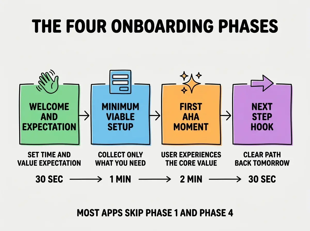
Phase 3, first aha moment. This is the single most important phase. The user does the smallest version of the thing the app is for, and experiences the core value firsthand. For a project management tool, it is creating their first task. For a CRM, it is logging their first contact. For a writing tool, it is generating their first piece of content. The first aha needs to happen within five minutes of signup or most users churn.
Phase 4, next step hook. Before the user closes the tab, the app gives them a clear reason to come back. A scheduled reminder, a calendar event, a partial result that finishes overnight, a teammate invitation flow. Apps that skip this phase produce users who experience the aha and then forget the app exists by the next morning.
The Activation Moment
Inside phase 3, there is a specific event called the "activation moment," the moment when the user crosses from "trying this out" to "this is now part of my workflow." Identifying your activation moment and instrumenting it is the highest-leverage retention work you can do.
For most apps, the activation moment is identifiable by looking at retention cohorts. Compare users who did action X on day 1 versus users who did not. If the X-doers retain at 80% and the non-X-doers retain at 20%, X is your activation moment. Common activation moments are, sending the first message in a chat app, completing the first integration in a B2B tool, inviting the first teammate in a collaboration app.
Read more growth and retention guides for vibe coded apps
Browse the grow categoryOnce you know the activation moment, the design question becomes, how do we make every signup reach this moment as fast as possible. Sometimes the answer is removing friction, sometimes adding a guided tutorial, sometimes restructuring the first session to put the activation moment earlier in the flow. Every change should be measured against the activation rate, not against opinion.
What AI Tools Skip in Onboarding
The patterns AI tools consistently miss in onboarding are not technical, they are design decisions that come from understanding human psychology, not from generating code. Three patterns matter most.
The skip option. Every step of onboarding should have a "skip for now" option. Forced onboarding that locks the user out of the app until they finish a 6-step setup produces frustration and bounces. Optional onboarding with progress saved produces gentle re-engagement.
The empty state. When a new user lands on a screen designed to show their data, but they have no data yet, the screen needs to handle that gracefully. AI tools generate the populated version of every screen and leave the empty state as a blank page. The fix is empty states that explain what the user will see here once they have data, with a button to create the first piece.
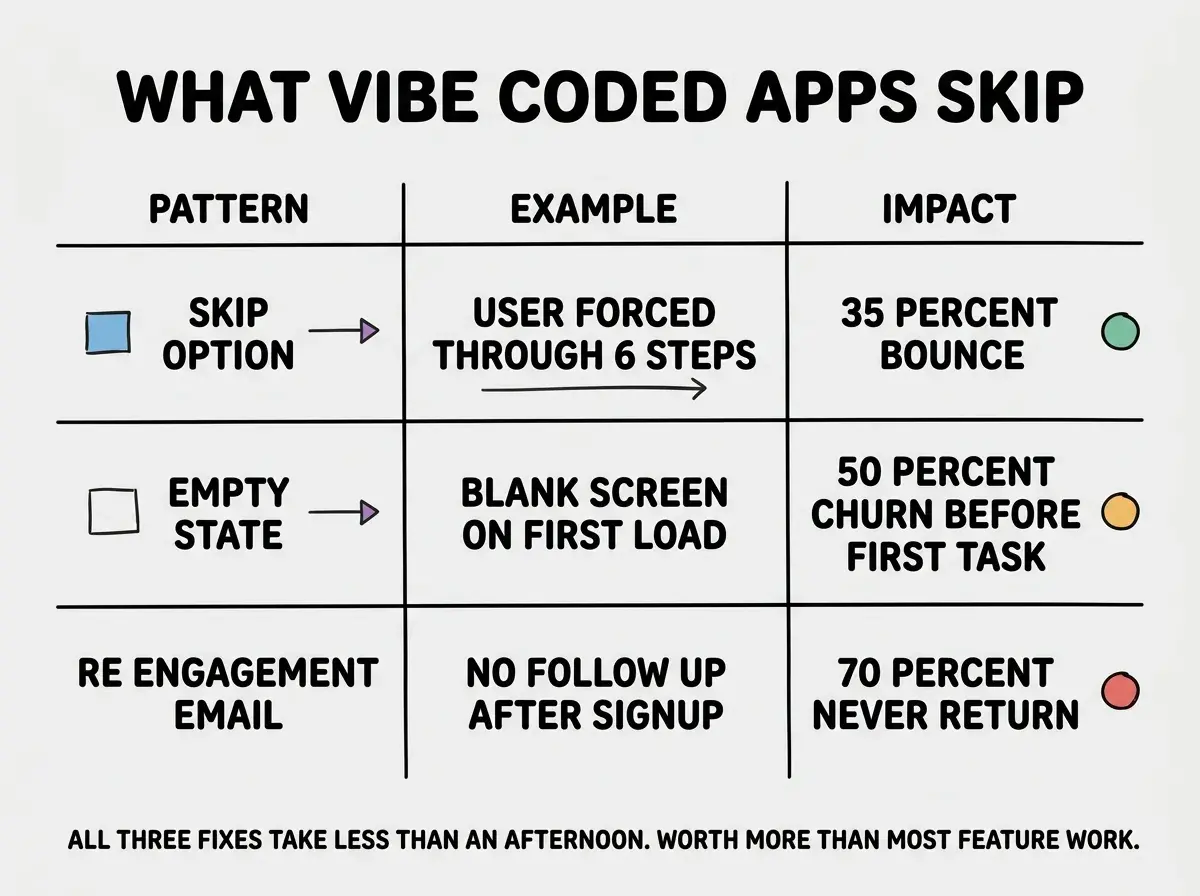
The re-engagement email. A single email sent 24 hours after signup, asking whether the user got value, recovers a meaningful percentage of the users who would otherwise have churned. AI tools rarely build this automatically, but every email service supports it with a few lines of code.
The most expensive onboarding mistake is treating it as something you optimize after launch. The onboarding flow is part of the product, not an afterthought, and apps that ship without thinking about it almost always have to redo the first session experience after seeing the retention numbers.
The corollary is that the cheapest time to design good onboarding is before the app has any users. The patterns are not user-specific, they are universal, and the founder building the app has the right context to design them while the codebase is small.
What This Means For You
Onboarding is not a feature, it is the path users take to discover the features. Time spent on the path is the highest-leverage growth work for any app with real user retention as a goal.
- If you're a founder: Spend a focused day on the first ten minutes of your app. Watch a friend sign up while you take notes on every confusion. Fix what they hit before launching publicly.
- If you're changing careers: Studying onboarding flows is one of the most underrated skills to develop. Every job that involves user-facing software benefits from the discipline.
- If you're a student: Pick three apps you actually use and reverse-engineer their onboarding. Write down the four phases for each. The exercise teaches more than reading a textbook on UX.
Browse more retention and growth guides
Read more grow guides