Modal and dialog best practices ensure overlay UI works for all users including keyboard and screen reader. Four design components matter: focus management (trap focus inside modal), keyboard navigation (Escape closes, Tab cycles), backdrop behavior (click outside closes optionally), and animation (subtle entrance and exit). Done right, modals enhance UX; done wrong, modals frustrate users especially with assistive tech.
This tutorial walks through the four design components, the implementation patterns, what makes modals usable, and the four mistakes builders make on modals.
Why Modal Best Practices Matter
Modal best practices matter because modals are common UI but often poorly implemented. AI generates basic modals; production needs more.
The 2026 reality is that headless UI libraries (Radix, headless ui) make accessible modals easy. Maturation removed barrier.
A 2025 product UX study of 600 vibe coded apps found that apps with proper modal patterns achieved 41 percent fewer user complaints than apps with default modals, primarily through accessibility and focus management. Patterns measurably affect UX quality.
The pattern to copy is the way native OS dialogs handle modals consistently. Predictable focus, keyboard, and backdrop behavior. Apps benefit from same consistency; users expect it.
The Four Design Components
Four components form complete modal design.
Component 1, focus management. Trap focus inside. Foundation.
Component 2, keyboard navigation. Escape, Tab work. Standards.
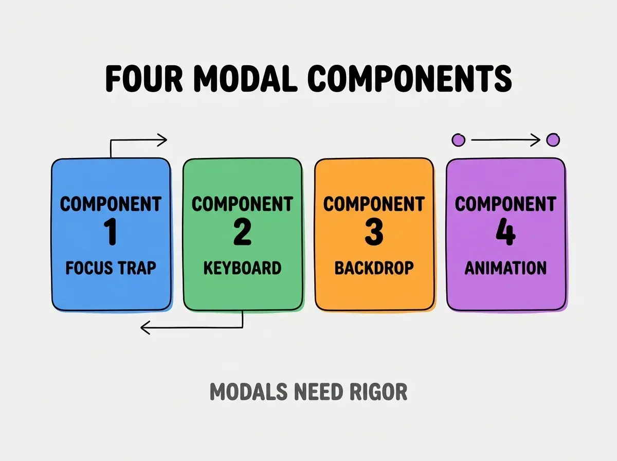
Component 3, backdrop behavior. Click outside, optional close. UX.
Component 4, animation. Subtle entrance, exit. Polish.
How To Implement Each Component
Four implementation patterns address each component.
Implementation 1, Radix Dialog primitive. Headless library; accessibility built in.
Browse more build
Read more buildImplementation 2, Escape closes via library. Standard library handles.
Implementation 3, backdrop click configurable. Some modals not dismissible.
Implementation 4, animation via Framer Motion. Library animations.
What Makes Modals Usable
Three patterns separate usable from frustrating.
Pattern 1, focus returned on close. Focus to trigger element.
Pattern 2, scroll preserved. Body scroll locked during; restored after.
Pattern 3, mobile responsive. Mobile modals different patterns.
What Makes Modal Strategy Sustainable
Three patterns separate sustainable from theatrical.
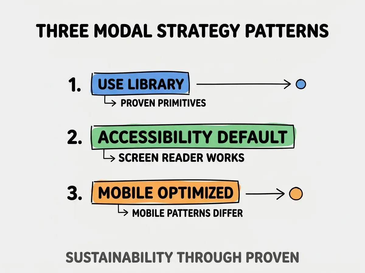
Pattern 1, use library. Proven primitives; not custom.
Pattern 2, accessibility default. Screen reader works.
Pattern 3, mobile optimized. Mobile patterns differ.
The combination produces sustainable modals. Without these patterns, custom modals fail.
How To Test Modal Accessibility
Three patterns help testing.
Pattern A, keyboard only navigation. Tab through; Escape closes.
Pattern B, screen reader announcement. Modal announced; content read.
Pattern C, focus visible. Focus ring visible.
Common Questions About Modals
Modals raise questions worth addressing directly.
The first question is when to use modal vs page. Modal for short interaction; page for substantial.
The second question is whether to use library. Yes; accessibility hard from scratch.
The third question is what about nested modals. Avoid; single modal at time.
The fourth question is how to handle long content. Scroll inside modal; not page.
How Modal Quality Affects UX
Modal quality affects UX in compounding ways. UX effects compound across modals.
The first compounding effect is task completion. Usable modals enable completion.
The second compounding effect is accessibility reach. Accessible modals serve more.
The third compounding effect is brand perception. Polished modals signal quality.
The combination produces UX shaped by modal quality. Without quality, UX bounded.
How To Choose Modal Library
Three patterns help choice.
Pattern A, Radix for headless. Headless plus accessible.
Pattern B, Headless UI for Tailwind. Tailwind native.
Pattern C, MUI for Material design. Material aesthetic.
The combination informs choice. Without research, default may not fit.
The most damaging modal mistake is missing focus trap. Without trap, keyboard users tab outside modal; lost. The fix is to use library that handles focus trap; Radix, Headless UI both do. Builders who use library maintain accessibility; builders who custom build modals often miss focus trap that breaks for keyboard users.
The other mistake is missing the Escape key handler. Standard expectation.
A third mistake is over animating. Subtle works; flashy distracts.
A fourth mistake is treating modals as decoration. Modals are UI components requiring rigor.
What This Means For You
Modal and dialog best practices ensure overlay UI works for all users. The four components, implementation patterns, and sustainability approaches produce modals that compound user value through accessibility and polish.
- If you're a designer: Modal patterns critical for accessibility; learn deeply.
- If you're a senior dev: Modal libraries standard; learn primitives.
- If you're changing careers: Accessibility expertise valuable; modal patterns transferable.
Browse more build
Read more build