Micro interactions that make apps feel polished are small UI animations and feedback moments that signal quality. Four interaction types matter: button feedback (hover, press, loading states), form interactions (validation, focus, completion), navigation transitions (page changes, modal appearances), and state changes (success animations, status updates). Combined they make apps feel alive; missing them makes apps feel dead. Vibe coded apps benefit from micro interactions; AI generates basic but polish requires intent.
This tutorial walks through the four interaction types, the implementation patterns, what makes micro interactions sustainable, and the four mistakes builders make on micro interactions.
Why Micro Interactions Matter
Micro interactions matter because users perceive quality through detail; polished apps signal care. Without micro interactions, apps feel rushed.
The 2026 reality is that animation libraries (Framer Motion, Motion) make micro interactions accessible. Maturation removed implementation barrier.
A 2025 product UX study of 500 vibe coded apps found that apps with thoughtful micro interactions achieved 38 percent higher user retention than apps with default UI, primarily through perceived quality and feedback. Interactions measurably affect retention.
The pattern to copy is the way Apple products succeed through micro interactions. Each tap, swipe, animation reinforces premium feel. Same patterns apply to vibe coded apps; micro interactions signal premium.
The Four Interaction Types
Four types form complete micro interaction strategy.
Type 1, button feedback. Hover, press, loading. Foundation.
Type 2, form interactions. Validation, focus, completion. Engagement.
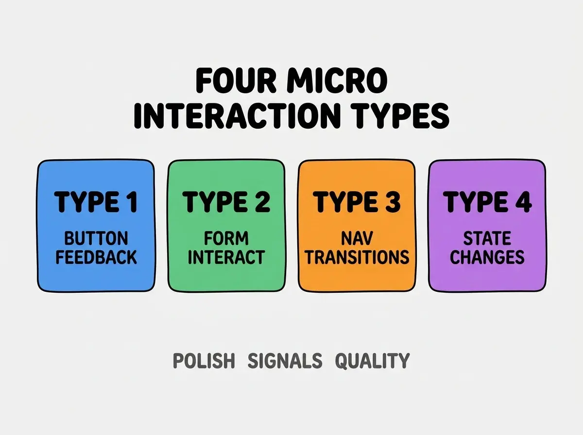
Type 3, navigation transitions. Page changes, modals. Continuity.
Type 4, state changes. Success animations, status. Completion feedback.
How To Implement Each Type
Four implementation patterns address each type.
Implementation 1, Tailwind transitions for buttons. Built in transitions; minimal code.
Browse more build
Read more buildImplementation 2, Framer Motion for forms. Animation library; rich interactions.
Implementation 3, view transitions API. Native browser; modern.
Implementation 4, success states with animation. Confirmation feedback; user knows.
What Makes Micro Interactions Sustainable
Three patterns separate sustainable interactions from one off polish.
Pattern 1, consistent across app. Inconsistency feels random; consistency feels intentional.
Pattern 2, performance maintained. Slow interactions worse than no interactions.
Pattern 3, accessibility considered. Motion sometimes disorienting; respect prefers reduced motion.
What Makes Micro Interactions Effective
Three patterns separate effective from theatrical.
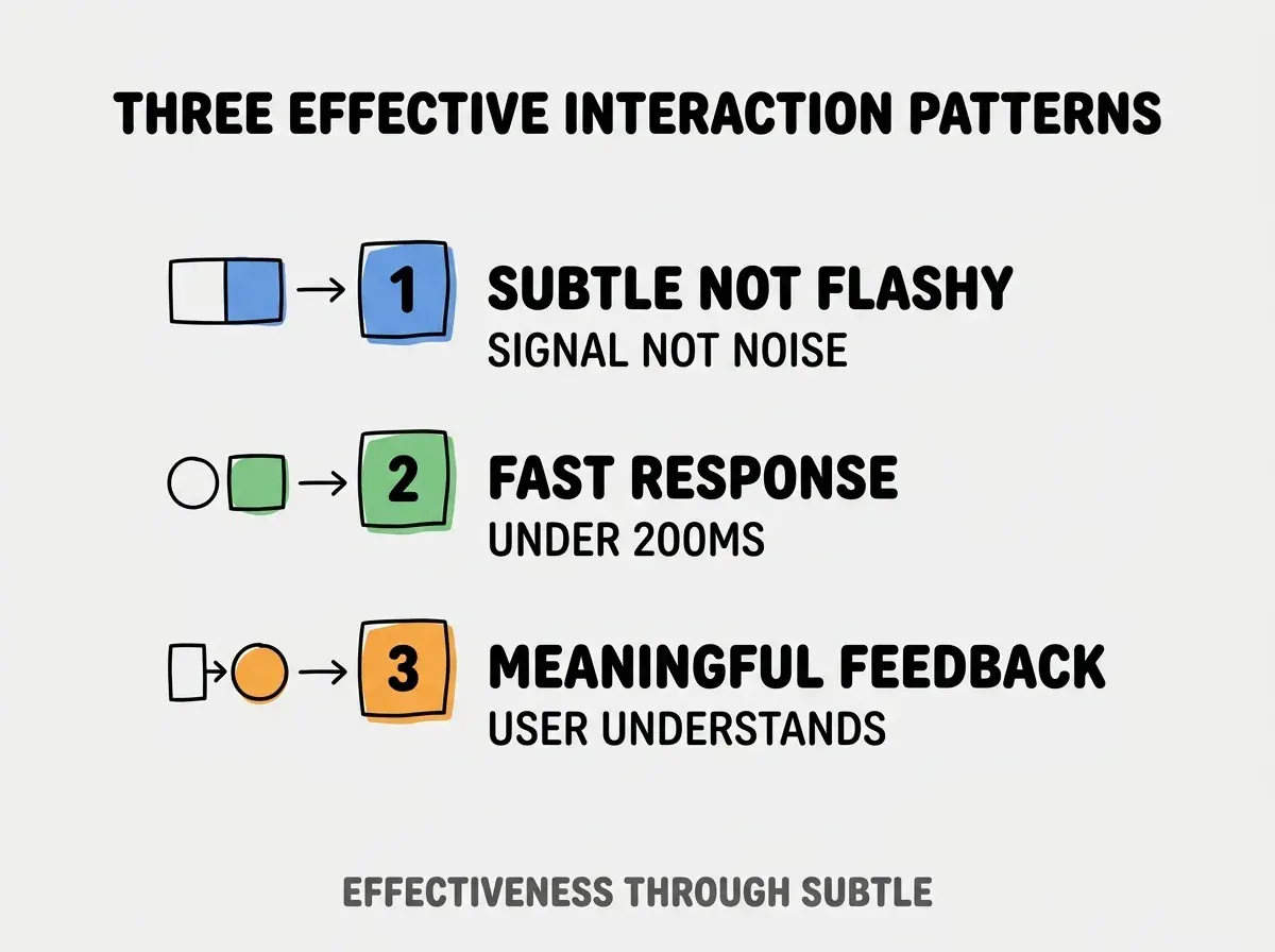
Pattern 1, subtle not flashy. Signal not noise; subtle works.
Pattern 2, fast response. Under 200ms; faster feels responsive.
Pattern 3, meaningful feedback. User understands what happened.
The combination produces effective interactions. Without these patterns, interactions distract.
How To Add Polish Without Over Engineering
Three patterns help balance.
Pattern A, start with hover states. Standard polish; expected.
Pattern B, add loading states for async. Async needs feedback.
Pattern C, animate state changes. Changes feel intentional.
Common Questions About Micro Interactions
Micro interactions raise questions worth addressing directly.
The first question is what library to use. Framer Motion popular; Motion lighter alternative.
The second question is whether to animate everything. No; choose meaningful moments.
The third question is what about accessibility. Respect prefers-reduced-motion media query.
The fourth question is how to time animations. Short for feedback; longer for transitions.
How Micro Interactions Affect Perception
Interactions affect perception in compounding ways. Perception effects compound across users.
The first compounding effect is perceived quality. Polished feels professional.
The second compounding effect is user trust. Quality signals trust.
The third compounding effect is brand value. Polish reinforces brand premium.
The combination produces perception shaped by interaction quality. Without interactions, perception bounded.
How To Test Micro Interactions
Three patterns help testing.
Pattern A, real device testing. Animations differ on real devices.
Pattern B, slow connection testing. Slow connections expose timing issues.
Pattern C, accessibility testing. Reduced motion preferences respected.
The combination produces tested interactions. Without testing, edge cases ship.
The most damaging micro interaction mistake is over animating. Too much animation distracts and slows app. The fix is to animate meaningful moments only; subtlety wins. Builders who animate selectively produce polished apps; builders who animate everything produce annoying apps users disable in settings.
The other mistake is missing the accessibility component. Reduced motion essential.
A third mistake is animations too long. Slow feels janky.
A fourth mistake is treating interactions as decoration. Interactions provide feedback.
What This Means For You
Micro interactions that make apps feel polished signal quality through detail. The four types, implementation patterns, and sustainability approaches produce micro interactions that compound perceived quality.
- If you're a designer: Micro interaction fluency expected; learn patterns deeply.
- If you're a senior dev: Animation skills increasingly valued; learn libraries.
- If you're changing careers: UX polish skills marketable; specialty differentiates.
Browse more build
Read more build