Mobile navigation patterns fall into three options: bottom tabs for primary navigation in app like experiences, hamburger menus for content focused apps with many sections, and slide out sidebars for hybrid app and content patterns. The right pattern depends on number of top level destinations, frequency of use, and app type. Most successful mobile vibe coded apps use bottom tabs because thumb reach matters; complex apps use hamburger for secondary navigation alongside bottom tabs.
This piece walks through the three mobile navigation patterns, when each fits, the prompts that build them, and the four mistakes builders make with mobile navigation.
Why Mobile Navigation Matters For Vibe Coded Apps
Mobile navigation matters because mobile users dominate most app traffic. Bad mobile navigation produces immediate bounce; good navigation enables sustained engagement.
The 2026 reality is that mobile traffic has continued growing; mobile first design is no longer optional. AI tools build any pattern correctly when prompted; choice of pattern matters more than implementation.
A 2025 mobile UX study of 300 vibe coded apps found that apps using thumb friendly bottom tab navigation had 47 percent higher mobile retention than apps using hamburger menus exclusively. Navigation pattern choice measurably affects mobile retention.
The pattern to copy is the way physical product designers consider how hands hold objects. Phone in hand has thumb reachable zones; navigation in thumb zones gets used, navigation outside zones gets ignored. Bottom tab pattern matches thumb reality.
The Three Mobile Navigation Patterns
Three patterns dominate mobile navigation.
Pattern 1, bottom tabs. Three to five primary destinations as tabs at bottom of screen. Always visible, thumb reachable, instant access.
Pattern 2, hamburger menu. Icon in top corner reveals slide out menu with all destinations. Hides navigation; more screen space for content.
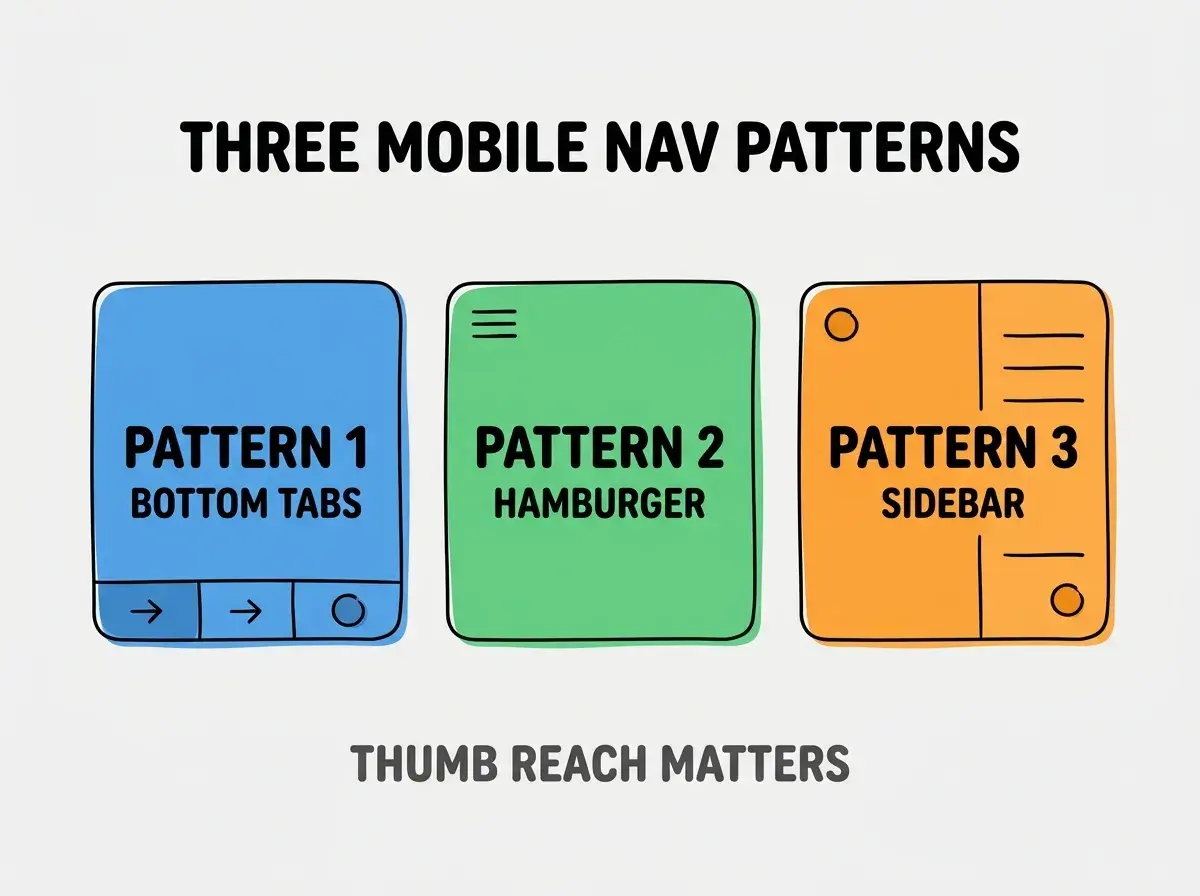
Pattern 3, slide out sidebar. Sidebar visible on desktop, slides out on mobile. Hybrid pattern for apps that work across screen sizes.
When Each Pattern Fits
Three scenarios match the three patterns.
Scenario 1, app like experience with 3-5 main sections. Bottom tabs win; instant access to primary destinations is core to app feel.
Browse more build articles
Read more buildScenario 2, content site with many sections. Hamburger wins; content needs space, navigation needed less frequently.
Scenario 3, hybrid web app working desktop and mobile. Slide out sidebar wins; same code adapts across screen sizes.
The Prompts That Build Each Pattern
Three prompts implement the three patterns.
Prompt 1, build bottom tabs with React Router. "Create bottom tab navigation with 4 tabs (Home, Search, Profile, Settings). Each tab has icon and label. Active tab highlighted with brand color. Use shadcn tabs or custom implementation."
Prompt 2, build hamburger menu. "Create hamburger icon button in top right that opens slide out menu containing all navigation. Menu slides from right with overlay behind. Close on overlay click or X button."
Prompt 3, build adaptive sidebar. "Sidebar always visible on desktop (md breakpoint and up). On mobile, sidebar hidden by default; hamburger button reveals it. Use shadcn Sheet component for mobile slide out."
What Makes Mobile Navigation Sustainable
Three patterns separate sustainable mobile navigation from accidental implementation.
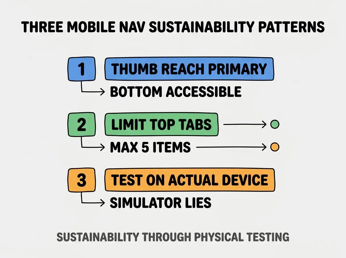
Pattern 1, thumb reach as primary criterion. Bottom and middle of screen reach easier than top; place primary actions in reachable zones.
Pattern 2, limit top tabs to 5 maximum. More than 5 tabs becomes unreadable; secondary navigation moves to hamburger.
Pattern 3, test on actual devices. Simulators miss thumb reach reality; actual devices reveal true usability.
The combination produces sustainable mobile navigation. Without these patterns, navigation looks fine but fails in usage.
How To Combine Patterns Effectively
Three combination patterns produce production mobile navigation.
Pattern A, bottom tabs plus hamburger overflow. 4-5 primary tabs in bottom; hamburger holds rest. Common pattern for feature rich apps.
Pattern B, sidebar with bottom tab fallback. Desktop sidebar; mobile bottom tabs replace sidebar primary items. Different patterns per screen size.
Pattern C, hamburger with persistent search. Hamburger for navigation; search bar persistent for content sites. Two access modes.
Common Questions About Mobile Navigation
Mobile navigation raises questions worth addressing directly.
The first question is whether hamburger menus are dead. No; hamburger has appropriate uses for content sites. Hamburger is wrong default for app like experiences.
The second question is whether to support gestures. Yes for swipe navigation between tabs; no for hidden gestures users cannot discover.
The third question is whether to use floating action button alongside tabs. Sometimes; FAB for single primary action makes sense in some apps. Avoid for navigation purposes.
The fourth question is how to handle landscape orientation. Bottom tabs work in landscape; sidebar may need adjustment for landscape mobile.
How Navigation Pattern Affects Engagement
Navigation pattern affects engagement in compounding ways. Engagement effects compound across user lifetime.
The first compounding effect is feature discovery. Visible navigation surfaces features; hidden navigation hides them.
The second compounding effect is task completion speed. Faster navigation enables faster task completion; speed compounds across daily usage.
The third compounding effect is daily return rate. Easy navigation produces daily returns; hard navigation produces abandonment.
The combination produces engagement shaped by navigation choice. Without thoughtful choice, navigation accidentally limits engagement.
How To Test Mobile Navigation
Three test patterns validate mobile navigation.
Pattern A, one handed usability test. Use app one handed on actual phone; thumb reach reality reveals issues.
Pattern B, task completion test. Time users completing tasks; navigation issues show as time delays.
Pattern C, accessibility audit on mobile. axe and Lighthouse work on mobile; mobile specific accessibility needs verification.
The combination produces validated mobile navigation. Without testing, navigation may work for designer but fail for users.
The most damaging mobile navigation mistake is using hamburger menu for app like experiences. Hamburger hides navigation; hidden navigation gets used 50 percent less than visible navigation. The fix is to use bottom tabs for app primary navigation; reserve hamburger for content sites or secondary navigation. Apps using bottom tabs see higher engagement; apps using hamburger as primary navigation lose engagement to visibility issues.
The other mistake is using more than 5 bottom tabs. 5 tabs is upper limit; more tabs become unreadable.
A third mistake is missing the safe area handling. iPhone bottom safe area requires padding; skipped padding produces buttons under home indicator.
A fourth mistake is treating navigation as final after first build. Navigation needs iteration; user testing reveals improvements.
What This Means For You
Mobile navigation patterns determine mobile retention rates. The three patterns, scenario fit, and combination approaches produce navigation that compounds engagement across mobile users.
- If you're a designer: Default to bottom tabs for app experiences; default fits most cases.
- If you're a founder: Audit your mobile navigation against thumb reach reality; bad navigation hurts all metrics.
Browse more build articles
Read more build