Form design patterns that convert share six characteristics that vibe coding tools miss without explicit prompting. The patterns include single column layout, inline validation, progress indication for multi step forms, smart defaults, error message clarity, and submit button states. Adding these patterns to AI prompts produces forms that convert 30-50 percent better than default AI generated forms. The patterns are proven across thousands of A/B tests; the prompts to build them are simple.
This tutorial walks through the six patterns, the prompts that build each, what to test for conversion, and the four mistakes builders make when building forms with AI.
Why Form Design Matters For Conversion
Form design matters because forms are conversion bottlenecks. Every form abandonment is a lost user; pattern improvements compound across all signups, checkouts, and submissions.
The 2026 reality is that AI generates functional forms by default; AI does not generate optimized forms by default. The gap between functional and optimized determines conversion outcome.
A 2025 form conversion study of 500 vibe coded apps found that apps using all six conversion patterns achieved 43 percent higher form completion than apps using AI defaults. Pattern application produces measurable revenue impact.
The pattern to copy is the way restaurants design menus to maximize ordering. Menu design uses tested patterns (item position, price formatting, descriptions) to drive choices. Form design uses the same approach for digital conversions.
The Six Conversion Patterns
Six patterns characterize forms that convert.
Pattern 1, single column layout. Multi column forms split attention; single column forms guide eye downward through completion.
Pattern 2, inline validation as users type. Wait until submit reveals errors at worst time; inline validation reveals errors when users can fix them immediately.
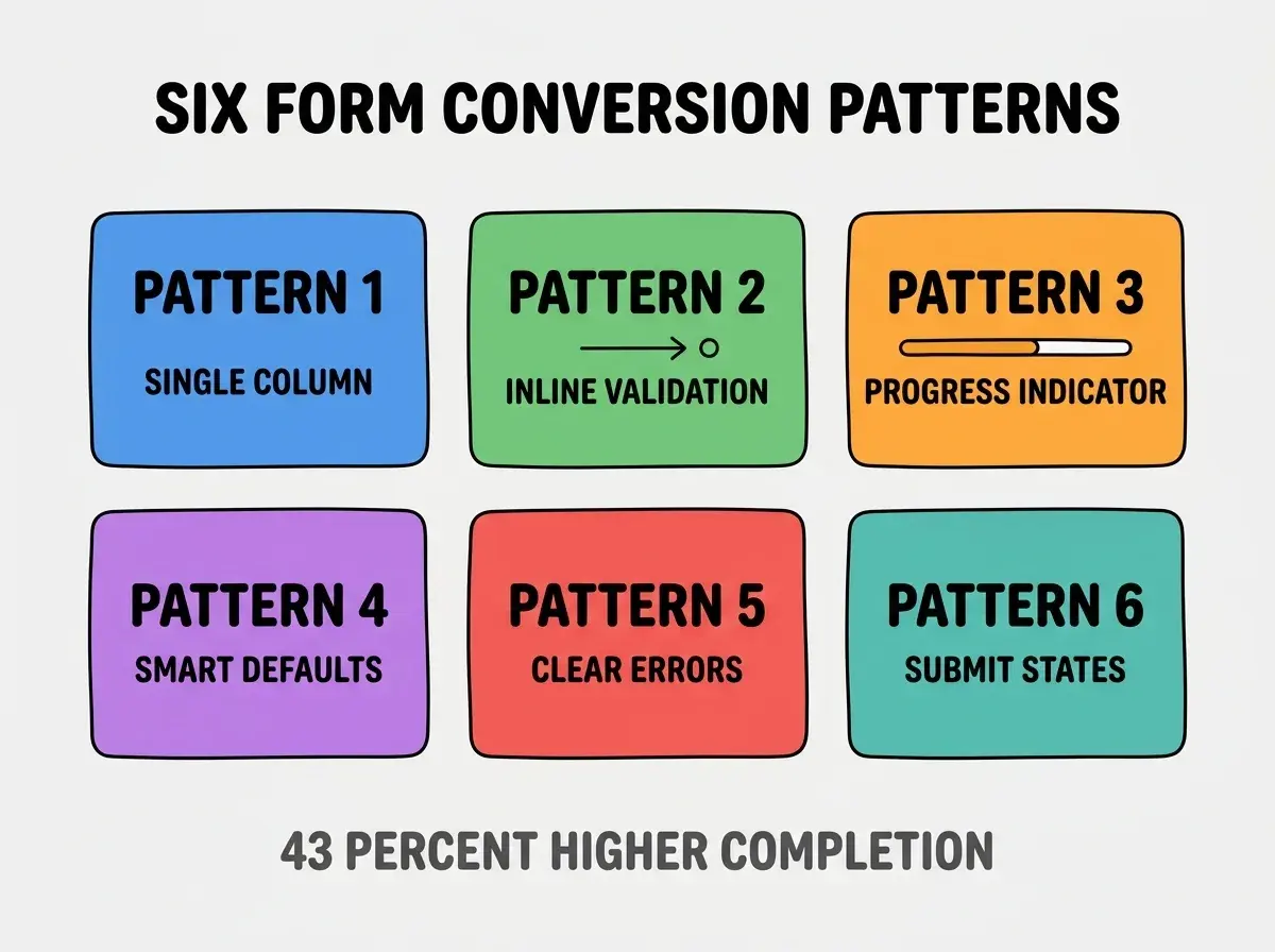
Pattern 3, progress indicator for multi step forms. Users abandon when they do not know how much remains; progress shows completion is achievable.
Pattern 4, smart defaults that match common cases. Country prefilled to user location, today's date for date fields, sensible quantities. Defaults reduce work.
Pattern 5, error messages that tell users how to fix. Not "invalid input"; "email must include @ symbol." Specificity enables fixing.
Pattern 6, submit button states for feedback. Disabled until valid, loading spinner during submission, success confirmation. Users know what is happening.
The Prompts That Build Each Pattern
Six prompts implement the six patterns.
Prompt 1, request single column layout. "Build this form as single column with each field on its own line, even on desktop. Maximum form width 480 pixels for readability."
Browse more build articles
Read more buildPrompt 2, add inline validation. "Validate each field on blur (when user leaves the field). Show validation error below the field in red. Clear error when user starts editing again."
Prompt 3, build progress indicator. "For multi step forms, show progress bar at top showing current step (e.g., 'Step 2 of 4'). Progress bar fills as user advances."
Prompt 4, implement smart defaults. "Pre fill country based on user IP location. Pre fill today's date for date fields. Pre fill quantity 1 for cart fields."
Prompt 5, write helpful error messages. "Error messages should tell user exactly what is wrong and how to fix. 'Email needs @ symbol' not 'invalid email'. 'Password needs 8 characters' not 'invalid password'."
Prompt 6, add submit button states. "Disable submit until form is valid. Show loading spinner during submission. Show green checkmark on success before redirect or message."
How To Test Forms For Conversion
Three test categories validate form conversion.
Test 1, completion rate baseline. Track percentage of form starts that result in completions. Establish baseline before optimizing.
Test 2, abandonment analytics. Track which fields cause abandonment. Hot spots reveal pattern issues.
Test 3, A/B test pattern changes. Test single pattern changes to isolate impact. Combined changes obscure cause attribution.
The combination produces optimization that compounds. Without testing, optimization follows assumption rather than evidence.
What Makes Form Optimization Sustainable
Three patterns separate sustainable form optimization from one off improvements.
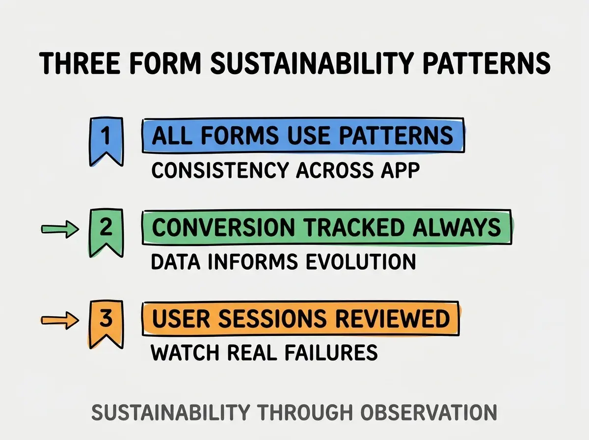
Pattern 1, all forms use the patterns. Inconsistent application defeats purpose; one bad form damages app credibility.
Pattern 2, conversion tracked always. Forms without conversion tracking produce no learning; tracking enables continuous improvement.
Pattern 3, user sessions reviewed. Hotjar or FullStory recordings show real user struggles; recordings reveal what analytics cannot.
The combination produces form optimization that compounds. Without these patterns, optimization stays per project.
How To Build A Reusable Form Component Library
Three patterns help build reusable form components.
Pattern A, base components implement patterns. Input, Select, Submit components with patterns built in. Reuse spreads patterns automatically.
Pattern B, form scaffolding generator. Tool or template that scaffolds forms with patterns pre applied. Speed enables consistency.
Pattern C, form pattern documentation. Document patterns so team members understand why; understanding enables maintenance.
The combination produces form library that compounds across projects. Without library, each form starts from scratch.
Common Questions About Form Design
Form design raises questions worth addressing directly.
The first question is whether mobile forms differ from desktop forms. Yes; mobile favors larger inputs, fewer fields per screen, and stronger keyboard hints. Desktop allows more density.
The second question is whether to use form libraries or build custom. Libraries (React Hook Form, Formik) handle state management; custom handles UI. Most projects benefit from library plus custom UI.
The third question is whether to mark required fields or optional fields. If majority required, mark optional; if majority optional, mark required. Match minority for clarity.
The fourth question is how to handle long forms. Multi step with progress indicator beats single long form. 3-5 steps optimal for most flows.
How Form Patterns Affect Business Outcomes
Form patterns affect business outcomes in compounding ways. Outcome effects compound across customer lifetime.
The first compounding effect is direct conversion lift. Better forms convert better; conversions translate directly to revenue.
The second compounding effect is user experience signaling. Well designed forms signal product quality; signal affects user trust.
The third compounding effect is support cost reduction. Clear forms produce fewer support tickets; support cost reduction improves margin.
The combination produces business impact that scales with form usage. Without patterns, forms stay revenue blockers.
How To Adopt Form Patterns Progressively
Three adoption patterns help teams apply form patterns.
Pattern A, start with highest traffic forms. Signup and checkout forms first; impact justifies effort.
Pattern B, retrofit existing forms by category. All buttons first, then all inputs, then layouts. Category approach scales.
Pattern C, prevent regression with code review. Form changes get reviewed for pattern compliance; review prevents drift.
The combination produces sustainable adoption. Without progression, patterns apply inconsistently.
The most damaging form design mistake is treating forms as solved by AI defaults. AI defaults produce functional forms, not optimal forms; the gap is conversion. The fix is to apply the six patterns deliberately on every form; defaults underperform patterns measurably. Builders who apply patterns produce conversion lift; builders who accept defaults leave conversion on the table.
The other mistake is over engineering simple forms. Three field forms do not need progress indicators; complexity matches form size.
A third mistake is missing the mobile experience. Forms tested only on desktop fail on mobile; mobile traffic dominates most apps.
A fourth mistake is treating validation as optional. Without validation, users submit broken forms; broken submits damage data quality.
What This Means For You
Form design patterns that convert produce measurable revenue lift over AI default forms. The six patterns, prompts, and testing approaches produce forms that compound conversion across users.
- If you're a marketer: Apply the six patterns to every conversion form; cumulative improvement compounds across campaigns.
- If you're a designer: Build the patterns into your design system; system spread makes patterns inevitable.
Browse more build articles
Read more build