A designer building a component showcase site documents design system components in a single accessible location. Four showcase patterns matter most: live component examples that demonstrate behavior, code snippets that engineers can copy, prop documentation that explains variants, and usage guidelines that prevent misuse. The build takes a weekend with vibe coding tools and produces a showcase that engineering teams actually reference rather than ignore.
This tutorial walks through the four showcase patterns, the prompts that build each, what makes showcases used vs ignored, and the four mistakes designers make when building showcases.
Why Component Showcases Matter For Design Teams
Component showcases matter because design systems without showcases get inconsistent implementation. Engineers cannot remember every detail; showcases provide reference that prevents drift.
The 2026 reality is that vibe coding tools enable designers to build their own showcases. Build capability removes engineering bottleneck; bottleneck removal enables design system maturity.
A 2025 design system study of 200 organizations found that organizations with active component showcases achieved 67 percent higher design consistency in production than organizations without showcases. Showcase availability measurably affects implementation quality.
The pattern to copy is the way museums display artifacts with context. Artifacts alone communicate less than artifacts with explanation, examples, and usage history. Component showcases work the same way; components alone communicate less than components with context.
The Four Showcase Patterns
Four patterns form complete component showcases.
Pattern 1, live component examples. Working components rendered on page; users see actual behavior, not screenshots.
Pattern 2, code snippets engineers can copy. Code that matches the live example; copy paste enables implementation.
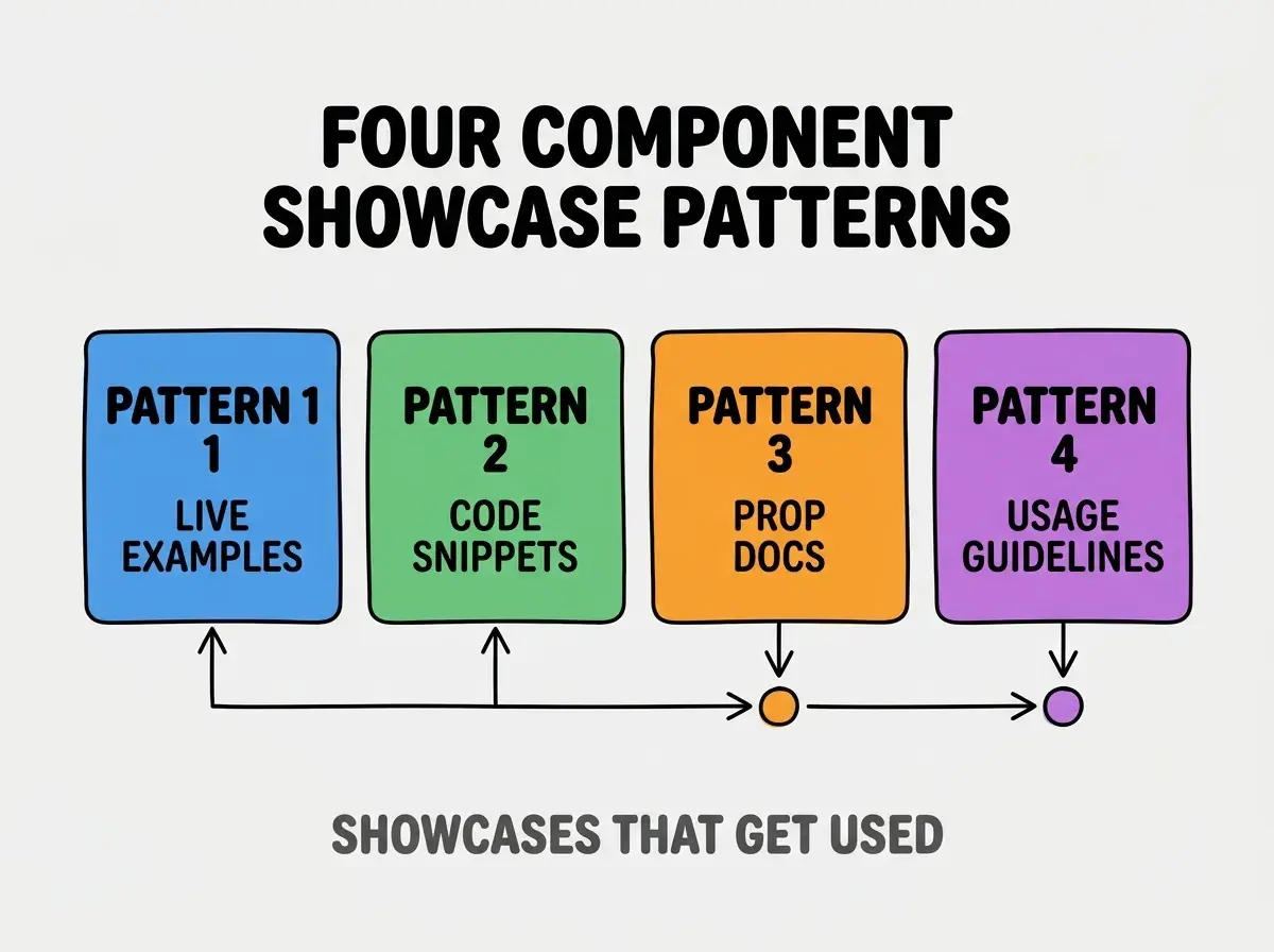
Pattern 3, prop documentation explaining variants. What each prop does, what values it accepts, what it changes.
Pattern 4, usage guidelines preventing misuse. When to use this component, when not to, common pitfalls.
The Prompts That Build Each Pattern
Four prompts produce each showcase pattern.
Prompt 1, build live component example. "Render Button component with all variants (primary, secondary, ghost) and all sizes (sm, md, lg) in a grid. Each example clickable to see hover and active states."
Browse more build articles
Read more buildPrompt 2, add copyable code snippets. "Below each component example, show code snippet that produces it. Add copy button. Use syntax highlighting with shiki or similar."
Prompt 3, build prop documentation table. "Add table below examples listing all props: name, type, default, description. Auto generate from TypeScript types if possible."
Prompt 4, write usage guidelines. "Add 'When to use' and 'When not to use' sections. Include common pitfalls section with example mistakes and corrections."
What Makes Showcases Get Used
Three patterns separate showcases that get used from showcases that get ignored.
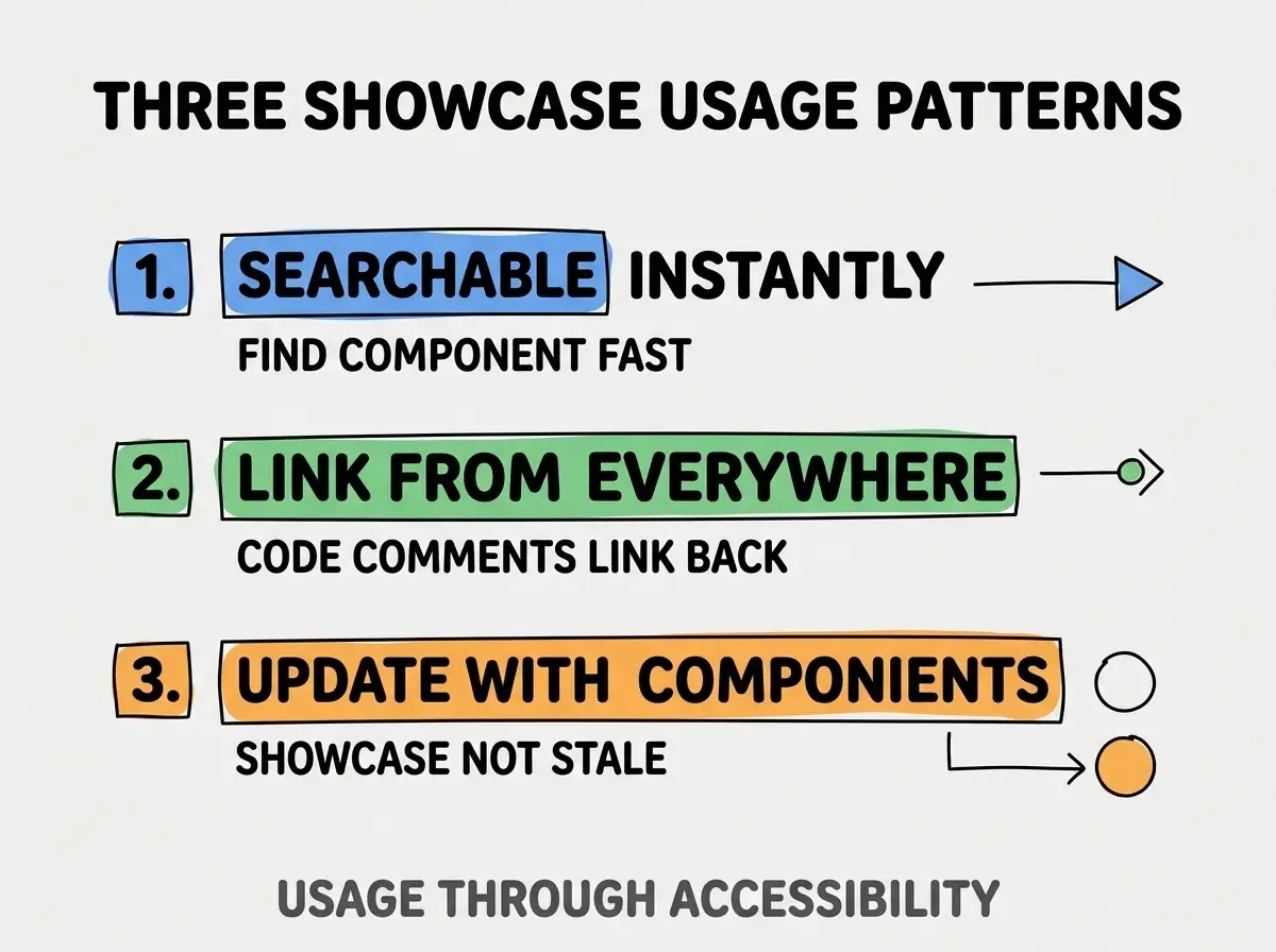
Pattern 1, searchable instantly. Search bar that finds components by name; finding fast enables using.
Pattern 2, linked from everywhere. Code comments reference showcase URLs; engineers find showcase from code.
Pattern 3, updated with components. Showcase changes when components change; without updates, showcase becomes wrong.
The combination produces showcases that get used. Without these patterns, showcases become beautiful artifacts that gather dust.
How To Build Showcase Without Engineering Bottleneck
Three patterns enable designer driven showcase building.
Pattern A, use Storybook or similar showcase tool. Storybook handles many patterns automatically; tool reduces work.
Pattern B, vibe coding tools build custom showcase quickly. Custom showcase tailored to your needs; AI handles complexity.
Pattern C, deploy to Vercel or Netlify free tier. Deployment infrastructure free; designers can deploy without engineering help.
Common Questions About Component Showcases
Component showcases raise questions worth addressing directly.
The first question is whether to use Storybook or build custom. Storybook has steep learning curve but mature; custom builds faster with vibe coding but lacks ecosystem. Match to needs.
The second question is whether to include design tokens. Yes; tokens are part of design system. Showcase covers all design system pieces.
The third question is whether to require engineering review. Designer driven showcase needs engineer accuracy review; collaboration improves quality.
The fourth question is whether to make showcase public. Internal showcases easier; public showcases serve recruiting and brand. Decide per organization.
How Showcases Affect Design System Adoption
Component showcases affect design system adoption in compounding ways. Adoption effects compound across teams and time.
The first compounding effect is implementation consistency. Engineers reference showcase; reference produces consistent implementation.
The second compounding effect is design vocabulary spread. Showcase language becomes team language; vocabulary speeds communication.
The third compounding effect is new contributor onboarding. New engineers learn design system from showcase; learning speeds productivity.
The combination produces design system adoption that compounds. Without showcases, adoption stays low.
How To Maintain Showcase Quality
Three maintenance patterns keep showcases useful.
Pattern A, update when components change. Component change triggers showcase update; without update, showcase becomes wrong.
Pattern B, audit usage analytics quarterly. Track which components viewed; rarely viewed may need promotion or removal.
Pattern C, gather engineer feedback periodically. Engineers know what is missing; feedback informs additions.
The combination produces sustainable showcase quality. Without maintenance, showcases decay.
The most damaging showcase mistake is building showcase without engineer collaboration. Designer built showcase that engineers ignore wastes design effort; collaboration produces showcase engineers use. The fix is to involve engineers from start; collaboration produces shared ownership. Showcases built collaboratively get used; showcases built solo by designers often go unused.
The other mistake is over decorating showcase pages. Showcase serves engineers; serving engineers requires functional design over decorative design.
A third mistake is missing search. Showcases without search frustrate engineers; search makes showcase usable.
A fourth mistake is treating showcase as one time project. Showcases need ongoing maintenance; without maintenance, showcase becomes wrong.
What This Means For You
Designer built component showcases enable design system adoption that engineering driven showcases often miss. The four patterns, prompts, and maintenance approaches produce showcases that improve design implementation across organizations.
- If you're a designer: Build a basic showcase this weekend; designer ownership often produces better showcases than engineering ownership.
Browse more build articles
Read more build