To build a style guide generator for designers in a weekend, structure the guide around four sections (foundations, components, patterns, content), pull from the same source as production code (component files, design tokens, content guidelines) so the guide stays current automatically, render component examples live rather than as screenshots, and add usage guidelines that explain when to use each component. The tool ships in two days and produces a style guide that beats Storybook for teams that want a designer-first interface.
This piece walks through the four sections, the auto-refresh architecture, the live preview patterns, and the four mistakes that turn style guides into archived wikis.
Why Style Guides Go Stale
Most design teams maintain style guides as separate documents (Figma files, wiki pages, dedicated sites) that drift from production code. The reason is that updating the guide requires manual work whenever components change, and the maintenance cost is high enough that the guide eventually goes stale.
The 2026 opportunity is to build a style guide that pulls live from production sources. Components render from the actual component code; tokens display from the actual token files; usage guidelines live next to the components. The PM does not maintain the guide; the guide reflects the current state automatically.
A 2025 Storybook survey of 1,200 design and engineering teams found that 71 percent reported their style guide was "more than 6 months out of date." Of teams that had built or adopted auto-generated style guides, only 18 percent reported the same. The maintenance burden determines whether style guides stay current, and automation is the only sustainable answer for most teams.
The pattern to copy is the way modern API documentation works. Documentation generators (Stoplight, Redocly) read OpenAPI specs and render docs automatically. The docs are always current because they ARE the spec, just rendered for humans. Style guides need the same shift: render from the source code, not from manually-maintained docs.
The Four Sections That Matter
Style guides serve four different purposes. Structuring around the four sections keeps the guide useful for each.
Section 1, foundations. Tokens and primitives: colors, typography, spacing, motion. The lowest-level building blocks. Pulled from token JSON.
Section 2, components. UI components with their props, variants, and states. Buttons, inputs, cards, modals. Rendered live from the actual component code.
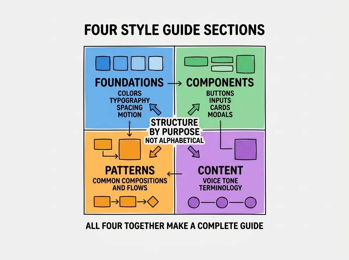
Section 3, patterns. Common compositions and flows. Sign-up patterns, dashboard layouts, empty states. Higher-level than components.
Section 4, content. Voice, tone, terminology, microcopy guidelines. Often missing from style guides but critical for product consistency.
The Auto-Refresh Architecture
The auto-refresh is what keeps the guide current. Three pieces handle the integration.
Piece 1, source readers. Read tokens from JSON, components from your component directory, content guidelines from a markdown file. All sources are version-controlled.
Piece 2, renderers. Take the source data and render the appropriate UI: token swatches, live component previews, formatted content guidelines. Use MDX so you can mix prose with rendered components.
Browse more designer build guides
Read more build articlesPiece 3, build trigger. Rebuild the style guide whenever any source changes. CI/CD on git push works for most teams; webhook triggers work for token edits via UI.
How to Make Live Previews Work
Live previews are the difference between style guides designers reference and style guides they ignore. Three patterns make previews work.
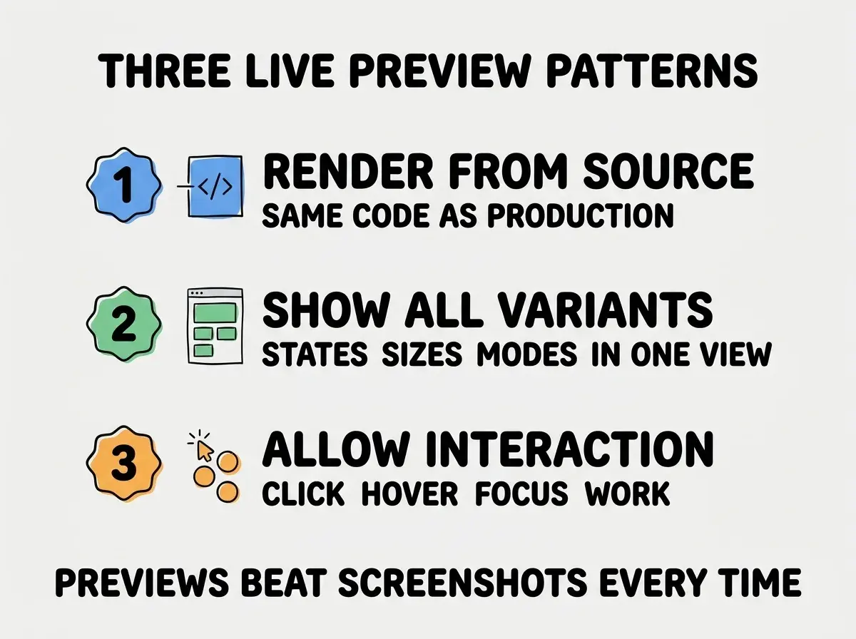
Pattern 1, render from source. Components in the style guide use the same code as production. No copying, no drift. If the component changes, the preview changes automatically.
Pattern 2, show all variants. A button preview shows primary, secondary, tertiary, ghost, with all states (default, hover, focus, disabled, loading) in one view. Designers see the complete picture without clicking around.
Pattern 3, allow interaction. Click, hover, focus actually work. Designers can interact with the preview to feel how the component behaves. Beats screenshots in every dimension.
Implementation Choices That Matter
The build is small, but a few choices significantly affect the result.
Choice 1, MDX vs custom format. MDX lets you mix prose with components. The flexibility is worth the small additional complexity over a custom format.
Choice 2, Storybook or custom. Storybook is powerful but designer-unfriendly. A custom guide built specifically for your team is often more useful, especially if you optimize for designer workflows over engineer workflows.
Choice 3, hosted vs in-app. Hosting the style guide as a separate site (style-guide.yourcompany.com) keeps it visible and easy to share. Embedding in the main app risks burying it.
Choice 4, search. A guide with 100+ components needs search. Algolia DocSearch (free for open-source) or local search libraries (FlexSearch) work well.
Choice 5, version pinning. Show which version of the design system the guide reflects. Designers can compare versions when components change. Helps with adoption and migration.
The combination of these choices produces a style guide that designers actually use. The investment is small compared to the cumulative value of consistent design across the product.
Component Documentation That Helps
Beyond the live preview, written documentation for each component significantly affects whether the guide gets used. Three documentation patterns work well.
Pattern 1, when to use vs when not to use. Most component docs explain how to use a component. Better docs explain when to use it AND when to use a different component instead. The negative guidance prevents common misuse.
Pattern 2, accessibility notes. Each component should document its accessibility behavior: keyboard support, screen reader labels, focus management. Designers learn the constraints; engineers verify the implementation.
Pattern 3, related components. Link to similar components that might be alternatives. A button entry links to icon button, link, and toggle. The cross-references help designers pick the right primitive.
The documentation that matters most is the kind that prevents misuse. A perfect API reference for a component used wrong produces worse results than a basic reference for a component used right. Frontload the guidance about appropriate use; the API docs can be terse.
The most damaging style guide mistake is treating it as a one-time launch artifact rather than as a living tool. Teams launch a beautiful style guide, announce it, and then never update it. Within months it is wrong about half the components, and the team stops trusting it. The fix is to put the style guide on the same deployment pipeline as the product, so every component change automatically updates the guide. Removing the maintenance cost is the only way to keep the guide accurate at scale.
The other mistake is over-investing in visual polish. A style guide that looks like a designed marketing site is impressive on launch and ignored afterward because updating it requires design effort. A clean, functional guide that any team member can update gets used; a polished design becomes archive material. Functional beats impressive every time for internal tools, and the discipline of resisting unnecessary polish is one of the marks of mature design teams who understand the difference between marketing-facing artifacts and team-facing tools.
What This Means For You
A custom style guide generator is one of the higher-leverage tools any design or engineering team can build in 2026. The investment is small, and the consistency value compounds across every product decision.
- If you're a founder: Build this if your team has a design system but no functional way to share it. The build cost is one weekend.
- If you're changing careers into design: Building a style guide generator teaches you the architecture of design systems from the inside. Highly transferable skill.
- If you're a student: Build a style guide for your portfolio. Demonstrates both design thinking and modern tooling.
Browse more designer build guides
Read more build articles