Building a component library for your project enables consistent UI through reusable components. Four library design components matter: component primitives (button, input, label as building blocks), composed components (forms, cards, dialogs combining primitives), documentation per component (props, usage, examples), and versioning for changes (track and communicate updates). Vibe coders without library duplicate UI; with library, consistency scales.
This tutorial walks through the four design components, the implementation patterns, what makes component libraries sustainable, and the four mistakes builders make on component libraries.
Why Component Libraries Matter
Component libraries matter because UI duplication produces inconsistency; libraries enforce consistency. Without library, AI generates new variants each time.
The 2026 reality is that component library tools (shadcn/ui, Storybook) make libraries accessible. Maturation removed barrier.
A 2025 product UX study of 500 vibe coded apps found that apps with component libraries achieved 56 percent better UI consistency than apps with ad hoc components, primarily through library enforcing reuse over duplication. Libraries measurably affect consistency.
The pattern to copy is the way print designers maintain font and color libraries for consistency. Standard fonts and colors; consistency guaranteed. Component libraries provide same for digital products.
The Four Design Components
Four components form complete library design.
Component 1, primitives. Button, input, label. Foundation.
Component 2, composed. Forms, cards, dialogs. Combinations.
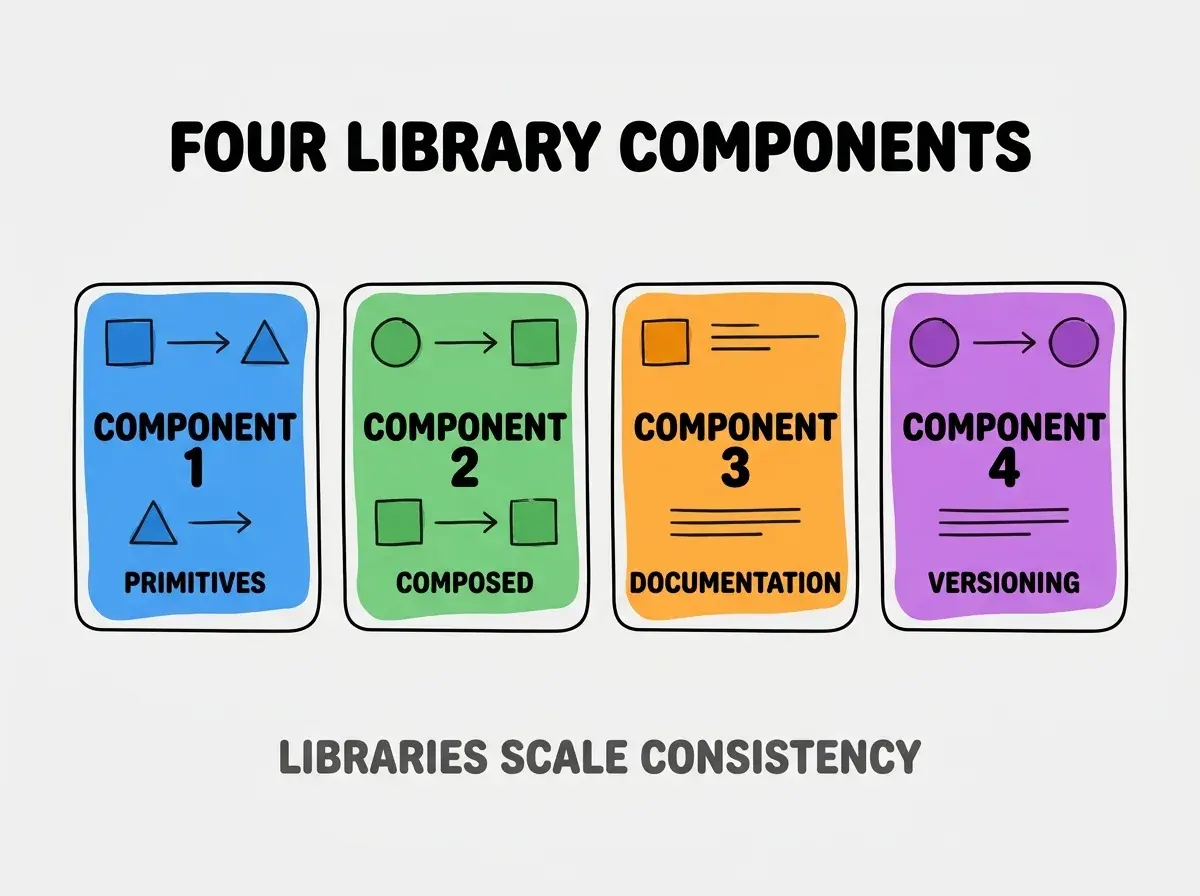
Component 3, documentation. Props, usage, examples. Knowledge.
Component 4, versioning. Track changes. Evolution.
How To Implement Each Component
Four implementation patterns address each component.
Implementation 1, shadcn/ui as starting primitives. Modern primitives; copy and extend.
Browse more build
Read more buildImplementation 2, compose primitives into project specific. Domain components from primitives.
Implementation 3, Storybook for documentation. Visual docs; standard.
Implementation 4, semver for library. SemVer enables consumer planning.
What Makes Component Libraries Sustainable
Three patterns separate sustainable libraries from abandoned.
Pattern 1, used by all features. Comprehensive use; without comprehensive, drift.
Pattern 2, evolves with product. Updates with product; static decays.
Pattern 3, contribution friction low. Easy contribution maintains.
What Makes Library Strategy Effective
Three patterns separate effective strategy from theatrical.
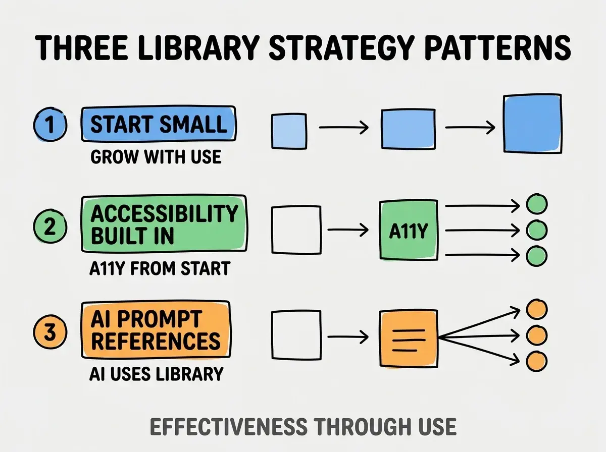
Pattern 1, start small. Grow with use; not all upfront.
Pattern 2, accessibility built in. A11y from start; retrofitting hard.
Pattern 3, AI prompt references. AI uses library; without reference, AI generates own.
The combination produces effective library strategy. Without these patterns, library becomes abandoned.
How To Set Up Library Structure
Three patterns help structure.
Pattern A, folder per component. Each component own folder; isolation.
Pattern B, index file exports. Clean import paths.
Pattern C, types per component. TypeScript types; consumer guidance.
Common Questions About Component Libraries
Component libraries raise questions worth addressing directly.
The first question is whether to publish to npm. For shared across projects yes; project specific no.
The second question is whether to use Radix or build primitives. Radix accessible; building learning.
The third question is how to handle component variants. Variant libraries (cva, tv); standard.
The fourth question is whether to test components. Yes; tests catch regressions.
How Component Libraries Affect Velocity
Libraries affect velocity in compounding ways. Velocity effects compound across features.
The first compounding effect is feature speed. Reuse faster than rebuild.
The second compounding effect is consistency. Library enforces consistency.
The third compounding effect is team capability. Library enables less senior to ship.
The combination produces velocity shaped by library quality. Without library, velocity bounded by reinvention.
How To Document Components Effectively
Three patterns help documentation.
Pattern A, examples per use case. Examples teach more than rules.
Pattern B, props table with descriptions. Props clear from table.
Pattern C, accessibility notes. A11y embedded in docs.
The combination produces effective documentation. Without examples, docs unused.
The most damaging component library mistake is over engineering before validating need. Library without users wastes time. The fix is to extract from real usage; library grows from patterns. Builders who extract create useful libraries; builders who design upfront create unused libraries.
The other mistake is missing the AI integration. AI must reference library.
A third mistake is over abstracting components. Some duplication acceptable.
A fourth mistake is treating library as one off. Libraries evolve; ongoing investment.
What This Means For You
Building a component library for your project enables consistency scaling and feature velocity. The four design components, implementation patterns, and sustainability approaches produce component libraries that compound product quality.
- If you're a senior dev: Library design fluency expected; learn patterns deeply.
- If you're a designer: Component library bridges design and code; investment justified.
- If you're changing careers: Component library skills marketable; specialty differentiates.
Browse more build
Read more build