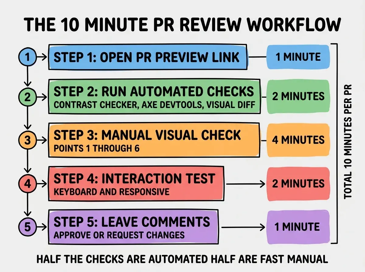
A design review checklist for AI-generated UI is the single most useful artifact a design team can have in 2026, because it converts the vague task of "review this PR" into a 10-minute repeatable workflow. The 12-point checklist below covers the issues AI-generated UI consistently introduces: token drift, spacing inconsistency, contrast failures, missing states, broken responsive behavior, accessibility gaps, and a few others. Following the checklist on every PR catches roughly 90 percent of the design issues that would otherwise reach production, and the time investment is small enough to scale.
This piece walks through each of the 12 points, explains why it matters, and includes the 10-minute workflow that turns the checklist into a habit. The checklist is intentionally generic so it works across any product, design system, or framework, but the core review discipline applies the same way regardless of stack.
Why a Checklist Beats Vibes
The default approach to design review in most teams is "look at the PR and say what feels off." This works when there is one designer reviewing one developer's work and they have shared context. It fails as soon as multiple developers are shipping AI-generated UI in parallel and the designer becomes a bottleneck.
A checklist solves the bottleneck by distributing the review across everyone who touches the PR. Developers can self-review against the checklist before requesting design review, designers can review faster because they know exactly what to look at, and product managers can sanity-check critical paths without needing the designer in the room. The output is the same or better quality with much less calendar friction.
A 2025 LeadDev survey of 200 design teams found that teams using a written design review checklist for AI-generated UI shipped 3.1x faster than teams without one, while showing measurably less design drift. The checklist itself averaged 8 to 15 items, and the most common version was almost identical across teams. The convention has converged because the AI failure modes are surprisingly consistent.
The pattern to copy is the way airline pilots use pre-flight checklists. The pilot has the experience to do the check from memory, but a written checklist catches the one item experience missed today because the pilot was tired or distracted. Design review is the same: the checklist catches the items your tired Friday-afternoon brain skipped.
The 12 Points
Each point below is small and verifiable. The full checklist takes 10 minutes per PR for a moderate UI change. Larger changes naturally take longer, but the same checklist applies.
1. Tokens used for every color. No hardcoded hex values, no off-token Tailwind classes. Every color comes from your design system tokens.
2. Spacing follows the scale. All padding, margin, and gap values use your design system spacing scale (typically 4px or 8px increments). No "looks about right" custom spacing.
3. Typography uses defined styles. Headings, body text, captions, and labels all use your defined typography styles. No custom font sizes or weights.
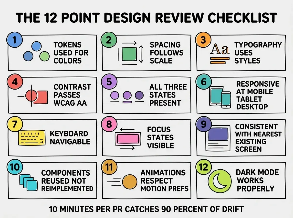
4. Contrast passes WCAG AA. Body text 4.5:1 against background, large text 3:1. Use a checker, do not eyeball.
Points 5 Through 8
The middle four points cover the issues that often slip past initial review because they require interaction, not just visual inspection.
5. All three states present. Empty state, loading state, error state. AI builds the happy path; the checklist confirms the unhappy paths exist too.
6. Responsive at mobile, tablet, desktop. The component works at 375px, 768px, and 1280px widths. AI often hardcodes desktop assumptions.
Browse more designer workflow guides
Read more tools articles7. Keyboard navigable. Tab order is logical, all interactive elements are reachable, no keyboard traps. AI often skips this entirely.
8. Focus states visible. Every focusable element has a visible focus ring that meets contrast requirements. The default Tailwind focus ring is usually fine but often missing.
Points 9 Through 12
The final four points cover system-level consistency issues that are hardest to catch in a single PR but easy when you know to look.
9. Consistent with nearest existing screen. If a similar screen already exists in the product, the new screen should match its conventions. AI often invents slightly different patterns each time.
10. Components reused, not reimplemented. If your design system has a Button component, the PR uses it instead of creating a new button. AI often reimplements rather than imports.
11. Animations respect motion preferences. If you have any animations, they respect prefers-reduced-motion. Users with vestibular disorders deserve a still version.
12. Dark mode works properly. If your product has dark mode, the new UI works in both themes without contrast or color issues.
The most common review mistake is checking only the screen the developer linked. Real review requires checking the screen plus at least one related screen (parent navigation, similar pages). AI changes often break adjacent flows because the model only saw the immediate context. A 30-second sanity check on the parent page catches a surprising number of regressions before they reach production.
The other mistake is treating the checklist as a one-time gate. Real value comes from applying it on every UI PR, even small ones. A "small" PR is where most drift sneaks in because nobody thinks it warrants a careful look. Apply the checklist consistently, and the team starts catching their own issues before requesting review.
A practical way to embed the checklist is to add it as a PR template. Every UI pull request opens with the 12 items as unchecked boxes, and the developer ticks them off before requesting review. This shifts the work from "designer reviews everything" to "developer self-reviews and designer spot-checks," which scales much better. The PR template itself takes about 5 minutes to set up and produces consistency across every contributor for the life of the repo.
A second practical move is to log the issues the checklist catches each week. After a month you have a leaderboard of the failure modes that show up most. Use that data to either tighten your design system constraints (so the AI cannot violate them) or update your codification (so the AI knows the right pattern). The checklist is a feedback loop into the design system, not just a quality gate.
What This Means For You
A written design review checklist is one of the highest-leverage process artifacts a design or engineering team can adopt in 2026. The cost is minimal, the discipline transfers across team members, and the quality gain is visible within weeks.
- If you're a founder: Adopt this checklist (or a customized version) for your team this week. The first PR review will surface 3 to 5 issues that would otherwise have shipped.
- If you're changing careers: Practicing AI-generated UI review using a checklist is a fast way to develop design judgment. The checklist is the scaffold; judgment grows on top of it.
- If you're a student: Use the checklist on your own portfolio projects. Showing reviewers you have a quality process is more impressive than just showing polished output.
Browse more designer workflow guides
Read more tools articles