Debugging mobile issues means tracking down bugs that never show up on your laptop but break everything the moment a real user opens your app on their phone. The fixes are usually small. The hard part is seeing the problem in the first place, because mobile environments behave differently in ways that catch every builder off guard.
If you have ever shipped something that looked perfect in your browser, only to get a screenshot from someone on iPhone showing a completely broken layout, you already know what this feels like. The good news is that browsers give you real tools to debug mobile without constantly reaching for a phone. This tutorial walks through the setup, the most common bugs, and how to describe them to AI so you get fixes that actually stick.
Why Mobile Bugs Are Different
Desktop browsers are forgiving. They have consistent rendering engines, reliable hover states, and plenty of screen real estate. Mobile browsers are not forgiving.
iOS Safari runs on WebKit, not Blink. It handles certain CSS properties differently than Chrome on Android. The URL bar shrinks and expands as you scroll, which means the viewport height is not constant. 100vh on iOS Safari includes the space behind that collapsing URL bar, so elements using height: 100vh overflow the visible area without a scrollbar to warn you. It is one of the most common sources of mobile-only layout breakage.
Touch events behave differently too. On desktop you have hover states and mouse events. On mobile, there is no hover. That dropdown that appears on mouseenter simply never triggers on a phone. The 300ms tap delay in older mobile browsers can make buttons feel unresponsive. And touch targets smaller than 44x44px fail to register reliably, meaning buttons that feel fine with a mouse cursor are genuinely hard to tap on a phone.
Viewport meta tags matter more than most builders realize. Without <meta name="viewport" content="width=device-width, initial-scale=1"> in your HTML head, mobile browsers zoom out to show the desktop version of your site instead of the mobile layout. AI tools usually include this, but it occasionally gets dropped during refactors.
Finally, network conditions are different. A feature that loads fine on your Wi-Fi office connection can time out on a 3G connection. API calls that feel instant on desktop produce loading states that users on mobile actually see.
The Remote Debugging Setup
The fastest way to debug mobile issues is connecting your actual device to your laptop and using desktop DevTools to inspect what is happening on the phone's screen in real time.
For Android (Chrome): Connect your phone via USB. On the phone, enable Developer Options (go to Settings, About Phone, tap Build Number seven times). Inside Developer Options, enable USB Debugging. On your laptop, open chrome://inspect in Chrome. Your device should appear under the Remote Targets section. Hit Inspect and a full DevTools panel opens showing the phone's browser, with the Elements panel, Console, Network tab, and everything you are used to.
For iOS (Safari): On your iPhone, go to Settings, Safari, Advanced, and enable Web Inspector. Connect to your Mac via USB. On your Mac, open Safari, go to Develop in the menu bar (enable it in Safari Preferences if it is not showing), and select your connected device. A separate Web Inspector window opens showing the page running on your phone. This is genuinely the best way to catch iOS Safari-specific rendering bugs.
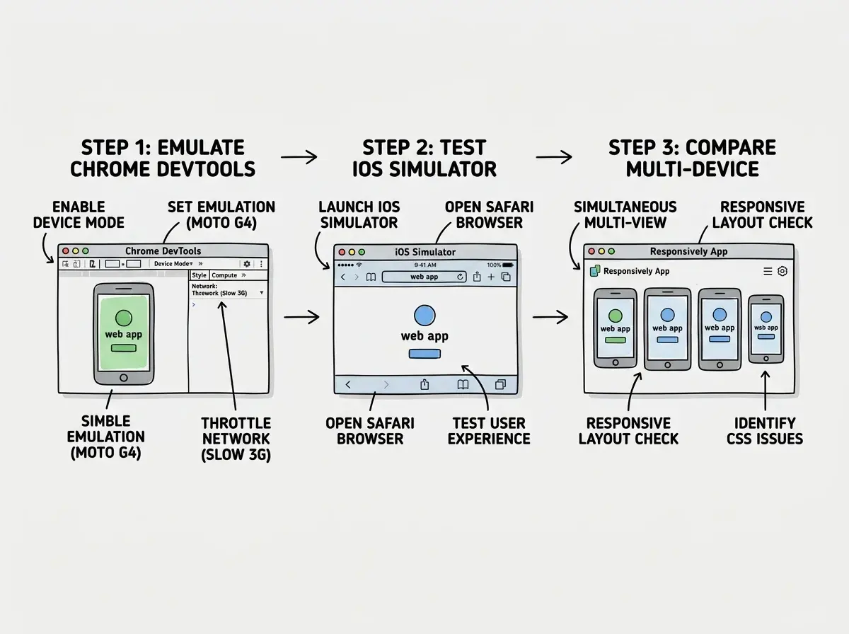
If you do not have a physical device handy, Chrome DevTools has a built-in Device Mode (the phone icon in the top left of DevTools, or press Ctrl+Shift+M). It simulates mobile viewport sizes and can throttle network speed. It is not perfect, because it is still running on Chrome's desktop engine, but it catches maybe 70% of mobile layout issues without needing a phone at all.
BrowserStack is worth knowing about for the remaining 30%. It streams real device sessions in your browser, including older iOS versions that Safari Simulator does not cover. The free tier is limited but enough for occasional spot checks before a big launch.

Once you have remote debugging running, you can inspect elements, read Console errors, and trace network requests exactly as you would on desktop. The only difference is that you are now seeing what your users on that device actually see, not what Chrome on your laptop renders.
Tutorials that walk you through the exact fixes for the most common mobile bugs.
Browse tutorialsCommon Mobile-Only Bugs and Fixes
Here are the bugs you will hit most often, with the exact symptoms and fixes.
The 100vh overflow bug. Symptom: a full-screen hero section or modal extends below the visible screen on iOS, forcing users to scroll when they should not need to. The fix is replacing height: 100vh with height: 100dvh (dynamic viewport height), which updates as the browser chrome shows and hides. For older iOS versions that do not support dvh, use min-height: -webkit-fill-available as a fallback.
Touch targets that do not register. Symptom: buttons that work fine on desktop produce nothing when tapped on mobile. Open Chrome DevTools Device Mode, use the touch cursor mode, and try tapping the button. If it misses, open the Elements panel and check the computed width and height of the button element. Anything under 40px in either dimension will have reliability issues. Add min-height: 44px; min-width: 44px; padding: 12px 16px to bring it into a reliably tappable range.
Hover-dependent features that silently break. Symptom: a dropdown, tooltip, or button state that requires hover never appears on mobile. Grep your CSS for :hover selectors that show or hide critical UI. Each one needs a touch alternative. Dropdown navigation usually needs a click handler instead. Tooltips need a tap-to-show behavior. Buttons should never rely on hover to look interactive.
Input zoom on iOS. Symptom: the entire page zooms in when a user taps a text input, and does not zoom back out when they are done. This happens when your font-size on input elements is below 16px. iOS Safari automatically zooms the viewport to make small inputs readable. The fix is adding font-size: 16px to all input and select elements in your mobile styles.
Sticky elements behind the address bar. Symptom: a sticky header or bottom navigation bar appears partially hidden behind the browser chrome on certain devices. The position is calculated against the wrong reference. Use position: sticky; top: env(safe-area-inset-top) for top elements and bottom: env(safe-area-inset-bottom) for bottom bars. This uses CSS environment variables that account for notches, home indicators, and collapsing browser chrome.
Flexbox gap not working in older WebKit. Symptom: gaps between flex children render correctly on Android but collapse to zero on iOS 14 and below. The gap property inside flexbox was not supported in Safari until version 14.5. If you need to support older devices, replace gap: 16px with margin-right: 16px on flex children (minus the last one), or use padding on the parent with negative margins on the children.
Most mobile-only bugs come from three sources: viewport height calculation differences in iOS Safari, touch events not having a hover equivalent, and input font sizes below 16px triggering automatic zoom. Before accepting AI-generated mobile styles as final, check each of these three things. They take two minutes to verify and prevent the most common "it looked fine on my laptop" reports.
Testing Without Physical Devices
You can catch the majority of mobile bugs without owning every device, using a combination of tools that are already in your browser.
Chrome DevTools Device Mode handles basic viewport simulation. Set the viewport to iPhone 14 dimensions (390x844), enable Touch events in the settings dropdown, and throttle the network to Slow 3G. Then walk through your app's critical flows: login, main action, checkout or signup, logout. Watch the Console tab while you do this. Many mobile errors appear there silently without breaking the layout visibly.
For iOS-specific rendering, the iOS Simulator built into Xcode (Mac only) is worth installing. It runs the actual WebKit rendering engine, so bugs that only appear in Safari show up correctly. Open Simulator, launch Safari, navigate to your local dev server via localhost. You can then attach Safari Web Inspector from your Mac's Develop menu for full debugging capabilities.
Responsively App is a free tool that shows multiple device sizes simultaneously in one window. It is useful for a quick visual scan before shipping but does not replace actual DevTools inspection.
When you find a bug, screenshot it or record the Console error. Then describe it precisely to your AI tool. Instead of "my button is not working on mobile," try: "On iOS Safari 17, the subscribe button has font-size: 14px on the input above it which triggers auto-zoom on tap. Change the input's font-size to 16px and verify no other inputs in the form have values below 16px."
Each tool in this stack has a different blind spot, which is why layering them matters. Device Mode catches viewport and layout issues. iOS Simulator catches Safari rendering quirks. BrowserStack fills in older OS versions you cannot easily simulate locally.
Debugging mobile issues only in Chrome DevTools Device Mode and shipping confident it works everywhere. Device Mode simulates viewport size and touch events but still runs Chrome's rendering engine. iOS Safari will still render certain CSS properties differently, handle the URL bar differently, and handle input events differently. Add at least one iOS Simulator check or a BrowserStack real-device session before shipping any mobile-critical feature. Ten minutes of real-device testing prevents most post-launch reports.
What This Means For You
Mobile debugging is not a specialized skill. It is the same inspect-identify-fix loop you already use for desktop, applied with awareness of a few platform-specific differences.
- If you are a founder shipping with AI tools: Your AI will generate code that looks correct on desktop and breaks in predictable ways on mobile. The bugs in this article (100vh, touch targets, input zoom) are the ones you will hit first. Run the three-check sequence (viewport height, hover dependencies, input font sizes) before every launch and you will catch them before your users do.
- If you are a designer moving into building: You already think about mobile layouts, which means you will notice when something looks off faster than most. The tools here (Chrome Device Mode, Safari Web Inspector, iOS Simulator) give you the visibility to confirm your instincts and describe the problem precisely enough for AI to fix it on the first try.
- If you are a student or career changer: Mobile bugs feel intimidating because they are invisible on your development machine. Once you have remote debugging set up and understand the three main sources of iOS Safari issues, they become routine. Build the habit of testing in Device Mode before every commit and you will rarely get surprised by mobile-only issues in production.
The biggest shift is moving from "it works on my laptop" to "it works where my users actually are." That usually means a phone, on a spotty connection, in a browser you did not test in. You do not need to own every device. Chrome DevTools, Safari Web Inspector, and the iOS Simulator together cover the vast majority of real-world scenarios. The rest is knowing which bugs to look for and how to describe them precisely enough for AI to fix them fast.
Practical tutorials for builders who want to spend less time stuck and more time shipping.
Browse tutorials