Every element on a web page is an invisible box. Your heading is a box. Your image is a box. That tiny button in the corner is a box. When your layout looks broken, it means one of those invisible boxes is the wrong size, sitting in the wrong place, or overlapping another box it should not be touching. Once you start seeing the web this way, debugging CSS layout problems stops being mysterious and starts being methodical.
If you are building with AI tools (and 92% of developers now use them daily), you have probably hit this moment. The AI generates a page that looks almost right, but something is off. A section bleeds past the screen edge. Two elements stack when they should sit side by side. A button hides behind an image. You stare at the code, change a random property, and hope for the best.
That approach wastes hours. This tutorial gives you a faster one. You will learn to see the invisible boxes with browser tools, understand the most common layout bugs, and describe visual problems to AI in a way that gets them fixed on the first try.
Seeing the Invisible Boxes With Inspect Element
Your browser has a free, built-in CSS debugger that most beginners never open. Right-click any element on your page and select "Inspect" (or "Inspect Element" in Safari). A panel will appear showing the HTML and CSS for whatever you clicked.
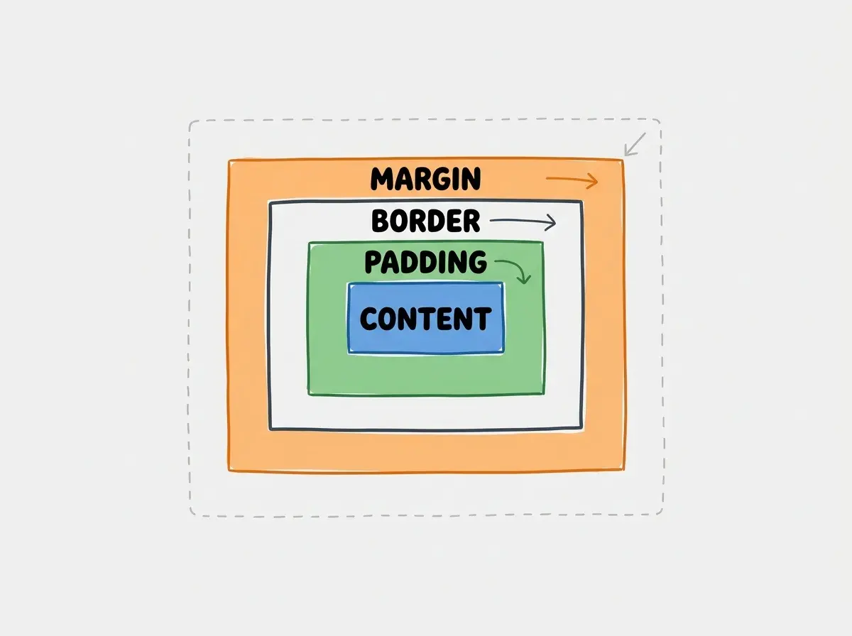
The most powerful part of this panel is the box model diagram. It shows you the exact dimensions of any element, broken into four layers. Content is the innermost layer, where your text or image actually lives. Padding is the breathing room between the content and the border. Border is the visible edge of the box. Margin is the invisible space pushing other boxes away.
Hover over any element in the inspector and your browser will highlight it on the page with colored overlays. Blue for content, green for padding, orange for margin. Suddenly those invisible boxes are not invisible anymore. You can see exactly where they start and stop.
Before changing any code, open the inspector and look at the boxes. Nine times out of ten, the problem becomes obvious the moment you can see it.
The Four Layout Problems You Will Hit Most Often
Once you can see the boxes, you need to know what to look for. Almost every CSS layout bug falls into one of four categories.
Overflow and unexpected scrollbars. An element is wider than its parent container, so it pushes past the edge of the screen and creates a horizontal scrollbar. This happens constantly with AI-generated layouts because the AI does not always account for padding when calculating widths. If a box is set to width: 100% but also has padding: 20px, the total width is actually wider than 100%. The fix is usually adding box-sizing: border-box to the element, which tells the browser to include padding inside the width calculation instead of adding it on top.
Z-index stacking gone wrong. You have a dropdown menu or a modal that should appear on top of other content, but it hides behind something else. The invisible boxes are overlapping, and the wrong one is winning. Z-index only works on elements with a position value other than static (the default). If your AI gives you z-index: 999 and it does nothing, check whether the element also has position: relative or position: absolute. Without that, the z-index property is completely ignored.
Flexbox alignment surprises. Flexbox is the most common layout system in modern CSS, and AI tools use it everywhere. But the alignment properties are confusing because they change meaning based on the flex direction. justify-content aligns items along the main axis (horizontal by default). align-items aligns along the cross axis (vertical by default). If you flip to flex-direction: column, those axes swap. Many AI-generated layouts look wrong because the tool used the right property on the wrong axis.
Padding versus margin confusion. Padding adds space inside a box (pushing the content inward). Margin adds space outside a box (pushing neighboring boxes away). If you want space between two cards, you need margin. If you want space between a card's edge and the text inside it, you need padding. AI tools frequently mix these up, and the result is layouts where spacing feels inconsistent or elements sit uncomfortably close to edges.
Before touching any CSS code, right-click the broken element and select Inspect. Look at the box model diagram. Check whether the content, padding, border, and margin are what you expect. The bug is almost always a box that is the wrong size or has unexpected spacing. Seeing it first saves you from guessing, and guessing is what turns a five-minute fix into an hour-long spiral.
Why AI-Generated CSS Breaks in Predictable Ways
AI coding tools are remarkably good at generating layouts that look correct in isolation. The problems appear when those generated sections interact with each other on a real page.
One common pattern is conflicting box-sizing rules. The AI generates a component with box-sizing: border-box, but your global styles use content-box. The boxes calculate their sizes differently, and the layout shifts in subtle ways.
Another frequent issue is hardcoded pixel values. An AI might set a sidebar to width: 300px because that looks right on a laptop. On a tablet, that sidebar eats up nearly half the viewport. On a phone, it pushes everything off the screen. The invisible box is a fixed size in a world where screens are not.
You will also see overuse of position: absolute. AI tools reach for absolute positioning when they want to place something in a specific spot. It works in the preview, but absolute-positioned elements are removed from the normal document flow. Other boxes do not know they exist. As content changes, those elements stay in their hardcoded spots while everything else shifts around them.
The fix for all three is the same. Do not accept AI-generated CSS as final. Run the page through your inspector, resize the window, and check whether the boxes hold together at every size.
Telling the AI "make it responsive" without specifying what responsive means for your layout. The AI will add generic media queries that might hide your sidebar or stack your columns in ways you did not want. Instead, be specific about what should happen at each size. Say "on screens narrower than 768px, stack the two columns vertically with the image on top and the text below" rather than just asking for responsiveness. The more precisely you describe the box arrangement, the better the result.
Describing Visual Bugs to AI So They Get Fixed
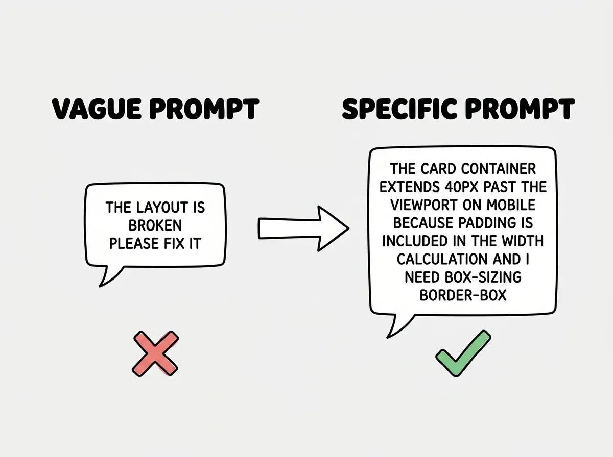
The way you describe a CSS problem to your AI tool determines whether you get a fix or a different kind of broken. Vague descriptions like "the layout is messed up" or "it does not look right" give the AI nothing to work with. Think in terms of the invisible boxes and describe exactly what is happening to them.
Here is a framework that works well. First, identify which box is misbehaving ("the card container in the pricing section"). Second, describe what it is doing ("it extends past the right edge of the screen on mobile"). Third, describe what it should be doing instead ("it should fit within the screen width with 16px of margin on each side"). Fourth, mention what you already checked ("I looked at the box model in the inspector and the card has padding of 40px but no max-width set").
Good prompt examples that get results on the first try:
"The three feature cards in the hero section are supposed to sit side by side, but the third wraps to a new line. Each card has min-width: 350px and the container is flex-wrap: wrap. Change the cards to flex: 1 1 300px so they shrink to fit."
"The nav dropdown appears behind the hero image. It has z-index: 10 but position: static. Add position: relative to the nav container and set z-index to 50."
"There is a horizontal scrollbar on the page. The testimonials section has a child with width: 100vw which does not account for the scrollbar. Change it to width: 100%."
Each description names the specific box, states what it is doing wrong, and provides the CSS values from the inspector. That is how you get one-shot fixes.
Learn the workflow that takes you from idea to working product.
Start buildingA Simple Debugging Checklist You Can Follow Every Time
When something looks wrong, run through this sequence before you start changing code or prompting your AI tool.
Step one, inspect the broken element. Right-click it, open the inspector, look at the box model. Note the dimensions, padding, and margin. Check whether box-sizing is border-box or content-box.
Step two, check the parent container. Many bugs come from the parent, not the child. If a card is not centering, the parent flex container might be missing justify-content: center.
Step three, resize your browser window. Drag it narrower and watch where things break. Most AI-generated layouts break somewhere between 600px and 900px wide.
Step four, check for conflicting styles. In the styles panel, look for crossed-out properties. A crossed-out property means another rule is overriding it.
Step five, describe what you found to the AI. Name the box, state what it is doing, state what it should do, and include the CSS values you found.
This takes two minutes. It replaces the twenty-minute cycle of guessing, prompting, and hoping.
Dig deeper
A few hand-picked sources if you want to go further.
What This Means For You
CSS layout debugging is one core skill. Learning to see the invisible boxes that make up every web page. Once you can see them, diagnosing problems becomes visual and intuitive instead of abstract and frustrating.
- If you are a founder building with AI tools: You can now unblock yourself when the AI generates a layout that is 90% right but has a glitch. Inspect the issue, identify the misbehaving box, and give your AI a precise prompt that fixes it in one pass. That saves real time on every iteration.
- If you are a designer moving into building: You already think visually, which is a huge advantage here. The box model maps directly to how you think about spacing and alignment in Figma. The inspector is your design tool for the browser. Use it to verify that the built version matches your intent, and describe any gaps using the terms from this tutorial.
The invisible boxes are always there. Now you know how to see them.
Explore step-by-step tutorials for founders and designers building with AI.
Browse tutorials