Data visualization with charts and graphs in vibe coded apps works best with Recharts or Tremor libraries combined with the right chart type for the data. The four chart types that cover most needs are line charts (trends over time), bar charts (comparisons), pie charts (composition), and number cards (single metrics). Most dashboards combine all four. AI tools build any chart type correctly when prompted with library and chart specifics.
This tutorial walks through the four chart types, the prompts that build each, what makes data visualization sustainable, and the four mistakes builders make with charts.
Why Data Visualization Matters For Vibe Coded Apps
Data visualization matters because dashboards without charts force users to interpret raw numbers. Charts compress understanding into visual patterns; patterns reveal what numbers hide.
The 2026 reality is that AI tools generate basic charts trivially; the differentiation is choosing the right chart type and configuring it well. Tool capability is no longer the bottleneck.
A 2025 dashboard usability study of 300 SaaS apps found that dashboards with appropriate chart types had 56 percent higher metric awareness than dashboards with raw numbers only. Visualization measurably affects whether users understand their data.
The pattern to copy is the way newspapers use different chart types for different stories. Stock prices use line charts because trends matter; market share uses pie charts because composition matters. Right chart for right purpose; same applies to dashboards.
The Four Chart Types That Matter Most
Four types cover most dashboard data visualization needs.
Type 1, line charts for trends over time. Show how a metric changes day by day, week by week. Essential for time series data.
Type 2, bar charts for comparisons. Compare values across categories. Vertical for time periods, horizontal for category names.

Type 3, pie charts for composition. Show parts of a whole. Use sparingly; humans read pie charts poorly.
Type 4, number cards for single metrics. Big number with label and trend indicator. Simple but powerful for KPI display.
The Prompts That Build Each Chart
Four prompts produce each chart type with Recharts.
Prompt 1, build line chart with Recharts. "Use Recharts LineChart with x axis as date and y axis as numeric. Add CartesianGrid, Tooltip, Legend. Use single line for one metric, multiple lines for comparison."
Browse more build articles
Read more buildPrompt 2, build bar chart with Recharts. "Use Recharts BarChart with categories on x axis and values on y axis. Add Tooltip. Use horizontal bars for category names, vertical for time periods."
Prompt 3, build pie chart with Recharts. "Use Recharts PieChart with data array of name and value. Limit to 5-7 segments; group smaller segments into 'Other' category for clarity."
Prompt 4, build number card. "Create card component with large number, smaller label, optional trend arrow showing percentage change vs previous period. Use Tailwind for styling."
What Makes Chart Selection Sustainable
Three patterns separate sustainable chart usage from chart confusion.
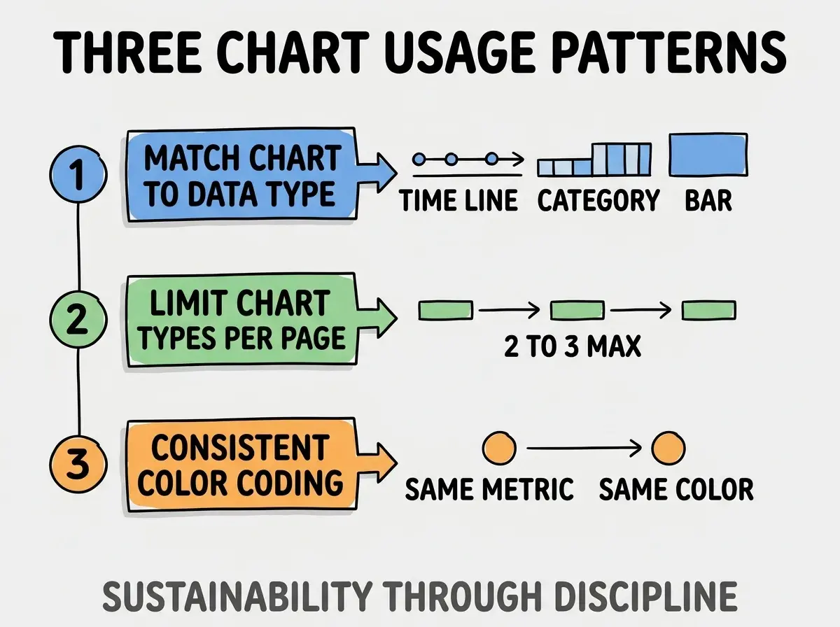
Pattern 1, match chart to data type. Time series gets line; categorical gets bar; composition gets pie. Match prevents misuse.
Pattern 2, limit chart types per page. 2-3 types maximum; more types overwhelm visual processing.
Pattern 3, consistent color coding. Same metric same color across charts; consistency aids recognition.
The combination produces dashboards users understand. Without these patterns, chart variety overwhelms.
How To Add Interactivity To Charts
Three interactivity patterns enhance chart usefulness.
Pattern A, hover tooltips for detail. Recharts Tooltip component shows exact values on hover; reveals detail without clutter.
Pattern B, time range selectors. Buttons for "7 days", "30 days", "90 days" filter chart data. Users explore different time scales.
Pattern C, click to drill down. Clicking chart element navigates to detail view. Enables exploration without showing everything upfront.
Common Questions About Data Visualization
Data visualization raises questions worth addressing directly.
The first question is whether to use Recharts or other libraries. Recharts dominates React ecosystem; Tremor builds on Recharts with prebuilt patterns. Both work well for vibe coded apps.
The second question is whether to use D3 directly. Rarely needed; Recharts handles most cases. D3 for custom or complex visualizations only.
The third question is how to handle large data sets. Aggregate before visualizing; raw data sets above 1000 points overwhelm both browser and viewer.
The fourth question is whether to support chart customization by users. Sometimes; depends on user sophistication. Power users want customization; casual users prefer defaults.
How Visualization Affects Decision Making
Data visualization affects decision making in compounding ways. Decision effects compound across user lifetime.
The first compounding effect is metric awareness. Users notice metric changes faster with charts; faster awareness enables faster response.
The second compounding effect is decision quality. Decisions made with visual context outperform decisions made with raw numbers.
The third compounding effect is dashboard adoption. Useful dashboards get used; useless dashboards get abandoned. Visualization quality determines usefulness.
The combination produces dashboards that influence behavior. Without visualization, dashboards become number lists that users skim and forget.
How To Choose Between Chart Libraries
Three patterns guide chart library selection.
Pattern A, Recharts for general purpose React apps. Solid library, good documentation, handles most cases. Default choice.
Pattern B, Tremor for dashboard heavy apps. Built on Recharts with prebuilt dashboard components. Faster building for dashboards.
Pattern C, Chart.js for non React or simple charts. Framework agnostic; lighter weight than full Recharts.
The combination matches library to project need. Without selection thinking, library choice follows familiarity rather than fit.
The most damaging data visualization mistake is using pie charts for too many segments. Pie charts with 8+ segments are unreadable; humans cannot compare similar sized slices. The fix is to limit pies to 5-7 segments; group smaller segments into "Other"; or switch to horizontal bar chart which handles many categories better. Builders who respect pie chart limits produce readable visualizations; builders who ignore limits produce visualizations users cannot interpret.
The other mistake is missing the loading and empty states. Charts without data should show meaningful empty states, not blank space.
A third mistake is over decorating charts. Background colors, gradients, 3D effects all reduce readability. Minimal styling reads better.
A fourth mistake is missing the mobile experience. Desktop charts that fail on mobile disenfranchise majority of users.
What This Means For You
Data visualization with charts and graphs produces dashboards that users actually understand. The four chart types, prompts, and selection patterns produce visualizations that compound user awareness over time.
- If you're a product manager: Audit your existing dashboards for chart type appropriateness; mismatches reduce metric awareness.
- If you're a senior dev: Default to Recharts plus Tremor; cover most cases with minimal library research.
Browse more build articles
Read more build