To build a social media analytics dashboard with AI in 3 days, focus on the four metrics that drive marketing decisions (reach, engagement rate, click-through, conversion attribution), pull data from each platform's API into a single normalized schema, render the data with a charting library that handles cross-platform comparison, and add scheduled refresh so the dashboard stays current without manual work. The result is a custom dashboard that beats most off-the-shelf tools for your specific use case, because you can include exactly the metrics you care about and exclude the noise.
This piece walks through the four metrics that matter, the API integration patterns for each major platform, the visualization choices that produce useful dashboards, and the four mistakes that turn analytics dashboards into ignored eye candy that nobody on the team actually opens after the first week.
Why Build Instead of Buy
Off-the-shelf social analytics tools (Sprout Social, Hootsuite, Buffer Analyze) are expensive and generic. They show every metric for every platform whether you care or not, which produces dashboards so dense that nobody reads them. The custom alternative shows only the metrics that drive decisions for your specific business, which produces a dashboard you actually use.
The build cost is low (3 days for a working version), the maintenance is small (a few hours per month), and the savings vs commercial tools are substantial ($100 to $500 per month for small teams). The build also gives you data ownership: you can export, query, or extend in ways that off-the-shelf tools do not allow.
A 2025 marketing tools survey found that 73 percent of small marketing teams using off-the-shelf social analytics tools reported they "do not actually look at the dashboard regularly." Of teams using custom-built dashboards, 89 percent reviewed them at least weekly. Custom is not better because it has more features; it is better because it has fewer features focused on what actually matters.
The pattern to copy is the way professional kitchens design their station layouts. A consumer kitchen has every appliance imaginable; a professional kitchen has exactly the tools needed for the menu being served. Custom analytics dashboards work the same way: less is more when the less is what you actually need.
The Four Metrics That Matter
Different businesses care about different metrics, but most B2B and consumer marketing teams converge on the same four. Tracking these well covers 80 percent of social media decisions.
Metric 1, reach. How many unique people saw your content. Different from impressions (which counts views, including repeats). Reach matters because it tells you the size of your audience reached, not the volume of attention.
Metric 2, engagement rate. Likes, comments, shares, and saves divided by reach. Tells you whether the content is connecting with the audience that saw it. A normalized rate is more useful than raw counts.
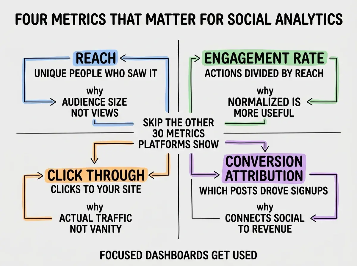
Metric 3, click-through. Clicks from social to your site. The actual traffic-driving metric. Use UTM parameters to attribute clicks to specific posts.
Metric 4, conversion attribution. Which posts drove signups, purchases, or other goal completions. Connects social activity to business outcomes. Requires UTMs plus integration with your analytics tool.
The API Integration Patterns
Each major platform has its own API with its own quirks. Three patterns cover most of the integration work.
Twitter (X) API. Use the X API v2 with appropriate access tier. Pull tweet metrics, audience metrics, and engagement data. Rate limits are tight; cache responses for at least an hour.
Browse more marketer build guides
Read more build articlesLinkedIn API. LinkedIn's API requires application approval but provides good engagement and reach data. Pull post metrics, follower demographics, and click-through data. Daily refresh is sufficient for most use cases.
Instagram Graph API. Connected through Facebook Business. Pull post insights, story insights, and audience demographics. The OAuth flow is the most complex part; the data itself is straightforward.
The Visualization Choices That Work
How the data is displayed determines whether the dashboard gets used. Three visualization patterns produce most of the value.
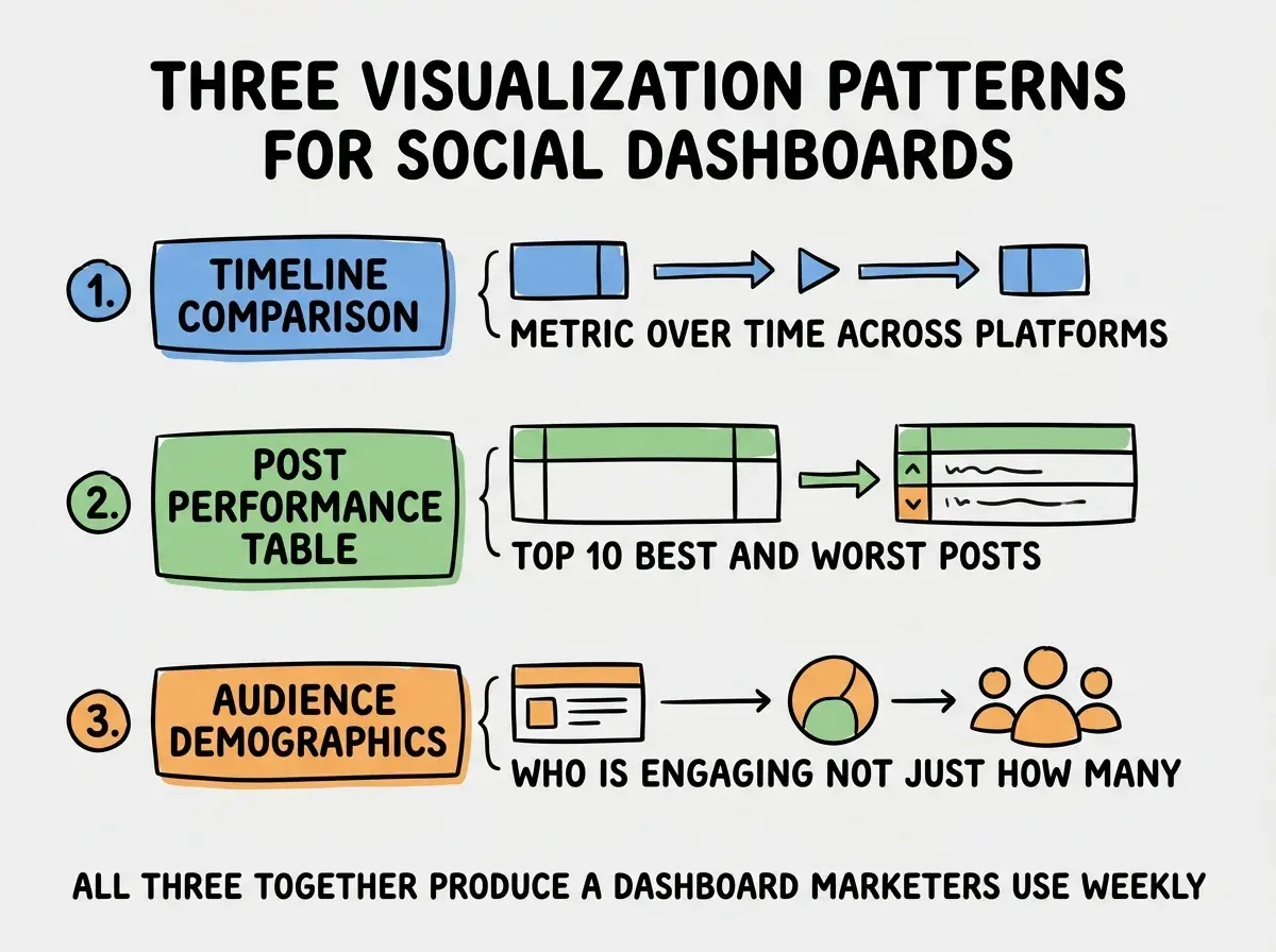
Pattern 1, timeline comparison. Show each metric over time, with multiple platforms overlaid. Spot trends and platform-specific patterns at a glance.
Pattern 2, post performance table. Top 10 best-performing and worst-performing posts in the period. Helps marketers learn what worked and what did not.
Pattern 3, audience demographics. Who is engaging (age, location, interests), not just how many. Helps refine targeting and content strategy. The demographic view often surfaces surprises (your audience is younger or more international than you assumed) that change content decisions for the next quarter.
A useful addition is to surface the demographic split alongside the engagement data, so a top-performing post is contextualized by who actually engaged with it. Posts that perform well overall but with the wrong audience are not real wins, and the demographic context catches that nuance.
The dashboard also benefits from adding a "this week vs last week" comparison view that highlights changes in each metric. The comparison surfaces trends faster than absolute charts and makes it easier to spot when something has shifted requiring action.
The most expensive social analytics dashboard mistake is showing every metric the platforms expose. A dashboard with 40 charts is overwhelming and gets ignored. The right approach is brutal curation: pick the four metrics, pick the three visualizations, leave everything else off. The discipline of saying no to extra metrics is what separates dashboards that drive decisions from dashboards that look impressive but get ignored. Less is more is a real principle here.
The other mistake is forgetting cross-platform normalization. Twitter's "engagement" is not the same as Instagram's "engagement," and comparing raw numbers across platforms produces wrong conclusions. Normalize by reach or by post count to make comparisons valid.
A useful pattern is to add a weekly digest email that summarizes the dashboard for marketers who do not log in daily. The email includes the top 3 wins and the top 3 concerns from the week. Most teams find that the digest gets read more reliably than the dashboard itself, and the digest forces a useful weekly synthesis discipline.
A second useful pattern is to add an "experiment tracker" section that links specific posts to their hypothesis (we tried X to see if Y) and outcome. Over time the tracker becomes the team's institutional knowledge about what works on each platform, which is dramatically more valuable than the raw metrics.
A third useful refinement is to add competitor benchmarking by tracking a small number of competitor accounts. The relative performance is often a clearer signal than absolute numbers, especially for newer products where audience growth is still volatile and absolute metrics swing widely.
The dashboard also benefits from being able to filter by content type (educational, promotional, behind-the-scenes). Different content types have different engagement patterns, and conflating them in the same metric obscures real signal about what resonates with your audience.
Dig deeper
A few hand-picked sources if you want to go further.
What This Means For You
A custom social analytics dashboard is a high-ROI internal tool for any marketing team in 2026. The build is small, the focus on relevant metrics produces actual decision-making value, and the cost vs commercial tools is dramatically lower.
- If you're a founder: Have your engineering team build this for marketing as an internal tool. The cost is small and the marketing team will use it more than any commercial tool.
- If you're changing careers: Marketing dashboard projects are great portfolio pieces because they involve API integration, data normalization, and visualization. All transferable skills.
- If you're a student: Build a personal brand analytics dashboard for your own social accounts. Practice the same patterns at smaller scale.
Browse more marketer build guides
Read more build articles