To build an email template builder for marketers in a weekend, focus on the constraint that email HTML is dramatically different from web HTML (table-based layouts, inline CSS, no JavaScript), use a library that handles the email-safe HTML output (MJML or React Email), give marketers a small set of well-designed templates rather than infinite blank-canvas freedom, and add live preview that shows how the email will look in real clients (Gmail, Outlook, Apple Mail). The build is roughly two days of focused work, and the result is a tool that produces emails that actually render correctly across the fragmented email client landscape.
This piece walks through the email HTML constraint, the four design patterns that work for marketing emails, the live preview architecture, and the four mistakes that produce email templates that look great in the editor and broken in users' inboxes when they actually arrive.
Why Email HTML Is Different
Email HTML is stuck in roughly 2005. Most email clients (Gmail, Outlook, Yahoo, Apple Mail) support only a subset of HTML/CSS, often inconsistently. Modern web techniques (flexbox, grid, JavaScript, web fonts) either do not work or render unpredictably. Email design has to use table-based layouts, inline CSS, and a small palette of safe fonts.
This constraint is what makes email template builders valuable. Without one, marketers either hire designers for every email or use commercial tools that lock content into proprietary formats. A custom builder gives you control over the templates, the data integration, and the export format.
A 2025 Litmus email rendering report tested 100 email designs across 50 email clients. Designs built with email-safe libraries (MJML, React Email) rendered correctly in 94 percent of clients. Designs built with modern web HTML rendered correctly in 41 percent. The difference is structural; modern HTML is not designed for email and email clients have not caught up to modern HTML in 20 years.
The pattern to copy is the way print magazines handled the transition to digital in the 2000s. Print had its constraints (paper sizes, color profiles, registration); digital had different constraints (screen sizes, color spaces, viewport variations). Magazines that mastered both produced output for each medium that respected its constraints. Email and web are similar; treating email like web produces broken emails.
The Four Design Patterns That Work
Each pattern fits a specific email use case. Most marketing programs use all four at different times.
Pattern 1, single-column promotional. Hero image, headline, body copy, CTA button. The default for promotional emails. Works in every client. Easy to write, easy to scan.
Pattern 2, multi-section newsletter. Header, multiple stories with images and short summaries, footer. Good for editorial content and digest formats. More complex layout, requires careful spacing.
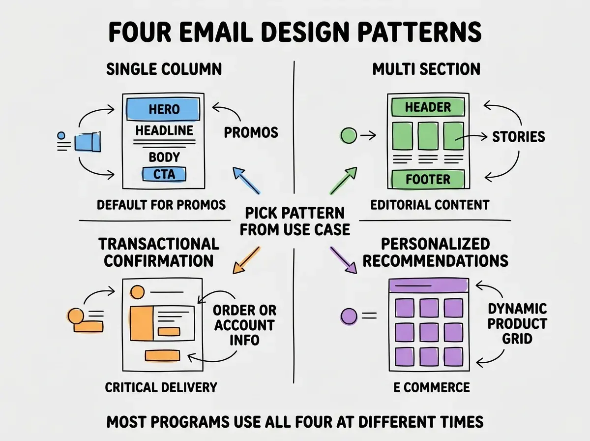
Pattern 3, transactional confirmation. Order confirmation, account changes, password resets. Has to be reliable and fast. Often plainer design than marketing emails because clarity matters more than visual impact.
Pattern 4, personalized recommendations. Dynamic content based on user data: recommended products, personalized greetings, behavioral triggers. Requires server-side rendering with merge fields for personalization.
The Architecture That Ships in Two Days
Three pieces handle the bulk of an email builder. The integration with sending infrastructure (Resend, SendGrid) is straightforward.
Piece 1, MJML or React Email as the rendering engine. These libraries take simplified markup and produce email-safe HTML. They handle the table layouts, inline CSS, and email client quirks for you.
Browse more marketer build guides
Read more build articlesPiece 2, template editor UI. A simple form-based editor with fields for the merge variables and content sections. Avoid the temptation to build a drag-and-drop editor; they take 10x longer and the form-based approach covers most needs.
Piece 3, live preview with multi-client rendering. Show the email rendered as it will appear in the major clients. Litmus and Email on Acid offer this as a service; you can also do basic preview with iframe sandboxing.
How to Handle the Responsive Email Problem
Email responsive design is harder than web responsive design because most email clients do not support media queries the same way browsers do. Three patterns work around the limitation.
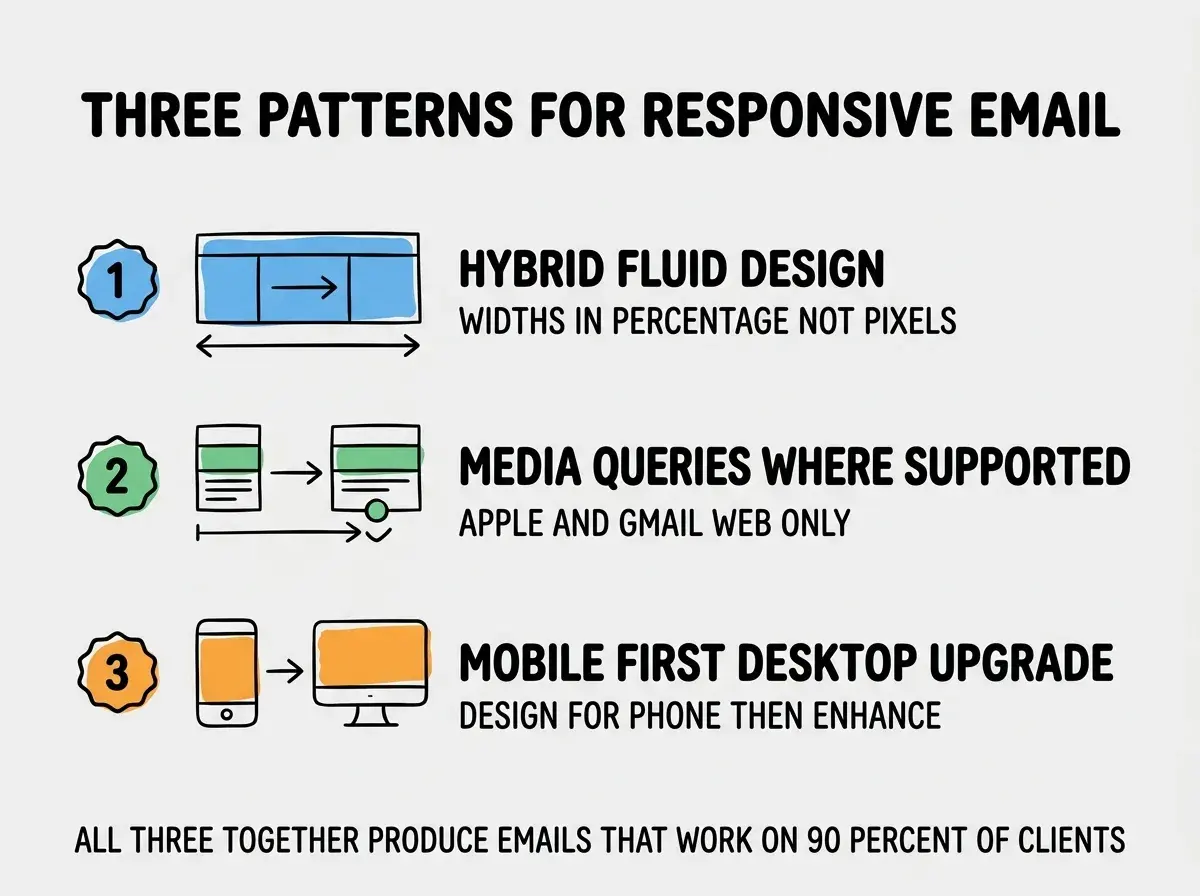
Pattern 1, hybrid fluid design. Use percentage-based widths instead of pixel widths. Tables resize based on container width. Works in every email client.
Pattern 2, media queries where supported. Apple Mail and Gmail Web support some media queries. Use them as progressive enhancement on top of fluid design. Other clients fall back to the fluid version.
Pattern 3, mobile-first design. Start with the mobile layout (single column, large tap targets) and enhance for desktop. Inverts the usual web pattern but matches how most email is read. Mobile-first design typically produces emails that look acceptable on any client, while desktop-first design produces emails that look great on desktop and broken on mobile, where most users actually read.
A useful refinement is to instrument the templates with click tracking that distinguishes mobile vs desktop opens. The data often shows that 60 to 80 percent of opens are on mobile, which calibrates design decisions toward the dominant reading context rather than toward what looks good in the editor preview.
The most damaging email template mistake is using modern CSS that works in your browser preview but fails in real email clients. Flexbox, CSS grid, position absolute, custom properties, web fonts all break in major clients like Outlook. The fix is to test in real clients before declaring a template ready. Litmus, Email on Acid, or even just sending test emails to a Gmail account, an Outlook account, and an Apple Mail account will catch most issues. Skipping this step produces templates that look great in the builder and broken in production.
The other mistake is over-personalizing. Marketing emails with too many merge fields (Hi {first_name}, the {product_category} you looked at on {date_visited} from {source} is now {discount}% off!) feel creepy and convert worse than simpler versions. Use personalization sparingly and where it actually adds value, not because the data is available.
A useful pattern is to keep a small library of approved templates rather than letting marketers create new templates for every send. Five to seven well-designed templates cover most marketing email use cases, and limiting the library prevents the slow drift toward inconsistent brand presentation that happens when every email is a new design.
A second useful refinement is to add a "send time preview" that shows how the email will look at different read times. Morning reading is different from evening reading, and the preview helps marketers think about timing rather than just content.
A third pattern that pays off is to add a built-in spam score check (using mail-tester.com or similar) that runs on every template before send. Spam triggers are sometimes subtle (certain words, image-to-text ratios, missing alt text), and the check catches issues that manual review misses.
What This Means For You
A custom email template builder is one of the most useful internal tools for any marketing team that sends substantial email volume. The build is small, the control is high, and the output quality beats most commercial alternatives for your specific use case.
- If you're a founder: Build this if your team sends more than 5 marketing emails per month. The customization and integration value compounds quickly.
- If you're changing careers: Email template builders are surprisingly fun to build because the constraints force creative solutions. Good portfolio piece.
- If you're a student: Try building one as a learning exercise. The email HTML constraints teach you a lot about web fundamentals you might otherwise skip.
Browse more marketer build guides
Read more build articles