You want to build a launch page with a waitlist, and you want it done today. Not next week after hiring a developer. Not after learning React from scratch. Today. 92% of developers now use AI coding tools daily, and the fastest-growing group among them is non-technical founders and marketers who need to validate ideas before writing a single check. This tutorial gets you from zero to a live launch page with email capture in under an hour.
Think of a launch page like a movie trailer. The movie is not finished yet, but the trailer builds anticipation, collects interest, and tells you whether people actually want what you are making. Your launch page does the same thing for your product. It is the cheapest, fastest market validation tool that exists.
Why a Launch Page Beats a Full Website
A launch page is not a website. It is a single page with a single job: convince visitors to give you their email address. That constraint is a superpower. You do not need navigation, multiple pages, a blog, or a pricing table. You need a headline, a value proposition, an email form, and a reason to believe. That is it.
This simplicity makes launch pages the perfect first build project. There is no database to configure, no authentication to set up, no complex routing to manage. One page, one form, one goal. If you can describe what your product does in two sentences, you have everything you need to start.
The social proof counter (showing how many people have signed up) is optional but powerful. It creates a bandwagon effect. When visitors see that 200 other people already joined the waitlist, signing up feels less risky and more exciting. We will add one in this tutorial.
A launch page is not about impressing visitors with design. It is about answering one question clearly: "What is this, and why should I care?" Every element on the page should serve that answer. If a section does not help someone decide to join your waitlist, remove it. Simplicity converts better than complexity every single time.
Set Up Your Tool and Write the First Prompt
Open Lovable, Bolt, or whichever AI coding tool you prefer. For this tutorial, I will use Lovable because it handles building and hosting in one place, but the prompts work in any tool.
Here is your starting prompt. Replace the bracketed sections with your own product details:
"Build a product launch page for [Your Product Name], a [one-sentence description of what it does]. The page should have these sections in order: a hero section with a bold headline, a subtitle explaining the core benefit, and an email signup form with a single input and a Join the Waitlist button. Below the form, show a counter that says 'X people on the waitlist' (start at a placeholder number like 127). Below that, add a three-column feature section with icons highlighting three key benefits. Use a dark background with white text and an accent color of [your brand color]. Make it responsive for mobile."
Hit enter and wait about sixty to ninety seconds. You will see a complete launch page appear in the preview.
Checkpoint: You should see a hero section with your headline, an email input, a submit button, the waitlist counter, and three feature cards. The styling will be rough but functional.
Refine the Design Until It Feels Right
The first version is a starting point. Now shape it into something that looks intentional and professional. Send each refinement as a separate message.
Refinement 1, the hero section: "Make the headline larger and bolder. Add a subtle gradient from the background color to a slightly lighter shade. Give the subtitle more breathing room below the headline. The email input and button should be on the same line on desktop, stacked on mobile."
Refinement 2, the waitlist counter: "Style the waitlist counter with a subtle pulse animation. Show it as '127+ builders already on the waitlist' with the number in the accent color and slightly larger font size."
Refinement 3, the feature cards: "Give each feature card a subtle border and rounded corners. Add a hover effect that slightly lifts the card. Make sure the icons are consistent in size and match the accent color."
Refinement 4, the footer: "Add a minimal footer with your product name, a copyright notice, and links to a placeholder Terms and Privacy page. Keep it simple and understated."
Each refinement takes about thirty seconds to type and another thirty for the AI to implement. Review the result after each one. If something looks off, describe specifically what needs to change rather than saying "make it better."
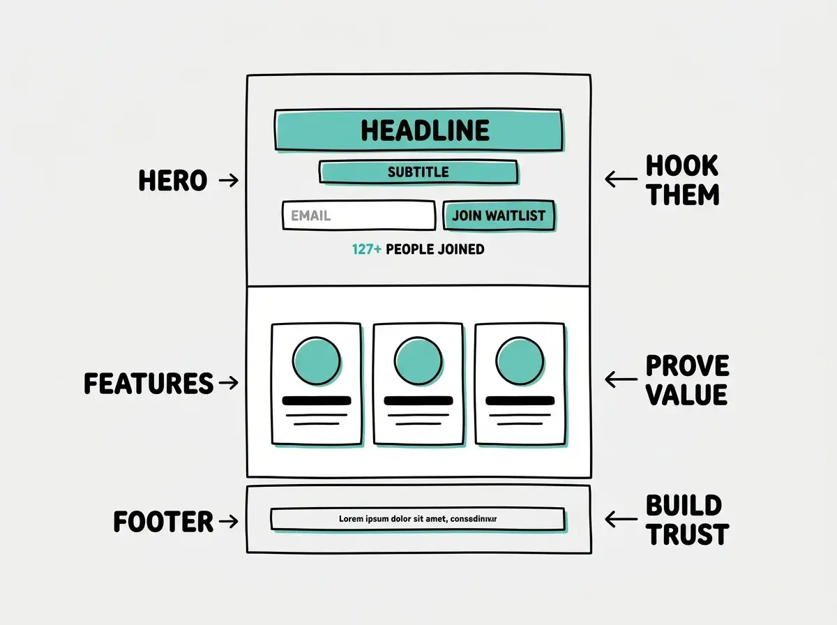
Checkpoint: By this point your page should look polished. The hero grabs attention, the features explain value, and the counter adds social proof. If you showed it to someone, they would not guess you built it thirty minutes ago.
Wire Up the Email Capture
A beautiful page without a working email form is just a poster. Let us make the form actually collect emails.
You have two solid options for storing waitlist signups, and both are free for early-stage projects.
Option A, use Formspree: "Connect the email signup form to Formspree. When someone submits their email, it should POST to a Formspree endpoint. After successful submission, replace the form with a thank-you message that says 'You are on the list! We will reach out when we launch.' Also increment the counter by one."
Option B, use Supabase: "Set up a Supabase table called 'waitlist' with columns for id, email, and created_at. When someone submits the email form, insert their email into the Supabase table. After successful submission, show a thank-you message and increment the counter. Query the actual row count from Supabase to display the real number."
Formspree is simpler (no database setup, emails forwarded to your inbox). Supabase gives you a real database with the actual count, which means your social proof counter shows real numbers. For a first project, Formspree gets you live faster. For a project you want to grow, Supabase is the better foundation.
Do not skip email validation on the form. Without it, you will get spam submissions, bots filling in garbage, and duplicate entries that inflate your waitlist count. Ask the AI to add basic validation: "Add email format validation to the signup form. Show an error message below the input if the email is invalid. Also prevent duplicate submissions by disabling the button after the first click and showing a loading spinner."
Add the Thank-You Flow
The moment after someone signs up is the highest-engagement moment you will have with that person until launch day. Do not waste it with a generic "thanks" message.
Tell the AI: "After successful email submission, show a thank-you screen that replaces the signup form. Include a headline that says 'You are in!' and a subtitle saying 'You are number [X] on the waitlist.' Below that, add share buttons for Twitter and LinkedIn with pre-filled text: 'Just joined the waitlist for [Product Name]. [Your one-line pitch]. Join me: [URL].' Add a subtle confetti animation that plays once when the thank-you screen appears."
The share buttons are important. Every person who shares your waitlist page is a free acquisition channel. You want to make sharing effortless by pre-filling the message so they just have to click one button.
Deploy and Connect Your Domain
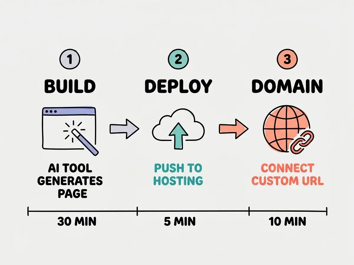
If you built in Lovable, your page is already live on a Lovable subdomain. If you used Bolt or Cursor, you will need to deploy to Vercel or Netlify.
For a custom domain (which you should absolutely get for a real launch), buy one from Namecheap, Google Domains, or Cloudflare Registrar. Then point it at your hosting provider by updating the DNS records. In Vercel, go to your project settings, click Domains, and add your custom domain. Vercel tells you exactly which DNS records to create.
A launch page on your-product.com looks dramatically more credible than one on your-product.lovable.app. The domain costs ten to fifteen dollars per year and takes about ten minutes to configure. DNS changes can take up to 48 hours to propagate, but usually finish within an hour.
Test Everything Before You Share the Link
Before you announce your launch page anywhere, run through this quick checklist.
Open the page on your actual phone (not a simulator). Tap the email field, type an email, and submit. Does the thank-you screen appear? Can you tap the share buttons? Is text readable without zooming?
Try submitting with an invalid email. The form should show an error. Try submitting with a valid email and confirm it arrives in your Formspree inbox or Supabase table. Try submitting twice with the same email to verify duplicate handling works.
Share the link with a friend and ask two questions: "What do you think this product does?" and "Would you sign up?" If they cannot answer the first question correctly, your headline needs work. If they would not sign up, your value proposition needs sharpening.
Dig deeper
A few hand-picked sources if you want to go further.
What This Means For You
You now have a live launch page with a working waitlist, social proof, and a share-optimized thank-you flow. The total cost is zero dollars (unless you bought a domain). The total time is under an hour. And you built it without writing code by hand.
But the page itself is not the point. The point is what happens next. Share the link everywhere your potential customers spend time. Post it in relevant communities, mention it in conversations, put it in your social media bios. Every email you collect is a signal that your idea resonates. If emails trickle in slowly, you might need a sharper value proposition or a different audience. If they pour in, you have validation that is worth more than any business plan.
The launch page is your cheapest possible experiment. Build it in an hour, test it with real people, and let the waitlist numbers tell you whether to keep going.