To build a user story mapping tool for PMs in a weekend, structure the data as user activities (top row) broken down into tasks (middle row) and stories (bottom row), provide drag-and-drop reordering across the grid, integrate with your issue tracker so stories sync with engineering reality, and add a "release slice" overlay that shows which stories are in which release. The build is roughly two days using AI assistance, and the resulting tool produces story maps that actually drive sprint planning rather than living as static artifacts in a wiki.
This piece walks through the data model, the three views that work, the integration patterns, and the four mistakes that turn story mapping into busywork.
Why Story Mapping Matters
User story mapping is one of the most useful PM techniques because it surfaces the user's journey as a coherent whole rather than as a flat list of features. Done well, story mapping helps the team see what is essential vs nice-to-have, what depends on what, and where the gaps are.
Done poorly, story mapping becomes a sticky-note exercise that produces a wall art that nobody references after the workshop. The difference is whether the map stays connected to actual work or becomes a static artifact.
A 2025 ProductBoard analysis of 300 product teams found that story mapping done in tools that synced with the issue tracker (Jira, Linear) drove 2.7x more sprint planning decisions than story mapping done on whiteboards or in disconnected tools. The technique is the same; the integration with engineering reality is what makes it stick.
The pattern to copy is the way restaurant menus relate to kitchen prep. The menu organizes the customer's journey (appetizer, main, dessert); the kitchen executes the dishes. If the menu and kitchen drift apart, customers order things that are not available. Story maps and engineering reality have to stay aligned the same way.
The Three Views That Work
Different stages of product work need different views of the same story map data.
View 1, full map. The complete journey from user activity down to story. For workshops and stakeholder presentations. Optimized for breadth.
View 2, release slice. Stories filtered to a specific release or sprint. For active planning conversations. Optimized for what we are committing to.
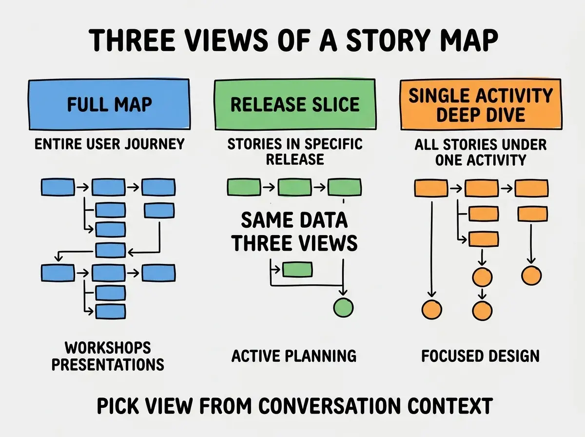
View 3, single activity deep dive. All stories under one user activity. For focused design or implementation work. Optimized for depth.
The Data Model and Integration
The data model is straightforward. Three entity types with clear relationships.
Activity. Top-level user goals (e.g., "Sign up for the service"). Few in number, broad in scope.
Task. User actions that achieve activities (e.g., "Verify email address"). More specific.
Browse more PM build guides
Read more build articlesStory. Specific implementation pieces (e.g., "Send verification email with 6-digit code"). Maps to issue tracker tickets.
Issue tracker integration. Each story has an ID that maps to a ticket in Linear, Jira, or GitHub Issues. Status updates flow back from the tracker so the story map shows current implementation state.
The Patterns That Make Story Maps Useful
Three patterns separate story mapping that drives decisions from story mapping that decorates wiki pages.
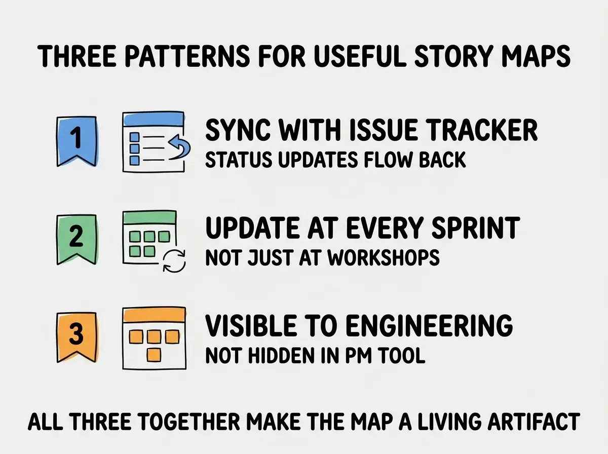
Pattern 1, sync with issue tracker. Status updates from Linear/Jira flow back to the story map. The map shows current reality, not aspirational state from last quarter.
Pattern 2, update at every sprint. Add new stories, mark completed ones, adjust priorities. A story map that does not change is dead.
Pattern 3, visible to engineering. Engineers can see and edit the map. Hidden in a PM-only tool, it becomes irrelevant to the people doing the work.
The integration with the issue tracker is the highest-leverage of these three patterns because it eliminates the maintenance work that kills most story maps. When stories on the map automatically reflect their ticket status (in progress, done, blocked), the map becomes a real-time view of where the work stands. PMs do not have to update statuses manually; engineers do not have to remember to update two systems. The map and the work stay aligned because the map IS a view onto the work, not a separate artifact about the work.
The "visible to engineering" pattern is the second highest-leverage because it determines whether the map informs decisions or sits in a PM-only tool. Many PM tools default to a permissions model where engineers can view but not edit. This is exactly wrong for story maps because the act of editing (adding new stories that emerged during build, marking stories as more complex than expected, splitting one story into three) is what keeps the map honest. Engineering needs full edit access for the map to reflect engineering reality.
Implementation Considerations
Building the actual tool is straightforward with AI assistance. A few implementation choices have outsized impact on adoption.
Choice 1, web vs desktop. Web wins. Story maps need to be shared via URL with stakeholders; desktop apps add a download barrier that kills adoption.
Choice 2, real-time collaboration vs eventual consistency. Real-time collaboration (multiple users editing simultaneously, seeing each other's changes) is significantly more complex to build but dramatically improves the workshop experience. Eventual consistency (changes save and sync but not in real-time) is easier and works fine for asynchronous use. Pick based on whether your team does live story mapping workshops or async updates.
Choice 3, hosted vs self-hosted. Hosted (Vercel, Netlify, Railway) ships in hours. Self-hosted gives you control over data but adds operational overhead. Hosted is right for most teams; only self-host if you have specific compliance requirements.
Choice 4, custom auth vs SSO. SSO via Google or GitHub is enough for most teams. Custom auth is overhead unless you have specific user management requirements. The simpler choice ships faster and gets used.
The most damaging story mapping mistake is doing it once at the start of a project and never updating. The map captures the team's understanding at a point in time, and that understanding evolves as the team learns more about the user. Static maps become wrong within weeks. The fix is to schedule a 30-minute story map update at the start of every sprint. The discipline keeps the map current and prevents the gradual divergence from engineering reality that kills most story maps.
The other mistake is over-investing in the visual polish. A story map that looks like a designed infographic is impressive at the workshop and ignored afterward because updating it requires design effort. A simple grid that anyone can edit gets used; a polished design becomes archive material.
The right level of visual polish is "professional but editable." Use clear typography, consistent spacing, and basic color coding (e.g., colors for status), but skip the custom illustrations and the polished layouts. The goal is a tool that anyone on the team can update in 10 seconds without thinking about design. The discipline of choosing functional over impressive is one of the marks of mature internal tools, and it pays back every single time the map needs an update.
What This Means For You
A custom story mapping tool is one of the higher-leverage PM tools you can ship in 2026. The build is small and the adoption value is real.
- If you're a founder: Build this if your team currently uses sticky notes or wiki pages for story mapping. The integration with issue tracker is the differentiator.
- If you're changing careers into PM: Story mapping is a fundamental PM technique. Build a tool to learn it more deeply.
- If you're a student: Practice story mapping on personal projects. The thinking style transfers to almost every product role.
Browse more PM build guides
Read more build articles