To build a mobile first responsive web app with AI tools, follow the four design phases (start with mobile constraints rather than desktop features, design touch interactions before mouse interactions, optimize for mobile network and battery realities, and progressively enhance for larger screens), recognize what separates mobile first design from desktop responsive afterthoughts, and apply the patterns that produce excellent mobile experiences. The mobile first matters because most web traffic now comes from mobile devices.
This piece walks through the four design phases, what makes mobile experiences excellent, the specific tooling, and the four mistakes that produce mobile experiences that feel like desktop afterthoughts.
Why Mobile First Design Matters
Mobile first design matters because mobile dominates web traffic. The matter; designing for desktop then adapting to mobile produces worse mobile experiences than designing mobile first.
The 2026 reality is that mobile traffic exceeds desktop for most products. AI tools support mobile first patterns when prompted; without explicit mobile first framing, AI defaults to desktop patterns.
A 2025 web traffic analysis of 1,000 web apps found that mobile traffic averaged 67 percent of total traffic with mobile retention 23 percent higher for apps designed mobile first compared to desktop first. Mobile first design produces measurable retention benefits.
The pattern to copy is the way restaurants design takeout menus. Takeout menus designed for takeout differ from dine in menus adapted for takeout; design context shapes outcome. Mobile first design follows similar pattern; designing for mobile context produces better mobile experiences than adapting desktop designs.
The Four Design Phase Approach
Four phases produce mobile first responsive web apps.
Phase 1, start with mobile constraints. Limited screen, touch input, network variability. Constraints inform design.
Phase 2, design touch interactions first. Tap targets, gestures, scroll patterns. Touch first prevents desktop bias.
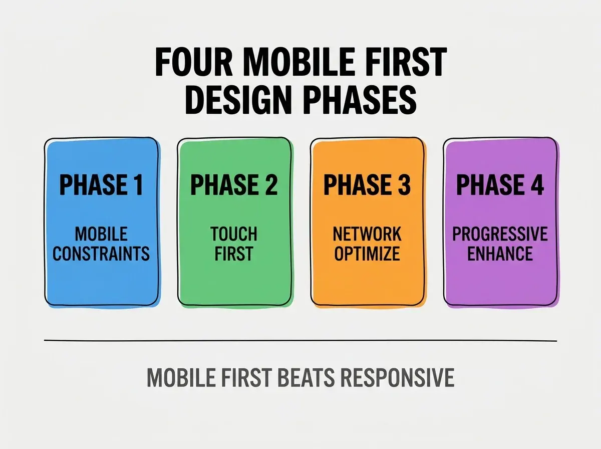
Phase 3, optimize for mobile network and battery. Reduced bandwidth, battery awareness. Optimization matters dramatically.
Phase 4, progressively enhance for larger screens. Desktop additions enhance mobile foundation. Enhancement preserves mobile quality.
What Makes Mobile Experiences Excellent
Three patterns characterize excellent mobile experiences.
Pattern 1, fast load times under 3 seconds. Mobile networks slower; load time matters dramatically. Without speed, users abandon.
Browse more design articles
Read more buildPattern 2, touch targets sized for thumbs. 44 pixel minimum; smaller targets miss. Without sizing, touch becomes frustrating.
Pattern 3, gestures matching native expectations. Swipe, pull to refresh, pinch zoom. Gesture matching reduces friction.
The Specific Tooling That Works
Three tool categories combine effectively for mobile first development.
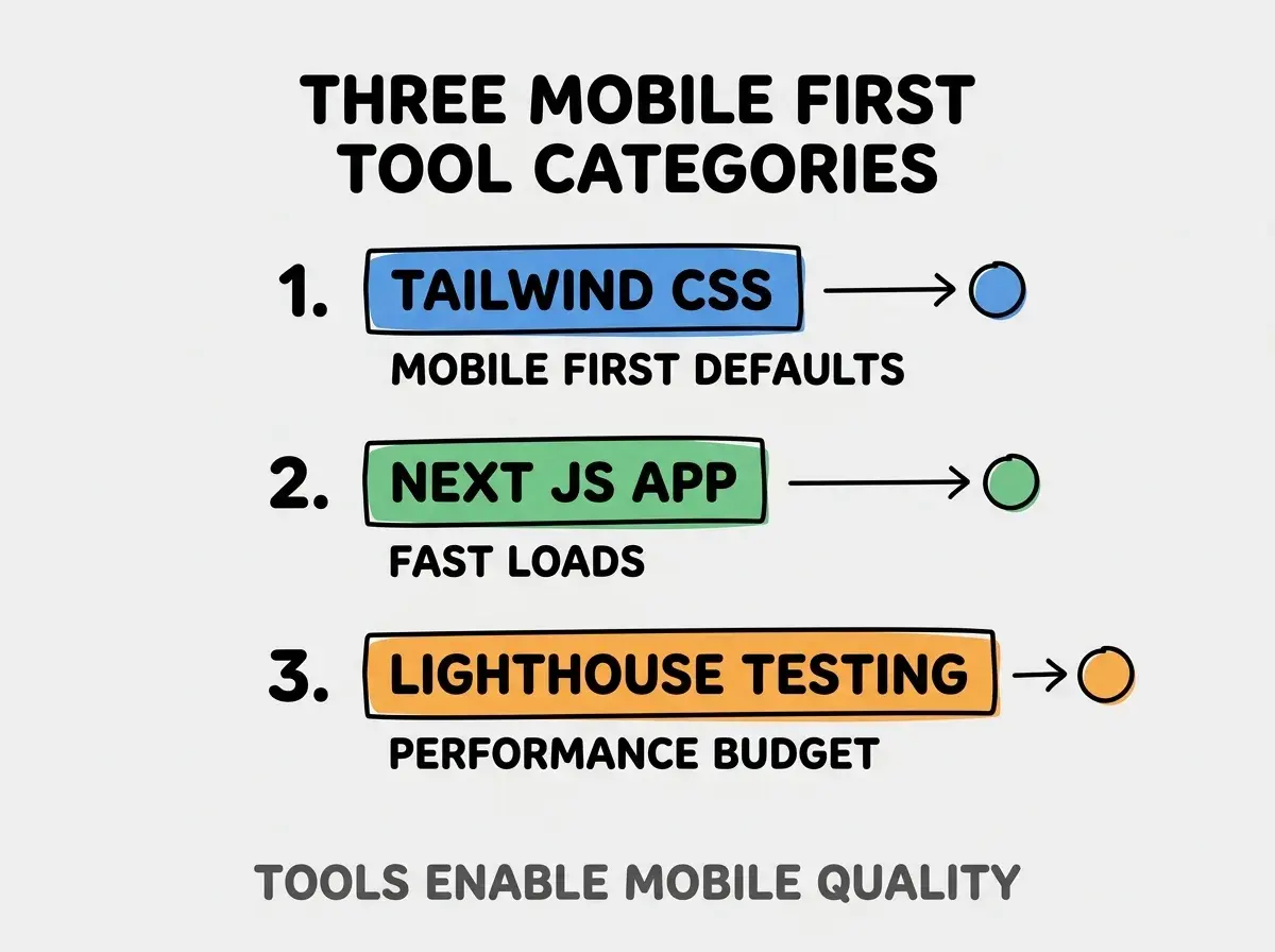
Tool 1, Tailwind CSS for mobile first defaults. Mobile first responsive utilities. Defaults reinforce mobile first thinking.
Tool 2, Next.js for fast loads. Server side rendering, image optimization, automatic code splitting. Performance built in.
Tool 3, Lighthouse for performance budget. Core Web Vitals measurement, performance auditing. Measurement enables optimization.
What Makes Mobile First Sustainable
Three patterns separate sustainable mobile first development from problematic patterns.
Pattern 1, mobile testing on actual devices. Emulators differ from real devices; real testing matters. Without real testing, issues surprise.
Pattern 2, performance budget enforced in CI. Performance regressions caught before deploy. Without budget, performance erodes.
Pattern 3, regular mobile UX audits. Periodic review catches mobile specific issues. Without review, issues accumulate.
The combination produces mobile first development that scales. Without these patterns, mobile experience erodes over time.
How To Migrate Existing Apps To Mobile First
Three migration patterns help existing app transitions.
Pattern A, audit current mobile experience. Identify specific mobile issues. Audit produces specific improvement targets.
Pattern B, prioritize critical paths first. High traffic paths get mobile first treatment first. Prioritization produces measurable improvement.
Pattern C, gradual migration over time. Page by page rather than wholesale. Gradual reduces migration risk.
The combination produces migration that improves mobile experience. Without patterns, migration often produces inconsistent experience.
The most damaging mobile first design mistake is treating mobile as smaller desktop rather than different context. Mobile users have different patterns, contexts, capabilities than desktop users. The fix is to design for mobile context explicitly; touch input, network variability, attention patterns all differ from desktop. Designs that respect mobile context produce better mobile experiences than designs that scale desktop down. Context matters more than just screen size.
The other mistake is missing performance investment for mobile. Mobile performance gaps produce abandonment. The fix is to optimize for mobile networks specifically.
A third mistake is ignoring touch interaction patterns. Mouse interactions differ from touch; mobile needs touch specific design.
A fourth mistake is testing only on high end devices. Real users have variable devices; testing should reflect reality.
How To Handle Specific Mobile Patterns
Three patterns deserve specific approaches.
Pattern A, navigation patterns for mobile. Bottom navigation, hamburger menus, contextual actions. Navigation matters dramatically for mobile.
Pattern B, form input patterns for mobile. Larger inputs, appropriate keyboards, autofill. Forms harder on mobile.
Pattern C, content patterns for narrow screens. Vertical layouts, progressive disclosure, focused content. Width matters for content.
The combination produces pattern specific approaches. Without specific approaches, generic responsive design serves mobile mediocrely.
How Mobile First Design Will Likely Evolve
Mobile first design will likely continue evolving with device capabilities.
The first likely evolution is foldable device support. Variable form factors require new design patterns. Foldables expand design considerations.
The second likely evolution is offline first patterns becoming standard. Offline capability beyond optional. Offline first matches mobile reality.
The third likely evolution is voice and gesture interfaces expanding. Beyond touch and text. Multi modal expands interaction possibilities.
The combination suggests mobile first will continue mattering. Designers learning patterns now build skills that remain valuable.
Common Questions About Mobile First Design
Mobile first design raises questions worth addressing directly.
The first question is whether mobile first applies to B2B apps. Yes increasingly; B2B mobile usage growing. Mobile first matters even for B2B.
The second question is how to handle desktop power users. Progressive enhancement adds desktop features; mobile foundation preserved. Both can work.
The third question is whether native apps still matter versus web. Yes for some use cases; PWAs handle many web cases. Choose based on requirements.
The fourth question is how to handle landscape mode on mobile. Test thoroughly; landscape often gets less attention. Without testing, landscape produces issues.
How Mobile First Affects Product Strategy
Mobile first design affects product strategy beyond pure design choices. Strategic effects compound over time.
The first compounding effect is user base composition. Mobile first products attract mobile heavy users; demographic differs from desktop heavy products.
The second compounding effect is feature prioritization. Mobile constraints force focus; focused products often outperform feature heavy ones.
The third compounding effect is engagement frequency. Mobile usage patterns produce frequent short sessions; product strategy benefits from matching this pattern.
Mobile first products often achieve higher engagement frequency than desktop first products, even when total time spent matches. Frequency matters for habit formation that retention depends on.
What This Means For You
Mobile first responsive web apps produce better mobile experiences than desktop responsive afterthoughts. The four phases, tool combinations, and migration patterns produce framework for mobile first development.
- If you're a founder: Mobile traffic dominates; mobile first matters for business outcomes. Plan mobile first from product start.
- If you're a designer: Mobile first design produces better outcomes than responsive afterthought. Invest in mobile first patterns.
- If you're a senior dev: Mobile first development requires intentional patterns. Build patterns that scale with team and project.
Browse more design articles
Read more build