To build a metrics dashboard that actually drives product decisions in 2026, design around four metric layers that each serve a different purpose (north star metric for the single number everyone cares about, input metrics for the levers that move the north star, leading indicators for early warning of problems, and operational metrics for day-to-day execution), pick the right tool for your stage (Mode or Hex for SQL-based dashboards, PostHog or Mixpanel for event-based dashboards, custom dashboards only when standard tools cannot handle your needs), and review the dashboard in a recurring meeting so the data drives action rather than sitting unwatched. Most dashboards fail not because of bad tools but because nobody reviews them; building review cadence into the rollout determines whether the dashboard produces value.
This piece walks through the four metric layers, the tooling options, the review cadence patterns that work, and the four mistakes that turn dashboards into ignored screensavers.
Why Most Dashboards Fail
Most dashboards get built, deployed, and then ignored. The team enthusiastically configures them in week 1; checks them weekly in month 1; checks them monthly in month 3; never opens them by month 6. The dashboard becomes shelfware that the founder paid to build.
The 2026 reality is that dashboard tools have matured to the point where the technical work is easy. The hard work is making dashboards that actually drive decisions, not dashboards that exist. Most teams have the former problem; few have the latter.
A 2025 ChartIO/Atlassian dashboard usage study of 1,400 SaaS teams found that 71 percent of dashboards were viewed less than monthly within 6 months of creation. Dashboards that were viewed weekly were 4x more likely to influence product decisions than dashboards viewed monthly or less. The cadence of review predicts dashboard value more than the metrics displayed. Building review cadence is more important than designing the dashboard itself.
The pattern to copy is the way airline pilots use cockpit instruments. Pilots check specific instruments at specific times; the instruments are designed for the moments they matter; the pilot has trained protocols for using them. Dashboards work the same way; without protocol for use, even the best dashboard sits unconsulted while the plane flies blind.
The Four Metric Layers
Four layers structure dashboards that drive decisions rather than producing visual noise.
Layer 1, north star metric. The single number that captures product success (weekly active users, MRR, monthly transactions). Everyone agrees on what good looks like; the dashboard centers on this metric.
Layer 2, input metrics. The levers that move the north star (signup rate, activation rate, retention rate). When the north star moves, you check input metrics to understand why.
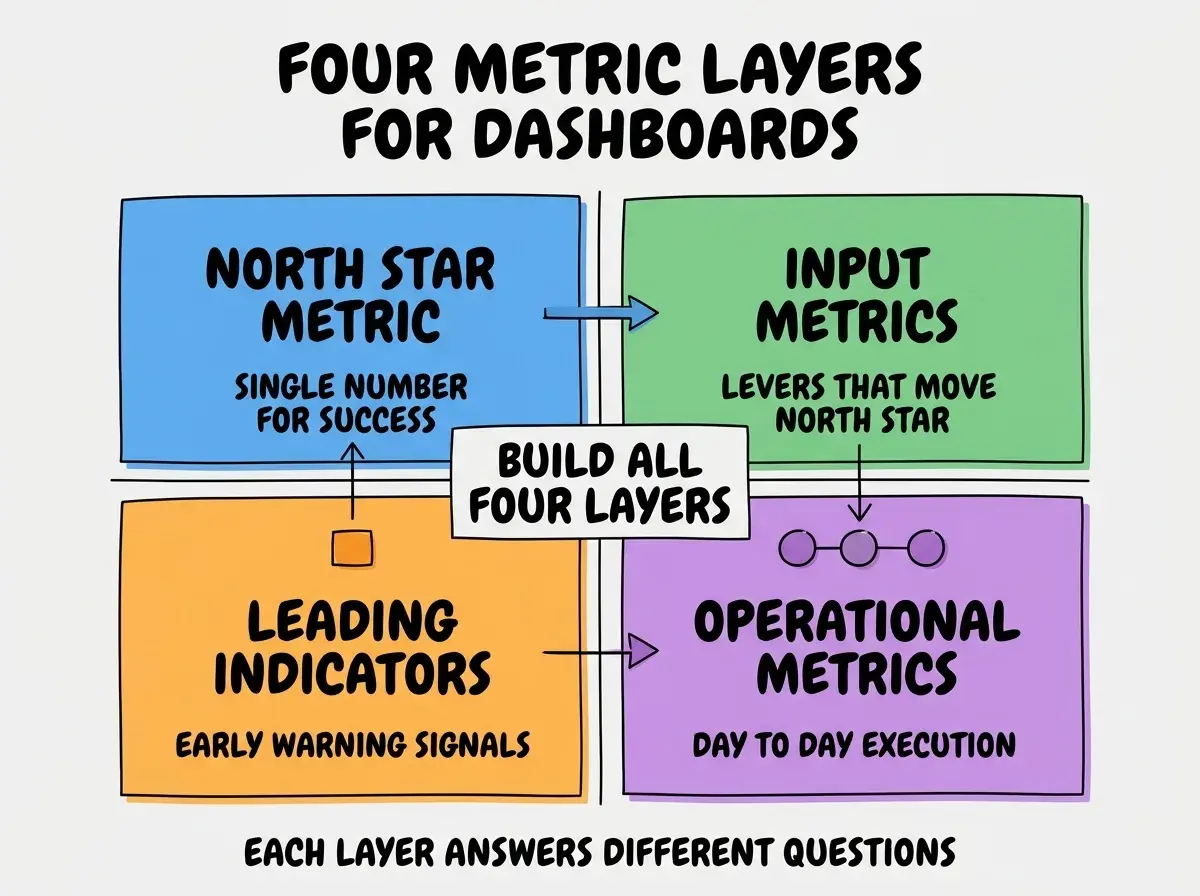
Layer 3, leading indicators. Metrics that predict future north star changes (NPS, support ticket volume, feature adoption). Catch problems before they show up in the north star.
Layer 4, operational metrics. Day-to-day execution metrics (active campaigns, support response time, deploy frequency). Operational dashboards differ from strategic ones; both have their place.
The Tooling Options
Three categories of tools cover most dashboard needs. Pick based on data sources and team skill.
Tool 1, SQL-based dashboards (Mode, Hex, Metabase). Best for teams with SQL skill and direct database access. Most flexible; highest learning curve and steepest setup investment.
Browse more product analytics tutorials
Read more grow articlesTool 2, event-based dashboards (PostHog, Mixpanel, Amplitude). Best for teams using event analytics. Integrated with the analytics tool; less flexibility but easier setup.
Tool 3, business intelligence platforms (Tableau, Looker, PowerBI). Best for enterprise teams with multiple data sources. Most powerful and flexible; also most expensive.
The Review Cadence Patterns That Work
Three review patterns separate dashboards that drive decisions from dashboards that sit unwatched.
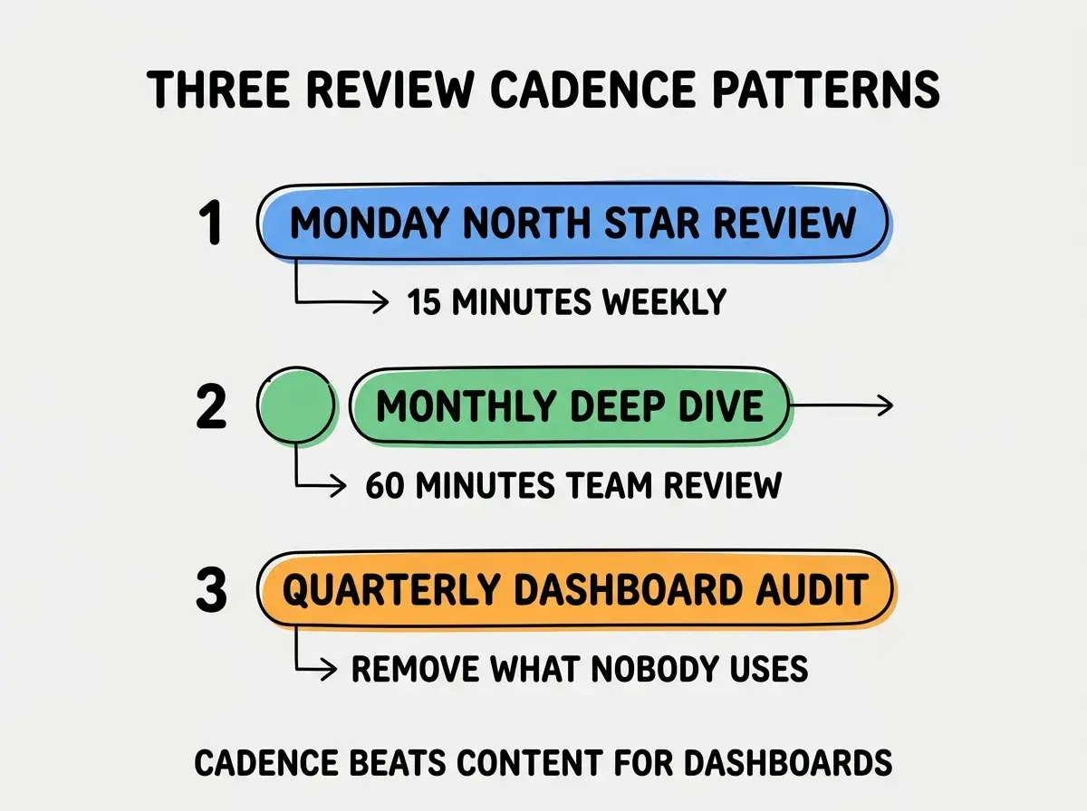
Pattern 1, Monday north star review. 15-minute weekly check of the north star and input metrics. Catches trends early; enforces the discipline of reviewing data before making product or growth decisions.
Pattern 2, monthly deep dive. 60-minute team review covering all four metric layers. Different from weekly; this is the strategic conversation about what the data means and which trends warrant action.
Pattern 3, quarterly dashboard audit. Review which metrics nobody looks at and remove them. Dashboard sprawl kills usability; pruning preserves it through deliberate maintenance over time.
How to Pick the Right North Star Metric
Three principles help select the north star metric that drives the right behaviors.
Principle 1, the metric should reflect customer value. Number of signups does not reflect customer value; weekly active users does. Pick metrics that align team incentives with customer outcomes.
Principle 2, the metric should be moveable through product work. Stock price reflects many things outside team control. MRR reflects pricing, retention, growth—all things the team affects. Pick metrics teams can actually move.
Principle 3, the metric should be checkable frequently. Annual metrics produce slow feedback. Weekly or monthly metrics let teams iterate. The cadence of the metric should match the cadence of work.
The combination produces north stars that actually align team behavior with business success. Without these principles, north stars become political (they look good) rather than functional (they drive right behavior).
How to Design Dashboards People Actually Use
Three design patterns produce dashboards that get viewed regularly.
Pattern A, lead with the north star. The first thing visible should be the most important number. Everything else supports the north star and should be visually subordinate to it.
Pattern B, time-bound every metric. "MRR" alone is meaningless; "MRR vs last month" or "MRR trend over 12 months" provides context. Every number needs comparison to be interpretable as good or bad.
Pattern C, surface anomalies prominently. Dashboards that highlight unusual values get more attention. A red flag on a metric that dropped 20 percent draws the eye; the same data buried in a chart goes unnoticed by even attentive viewers.
The combination produces dashboards people want to check rather than dashboards they ignore. Without these patterns, even well-designed dashboards become invisible over time.
The most damaging dashboard mistake is showing too many metrics. Founders try to display every interesting metric, then nobody can find the important ones. The fix is the opposite of comprehensive; show 5-10 metrics maximum on the primary dashboard, with detail dashboards for deep dives. Teams with focused dashboards report 3-4x higher engagement than teams with comprehensive ones. Information density should be calibrated to attention; below the calibration produces curiosity, above it produces overwhelm and abandonment.
The other mistake is failing to update dashboards when product changes. A dashboard built for a product 6 months ago may show metrics that no longer matter. The fix is to refresh dashboards quarterly to align with current priorities; metrics that mattered before may not matter now, and new metrics may need adding. Dashboards are living documents; static dashboards become irrelevant.
A third mistake is mixing internal team metrics with customer-facing metrics on the same dashboard. Internal metrics (deploys per week, support tickets handled) and customer-facing metrics (active users, revenue) serve different audiences and answer different questions. The fix is to keep them on separate dashboards; mixing them dilutes the focus of each.
What This Means For You
Metrics dashboard is high-leverage tool when designed and used well. The four layers, tooling options, and review cadence produce dashboards that drive decisions.
- If you're a founder: Build your dashboard with the four layers and commit to weekly review. The discipline of looking at data drives better decisions than relying on intuition.
- If you're changing careers into product or analytics: Dashboard design is increasingly expected for product roles. Practice on side projects to build the skill.
- If you're a student: Study how successful products design their dashboards. Many product teams publish their dashboard structure in case studies.
Browse more product analytics guides
Read more grow articles