Typography in web apps determines whether your app feels professionally designed or amateur, and AI defaults consistently produce amateur typography. The four typography rules that fix AI defaults are font scale ratio (use modular scale not arbitrary sizes), line height (1.5 for body, 1.2 for headings), font weight contrast (use 2-3 weights maximum), and reading line length (45-75 characters per line). Adding these rules to your prompts produces typography that feels designed rather than defaulted.
This piece walks through the four typography rules, what AI defaults look like, how to override them, and the four mistakes builders make with web typography.
Why Typography Matters For Vibe Coded Apps
Typography matters for vibe coded apps because typography is the most visible design element. Users notice typography subconsciously; bad typography makes apps feel amateur even when other design is competent.
The 2026 reality is that AI tools generate functional typography that fails design standards. Functional means letters render; design standards mean letters render with intentional hierarchy and reading comfort.
A 2025 design audit study of 300 vibe coded apps found that apps using design system typography rules ranked 47 percent higher in user trust surveys than apps using AI default typography. Typography measurably affects perceived quality.
The pattern to copy is the way book designers craft typography for reading comfort. Centuries of typography refinement produce reading experiences that disappear into content. Web typography follows the same principles; getting them right makes content readable rather than imposing.
The Four Typography Rules That Matter Most
Four rules transform AI default typography into professional typography.
Rule 1, font scale ratio. Use modular scale (1.125, 1.25, 1.333) for size relationships. AI uses random sizes; modular scale produces visual rhythm.
Rule 2, line height proportional to font size. Body text 1.5x; headings 1.2x; small text 1.4x. AI uses default 1.5 for everything; proportional adjustment matters.
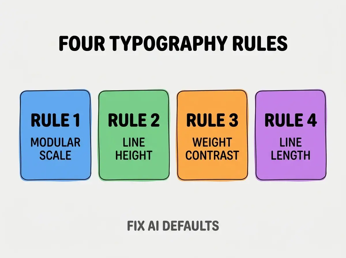
Rule 3, font weight contrast. Use 2-3 weights maximum (400 regular, 700 bold, optionally 500 medium). AI uses 4-5 weights; weight overload produces visual chaos.
Rule 4, reading line length. 45-75 characters per line for body text. AI ignores line length; full width text is unreadable on wide screens.
What AI Default Typography Looks Like
AI defaults follow predictable patterns that produce amateur outcomes.
Default 1, arbitrary font sizes. 14px, 16px, 18px, 20px, 24px, 32px without ratio relationship. Sizes feel random because they are random.
Browse more build articles
Read more buildDefault 2, uniform 1.5 line height. Headings get same line height as body; headings look loose and disconnected.
Default 3, weight chaos. Light, regular, medium, semibold, bold, extrabold all in same component. Eye cannot find hierarchy.
Default 4, full width body text. Paragraphs span entire screen width; eye cannot track from line end to next line start.
How To Override Each Default
Four prompt patterns override the four defaults.
Override 1, specify modular scale. "Use modular scale 1.25 for typography. Body 16px, h3 20px, h2 25px, h1 31px. Use Tailwind text-base, text-xl, text-2xl, text-3xl matching this scale."
Override 2, specify line heights per size. "Body text uses leading-relaxed (1.625). Headings use leading-tight (1.25). Small text uses leading-normal (1.5)."
Override 3, limit font weights. "Use only font-normal (400) and font-bold (700). Use font-medium (500) only for buttons. Avoid other weights."
Override 4, constrain line length. "Body text containers max-width 65 characters using max-w-prose. Never let body text span more than that."
What Makes Typography Sustainable
Three patterns separate sustainable typography from one off application.
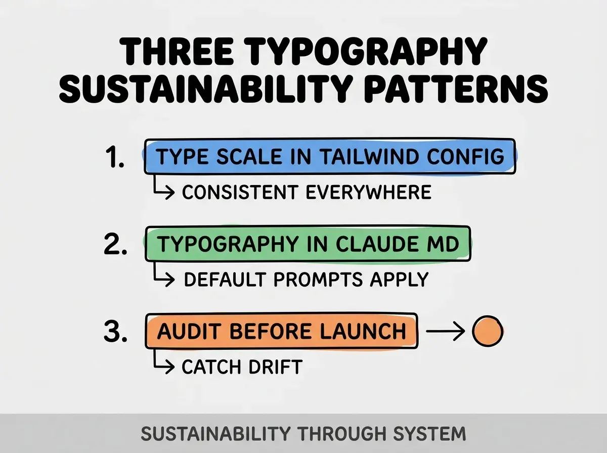
Pattern 1, type scale in Tailwind config. Custom scale enforces sizes; consistent across all components.
Pattern 2, typography rules in CLAUDE.md. AI reads rules and applies them; defaults shift toward professional.
Pattern 3, typography audit before launch. Pre launch review catches drift; reviews preserve quality.
The combination produces sustainable typography. Without these patterns, typography drifts toward AI defaults.
How To Choose Web Fonts
Three patterns guide font selection for vibe coded apps.
Pattern A, system fonts for performance. -apple-system, sans-serif loads instantly; matches OS aesthetic.
Pattern B, Google Fonts for variety. Inter, Plus Jakarta Sans, Geist all popular and reliable. Subset to needed weights.
Pattern C, variable fonts for advanced needs. Variable fonts contain multiple weights in one file; smaller download for multiple weight needs.
Common Questions About Web Typography
Web typography raises questions worth addressing directly.
The first question is whether to use serif or sans serif for apps. Sans serif standard for web apps; serif acceptable for content focused apps. Match audience expectation.
The second question is whether to support custom user font sizes. Yes via rem units; user accessibility settings should affect text size.
The third question is whether to use rem or px units. rem for accessibility; respects user preferences. Use rem with html font size 16px as base.
The fourth question is whether to use Tailwind typography plugin for prose. Yes for content heavy pages; plugin handles prose typography well.
How Typography Affects Conversion
Typography affects conversion in compounding ways. Conversion effects compound across visitors.
The first compounding effect is trust signaling. Professional typography signals professional product; trust translates to action.
The second compounding effect is reading completion. Better typography keeps readers reading; reading produces conversion opportunities.
The third compounding effect is brand consistency. Consistent typography across pages builds brand recognition; recognition builds preference.
The combination produces conversion patterns shaped by typography. Without typography attention, conversion limits accidentally.
How To Audit Existing Typography
Three audit patterns reveal typography issues in existing apps.
Pattern A, screenshot comparison. Compare your app to apps you admire; gaps reveal opportunities.
Pattern B, accessibility audit. Lighthouse and axe identify text contrast and size issues.
Pattern C, mobile reading test. Read your app on actual phone; mobile reveals issues desktop hides.
The combination produces typography audit. Without auditing, typography issues persist invisibly.
The most damaging typography mistake is using too many font sizes. AI generates 8-12 different sizes per page; visual hierarchy breaks down. The fix is to limit to 4-6 sizes maximum following modular scale; constraint produces clarity. Builders who limit sizes produce readable apps; builders who let AI choose produce visually chaotic apps that users find tiring.
The other mistake is missing the line length constraint. Long lines fatigue eyes; constraint to 45-75 characters dramatically improves readability.
A third mistake is using default Tailwind without customization. Default Tailwind is not opinionated; customization produces brand specific typography.
A fourth mistake is treating typography as final polish. Typography decisions affect every component; setting them late requires rework.
What This Means For You
Typography in web apps determines professional perception more than any other single design element. The four rules, prompts, and sustainability patterns produce typography that compounds quality perception across user interactions.
- If you're a designer: Add typography rules to your design system documentation; rules spread across all builds.
Browse more build articles
Read more build