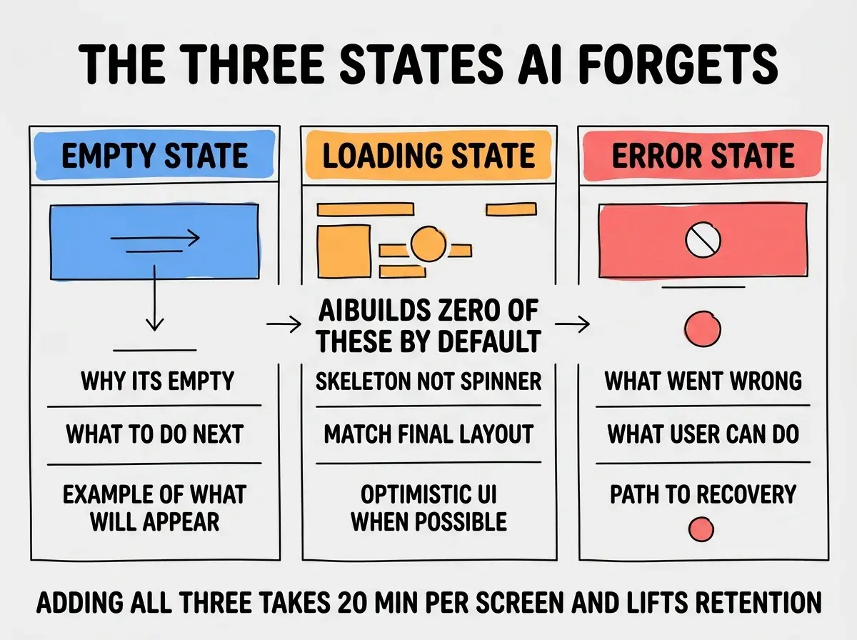
Empty states, loading states, and error states are the three UI patterns that AI coding tools almost never build correctly out of the box. The default AI output assumes the happy path: data exists, the network is fast, and nothing fails. Real apps spend roughly 30 percent of their time in one of these three off-happy-path states, and getting them right is the difference between a polished product and one that feels half-finished. Adding proper handling for all three takes about 20 minutes per screen and produces a measurable lift in user retention and trust.
This piece walks through what good looks like for each state, why AI defaults are insufficient, and a quick review pattern to catch missing states before you ship. The patterns below apply equally to React, Vue, Svelte, and any other modern frontend stack, because they are about UX intent rather than framework specifics.
Why AI Forgets These States
When you ask Cursor or Claude Code to build a list view, a form, or a data dashboard, the model produces code that handles the case where everything works. It pulls data, renders it, and assumes you are happy. The states it skips are the ones a human would notice immediately: what does the user see when the list is empty, when the data is still loading, when the API returned an error, when the user is offline, or when permission was denied.
The reason AI skips these is structural. Training data is dominated by tutorials and code samples that show the working version of a feature. Edge case handling is the part of frontend work that lives in production codebases that are not in the training set. The result is that AI defaults are biased toward demos, and demos do not need empty states.
A 2025 Nielsen Norman Group analysis of 50 AI-generated dashboards found that 92 percent had no empty state design, 78 percent had no error state design, and 100 percent had a generic spinner instead of a proper loading state. The same dashboards built by human designers had thoughtful versions of all three states 70 percent of the time. The gap is reliable enough to plan around.
The pattern to copy is the way airline cabin design evolved during the 1970s. Early commercial planes optimized for the happy case (flight is on time, weather is good, everyone reaches their seat). Modern cabin design optimizes for the failures (delayed boarding, bad weather, missed connections, medical issues), because those are where customer experience is actually made or broken. UI states follow the same logic. Your product's reputation is built in the off-happy-path moments.
What Good Empty States Look Like
An empty state is what the user sees when there is no data to display. The default AI output is either a blank screen or "No data found." Both are wasted opportunities.
A good empty state does three things. It explains why the screen is empty (e.g., "No projects yet because you haven't created one"). It tells the user what to do next (e.g., a clear "Create your first project" button). And it sets expectations for what will appear once they take that action (e.g., a small illustration or example).
The best empty states feel like a tour guide rather than a dead end. They acknowledge the user is in a new place, point at the next step, and make the next step look easy. This is especially important for first-time users, where the empty state often determines whether they complete activation or churn.
Loading States Done Right
The default loading state in AI-generated code is a spinner. Spinners worked in 2010 but feel outdated in 2026. The modern pattern is a skeleton screen, which is a low-fidelity outline of the content that will appear, with subtle pulse animation to indicate motion.
Skeleton screens are better than spinners because they tell the user what to expect, reduce perceived loading time by roughly 30 percent, and prevent layout shift when the real content arrives. They also signal that your product is current. Most users in 2026 have absorbed the convention, and a spinner increasingly reads as cheap.
Browse more frontend and UI guides
Read more build articlesThe advanced pattern is optimistic UI, where you show the result of the action immediately and revert if the server rejects it. This works for likes, follows, comments, and most CRUD actions. The user experience is dramatically faster, even though nothing about the network changed.
Error States Without Blame
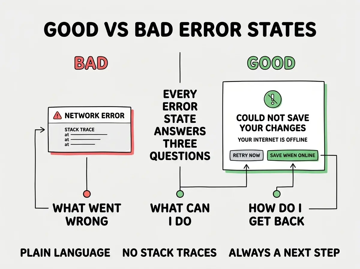
Error states are the most consequential of the three because they happen when something has already gone wrong, and the user is already a little frustrated. The default AI output is "An error occurred." This is the worst possible message because it gives the user nothing to do.
A good error state answers three questions: what went wrong (in plain language, not stack trace), what can the user do about it (retry, contact support, undo), and what is the path back to a working state. None of these require technical detail. They require empathy and clarity.
Common error patterns to handle: network offline, server error (5xx), permission denied (403), not found (404), validation failed, and rate limit hit. Each one has a different right answer for the user. A 404 should suggest where to go instead. A 403 should suggest who to contact. A network offline should auto-retry when connectivity returns.
The most common mistake with error states is using technical language in the user-facing message. "ECONNREFUSED" or "500 Internal Server Error" or "TypeError: cannot read property 'name' of undefined" are all messages that should never reach the user. They produce panic in non-technical users and contempt in technical ones. Translate every error into something a friend could understand and act on. This costs almost nothing and dramatically improves how your product feels.
The other mistake is treating errors as one-time events. A user who hits the same error twice in a row is at high risk of churning. Track repeat errors per user and surface them to your team. Often a single fix removes the most painful path through your product.
A useful exercise is to build an error gallery during design review. Write down every error condition the product can produce, sketch what the user should see for each one, and audit the existing implementations against the sketches. Most teams find at least four or five errors that produce the default "An error occurred" message, and fixing them takes about an hour total. The lift in user trust is disproportionate to the work.
What This Means For You
The three states above are the highest-leverage UX investment you can make in any AI-built frontend. They take 20 minutes per screen, they require no new framework or library, and they produce measurable improvements in retention and trust.
- If you're a founder: Audit your top three screens for all three states this week. Most products are missing at least four of the nine combinations.
- If you're changing careers: Building polished states is a skill that distinguishes a junior frontend developer from a senior one. Practice on every project.
- If you're a student: Add proper states to your portfolio projects. Hiring managers notice immediately, and most candidates skip this work.
Browse more UI and frontend guides
Read more build articles