Color theory for developers in 2026 comes down to five rules that separate professional-looking UIs from generic AI defaults: pick one primary color and stick with it, use a neutral palette with at least 9 shades for everything else, ensure 4.5 to 1 contrast for text on background, never use saturated colors for backgrounds or large surfaces, and reserve red exclusively for destructive or error actions. These five rules cover roughly 90 percent of the color decisions in a typical web app, and following them produces output that looks intentional even when AI generated most of the code.
This piece walks through each rule, explains why AI defaults usually break them, and gives the quick palette-picking workflow that turns "ten shades of slate" into a coherent design. None of the rules require a design degree or expensive tools; they just require enough discipline to apply them consistently across every screen.
Why AI Color Defaults Look Generic
When you ask AI for a UI, the colors it produces are usually drawn from a small pool of safe choices. Slate, gray, blue, indigo, and the occasional emerald accent. Every Tailwind project starts to look the same because the AI defaults to the same Tailwind palette tokens. The result is technically functional and visually forgettable.
The deeper problem is that color is used as decoration in AI output, not as communication. Buttons get a color because every button needs a color. Backgrounds get a tint because plain white feels cold. Borders get a shade because borders separate things. None of these decisions are wrong, but none of them are intentional either, and the cumulative effect is generic.
A 2025 Awwwards analysis of 200 AI-built sites compared to 200 human-designed sites found that the AI sites used an average of 11 distinct colors across their interfaces, versus 5 for the human-designed sites. More color did not mean better design. The human sites with fewer colors scored 2.3x higher on design quality assessments. Restraint is the single most reliable signal of professional color work.
The pattern to copy is the way professional kitchens use a small mise en place. A great chef has 10 to 15 ingredients prepped and uses them in different combinations. An amateur cook has 50 ingredients in the fridge and uses three in any given dish. The visible difference is restraint. Color works the same way. Pick a small palette, use it consistently, and the work reads as professional even before anyone looks at the details.
The Five Rules That Cover 90 Percent of Decisions
Each rule below is small enough to remember and high-leverage enough to change your output noticeably. Memorizing them takes 5 minutes; applying them takes practice.
Rule 1, one primary color. Pick a single primary color for your brand and use it for primary actions, links, and key emphasis. Do not have two primary colors. Two primaries fight for attention and the user gets confused about what to click first.
Rule 2, neutral palette with depth. You need 9 to 11 neutral shades to handle backgrounds, borders, text, and disabled states across both light and dark themes. Tailwind's slate, gray, zinc, and stone all work; pick one and stick with it.
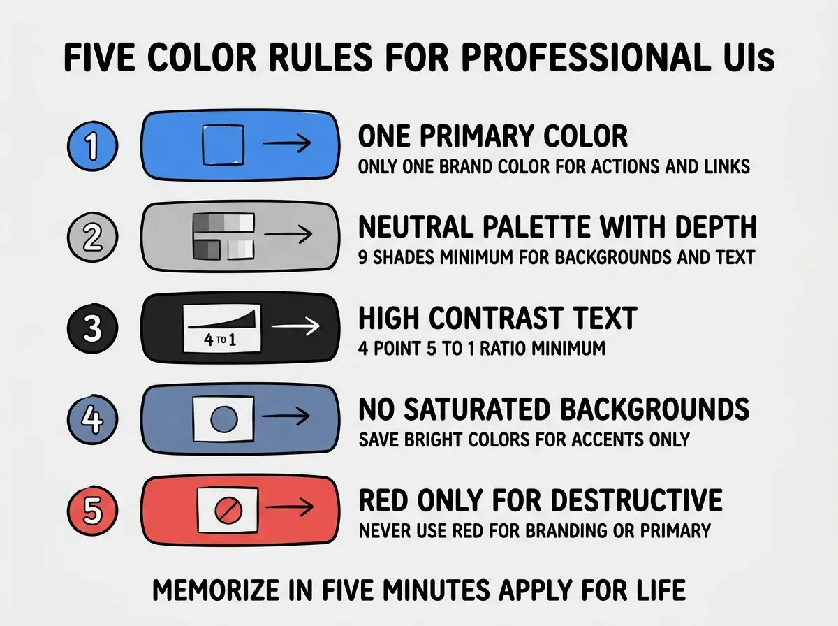
Rule 3, high contrast text. Body text should have at least 4.5 to 1 contrast against its background, headings can go to 3 to 1 if they are large enough. Use a contrast checker, do not guess. AI defaults often produce gray text on white that fails WCAG AA.
Rule 4, no saturated backgrounds. Bright fully saturated colors as page or section backgrounds make text hard to read and feel amateur. Save your saturated colors for buttons, badges, and small accent moments.
Rule 5 and the Palette-Picking Workflow
The fifth rule is small but consistently violated. After the rules, the workflow for picking an actual palette is the practical part most developers want.
Rule 5, red is reserved. Red signals danger, errors, and destructive actions in nearly every UI convention. Using red for branding or primary actions confuses users who have absorbed the convention. Use orange, coral, or magenta if you want a warm primary. Save red for delete, error, and warning.
Browse more UI and frontend design guides
Read more build articlesThe palette-picking workflow that works in 2026 is fast: pick one primary from a curated source (Radix Colors, Tailwind, or Open Color), pair it with a neutral from the same source, add semantic colors for success (green), warning (amber), and error (red), then generate light and dark mode variants. The whole process takes 10 minutes and produces a palette that holds up in design reviews.
How to Use the Palette in Practice
Once you have a palette, the next question is how to apply it consistently. Three patterns produce most of the visual coherence you see in well-designed apps.
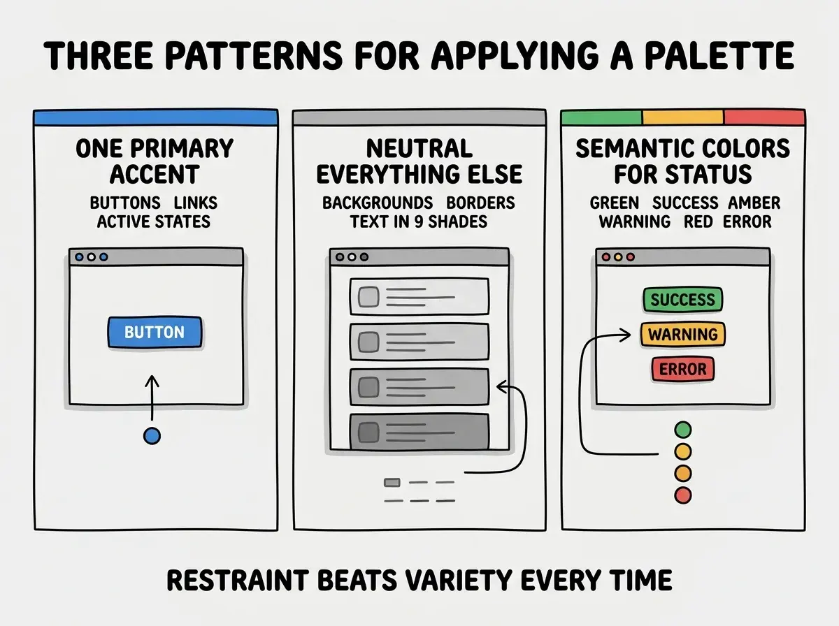
One primary accent. Buttons, active links, and current state indicators all use the primary color. Everything else is neutral. This produces a single point of visual hierarchy that the user's eye can rest on.
Neutrals everywhere else. Use your 9-shade neutral palette for backgrounds, borders, text in different priorities, and disabled states. The variation comes from shade, not hue. This is the single biggest difference between professional and amateur color use.
Semantic colors for status. Green for success, amber for warning, red for error, blue for info. These are conventions and they work because users have learned them. Do not invent new color meanings unless you have a strong reason.
The most expensive color mistake is using your brand color for everything that needs emphasis. New developers often use the primary color for headings, links, key text, button backgrounds, and accent borders all at once. The screen ends up screaming, and nothing actually stands out. Reserve the primary color for true call-to-action moments. Everything else should be neutral. The contrast between mostly neutral and a single bright accent is what produces visual hierarchy.
The other mistake is changing palette mid-project. Color decisions compound, and switching the primary or neutral halfway through a build means revisiting every screen. Pick a palette in the first hour of any new project and stick with it. If it turns out to be wrong, change it once at a planned milestone, not gradually as you go.
A small habit that pays off is to keep a one-page palette reference next to your editor. List every color token by name with a hex value and a short note on when to use it. Glance at it when you generate UI with AI and you will catch off-token values immediately, which is much faster than hunting them down later in a design review.
What This Means For You
Color theory does not require a design degree. The five rules above plus a 10-minute palette workflow produce output that looks professional, even when AI generated most of the underlying code.
- If you're a founder: Pick a palette before you write any UI code. Changing it later is expensive and the constraint forces better design decisions.
- If you're changing careers: Color literacy is a transferable skill. A non-designer who applies the five rules consistently will outperform a designer who does not.
- If you're a student: Build a small palette library you reuse across projects. The consistency makes your portfolio look intentional rather than experimental.
Browse more UI and frontend guides
Read more build articles