Every AI coding tool in 2026 reaches for the same component library. Ask Cursor to build a dashboard. Ask Claude Code to scaffold a settings page. Ask v0 to design a landing page. The components that appear in your codebase will almost certainly be shadcn/ui. With 92% of developers using AI tools daily, the component library your AI picks on the first pass is the one that ends up in production. Understanding why shadcn/ui dominates that default slot, and how to work with it effectively, is worth your time.
Think of it like this. Most component libraries are rental furniture. You get a nice couch, but you cannot reupholster it, you cannot swap the legs, and if the company changes the fabric next season, your living room changes too. shadcn/ui is more like a LEGO Technic set. You get pre-designed building blocks that snap together beautifully, but every single piece belongs to you. Take it apart, rebuild it, combine it with pieces from other sets. Nobody is going to revoke your license or push a breaking update to your living room.
shadcn/ui is not a traditional npm package. It is a collection of component source code you copy into your project and own completely. This distinction is the single biggest reason AI tools prefer it. When an AI generates a shadcn/ui Button, that Button lives in your codebase as a file you can read, modify, and extend without dependency conflicts.
How shadcn/ui Actually Works
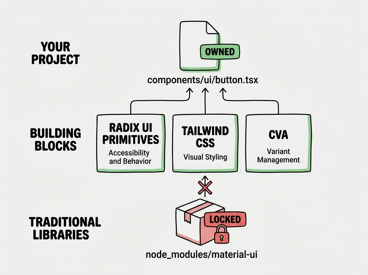
Traditional component libraries like Material UI or Chakra UI install as npm dependencies. You import components from node_modules, and the library controls the implementation. Want to change how a Dialog animates? You override styles or hope the library exposes the right prop. Want to modify the internal markup of a Select component? You are usually out of luck.
shadcn/ui flips this model entirely. When you run npx shadcn@latest add button, the CLI does not install a package. It copies a fully functional Button component into your project at components/ui/button.tsx. That file is yours. It uses Radix UI primitives for accessibility, Tailwind CSS for styling, and class-variance-authority for variant management. But you own every line and can change anything.
This is the LEGO Technic difference in practice. Each component is a self-contained block that arrives pre-assembled but fully modifiable. You are not renting someone else's abstraction. You are getting a blueprint and all the raw materials.
The architecture breaks down into three layers. Radix UI handles the accessibility and behavior (keyboard navigation, focus management, ARIA attributes). Tailwind CSS handles the visual styling. And cva (class-variance-authority) handles variants, letting you define default, destructive, outline, and ghost button styles in a clean, type-safe way.
Why AI Tools Love This Model
The reason every AI coding tool defaults to shadcn/ui comes down to how AI generates code. Large language models work with text. They predict the next token based on patterns in their training data. When an AI tool needs to generate a component, it has two options.
Option A is to import from an external library, which requires knowing the exact API surface, the current version's props, and how the library's styling system works. If the training data is even slightly out of date, the generated code breaks.
Option B is to generate the actual component code inline. This is where shadcn/ui shines. The components are Tailwind-based (which every model knows deeply), use standard React patterns, and follow a consistent file structure. An AI can generate or modify a shadcn/ui component with high confidence because it is just React plus Tailwind. No proprietary API to memorize. No version-specific props to get wrong.
There is a practical consequence here that matters. When you ask an AI to "make this button bigger and add a loading spinner," the AI can directly edit components/ui/button.tsx in your project. With Material UI, the AI has to figure out which theme override, which sx prop, or which styled-component wrapper will achieve the result without breaking other instances. The copy-paste ownership model makes AI modifications dramatically more reliable.
The v0 Pipeline That Changed Everything
Vercel's v0 turned shadcn/ui from a popular library into the default standard for AI-generated interfaces. The pipeline works like this. You describe a UI in natural language. v0 generates a complete React component using shadcn/ui primitives and Tailwind CSS. You copy the result into your project, and it works because the generated code uses the same component files already in your components/ui directory.
This created a flywheel effect. More developers use v0, which generates more shadcn/ui code, which trains more AI models on shadcn/ui patterns, which makes AI tools even better at generating shadcn/ui code. The LEGO Technic analogy holds here too. v0 is like an instruction booklet that designs new builds using the same blocks you already own.
Other AI tools followed. Cursor's Composer generates shadcn/ui by default. Claude Code scaffolds shadcn/ui components when building interfaces. Bolt and Lovable both include it in their generated project templates. The ecosystem convergence is not accidental. It happened because the copy-paste model is uniquely compatible with how AI generates and modifies code.
Installation and Setup
Getting started is straightforward. Initialize shadcn/ui in an existing Next.js project with Tailwind CSS already configured.
npx shadcn@latest init
The CLI asks a few questions about your preferred style, color theme, and where to put components. After initialization, you add individual components as needed.
npx shadcn@latest add button dialog card input
Each command copies the component source into your project. Your components/ui directory grows organically. You only have what you use, unlike traditional libraries where you install thousands of components and use twelve.
The components.json file in your project root tracks your configuration. It tells the CLI where to put new components, which Tailwind config to reference, and what import aliases to use. This file is important when AI tools generate code, because they can read it to understand your project's shadcn/ui setup.
Running npx shadcn@latest add for components you plan to heavily customize immediately. The CLI gives you a solid starting point, but if you know you need a completely custom DataTable or a non-standard Dialog, start from the shadcn/ui source on GitHub and adapt it manually. Otherwise you end up running the CLI, then rewriting 80% of the generated file, which defeats the purpose of the scaffolding step.
Customization Patterns That Work
Owning the source code means you can customize at any level. Here are the patterns that work well in practice, especially when working alongside AI tools.
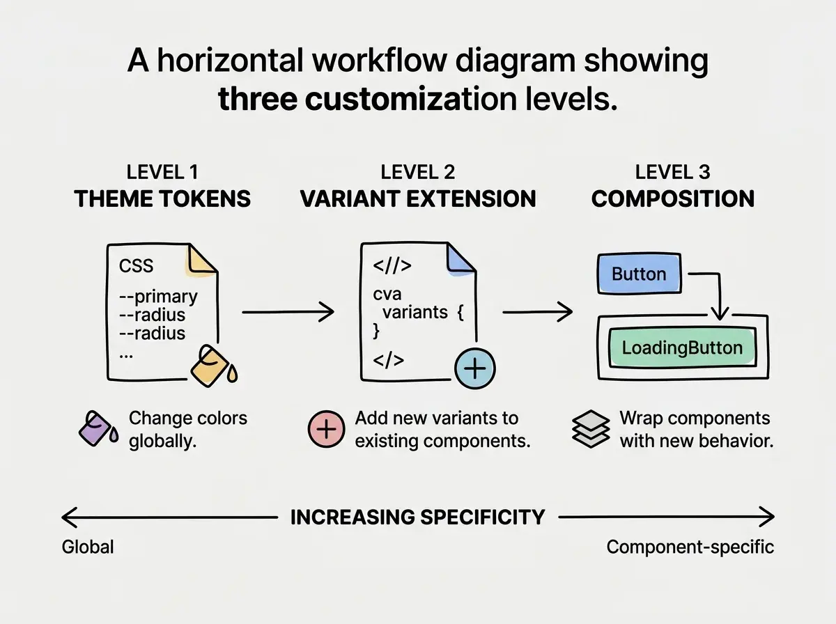
Variant extension is the most common customization. Open button.tsx, find the variants object in the cva call, and add your own. Need a brand variant with your company's colors? Add it right next to default and destructive. The TypeScript types update automatically because cva infers them.
const buttonVariants = cva(
  "inline-flex items-center justify-center rounded-md text-sm font-medium",
  {
    variants: {
      variant: {
        default: "bg-primary text-primary-foreground hover:bg-primary/90",
        brand: "bg-indigo-600 text-white hover:bg-indigo-500",
        destructive: "bg-destructive text-destructive-foreground hover:bg-destructive/90",
      },
    },
  }
)
Composition over modification is the second pattern. Instead of changing the base Button, create a LoadingButton that wraps it with spinner logic. This keeps the original shadcn/ui component intact (making future updates easier) while adding your project-specific behavior on top. Same LEGO Technic principle: combine existing blocks into new builds rather than melting them down and recasting them.
Theme tokens give you project-wide control. shadcn/ui uses CSS custom properties like --primary, --secondary, --destructive defined in your global CSS. Change these tokens once and every component updates. This is where designers get real power. The design system lives in a single CSS file, not scattered across dozens of component overrides.
When shadcn/ui Is Not the Right Choice
The LEGO Technic model has tradeoffs. Owning all the component source code means you also own all the maintenance. When Radix UI ships an accessibility fix, shadcn/ui components in your project do not auto-update. You need to check the shadcn/ui changelog and manually apply changes. For teams without a dedicated frontend developer, this maintenance burden adds up.
If you need a highly opinionated, batteries-included design system with minimal customization, something like Ant Design or Material UI might serve you better. You trade ownership for convenience, and for internal tools or admin dashboards where brand differentiation does not matter, that tradeoff can be worth it.
Projects with non-React frameworks also face friction. shadcn/ui is React-first. Ports exist for Vue, Svelte, and Solid, but they vary in completeness and community support. If you are building with Nuxt or SvelteKit, evaluate the framework-specific port carefully before committing.
The component library is one piece of a larger architecture puzzle.
Explore the fundamentalsThe Bigger Picture
shadcn/ui's dominance in AI-generated code is not just a trend. It reflects a fundamental shift in how we think about component libraries. The copy-paste ownership model solves real problems that traditional npm packages cannot. It eliminates version conflicts. It makes AI modifications reliable. It gives developers and designers full control without sacrificing the starting-point quality of well-designed components.
The convergence of AI tools around shadcn/ui also means that the React component ecosystem is standardizing in a way it never has before. When every AI tool generates the same component patterns, the community develops shared knowledge, shared debugging strategies, and shared customization techniques. That flywheel benefits everyone.
For senior developers and designers evaluating their frontend stack in 2026, the question is not really "should I use shadcn/ui?" The question is "do I understand how to customize and maintain it effectively?" Because whether you choose it or not, your AI tools already have.
Dig deeper
A few hand-picked sources if you want to go further.
Check out how real projects combine AI tools with shadcn/ui components.
Browse project breakdowns