Dashboard layout patterns for vibe coded apps fall into three main categories: sidebar navigation for feature dense apps, topbar navigation for simpler apps, and card grids for data dense displays. The right pattern depends on navigation depth, screen real estate, and user task type. Most production dashboards combine all three: sidebar for navigation, topbar for context and account, cards for data presentation. AI tools build any pattern correctly with appropriate prompting.
This piece walks through the three layout patterns, when each fits, the prompts that build them, and the four mistakes builders make when designing dashboards.
Why Dashboard Layout Choice Matters
Dashboard layout choice matters because it shapes user efficiency. The wrong layout for the task forces users to fight the interface; the right layout makes interfaces invisible.
The 2026 reality is that AI tools build any dashboard layout you describe; the limit is no longer technical but design judgment. Choosing the right pattern matters more than implementing it.
A 2025 dashboard usability study of 200 SaaS apps found that dashboards using appropriate layout patterns for their use case had 40 percent higher daily active usage than dashboards with mismatched layouts. Layout fit measurably affects engagement.
The pattern to copy is the way librarians organize libraries differently for different purposes. Reference libraries differ from lending libraries; both serve readers. Dashboard layouts work the same way; pattern serves purpose, not aesthetic.
The Three Dashboard Layout Patterns
Three patterns cover most dashboard scenarios.
Pattern 1, sidebar navigation. Vertical navigation on left edge; many top level destinations; nested navigation possible. Suits feature dense apps.
Pattern 2, topbar navigation. Horizontal navigation across top; few top level destinations; simple structure. Suits content focused apps.
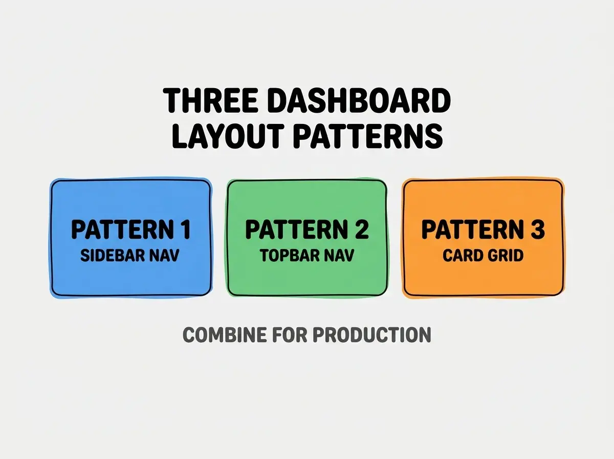
Pattern 3, card grid layout. Data presented as cards in grid; supports varied content types per card. Suits data dense displays.
When To Use Each Pattern
Three scenarios match the three patterns.
Scenario 1, feature dense SaaS app. 5+ top level navigation items; deep nesting needed. Sidebar wins because vertical space accommodates many items.
Scenario 2, content focused app. 2-4 top level items; flat structure. Topbar wins because vertical space is precious for content.
Browse more build articles
Read more buildScenario 3, data dashboard with mixed metrics. Multiple data types displayed simultaneously. Card grid wins because cards isolate data types visually.
The Prompts That Build Each Pattern
Three prompts implement the three patterns.
Prompt 1, build sidebar navigation. "Create dashboard with collapsible sidebar on left containing nav items with icons and labels. Sidebar collapses to icon only on mobile. Main content area takes remaining width. Use shadcn/ui Sidebar component."
Prompt 2, build topbar navigation. "Create dashboard with horizontal nav bar at top containing logo on left, nav items in center, user menu on right. Mobile nav collapses to hamburger. Use Tailwind for layout."
Prompt 3, build card grid layout. "Create card grid that adapts from 1 column (mobile) to 2 columns (tablet) to 3-4 columns (desktop). Each card has consistent padding, rounded corners, subtle shadow. Cards contain heterogeneous content types."
What Makes Dashboard Layouts Sustainable
Three patterns separate sustainable dashboard layouts from fragile ones.
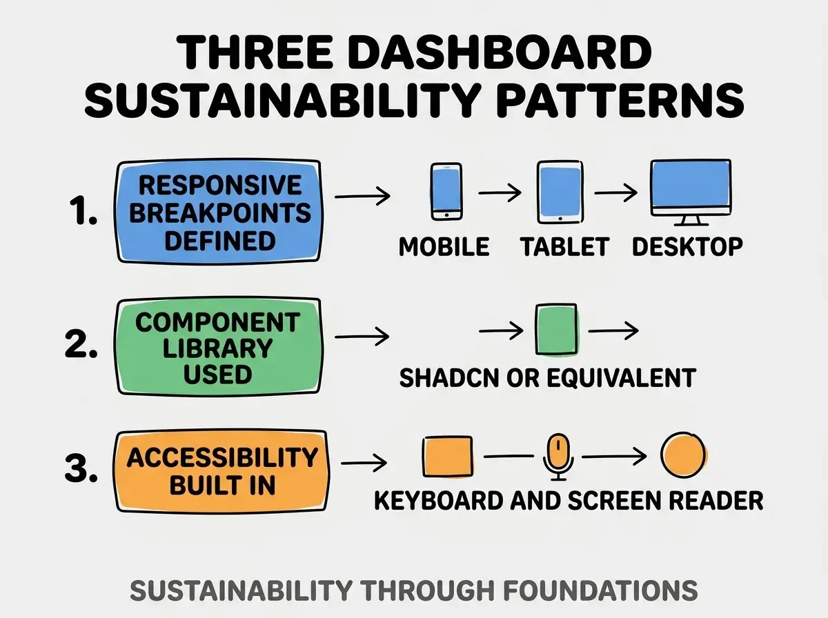
Pattern 1, responsive breakpoints defined. Mobile, tablet, desktop layouts all designed; not afterthoughts.
Pattern 2, component library used. shadcn/ui or equivalent provides consistent components; consistency reduces maintenance.
Pattern 3, accessibility built in. Keyboard navigation, screen reader support, focus management all included.
The combination produces dashboards that work for all users. Without these patterns, dashboards work for some users only.
How To Combine Patterns Effectively
Three combination patterns produce production dashboards.
Pattern A, sidebar plus topbar. Sidebar for navigation, topbar for account and context. Most common SaaS pattern.
Pattern B, sidebar plus card grid pages. Sidebar navigates to pages; pages use card grids for content. Data dashboard pattern.
Pattern C, topbar plus tabs. Topbar for top level, tabs for sub navigation. Simple app pattern.
Common Questions About Dashboard Layouts
Dashboard layouts raise questions worth addressing directly.
The first question is whether to use sidebar or topbar for new SaaS. Sidebar usually wins; SaaS apps grow features over time, sidebar accommodates growth.
The second question is whether to use icons or text in sidebar. Both; icons for fast recognition, text for clarity. Icon only on mobile to save space.
The third question is how many cards per row. Depends on card content; 3-4 columns for dashboards with many cards, 2 for richer cards.
The fourth question is how to handle mobile dashboards. Mobile usually drops sidebar to drawer or bottom nav; cards stack to single column.
How Layouts Affect User Behavior
Dashboard layouts affect user behavior in compounding ways. Behavior effects compound across user lifetime.
The first compounding effect is feature discovery. Layouts that surface features get features used; hidden features stay hidden.
The second compounding effect is daily efficiency. Efficient layouts compress task time; saved time compounds across daily usage.
The third compounding effect is user satisfaction. Well designed layouts feel satisfying; satisfaction translates to retention.
The combination produces user behavior shaped by layout. Without layout attention, behavior follows accidental defaults.
How To Test Dashboard Layouts
Three test patterns validate dashboard layouts.
Pattern A, user task completion testing. Give users tasks; observe completion paths. Dead ends and confusion reveal layout issues.
Pattern B, mobile testing dedicated. Test on actual phones, not just resized browser. Touch targets and layout differ.
Pattern C, accessibility audit. axe or Lighthouse audit catches accessibility layout issues that visual review misses.
The combination produces validated dashboards. Without testing, layouts may work for designer but fail for users.
The most damaging dashboard layout mistake is choosing layout based on aesthetic preference rather than task fit. Sidebar looks professional; sidebar fails for content focused apps. The fix is to choose layout based on navigation depth, content density, and user task; aesthetic follows function. Builders who choose by function produce dashboards users love; builders who choose by aesthetic produce dashboards that look good but feel wrong.
The other mistake is over engineering navigation hierarchy. Three levels deep is usually plenty; deeper navigation hides features.
A third mistake is missing the loading and empty states. Layouts must handle no data, loading data, and error states gracefully.
A fourth mistake is treating layout as one time decision. As features grow, layout may need restructure; periodic review catches drift.
What This Means For You
Dashboard layout patterns produce dashboards that match user tasks. The three patterns, prompts, and combination approaches produce dashboards that work for production rather than just demos.
- If you're a founder: Match dashboard layout to your app's navigation depth; mismatch produces confusion that hurts retention.
- If you're a product manager: Test dashboard layouts with users early; later changes are expensive.
Browse more build articles
Read more build