You can build a SaaS dashboard from zero to working prototype in a single day using AI coding tools, even if you have never built one before. 92% of developers now use AI tools daily, and dashboards are one of the most requested projects among founders and indie hackers. This tutorial walks you through the exact prompt sequence that turns a blank screen into a functional admin panel with charts, data tables, filters, and role-based access.
Think of a dashboard like the cockpit of an airplane. Every pilot needs the same core instruments: altitude, speed, fuel, heading. But a cargo pilot and a fighter pilot arrange those instruments differently. Your SaaS dashboard works the same way. The components are standard. The arrangement depends on what your users need to see first and act on fastest.
What Makes a Good Dashboard
Before you open your AI tool and start prompting, you need to understand what separates a good dashboard from a cluttered mess. A good dashboard answers one question instantly: "How is my business doing right now?" If a user has to squint, scroll, or click through three tabs to find that answer, the dashboard has failed.
The best dashboards share four qualities. First, they surface key metrics at the top in large, readable cards. Revenue, active users, churn rate. Pick three to five numbers that matter most and give them prime real estate. Second, they use charts sparingly. One or two well-chosen charts beat six competing for attention. Third, they provide a data table for detailed exploration below the summary. Fourth, they load fast. A dashboard with beautiful charts that takes eight seconds to load is worse than a plain one that loads in one.
Most vibe-coded dashboards fail because of two things: too many charts crammed onto one page, and no loading states. When every chart competes for attention, nothing stands out. When data takes a second to arrive but the UI shows nothing, the whole thing feels broken.
A dashboard is not a place to show everything you can measure. It is a place to show the three to five things your user needs to act on right now. Start with the smallest useful set of metrics. You can always add more later, but you cannot un-overwhelm a user who already bounced.
The Prompt Sequence That Builds the Whole Thing
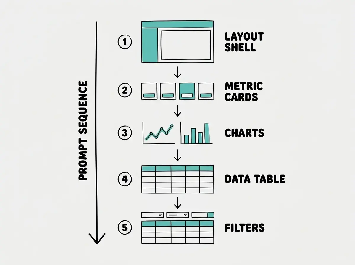
The secret to building a complex UI with AI is not one massive prompt. It is a deliberate sequence of focused prompts, each building on the last. Here is the exact sequence.
Prompt 1, the Layout Shell
Start with the skeleton. Do not ask for charts, data, or colors yet. Just the structure.
"Build a SaaS dashboard layout using Next.js and shadcn/ui. Include a collapsible sidebar on the left with navigation items for Dashboard, Users, Analytics, and Settings. The main content area should fill the remaining width. Add a top header bar with a search input, a notification bell icon, and a user avatar dropdown in the top right. Use a clean, minimal design with a white background and subtle gray borders."
This prompt gives the AI a clear structural target without overwhelming it with data concerns. You will get a responsive shell that works on desktop and collapses the sidebar on mobile.
Prompt 2, the Metric Cards
Now populate the top of the main content area.
"Add a row of four metric cards at the top of the dashboard content area. Each card should show a label, a large number, and a percentage change indicator with a green up arrow or red down arrow. The four metrics are: Monthly Revenue ($24,500 with +12%), Active Users (1,247 with +8%), Churn Rate (3.2% with -0.5%), and New Signups (384 with +23%). Use the shadcn/ui Card component. Add subtle hover effects."
Prompt 3, the Charts
Keep it to two charts. Resist the urge to add more.
"Below the metric cards, add two charts side by side. The left chart should be a line chart showing monthly revenue over the past 12 months. The right chart should be a bar chart showing new signups per month over the same period. Use Recharts for both. Add proper axis labels, a tooltip on hover, and a legend. Use teal as the primary chart color."
Prompt 4, the Data Table
"Below the charts, add a users data table using the shadcn/ui Table component. Include columns for Name, Email, Plan (Free/Pro/Enterprise), Status (Active/Inactive), Join Date, and a three-dot actions menu. Populate it with 10 rows of realistic sample data. Add pagination controls at the bottom showing rows per page and page navigation. Add alternating row backgrounds for readability."
Prompt 5, the Filters
"Add a filter bar above the data table. Include a search input that filters by name or email, a dropdown to filter by plan type, a dropdown to filter by status, and a date range picker for join date. All filters should work together and update the table in real time. Add a 'Clear All' button to reset filters."
Each prompt takes thirty seconds to write and sixty seconds for the AI to implement. After all five, you have a complete dashboard. Total time: about twenty-five minutes.
Connecting to Supabase for Real Data
Sample data gets you through demos. Real data makes it a product. Supabase is the fastest way to add a real backend because it gives you a PostgreSQL database, authentication, and an API in one setup.
"Set up a Supabase client using @supabase/supabase-js. Create a users table with columns: id (uuid, primary key), name (text), email (text), plan (text, one of 'free', 'pro', 'enterprise'), status (text, one of 'active', 'inactive'), and created_at (timestamp). Replace the sample data in the users table with a query to Supabase. Add a loading skeleton while data is fetching."
That last sentence is critical. Loading skeletons separate a prototype from a product. When your table shows animated gray rectangles while data loads, the dashboard feels intentional. When it shows nothing or a jarring spinner, it feels broken.
After the AI generates the Supabase integration, go to your Supabase dashboard, create the table, and add test rows. Your dashboard pulls from real data within minutes. For charts, you can create a separate analytics table with pre-calculated monthly metrics or aggregate raw data on the client side. For under ten thousand users, client-side aggregation is fine.
Building Role-Based Views
Not every user should see the same dashboard. An admin needs revenue data, user management, and system health. A regular user needs their own usage stats, billing info, and support options. This is where role-based access comes in.
"Add role-based rendering to the dashboard. Create a user context that stores the current user's role (admin or user). If the role is admin, show all four metric cards, both charts, and the full users table with the ability to change user plans and status. If the role is user, show only two metric cards (their own usage and billing), a single chart of their usage over time, and their account details. Hide the Users and Analytics sidebar items for non-admin users. Add a toggle in the header to switch between roles for testing."
The testing toggle lets you verify both views without logging in and out repeatedly. Remove it before you ship, but during development it saves enormous time.
One thing the AI will likely miss: make sure Supabase queries also filter by role. Client-side hiding is not security. If an admin-only endpoint returns all user data regardless of who is asking, a non-admin user can open developer tools and see everything. Always pair client-side role checks with Row Level Security in Supabase.
Hiding UI elements based on role is not the same as securing your data. If your Supabase queries return all rows and you filter them in the browser, anyone with developer tools can see everything. Always enforce role-based access at the database level using Row Level Security policies, not just in your React components.
Making the Dashboard Responsive
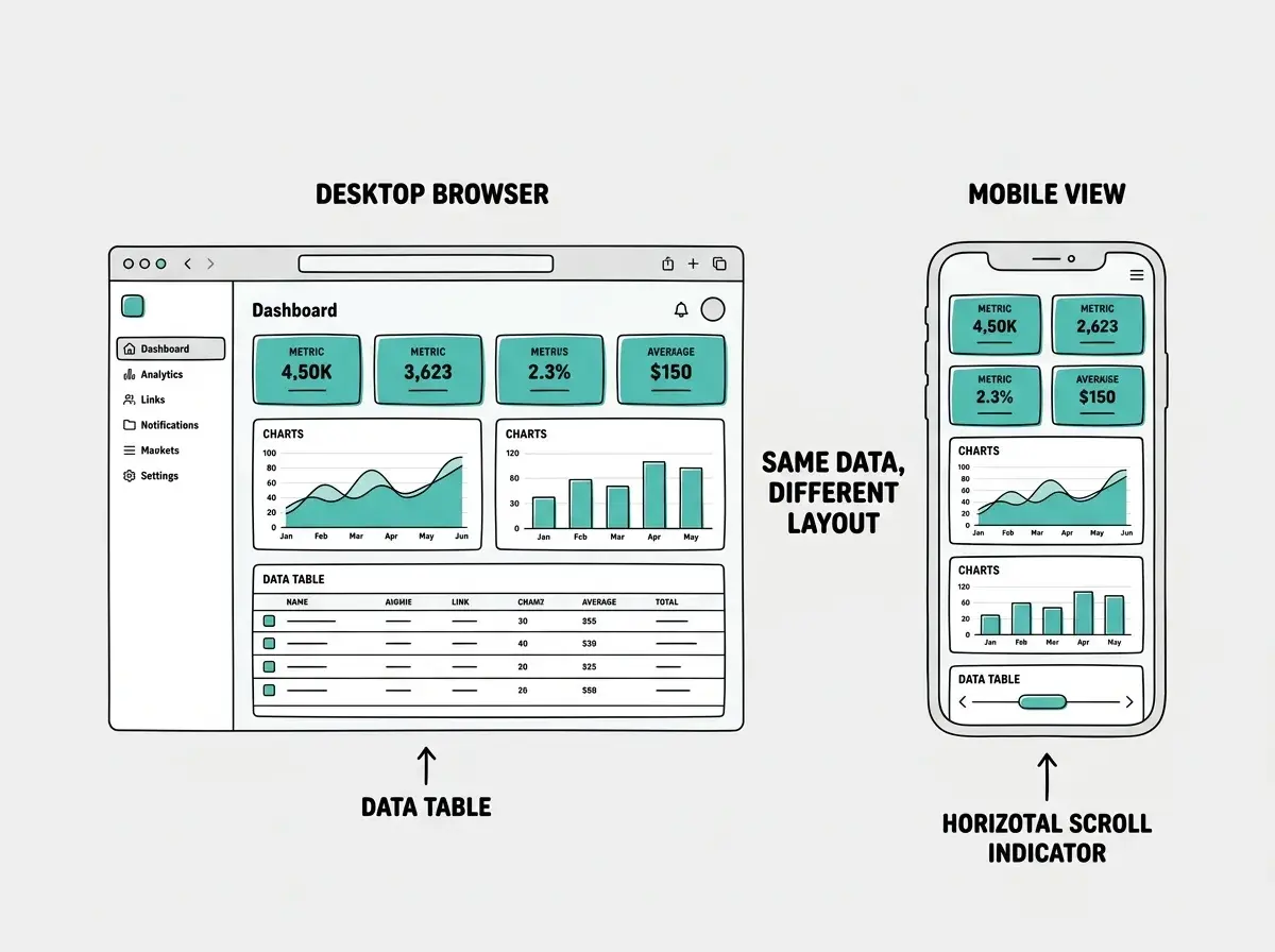
Dashboards are tricky on mobile because they are information-dense. You cannot just shrink four columns into one. The mobile version needs to be a different experience.
"Make the dashboard fully responsive. On screens below 768px: collapse the sidebar into a hamburger menu overlay, stack the metric cards in a 2x2 grid, stack the two charts vertically, make the data table horizontally scrollable, and move the filter bar into a collapsible 'Filters' button that expands a panel. Ensure touch-friendly tap targets."
The horizontally scrollable table is important. Do not try to hide columns on mobile or compress them into an unreadable mess. Let the user scroll sideways. They already know this pattern from spreadsheets.
This is part of the S01 series on building real products with AI from scratch.
See all tutorialsPitfalls That Kill Dashboard Projects
After reviewing dozens of AI-generated dashboards, I see the same problems repeatedly.
Too many charts on one page. Every chart you add dilutes the ones already there. More than three charts on a single view means extras should move to a separate Analytics page.
No loading states anywhere. When data arrives in two seconds on a slow connection, your dashboard looks broken without skeleton loaders. Add them to every component that fetches data.
Ignoring empty states. A new SaaS has zero users and zero revenue. If your dashboard shows a bunch of zeros and empty charts, add helpful messages like "No users yet. Share your invite link to get started."
No error handling on API calls. Supabase goes down. Networks fail. Every data fetch needs a try-catch with a user-friendly error message, not a blank screen.
Polishing before validating. If you are spending three days perfecting chart animations before you have ten paying users, you are optimizing the wrong thing. Ship it. Improve based on what actual users need.
Start with the prompt sequence above and have a working prototype by tonight.
Get startedDig deeper
A few hand-picked sources if you want to go further.
What This Means For You
You do not need to be a frontend engineer to build a SaaS dashboard that looks and works like a professional product. The prompt sequence in this tutorial gives you a repeatable system for building any dashboard. The shadcn/ui components handle the design. Supabase handles the data. Role-based views handle access control.
Start with the five-prompt sequence. Get the static version working with sample data. Then swap in Supabase, add roles, and make it responsive. That is a real dashboard, built in a day, ready for your first users.