To build an internal reporting dashboard with AI tools, follow the four phase approach (define the questions stakeholders actually ask, build the data pipeline that answers them, design visualizations that match the questions, and ship with the workflow patterns that produce sustained adoption), recognize what separates dashboards that get used from dashboards that get ignored, and apply the patterns that produce reports stakeholders return to weekly. The internal reporting dashboard becomes valuable only when stakeholders use it; the use depends on alignment with their actual questions.
This piece walks through the four phases, the question-driven design pattern, the specific tooling that worked, and the four mistakes that produce dashboards no one looks at.
Why Internal Reporting Dashboards Matter
Internal reporting dashboards exist to inform decisions, not display data. The distinction matters; many dashboards display metrics no one acts on, while the metrics decision-makers actually need go missing. Question-driven design produces dashboards that get used.
The 2026 reality is that AI tools make dashboard building dramatically faster than traditional approaches. The question shifts from "can we build it" to "should we build this exact dashboard"; the design questions matter more when build cost drops.
A 2025 internal tools survey of 800 companies found that 67 percent of internal dashboards built were used less than once per month after the first week. The build cost of dashboards is no longer the constraint; the design quality is. Question-driven dashboards see weekly use; vanity dashboards see one week of attention then nothing.
The pattern to copy is the way television news producers design their broadcasts. They start with what viewers want to know, then design segments that deliver it. Dashboard designers who start with stakeholder questions produce reports stakeholders use; designers who start with available data produce dashboards stakeholders ignore.
The Four Phase Approach
Four phases produce internal reporting dashboards that get used.
Phase 1, define the questions stakeholders actually ask. Interview the people who will use the dashboard. What do they want to know weekly? What decisions do they make? The questions become the dashboard structure.
Phase 2, build the data pipeline that answers them. Connect to the data sources, transform as needed, calculate the metrics that match the questions. AI tools handle pipeline code generation effectively; the design judgment matters more than the implementation.
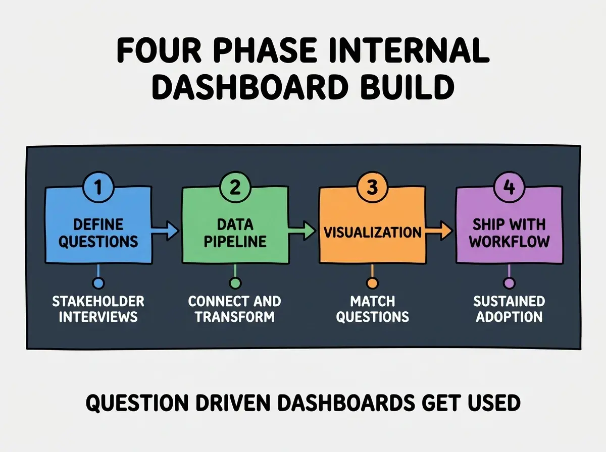
Phase 3, design visualizations that match the questions. Numbers for "how much" questions, time series for "trend" questions, comparisons for "versus" questions. Match visualization to question; mismatched visualizations confuse stakeholders.
Phase 4, ship with workflow patterns that produce adoption. Embed in stakeholder workflows, send weekly summaries, integrate with team rituals. The dashboard becomes used through workflow integration; standalone dashboards rarely get sustained use.
The Question Driven Design Pattern
Three patterns produce question driven dashboards that get used.
Pattern 1, list every stakeholder question explicitly before building. What do they want to know? When? What action follows? Write the questions; the dashboard becomes the answer set.
Browse more internal tool tutorials
Read more build tutorialsPattern 2, organize the dashboard by question category. Revenue questions in one section, operational questions in another. Section structure matches stakeholder mental models; mixed sections confuse navigation.
Pattern 3, prioritize the most asked questions visually. Top of page, larger size, immediate visibility. The hierarchy matches usage; the layout supports the actual workflow.
The Specific Tooling That Worked
Three tool categories combine effectively for internal dashboard building.
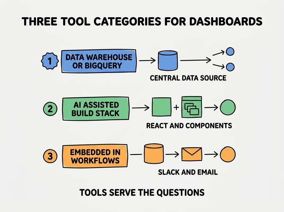
Tool 1, data warehouse or BigQuery for central data. Single source of truth. Stakeholder questions answered consistently rather than from different sources producing different numbers.
Tool 2, AI assisted build stack for the dashboard itself. React, charting libraries, AI generated components. Build velocity high enough that dashboards iterate based on stakeholder feedback rather than freezing at v1.
Tool 3, embedded in workflows through Slack and email. Weekly summaries pushed to stakeholders. The dashboard reaches stakeholders rather than waiting for them to visit; passive dashboards see less use than active ones.
What Makes Dashboards Actually Get Used
Three patterns separate used dashboards from ignored ones.
Pattern 1, dashboards must answer questions stakeholders are already asking. New questions rarely get traction; existing questions produce immediate use. Listen to stakeholder conversations before building.
Pattern 2, weekly cadence beats real time for most reports. Real time dashboards distract; weekly summaries inform decisions. The cadence matches decision making rather than data update frequency.
Pattern 3, action recommendations alongside metrics. Numbers without context confuse; numbers with suggested actions inform. The action layer makes data useful for decision makers who do not interpret numbers fluently.
The combination produces dashboards that survive past launch week. Without these patterns, dashboards become forgotten links in nav menus that no one clicks.
How to Build Your First Internal Dashboard
Three implementation patterns help first dashboards succeed.
Pattern A, start with one stakeholder, not the whole company. Single user case studies produce focused dashboards; multi stakeholder requirements often produce dashboards that serve no one well.
Pattern B, ship in 1-2 weeks, not 1-2 months. Speed produces feedback; long build cycles produce dashboards that miss the moment of need. Iterate after launch rather than perfecting before.
Pattern C, measure usage and remove unused sections. Sections that get less than weekly visits should be removed. Dashboard simplicity correlates with sustained use; busy dashboards get ignored.
The combination produces first dashboards that establish the pattern for future dashboard work. Without these patterns, first dashboards often consume months and produce nothing used.
The most damaging dashboard mistake is building based on available data rather than stakeholder questions. Available data is what you can measure; stakeholder questions are what they want to know. The fix is to start with question interviews, then determine what data you need; you may find you need data you do not currently have, and the gap matters more than the existing data. Question driven dashboards produce sustained use; data driven dashboards produce one week of attention.
The other mistake is including every metric you can calculate. Comprehensiveness reduces use; focused dashboards get more attention than complete dashboards. The fix is ruthless prioritization; cut metrics that are not directly used in decisions.
A third mistake is failing to embed the dashboard in workflow. Dashboards on intranets see less use than dashboards summarized in Slack. The fix is to push relevant data to stakeholders rather than waiting for them to pull; the push pattern produces sustained engagement.
A fourth mistake is treating dashboard launch as completion rather than starting point. Dashboards improve through ongoing iteration based on real usage patterns. The fix is to commit to monthly review of usage data and quarterly revisions; dashboards that stop evolving stop being useful.
What This Means For You
The internal reporting dashboard built with AI tools becomes valuable through question driven design and workflow integration. The four phases, design patterns, and tool combinations produce dashboards stakeholders use weekly.
- If you're a product manager: Start with stakeholder question interviews before any building. The questions determine what dashboard would be useful; building without questions produces dashboards no one uses.
- If you're a founder: Internal dashboards inform team decisions. Build them when team scale makes ad hoc reporting too slow; before that, ad hoc beats premature dashboards.
- If you're a senior dev: AI tools handle dashboard implementation effectively. The bottleneck is design, not build; invest time in question definition and visualization choice.
Browse more internal tool tutorials
Read more build tutorials