To build an inventory management dashboard with AI in 2026, structure the dashboard around four core views (current stock levels, reorder alerts, sales velocity by SKU, supplier lead times), pull data from your e-commerce platform via API, add a simple barcode scanner for manual stock counts, and surface low-stock warnings prominently. The build takes 3 to 5 days with AI assistance and produces a tool your operations team uses daily, beating the default platform inventory views on speed and customization.
This piece walks through the four core views, the integration patterns, the alert thresholds that matter, and the four mistakes that turn inventory dashboards into spreadsheets that nobody updates.
Why Custom Inventory Dashboards Pay Back
E-commerce platforms (Shopify, WooCommerce, BigCommerce) all have built-in inventory management. They handle the basics. What they do not handle well is the operational reality of small-to-medium stores: multi-warehouse, supplier coordination, custom reorder logic, and the speed-of-information your staff need on a daily basis.
A custom inventory dashboard built with AI assistance closes the gap between "what the platform provides" and "what your operations actually need." The build is small enough that even small stores can justify it; the daily time savings compound quickly.
A 2025 NetSuite survey of 800 small-to-medium e-commerce operations found that teams with custom inventory dashboards reported 31 percent fewer stock-outs and 22 percent lower inventory holding costs compared to teams using only platform-default inventory views. The improvements came from faster reaction time to changing demand and better visibility into supplier performance. Inventory is one of the most under-tooled areas in small e-commerce; custom dashboards close the gap.
The pattern to copy is the way restaurants moved from paper inventory sheets to dedicated inventory tablets. The paper system worked but slowed staff down and missed problems. The tablet system caught issues earlier and freed staff time. E-commerce inventory follows the same pattern: defaults work but custom catches more.
The Four Core Views
Different operations work need different inventory views. Four views cover most use cases.
View 1, current stock levels. All SKUs with current quantities, sorted by status (out of stock, low, OK). The default view your team opens daily. Optimized for at-a-glance status check.
View 2, reorder alerts. Items below their reorder threshold, grouped by supplier. Includes recommended order quantities. Optimized for the weekly purchasing decision.
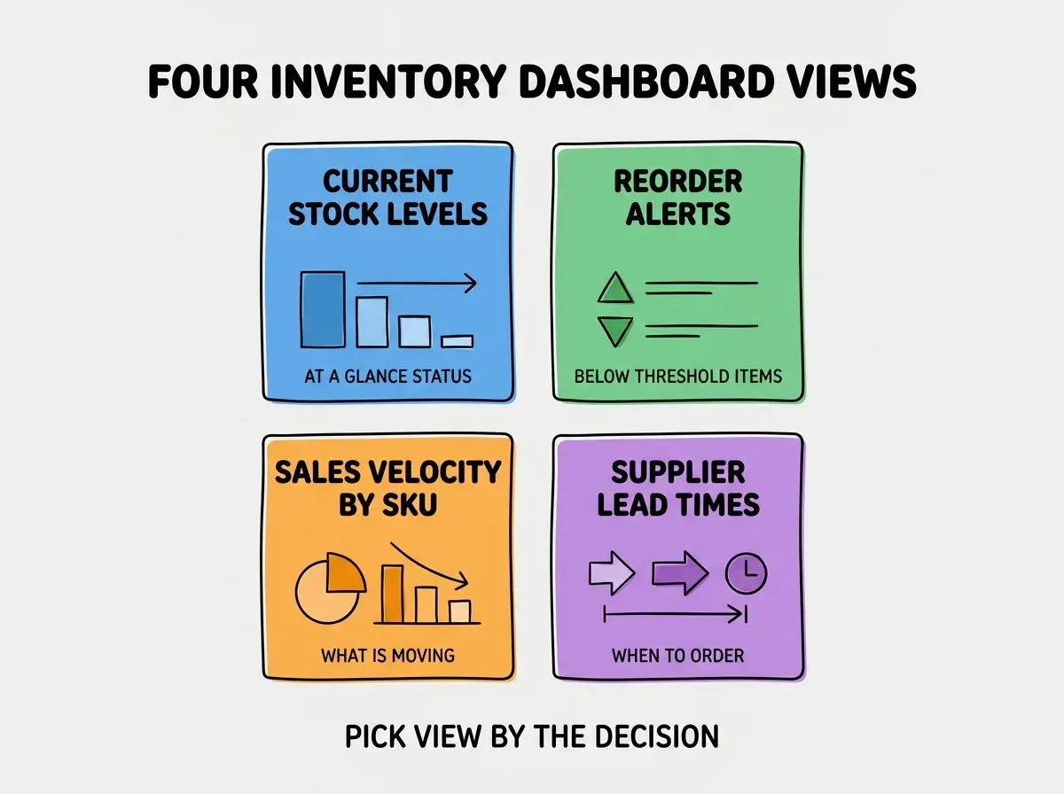
View 3, sales velocity by SKU. Units sold per day or week, with trends. Helps identify slow movers and rising stars. Optimized for catalog decisions.
View 4, supplier lead times. How long each supplier takes to fulfill orders, with reliability scores. Drives reorder timing decisions.
The Integration Patterns
The dashboard's value comes from real-time data. Three integration patterns handle most data sources.
Pattern 1, e-commerce platform API. Pull product, inventory, and order data from Shopify, WooCommerce, or your platform. Webhook for real-time updates plus periodic sync. The foundation.
Browse more e-commerce build guides
Read more build articlesPattern 2, supplier integrations. EDI, supplier APIs, or shared spreadsheets. Most small stores end up with a mix; design for that reality.
Pattern 3, manual updates. Barcode scanner, manual stock counts, manual order entry. The human-in-the-loop part. UI matters because staff use it daily.
The combination of these three integrations covers most operations. Start with the e-commerce platform integration; add supplier and manual updates as needed.
Alert Thresholds That Actually Help
Alerts are useful only if they fire at the right time. Three threshold patterns work well.
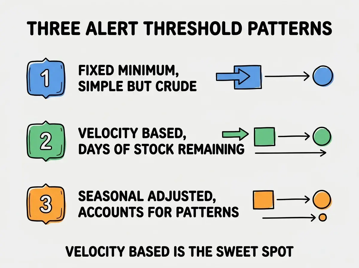
Pattern 1, fixed minimum. Alert when units drop below a fixed number (e.g., 10). Simple but crude; does not account for sales velocity. Good starting point.
Pattern 2, velocity-based. Alert when days of stock remaining drops below a threshold (e.g., 14 days). Accounts for actual sales rate. The sweet spot for most stores.
Pattern 3, seasonal-adjusted. Velocity-based but with seasonal multipliers. Critical for stores with strong seasonality (gifts, swimwear, etc.). More complex to implement.
Most small stores should start with fixed minimums, graduate to velocity-based after the basics work, and only add seasonal adjustment if they have clear seasonal patterns. The progression matches the team's analytical maturity.
The Mobile Experience That Matters
Inventory work happens on the floor, in warehouses, in the back of stores. A desktop-only dashboard misses the actual moment of inventory work.
Mobile feature 1, barcode scanner. Scan SKUs to pull up product details, update counts, mark received. The single most important mobile feature.
Mobile feature 2, low-stock browse. See low-stock items quickly when on the floor. Drives "let me grab one from storage" workflows.
Mobile feature 3, quick stock adjustments. Add or remove units from stock with two taps. Faster than going back to a desktop. Critical for fast-paced operations and the small moments that add up to significant time savings each day.
The mobile experience is where many custom dashboards fall short. Teams build a beautiful desktop dashboard and ignore mobile, then wonder why their warehouse staff still uses spreadsheets. Build mobile-first or at least mobile-equal from the start.
The most damaging inventory dashboard mistake is treating it as a reporting tool rather than as a workflow tool. Reporting dashboards show data; workflow dashboards drive actions. The difference is whether staff can take action from inside the dashboard (place an order, mark items received, adjust counts) or whether they have to go to other tools. Workflow dashboards become daily-use tools; reporting dashboards become weekly-glance tools at best. The fix is to design every screen around an action the user can take, not around a question the data can answer. Action-first design is what makes inventory dashboards stick.
The other mistake is over-customizing the dashboard for one specific user (usually the founder) and ignoring the broader team's needs. Founders often have idiosyncratic data preferences that staff find confusing. Design for the median user (warehouse staff, operations team) and let the founder use Excel exports for their custom analyses.
Reporting and Analytics Layer
Beyond the operational views, three reporting patterns help leadership understand inventory health over time.
Report 1, inventory turnover. How quickly stock turns over each month. High turnover means efficient capital use; low turnover means tied-up cash. Key health metric.
Report 2, dead stock identification. Items that have not sold in 30, 60, 90 days. Surfaces capital tied up in non-moving inventory. Drives clearance sale decisions.
Report 3, supplier scorecard. On-time delivery rate, defect rate, lead time consistency by supplier. Drives supplier negotiation and replacement decisions.
These three reports are reviewed weekly by leadership rather than constantly by operations. The split between operational dashboards (used daily) and reporting dashboards (reviewed weekly) keeps each focused on its actual audience and prevents the dashboard sprawl that kills inventory tools at most stores.
The combination of operational views and reporting views also serves a maturity progression. New stores need operational visibility most; mature stores derive more value from reporting. Building both lets the same dashboard serve the store as it grows, rather than requiring a rebuild every time the team's analytical needs evolve over the months and years ahead.
Dig deeper
A few hand-picked sources if you want to go further.
What This Means For You
A custom inventory management dashboard is one of the higher-leverage operations investments any e-commerce store can make in 2026. The build is small with AI assistance, and the daily time savings compound.
- If you're a founder: Build a custom inventory dashboard once you have 50+ SKUs. Below that, platform defaults are enough.
- If you're changing careers into e-commerce operations: Inventory tooling is increasingly valued in operations roles. Building one teaches you the metrics that operations teams care about.
- If you're a student: Build an inventory dashboard for a hypothetical store as a portfolio project. The combination of data viz and operational thinking is rare.
Browse more e-commerce build guides
Read more build articles