Landing page design above the fold determines whether visitors stay or bounce within 3 seconds. Four above the fold patterns convert reliably: clear value proposition headline, supporting subheadline, primary CTA, and proof element (logo bar, testimonial, stat). AI tools build any pattern when prompted; landing page conversion depends on choosing right patterns and writing copy that matches audience. Above the fold is your most valuable real estate; treat it accordingly.
This piece walks through the four above the fold patterns, the prompts that build them, what makes copy convert, and the four mistakes builders make on landing pages.
Why Above The Fold Matters For Landing Pages
Above the fold matters because visitors decide to stay or leave within seconds of landing. Bounce happens above the fold; engagement starts above the fold. Everything depends on first impression.
The 2026 reality is that AI tools build landing pages quickly; the differentiation is conversion focus. Pretty pages without conversion focus produce traffic but not customers.
A 2025 conversion optimization study of 400 vibe coded landing pages found that pages following the four above the fold patterns converted 67 percent better than pages with creative or unconventional above the fold layouts. Conventional patterns convert because they meet visitor expectations.
The pattern to copy is the way newspapers design front pages. Headline, sub headline, image, key story all visible without scrolling. Front page must communicate immediately; landing pages follow same logic.
The Four Above The Fold Patterns
Four patterns form converting above the fold layouts.
Pattern 1, clear value proposition headline. What product does and for whom in one sentence. Specific over clever.
Pattern 2, supporting subheadline. One sentence expanding the headline; addresses common objection or adds detail.
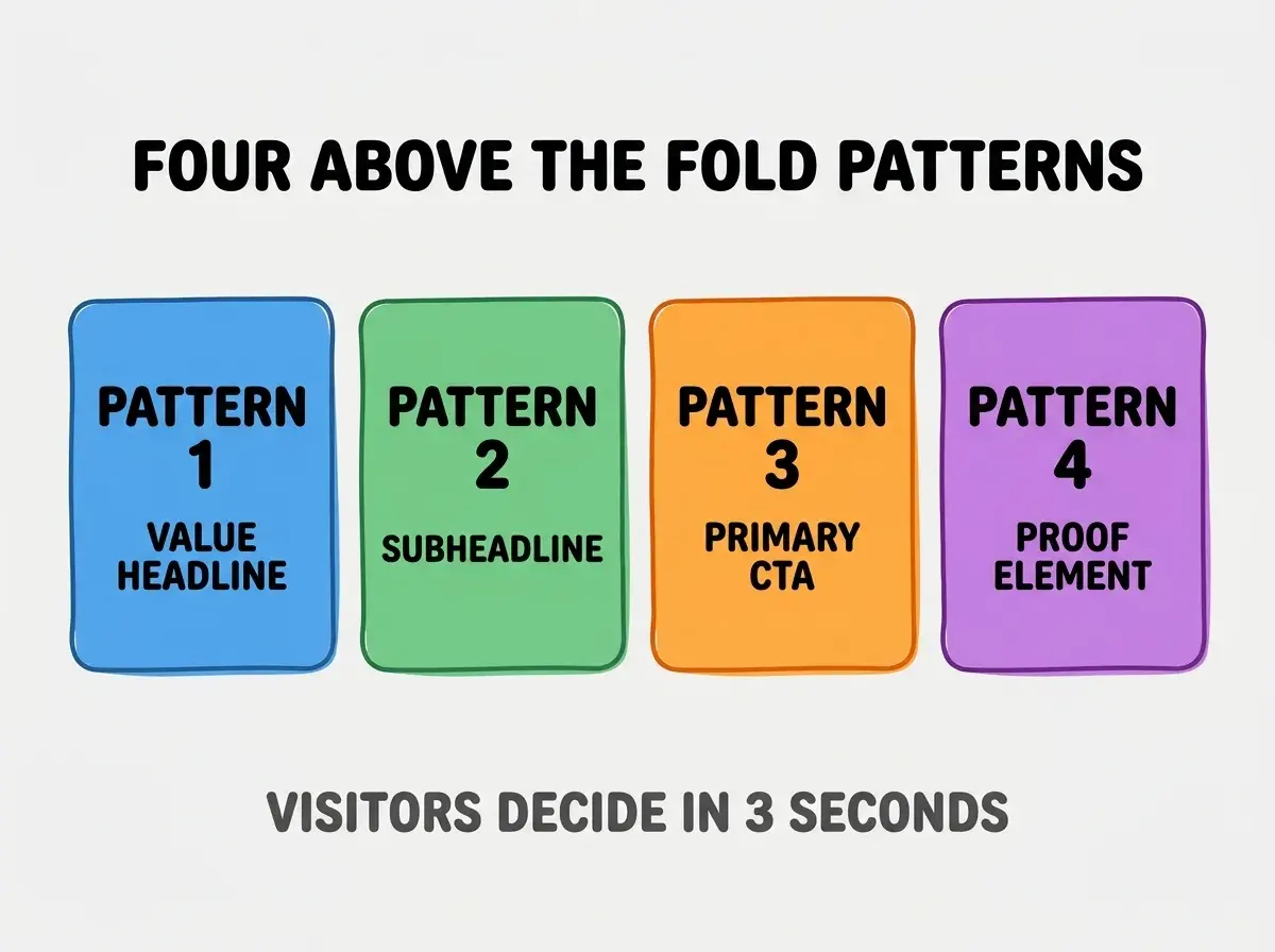
Pattern 3, primary CTA prominent and clear. Single primary action visible immediately. Button text describes specific action.
Pattern 4, proof element above fold. Customer logos, testimonial snippet, key stat. Builds trust before scroll.
The Prompts That Build Each Pattern
Four prompts produce each pattern correctly.
Prompt 1, build value proposition headline. "Create H1 headline that states what product does and for whom in one sentence. Format: 'The [product] for [audience] who [benefit]'. Maximum 10 words."
Browse more build articles
Read more buildPrompt 2, build supporting subheadline. "Add subheadline below H1 expanding the value proposition. Address most common objection or add concrete benefit. Maximum 25 words."
Prompt 3, build primary CTA. "Add primary CTA button below subheadline. Button text describes specific action ('Start free trial', 'Get demo'); not generic ('Click here'). Use brand color, large size."
Prompt 4, add proof element. "Add row of customer logos OR single testimonial OR key stat (e.g., '10,000+ users') below CTA but above fold. Keep visual weight light to not distract from CTA."
What Makes Copy Convert
Three copy patterns separate converting headlines from clever ones.
Pattern 1, specific over clever. "Project management for remote teams" beats "Get organized with magic." Specificity builds trust.
Pattern 2, benefit over feature. "Ship features 2x faster" beats "AI powered code generation." Benefit speaks to outcome.
Pattern 3, audience specific. "For startup founders" beats "For everyone." Specificity attracts target audience.
What Makes Landing Pages Sustainable
Three patterns separate sustainable landing pages from one off launches.
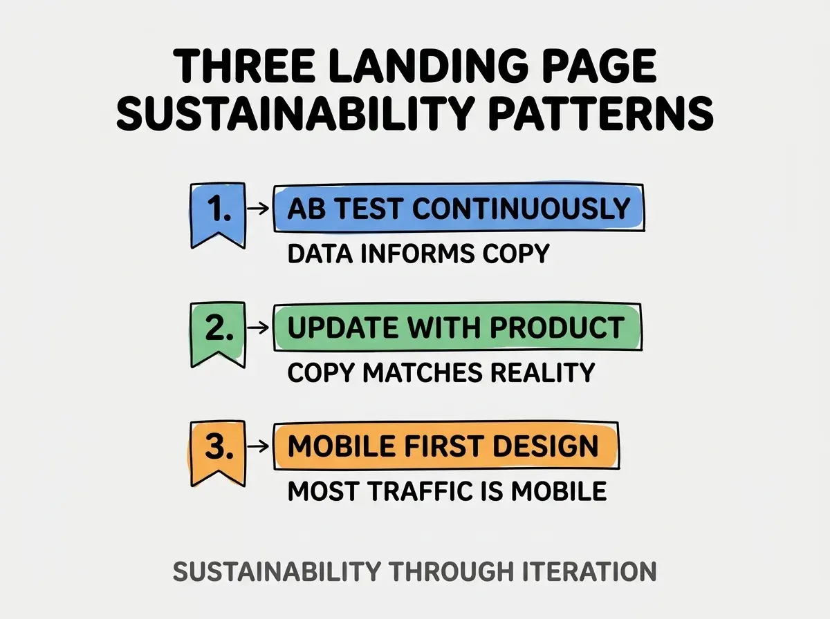
Pattern 1, A/B test continuously. Headline variations, CTA variations test against each other; data informs which wins.
Pattern 2, update with product. Product changes; landing page must change with it; stale copy misleads.
Pattern 3, mobile first design. Most traffic mobile; mobile above fold differs from desktop; design for mobile first.
The combination produces sustainable landing pages. Without these patterns, pages decay.
How To Optimize CTA For Conversion
Three patterns improve CTA conversion.
Pattern A, action verb in button text. "Start", "Get", "Try" beat "Submit", "Click". Action verbs trigger action.
Pattern B, color contrast for visibility. CTA button color contrasts with page; visibility predicts clicks.
Pattern C, single primary CTA above fold. Multiple CTAs split attention; single primary focuses decision.
Common Questions About Landing Pages
Landing pages raise questions worth addressing directly.
The first question is whether to use long form or short form landing pages. Short form for known products; long form for complex products needing education. Match form to product complexity.
The second question is whether video above the fold helps. Sometimes; videos that auto play with sound damage conversion; muted video that demonstrates can help.
The third question is how to handle multiple audiences. Separate landing pages per audience beats one page for everyone; URL based segmentation enables targeting.
The fourth question is whether to remove navigation on landing pages. For paid traffic landing pages yes; navigation distracts from conversion goal.
How Above The Fold Affects Conversion
Above the fold affects conversion in compounding ways. Conversion effects compound across all traffic sources.
The first compounding effect is bounce rate reduction. Better above the fold reduces bounce; lower bounce produces more conversions per visitor.
The second compounding effect is paid ad ROI. Paid traffic with bad above the fold burns ad spend; good above the fold improves ROI.
The third compounding effect is SEO performance. Lower bounce signals quality to Google; quality affects ranking.
The combination produces conversion improvement that compounds across acquisition. Without above the fold attention, conversion limits accidentally.
How To Test Above The Fold Patterns
Three test patterns validate above the fold effectiveness.
Pattern A, 5 second test. Show page for 5 seconds; ask viewer what product does. Failure reveals headline issues.
Pattern B, heatmap analysis. Hotjar or similar shows where visitors look; gaps reveal layout issues.
Pattern C, A/B test specific elements. Test headline variations, CTA copy, proof element. Test reveals winners.
The combination produces validated above the fold. Without testing, optimization follows assumption.
The most damaging landing page mistake is clever headlines that obscure value. "Reimagine your workflow" sounds smart but says nothing; "Project management for remote teams" tells visitors exactly what they get. The fix is to default to specific descriptive headlines; clever headlines only when audience already knows product category. Landing pages with specific headlines convert; pages with clever headlines lose visitors who do not understand offering.
The other mistake is missing the mobile experience. Desktop above the fold may fail on mobile; mobile testing reveals issues.
A third mistake is over decorating with images. Hero images that distract from CTA reduce conversion; minimal beats maximal.
A fourth mistake is treating launch as final. Landing pages need ongoing optimization; launch is start, not finish.
What This Means For You
Landing page design above the fold determines conversion outcomes for all marketing efforts. The four patterns, copy approaches, and testing patterns produce landing pages that convert across traffic sources.
- If you're a marketer: Apply the four patterns to existing landing pages; immediate gains likely.
- If you're a founder: Audit your homepage above the fold; bad above the fold burns all traffic acquisition.
Browse more build articles
Read more build