Image and asset optimization is the work of getting visual content to your users as fast and small as possible without losing visible quality. For most vibe coded apps, unoptimized images are the single biggest performance problem, easily 70% to 90% of total page weight, and the easiest one to fix once you know the patterns. The fix is rarely complicated. The fix is just rarely automatic, and AI tools default to the unoptimized path because that is the simplest code to generate.
This guide walks through the format choices, the compression pipeline, the CDN setup, and the specific AI-generated patterns that quietly destroy your Core Web Vitals.
Why AI Generates Unoptimized Image Code
The default pattern AI generates for displaying an image is <img src="/path.jpg" />. It works, it renders, and it tanks performance. There is no responsive sizing, no modern format, no lazy loading, and no CDN consideration. The user downloads a 2 MB JPEG to render in a 400 pixel container, the page weight balloons, and Core Web Vitals scores fall.
The reason AI generates this pattern is that it is the simplest, oldest, and most heavily represented in training data. Modern image patterns (Next.js <Image>, responsive srcset, AVIF or WebP fallback, lazy loading) are newer and less consistently documented. The AI knows about them but only suggests them when prompted by name.
A 2025 HTTP Archive analysis of one million production websites found that the median page contained 2.1 MB of images, and that 76% of those images were larger or in a less efficient format than necessary. For sites built with AI tools, the gap was even larger, the median page had 2.8 MB of unoptimized images.
The pattern to copy is shipping logistics. A package gets shrink-wrapped, sized to the smallest box that fits, and routed through the closest distribution center to the customer. You do not ship a 50 cubic foot box for a 1 cubic foot item, even if the item physically fits. Image optimization is the same, ship the smallest viable representation through the closest delivery point.
Format Selection by Use Case
The format choice is the single biggest lever in image optimization. Use the wrong format and no amount of compression saves you. Use the right format and the file is 50% to 80% smaller before any other work.
For photographs and complex images, AVIF is the modern leader, typically 50% smaller than JPEG at equivalent quality, with WebP as the fallback for slightly older browsers, and JPEG as the universal fallback. The pattern is to serve AVIF first, fall back to WebP, fall back to JPEG, all from the same <picture> element.
For illustrations, logos, and UI elements, SVG is almost always correct. Vector graphics scale to any size without quality loss and are usually smaller than any raster equivalent at typical UI sizes. The catch is that SVGs from designers often include hidden bloat (XML metadata, embedded fonts, layer names) that should be stripped before shipping.
For screenshots and graphics with sharp edges, WebP is the right default, with PNG as a fallback. The animated case (GIFs) is where most apps over-pay. A modern animated WebP is 5 to 10 times smaller than the equivalent GIF at equivalent quality.
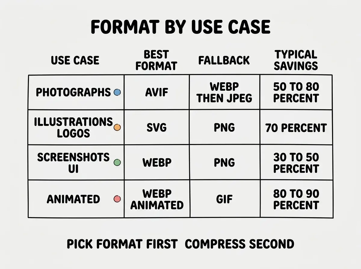
The decision tree is short, photographs go to AVIF, illustrations to SVG, screenshots to WebP, and animations to animated WebP. Get the format right and the rest is incremental.
The Automated Pipeline
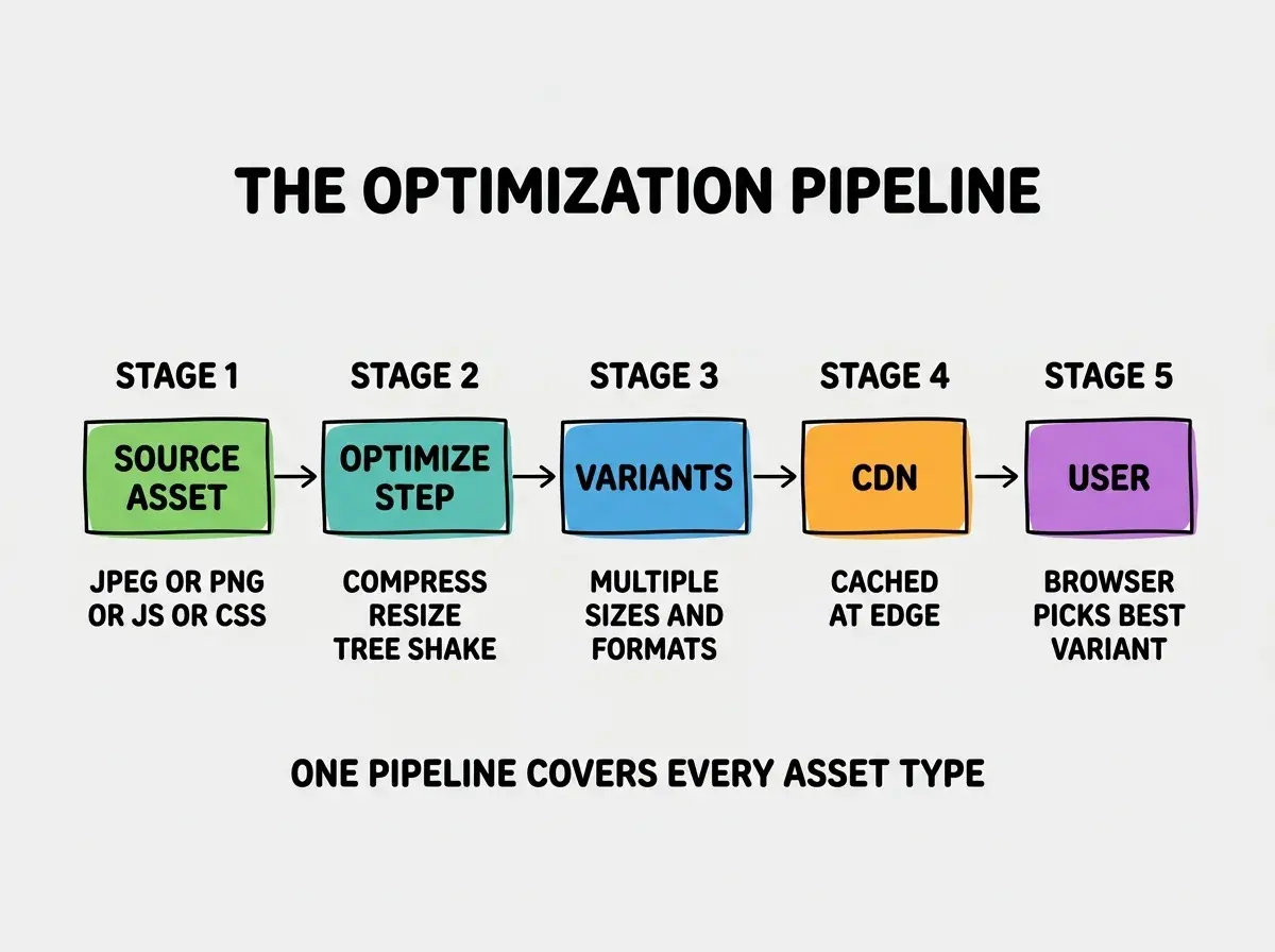
Manually optimizing every image is unsustainable. The right architecture is an automated pipeline, the developer uploads the source image, the pipeline generates multiple sizes and formats, and the app references the optimized variants by URL.
For a Next.js app, the easiest path is the built-in <Image> component, which generates responsive sizes and modern formats at request time and caches them. For other frameworks, services like Cloudinary, ImageKit, or Cloudflare Images do the same job through a URL-based API. The trade-off is cost (a few dollars per month for small apps, scaling with traffic) versus build complexity.
The pipeline pattern that has worked well for me is, store source images at full resolution in object storage (R2, S3, or Cloudflare Images), generate variants on-demand at multiple breakpoints (320, 640, 1024, 1920 pixels), serve them through a CDN with a long max-age, and use srcset and sizes attributes to let the browser pick.
Read the rest of the performance series for vibe coded apps
Browse the ship categoryThe browser does the actual selection at render time based on viewport, device pixel ratio, and the sizes hint. This is a 30-line change to your <img> tags that often cuts image bandwidth by 60% to 80% on mobile.
Beyond Images, the Other Asset Types
Images get most of the attention but other assets matter too. The same shipping-logistics principle applies, ship the smallest viable representation through the closest delivery point.
JavaScript bundles. Most vibe coded apps ship more JavaScript than they need because tree-shaking is misconfigured or because the app pulls in entire libraries for one function. The fix is to audit the bundle (Next.js has a built-in analyzer, others use webpack-bundle-analyzer) and replace expensive dependencies with lighter alternatives or dynamic imports.
CSS. Modern build tools generate optimized CSS but only if configured. Tailwind purges unused classes, CSS modules avoid global namespace bloat, and PostCSS minifies the output. The single biggest lever is removing unused CSS, often 70% of what gets shipped is dead.
Fonts. Custom fonts are heavier than people expect, often 100 KB to 300 KB per family. The fixes are to use only the weights you actually display, subset fonts to remove unused glyphs, and use font-display: swap so text renders before the font loads. Variable fonts deserve special mention, a single variable font file can replace four or five static weight files, often cutting total font payload by 60% while supporting more weight options.
Video. Most vibe coded apps that show video do not need an autoplay hero video, but if they do, the file should be in modern container formats (AV1 or H.265) at appropriate resolutions for the display area. A 4K video file rendered in a 720 pixel container is a wasted 50 MB of download. For decorative loops, an animated WebP or a CSS animation is usually a better choice than a video file at all.
The single most damaging image optimization mistake in vibe coded apps is using a hero image without a fixed width and height attribute. The image renders, the page reflows, and the Cumulative Layout Shift score tanks. Always specify dimensions, even on responsive images.
The corollary is that aspect-ratio in CSS solves the same problem for cases where you do not know the exact pixel dimensions. The browser reserves the space before the image loads, the layout does not shift, and the user never notices the load.
What This Means For You
Image and asset optimization is a low-effort, high-impact area of production readiness. A weekend of work setting up the pipeline correctly typically cuts page weight by 60% to 80% and meaningfully improves Core Web Vitals scores.
- If you're a founder: This is the cheapest performance win you will find. Set up the pipeline once, and every future image benefits without any per-asset work.
- If you're changing careers: Knowing the format-by-use-case decision tree is one of those small bits of operational vocabulary that makes you sound experienced quickly. Internalize it.
- If you're a student: Run any class project through PageSpeed Insights and apply the suggested image fixes one by one. The score improvement is immediate and the lesson sticks.
Browse more performance and production guides
Read more ship guides