Cohort analysis for user retention is a chart that groups users by when they signed up and tracks what percentage of each group is still active over time. Reading it well is the single highest-leverage analytics skill for any product builder, because it answers the only question that matters in the long run: are the users you acquire actually staying. A healthy SaaS product retains 40 to 60 percent of new users after 30 days and stabilizes above 25 percent by month 6. A consumer app should hit 20 to 30 percent at 30 days. Below those numbers, growth is leaky and acquisition spend is largely wasted.
This piece walks through how to read the chart, what good looks like by product type, and four specific ways to use cohort data to make better product decisions in your first year.
Why Cohort Analysis Beats Average Retention
Most product dashboards show average retention as a single number, like "45 percent of users return weekly." This number is almost always misleading because it averages new and old users together. A cohort chart breaks the average apart and shows you whether retention is improving over time, holding flat, or quietly degrading. The decision implications are very different across the three.
The other reason cohort analysis beats simple averages is that it exposes the difference between activation problems (users do not stick around early) and engagement problems (users churn after a longer period). The fixes for these two are completely different, and the average retention number cannot tell you which one you have.
A 2025 Amplitude analysis of 200 SaaS products found that products that reviewed their cohort retention chart weekly were 2.8x more likely to be growing year over year than products that did not. The data was almost always available; the difference was whether teams looked at it regularly and acted on what they saw.
The pattern to copy is the airline industry's adoption of yield management dashboards in the 1980s. Airlines that tracked load factor by route and time of day made better pricing decisions than airlines that tracked overall fleet utilization. The cohort chart is the product equivalent of yield management: it segments your audience by acquisition window and shows you which segments are actually working.
How to Read a Cohort Chart
A cohort chart has rows for sign-up cohorts (e.g., users who signed up in week 1, week 2, etc.) and columns for time elapsed (e.g., week 0, week 1, week 2). Each cell shows the percentage of that cohort that was still active in that week.
The key thing to look for is whether each row's curve is improving over time. Read the chart vertically by column. If the percentage for week 4 (or whatever your key milestone is) is going up over successive cohorts, your retention is improving. If it is flat or declining, you have a problem.
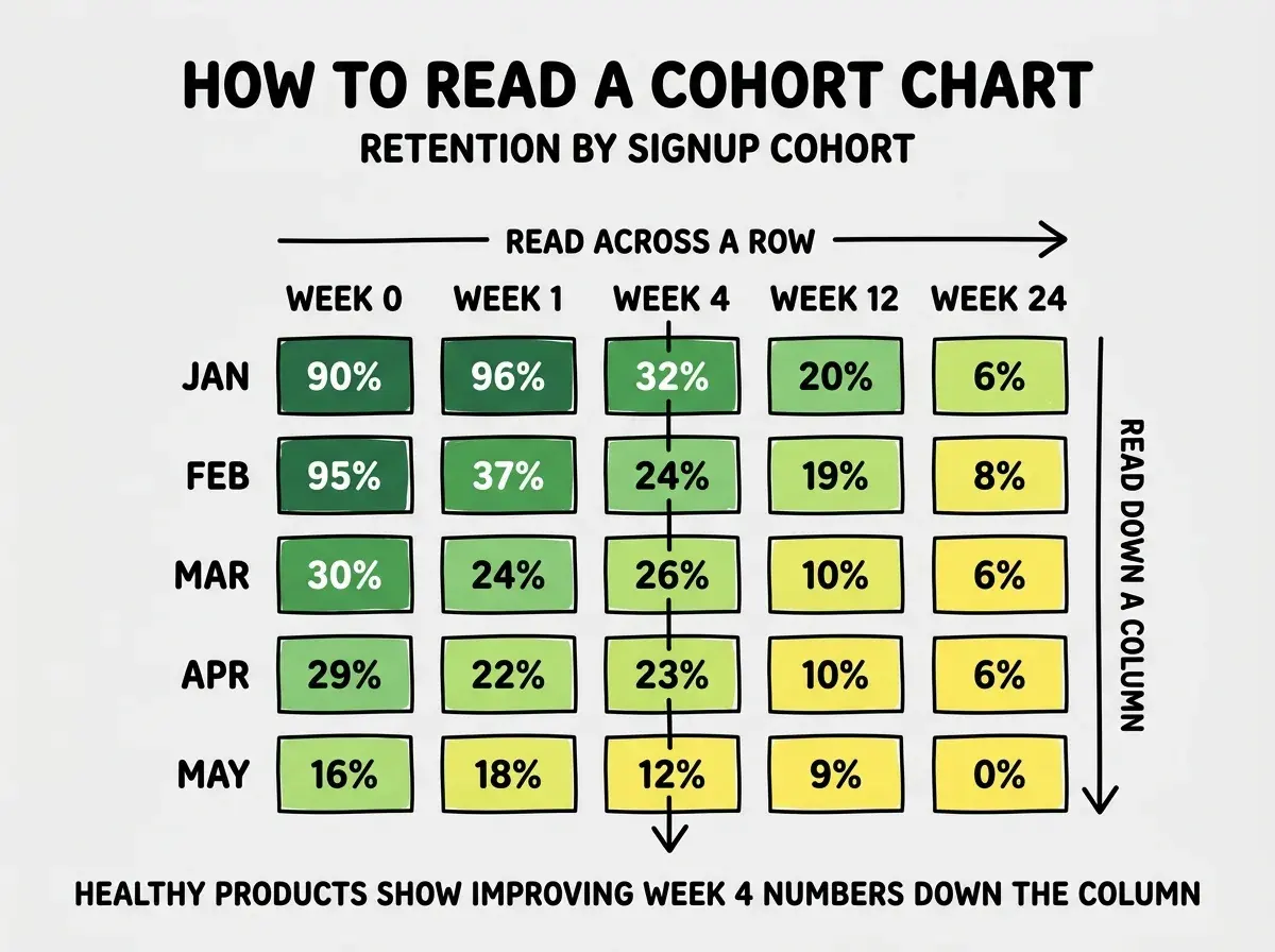
The second key thing is the smile or frown at the right edge. A "smile" curve flattens out after the first few weeks, meaning users who survive the first month tend to stick around forever. A "frown" curve keeps declining, meaning even long-term users eventually leave. Smile curves indicate strong product-market fit. Frown curves indicate either a value problem or a content/feature freshness problem.
What Good Looks Like by Product Type
The benchmarks vary wildly by product type. Comparing your retention to the wrong reference can lead you to either complacency or panic.
B2B SaaS. Healthy week 4 retention of 50 to 70 percent. The smile curve typically settles around 35 to 50 percent by week 24. Anything above this range is excellent, anything below 30 percent at week 4 is a problem.
Consumer subscription. Healthy week 4 retention of 30 to 50 percent. Smile curve at 15 to 25 percent by week 24. Consumer products have higher churn than B2B because users have more alternatives and lower switching costs.
Browse more analytics and growth guides
Read more grow articlesFree consumer apps. Healthy day 30 retention of 15 to 25 percent. The bar is much lower because there is no payment commitment. The smile curve often settles around 8 to 15 percent.
Marketplaces. Highly variable. Two-sided marketplaces should show separate cohorts for buyers and sellers, with buyers typically retaining at consumer rates and sellers at B2B rates.
The Four Ways to Use Cohort Data
Reading the chart is half the battle. Acting on what you see is where most teams stop. There are four reliable ways to use cohort data to drive product decisions.
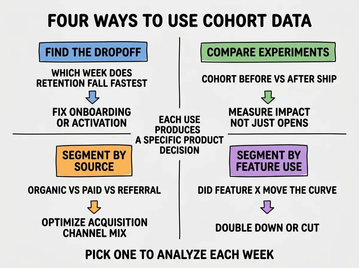
Find the dropoff. Look at where retention falls fastest. If you lose 50 percent of users between week 1 and week 2, you have an early activation problem. If you lose 30 percent between week 8 and week 12, you have a long-term value problem. The fix is in the corresponding part of the funnel.
Compare experiments. When you ship a major feature or change, the cohorts before and after should look different. If they do not, your change had no impact regardless of what your event tracking says.
Segment by acquisition source. Cohorts of users from organic search often retain very differently from users from paid ads or referrals. Knowing which source produces sticky users tells you where to spend acquisition budget.
Segment by feature use. Compare cohorts of users who used feature X in their first week against cohorts who did not. If the feature X cohort retains better, you have a candidate for an "aha moment" to push every new user toward.
The most common cohort analysis mistake is calculating retention against signups instead of against activated users. Counting users who signed up but never returned even once dilutes your cohort and makes the chart look much worse than reality. Define an "activated" event (first key action) and calculate retention from that point forward. The chart becomes useful, the curves become readable, and the decisions become obvious.
The other mistake is changing the cohort definition mid-stream. If you decide to switch from weekly to monthly cohorts, or from "signed up" to "completed onboarding," you lose the ability to compare against history. Pick a definition early and stick with it for at least 12 months, even if you find a slightly better one along the way.
What This Means For You
Cohort analysis is the single most useful retention tool any product builder can have. It is also one of the most under-used, mostly because the chart looks intimidating until you have read 10 of them.
- If you're a founder: Build the cohort chart in Posthog or Amplitude in the first week of launch. Look at it weekly and act on what changes.
- If you're changing careers: Cohort analysis is a top-three skill for any modern PM role. Practice on your own product or any open data set.
- If you're a student: When you build a portfolio project, instrument it well enough to produce a cohort chart. Showing one in interviews demonstrates real product thinking.
Browse more retention and analytics guides
Read more grow articles