👋 Hello again, Vibe-Coders!
Welcome to Week 4 of your beginner-friendly journey from zero to vibe-coding hero.
By now, you’ve told a computer what to do (Week 1), learned where your code lives (Week 2), and designed what users see (Week 3).
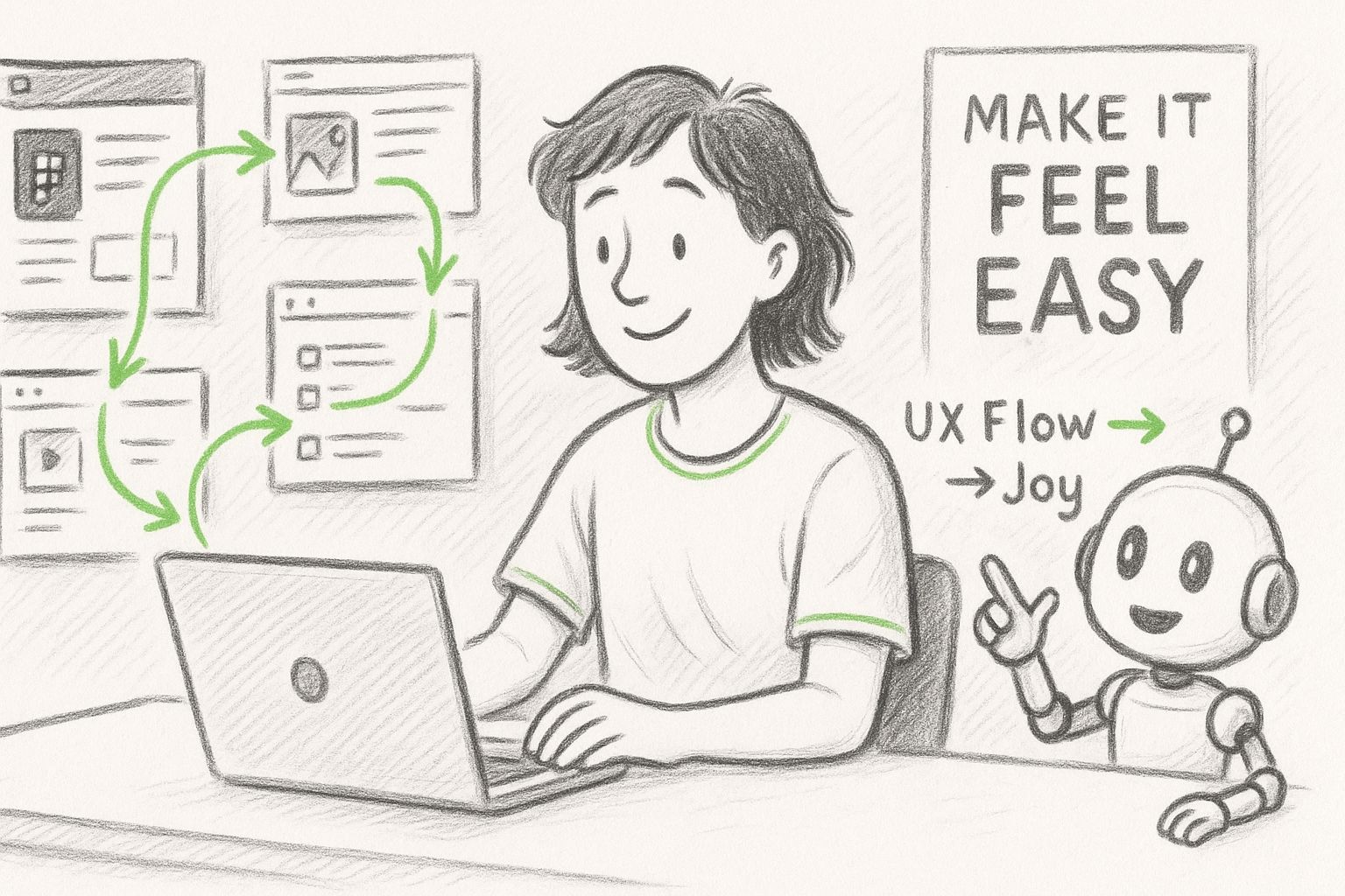
This week, you’ll learn something deeper: how your app should feel to use.
You’re about to become the kind of builder who thinks not just about pixels but about people.
So grab a tea, and let’s make your apps feel effortless. ☕
Are you ready? Let’s dive in!
The Gold standard for AI news
AI keeps coming up at work, but you still don't get it?
That's exactly why 1M+ professionals working at Google, Meta, and OpenAI read Superhuman AI daily.
Here's what you get:
Daily AI news that matters for your career - Filtered from 1000s of sources so you know what affects your industry.
Step-by-step tutorials you can use immediately - Real prompts and workflows that solve actual business problems.
New AI tools tested and reviewed - We try everything to deliver tools that drive real results.
All in just 3 minutes a day
📖 Coding Basics Explained: User Experience (UX)
What It Is:
When an app just flows: every tap feels right, every message arrives when you need it, that’s good User Experience (UX).
It’s not about pretty colors. It’s about how easy and satisfying it feels to use something.
Real World Comparison:
Think of visiting a theme park. The lines, signs, and music all guide you smoothly. That’s UX in the real world: design of feelings and flow.
Why You Care:
Even the most beautiful app (UI) fails if it’s confusing. UX makes it stick. It’s the secret behind apps people love.
Simple Example:
When Spotify tells you “Playing on another device” instead of silently failing, that’s UX caring about your sanity.

🔑 The Beginner Breakthrough
The Stuck Moment:
“My app looks nice, but people don’t know what to do next.”
Why This Happens:
You designed for your eyes, not your empathy. UX starts when you imagine how a real person will move and think.
The Simple Fix:
Ask yourself:
Are users confident at each step?
Do buttons respond instantly?
Is it clear what happens next?
Then tweak tiny things: label changes, smoother motion, shorter text to replace friction with flow.
What This Unlocks:
Once you think like your users, you’ll stop decorating screens and start shaping experiences.
🛠 Tool That Makes Sense: Figma
Beginner Rating: ⭐️⭐️⭐️⭐️⭐️ (5/5)
Figma is your visual playground for designing, testing, and refining your app’s flow, no code required. Drag boxes, connect arrows, and instantly feel how your app behaves.
Perfect For:
Mapping journeys and testing the app feel before actually starting to vibe-code your app.
Honest Reality:
The menus seem deep, but you’ll mostly use frames, text, and a “lightning-bolt” connector. So, don’t feel intimidated by all the stuff you’re going to see when you open Figma.
📚 Jargon of the Week
Word: Prototype
What it sounds like: Some top-secret machine in a sci-fi movie.
What it actually means: A prototype is a clickable model that simulates your app before it’s built.
Real-world analogy: Like a movie trailer, you sense the story and mood even though the full film isn’t finished.
Why you’ll hear it: UX designers prototype to test feelings and fix confusion before coding.
🚀 Try This Right Now
What You’ll Do: Make a two-screen clickable journey: nothing fancy, just flow.
Go to Figma, sign up if you don’t have an account, or log in if you do have one. Then click on New Design File
Draw two frames (screens - you can find them at the bottom bar).
Add text:
Screen 1 → “Welcome to my app!”
Screen 2 → “You made it 🎉”
Switch to Prototype mode ⚡️ and link Screen 1 to Screen 2. (Click on the first frame, use small circles with + signs in them, click on one of them, and just draw a line to the target frame)
Hit Present and click! You’ve built your first UX prototype.
Why this matters: You’ll feel the power of designing experiences before even starting to vibe-code.
🎯 Mini-Project Challenge
What You’ll Build: A three-screen prototype that guides users through a tiny experience, like choosing a mood or favorite color, and ends with a cheerful message.
Why It Matters: You’ll practice empathy: every click should feel natural and rewarding.
Time Needed: 15–20 minutes.
Your Mission:
Set up three screens —> a Start, a Choice, and a Result.
Add a warm welcome message on the first screen and a single clear button (“Let’s Go!”).
Ask one simple question on the second screen, something playful like “What number matches your mood today?” and give two or three choices as buttons.
Create a result screen with a friendly message that reacts to their choice (“15 it is! Fresh start ahead”).
Link everything together using Figma’s Prototype mode ⚡️:
Start → Choice
Choice → Result
Result → Back to Start (a Restart button makes users feel in control).
Preview your flow in Present mode and tweak until it feels smooth and satisfying.
Success Looks Like: You can move from start → finish → restart without hesitation.
If it feels obvious what to do next, you’ve built great UX.
You can connect everything (rectangles, texts, frames), change the style and play around as you wish. Just do some experiments, navigate around the menus, and make sure that you’re a vibe-coder enthusiast with a fine taste of UX!
🔮 Weekly Roundup
You’ve officially leveled up from making screens to designing feelings.
By prototyping in Figma, you practiced the golden rule: “Good UX is invisible, you only notice it when it’s gone.”
Next week, your app gets a memory! We’ll explore Databases, where your creations start to remember names, moods, and choices.
Until then, keep asking one question every time you open an app:
“Why does this feel so smooth?”
So you like what you see? Then why don’t you…


